Encoding & Decoding: A World of Signs
‘Semiotics is in principle, the discipline of studying everything which can be used in order to lie. If something cannot be used to tell a lie, conversely it cannot be used to tell the truth: it cannot in fact be used “to tell” at all’. (Eco, 1976, p.7)
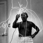
This session introduces participants to the language of semiotics, stemming from the Greek sēma (sign) and the ways in which we might understand the photograph as a ‘code’. It draws from the ideas of Ferdinand de Saussure, Charles Sanders Pierce and Roland Barthes, in considering a ‘language’ of photography / visual culture in an advertising context.
‘It is not the person ignorant of writing, but ignorant of photography, as somebody said, who will be the illiterate of the future, But mustn’t the photographer who is unable to read his own pictures be no less deemed an illiterate?’ (Moholy-Nagy in Benjamin, 1931, p.294)
This Session could be run in conjunction with:
Aims & Outcomes:
- To become familiar with the language of semiotics
- To explore the role of text within adverts to convey / support the message
- To consider dominant, negotiated and oppositional readings of adverts
- Participant Outcome: 1 x A3 print advert

Semiotics is concerned with everything that can be taken as a sign. A sign is everything that can be taken as significantly substituting for something else. This something else does not necessarily have to exist or actually be somewhere at the moment that the sign stands in for it. (Eco, 1976, p.7)
suggested Session Outline:
- Give / modify the Presentation below. Concentrate on the language used by de Saussure (signifier / signified) Pierce (icon / index / symbol) and Barthes (denotation / connotation / lingusitic message / cultural paradigms). Daniel Chandler offers an excellent overview available here. Throughout:
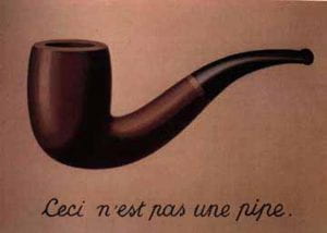
- Think about and compare the use of written / verbal language and visual language. What (seems to) make a photograph different from painted or illustrated representations? How might the use of text within an sign / advert ‘guide’ our interpretation of it? Are there synergies between the messages conveyed by written text and the images?
‘it is perhaps only when encountering a different language that this experience of a gap between language and the world of objects (the objects language designates) actually begins to reveal itself as “unnatural”. Suddenly, the way language names things in the world comes upon a different system’ (Bate, 2016, p.19)
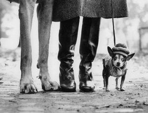
- Dog
- Chein
- Hund
- Perro
- 狗
- كلب
‘
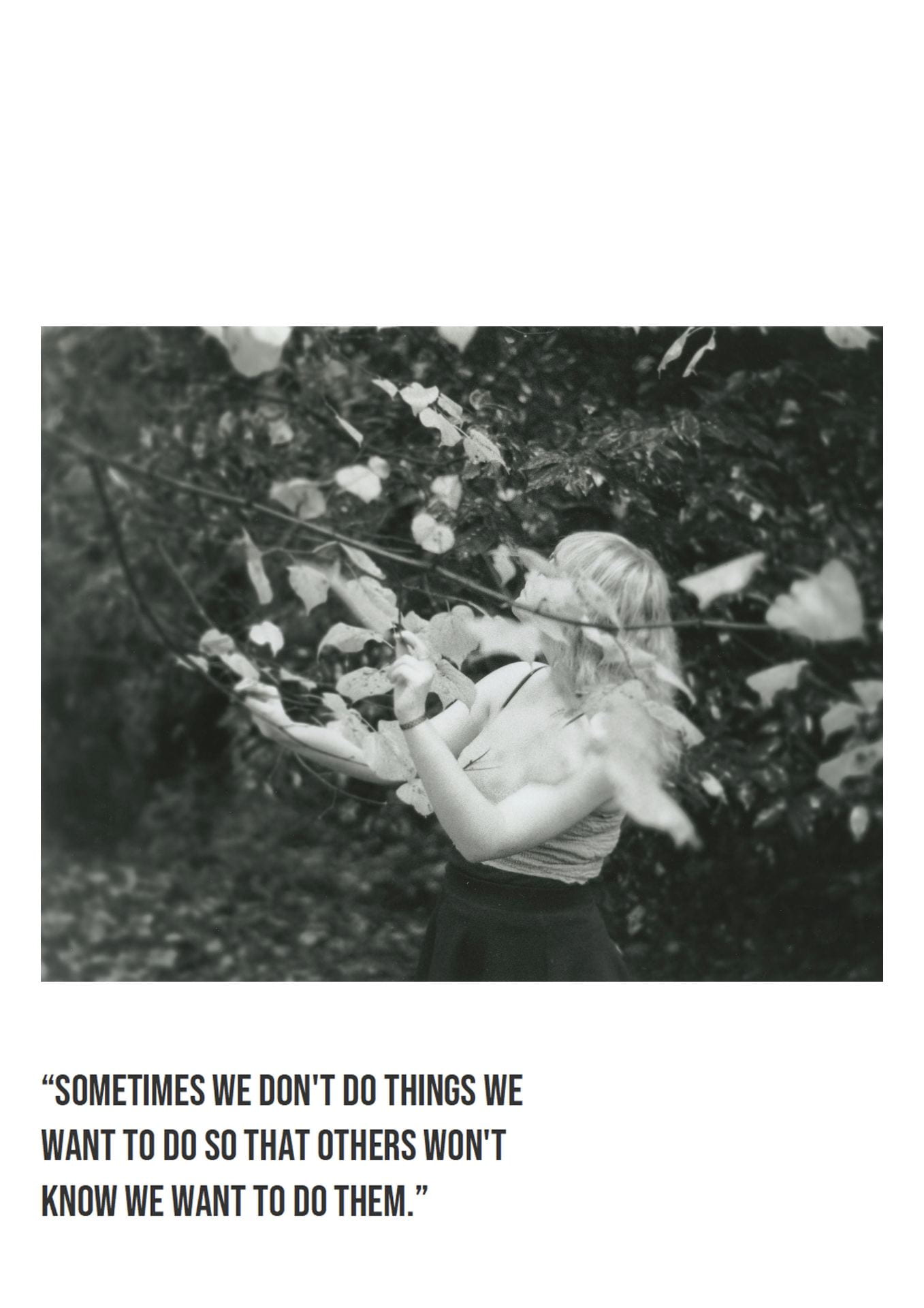
‘The caption permits me to focus not only my gaze, but also my understanding’ (Barthes, 1977, p.39)


- Think about how these messages may reproduce dominant ideologies / cultural paradigms. Are these speciifc to shared understandings?
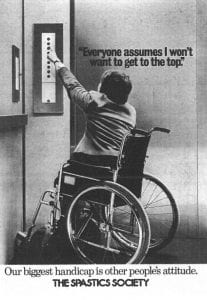
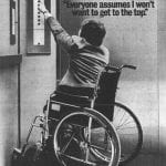
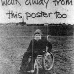
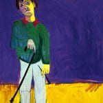
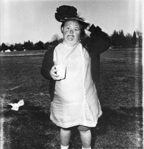
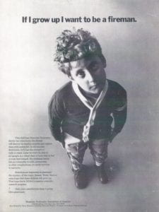
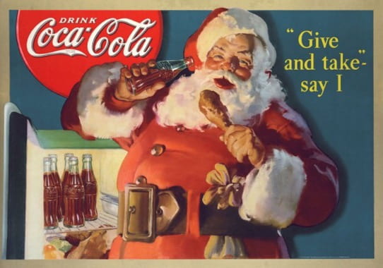
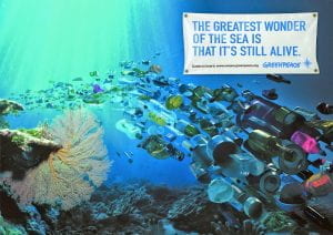
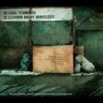
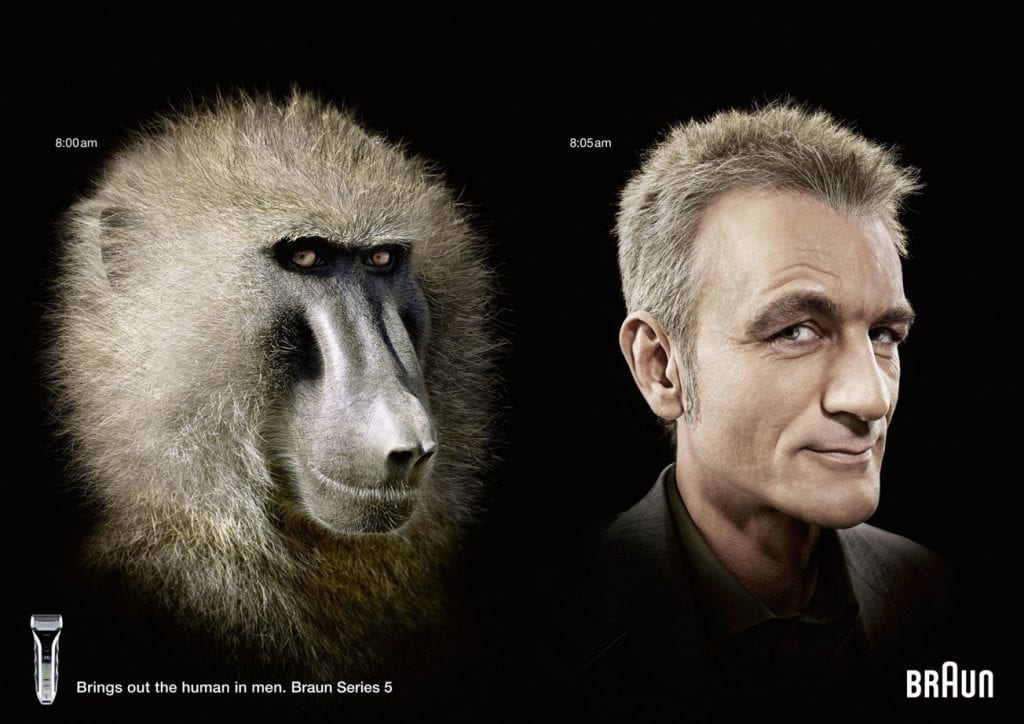
- What ideaologies are promoted by the images below? Do they become ‘invisible’ through shared understandings?
- Select an advert / image and make a large print out / projection of it. Using post it notes, participants should work in a group to identify each dennotational aspect of the image to and deconstruct what it connotes.
- Compare Roland Barthes (1972) essay ‘The World of Wrestling‘ in Mythologies to the visual language used in The Lion King (1994)

Messages are socially produced in particular circumstances and made culturally available as shared explanations of how the world works. In other words, they are ‘ideologies’, explanatory systems of belief’ (Goodwin & Whannel, 2005, p.60)

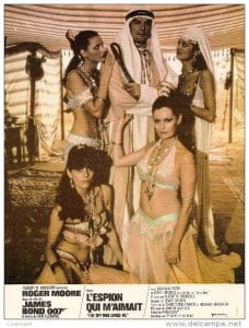
‘An Italian would barely perceive the connotation of the name, no more probably than he would the Italianicity, [it is] based on a familiarity with certain tourist stereotypes’ (Barthes, 1977, p.34)
Think About: What are the dennotative and connotative aspects of the Pazani advert Barthes discusses? Does it have any synergies with the Dolmio advert below? Does the Dolmio advert introduce any ofher ideologies (family / gender roles etc)?
‘By the word reading we mean not only the capacity to identify and decode a certain number of signs, but also the subjective capacity to put them into a creative relation between themselves and with other signs’ (Hall, 1999, p.514)
‘Understanding photography as a body of practices and aesthetic values which follows a paradigmatic structure is helpful in understanding its representational role, for it focuses our attention on how the interactions between the intentions of photographers and the uses to which thier photographs are put’ (Hall, 1999, p.80)
‘Advertising forms a system of meaning… The viewer sees all advertisements as one, or rather sees their rules as applicable to one another and thus part of an interchangeable system’ (Williamson, 1978, p.13)
- Or is it? Think about how these messages may be misconcieved. Consider dominant readings / negotiated readings / oppositional readings.
- Revisit the previous large image / post it notes and consider how the image / advert might be understood in different ways, by whom and why.
- Consider adverts which have attracted controversy. Evaluate some examples of The Advertising Standards Authority decisions available here
- How would you evaluate the John Lewis (2015) Man on the Moon Christmas campaign? Why do you think it attracted oppositional readings? How do you feel about the morality of supermarkets etc offering ‘charity’ christmas campaigns? Is this practice sincere or disingenuous?
‘It’s unclear why the old man is on the moon, though he looks a lot like one of those desiccated Nazis who fled Germany after the war and built an Aryan paradise in Patagonia. Lily sends Heinrich a telescope, delivered by party balloons, with which he can spy on the child in her bedroom. How is that good?’ (Pearson, 2015)
‘As soon as a photograph leaves Eden and enters into circulation, it becomes culturally coded, transforming the image and putting it into the realm of connotation’ (Elkins, 2007, p.15)
Presentation ideas: Encoding & Decoding: A World of Signs
to follow
- Ask participants to create an advertising (campaign) of thier own. This might be themed (e.g. Christmas) or it might be within a certain product context (e.g. a mystery scent – they might create an advert based on smell alone).
- They should conduct a semiotic analysis of thier final consturcted image. What does it denote / connote? Why did they make the visual choices they did? Does it conform to any cultural paraadigms? What is it’s linguistic messge? How might it be (mis) read? By whom and why?
- Print / project and critique
‘There is one lesson we can learn from photographs: images exist not to be believed, but to be interrogated’ (Grundberg, 1999, p.273)