The aesthetics of Apathy: advertising the Environment
‘An image is drained of its force by the way it is used, where and how often it is seen’ (Sontag, 2003, p.105)
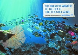
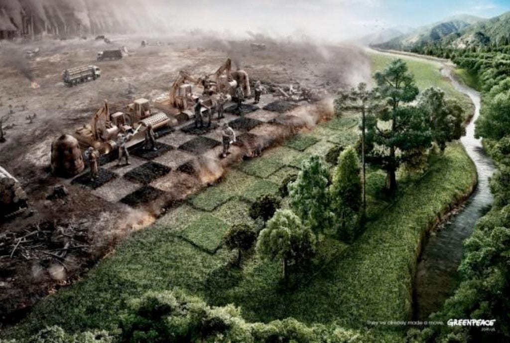
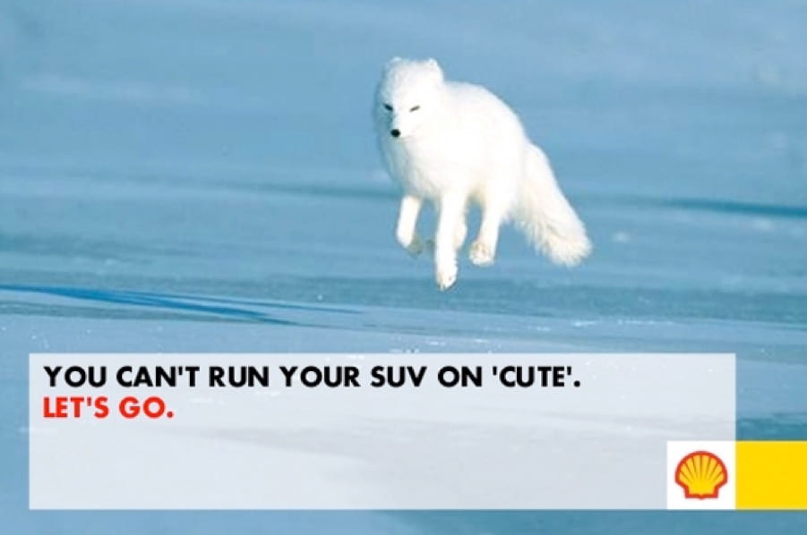
This session encourages a comparative approach to advertising campaigns which promote environmental awareness and concern. Specifically, participants are encouraged to consider the potential for compassion fatigue in our image saturated world, the use of aesthetics / shock tactics in these adverts, as well as the importance / function of text within the adverts to spur us to take action (or not).
This Session could be run in conjunction with:
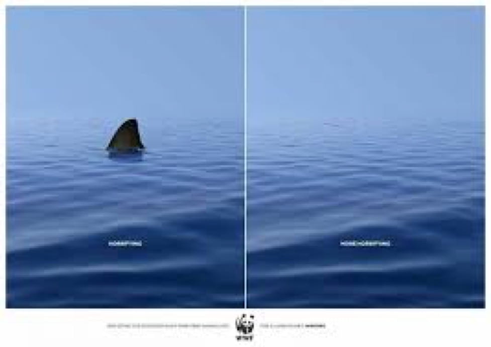
‘Those who design these actively campaign to awaken public consciousness over misuse of the environment and shape their communications to create and reinforce that message’ (Gold & Revill, 2004, p.3)
Aims & Outcomes:
- To investigate the aesthetics of environmental issues in advertising
- To consider the impact of these at provoking our ‘concern’ and action
- To reflect on the success / weakness of each of these practices considering the intent / visual approach of the adverts
- To consider the role of text within the adverts to convey / support the message
- Participant Outcome: 1 x A3 print advert
‘Environmentalists picture the environment as ‘suffering’ too. These are all compositions that invoke a kind of visual ‘pain’ in the viewer’ (Bate, 2009, p.119)
You will need:
- Digital cameras for all participants (and appropriate memory cards) *This session can also be run using Camera phones or Lumix cameras
- Card readers
- Access to computers (or laptops) and imaging software
- An Introductory Brief & Presentation (below) for participants to outline the ideas and provide examples
- A booked room to critique participants work (either via a projector or via print)
- Blue tack to pin the work
- Costings and Risk Assessments
‘A photograph that brings news of some unexpected zone of misery cannot make a dent in public opinion unless there is an appropriate context of feeling and attitude’ (Sontag, 1977, p.17)
Presentation: The Aesthetics of Apathy


‘Shocking ads traditionally worked because the message became so deeply lodged in a person’s consciousness that they were eventually forced to act upon it. However, if the same message and same tactics are being used all the time, then it just becomes wallpaper to a person and makes it far easier to ignore’ (Gardner in Williams 2009)

Preparation Work:
- Ask participants to read Aimee Meade (2014) ‘Emotive Charity Advertising: Has the public had enough? in The Guardian (24th September 2014) available here
- Ask participants to read Fiona Shields (2019) ‘Why We’re Rethinking the Images we Use for our Climate Journalism in The Guardian (18th October 2019) available here
- Ask participants to read Matt Williams (2009) ‘Close Up: Does Shock Advertising Still Work?’ in Campaign (24th April 2009) available here
- Ask participants to watch and evaluate ‘Rang Tan’ Iceland Advert (2018) available here
- Ask participants if they have thier own digital cameras and cards
- Make sure you have access to computers / image editing software
- Make sure there are enough team members to support participants (never assume thier prior knowledge)
- Decide whether you will project the work or print it.
- If you are printing it make sure Reprographics are aware and be aware of timekeeping so they have space to print the work – or use A3 colour photocopiers.
- *If you are running this session off campus, make sure there is access to printers or projectors
‘If an ad is too shocking, for example, you run the risk of people deliberately avoiding what you say – they look away, change channel, turn the page. Also, if you start adding unnecessary layers of drama, people see through it, they feel they’re being manipulated (Brazier in Williams, 2009)

suggested Session Outline:
- Ask participants what environmental they have concerns about globally / locally
- Give the Presentations above. Invite participants to compare the adverts? What are the similarities and differences? Pay attention to aesthetics and use of text as message. Is is successful? Which adverts enourage you to ‘care’ more? Why?
- Brainstorm environmental issues and select issues that participants care about. How has this been represented visually? which aesthetic approach works best?
- individually / in groups make an advert (include text) which aims to inspire change and encourage people to ‘care’ about the chosen environmental issue.
- Print / Project and critique the images with these aesthetics / use of text in mind and considering how we might overcome compassion fatigue.
‘To aestheticize tragedy is the fastest way to anaesthetize the feelings of those who are witnessing it. Beauty is a call to admiration, not to action’ (Sischy, 1991, p.92)