Communicate / Consume

Encoding & Decoding: A World of Signs

‘Semiotics is in principle, the discipline of studying everything which can be used in order to lie. If something cannot be used to tell a lie, conversely it cannot be used to tell the truth: it cannot in fact be used “to tell” at all’. (Eco, 1976, p.7)
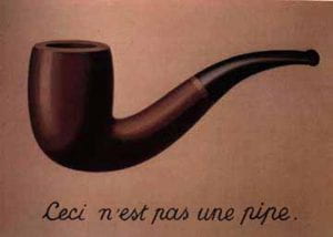
René Magritte (1929) The Treachery of Images

This session introduces participants to the language of semiotics, stemming from the Greek sēma (sign) and the ways in which we might understand the photograph as a ‘code’. It draws from the ideas of Ferdinand de Saussure, Charles Sanders Pierce and Roland Barthes, in considering a ‘language’ of photography / visual culture in an advertising context.


‘It is not the person ignorant of writing, but ignorant of photography, as somebody said,  who will be the illiterate of the future, But mustn’t the photographer who is unable to read his own pictures be no less deemed an illiterate?’ (Moholy-Nagy in Benjamin, 1931, p.294)

This Session could be run in conjunction with:
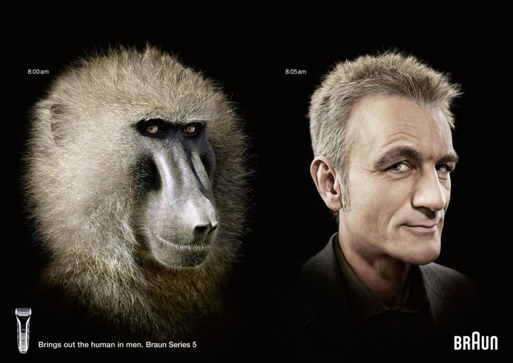
Braun Advert (2008)

Aims & Outcomes:

  • To become familiar with the language of semiotics
  • To explore the role of text within adverts to convey / support the message
  • To consider dominant, negotiated and oppositional readings of adverts
  • Participant Outcome: 1 x A3 print advert
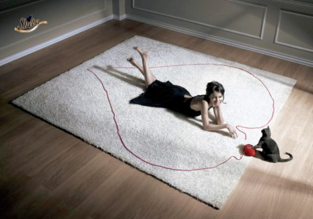
Sheba Advert (2008)
Semiotics is concerned with everything that can be taken as a sign. A sign is everything that can be taken as significantly substituting for something else. This something else does not necessarily have to exist or actually be somewhere at the moment that the sign stands in for it. (Eco, 1976, p.7)

suggested Session Outline:

  • Give / modify the Presentation below. Concentrate on the language used by de Saussure (signifier / signified) Pierce (icon / index / symbol) and Barthes (denotation / connotation / lingusitic message / cultural paradigms). Daniel Chandler offers an excellent overview available here. Throughout:
  • Think about and compare the use of written / verbal language and visual language. What (seems to) make a photograph different from painted or illustrated representations? How might the use of text within an sign / advert ‘guide’ our interpretation of it? Are there synergies between the messages conveyed by written text and the images?
‘it is perhaps only when encountering a different language that this experience of a gap between language and the world of objects (the objects language designates) actually begins to reveal itself as “unnatural”. Suddenly, the way language names things in the world comes upon a different system’ (Bate, 2016, p.19)
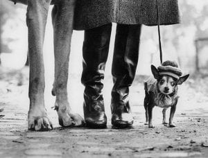
Elliott Erwitt (1974) New York
  • Dog
  • Chein
  • Hund
  • Perro
  • كلب


‘The caption permits me to focus not only my gaze, but also my understanding’ (Barthes, 1977, p.39)
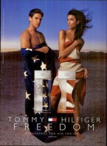
Tommy Hilfiger Advert (2000)
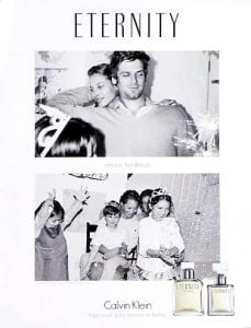
Calvin Klein Advert (1995)
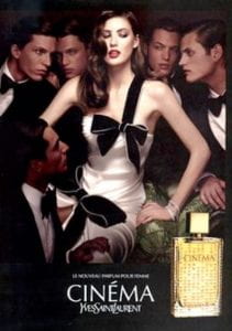
Yves Saint Laurent Advert (1995)
  • Think about how these messages may reproduce dominant ideologies / cultural paradigms. Are these speciifc to shared understandings?
  • What ideaologies are promoted by the images below? Do they become ‘invisible’ through shared understandings?
  • Select an advert / image and make a large print out / projection of it. Using post it notes, participants should work in a group to identify each dennotational aspect of the image to and deconstruct what it connotes.
  • Compare Roland Barthes (1972) essay ‘The World of Wrestling‘ in Mythologies to the visual language used in The Lion King (1994)
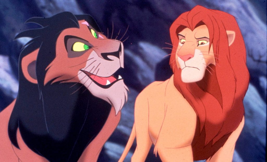
The Lion King (1994) Walt Disney Feature Animation: Roger Allers & Rob Minkoff
Messages are socially produced in particular circumstances and made culturally available as shared explanations of how the world works. In other words, they are ‘ideologies’, explanatory systems of belief’ (Goodwin & Whannel, 2005, p.60)
Panzani Advert (c.1970)


‘An Italian would barely perceive the connotation of the name, no more probably than he would the Italianicity, [it is] based on a familiarity with certain tourist stereotypes’ (Barthes, 1977, p.34)

Think About: What are the dennotative and connotative aspects of the Pazani advert Barthes discusses? Does it have any synergies with the Dolmio advert below? Does the Dolmio advert introduce any ofher ideologies (family / gender roles etc)?

‘By the word reading we mean not only the capacity to identify and decode a certain number of signs, but also the subjective capacity to put them into a creative relation between themselves and with other signs’ (Hall, 1999, p.514)
‘Understanding photography as a body of practices and aesthetic values which follows a paradigmatic structure is helpful in understanding its representational role, for it focuses our attention on how the interactions between the intentions of photographers and the uses to which thier photographs are put’ (Hall, 1999, p.80)
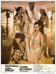
The Spy Who Loved Me Film Poster (1977) Lewis Gilbert
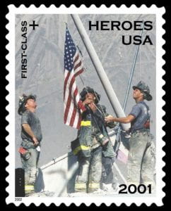
American Heroes Postage Stamp (2001)
‘Advertising forms a system of meaning… The viewer sees all advertisements as one, or rather sees their rules as applicable to one another and thus part of an interchangeable system’ (Williamson, 1978, p.13)
  • Or is it? Think about how these messages may be misconcieved. Consider dominant readings / negotiated readings / oppositional readings.
  • Revisit the previous large image / post it notes and consider how the image / advert might be understood in different ways, by whom and why.
  • Consider adverts which have attracted controversy. Evaluate some examples of The Advertising Standards Authority decisions available here
  • How would you evaluate the John Lewis (2015) Man on the Moon Christmas campaign? Why do you think it attracted oppositional readings? How do you feel about the morality of supermarkets etc offering ‘charity’ christmas campaigns? Is this practice sincere or disingenuous?
‘It’s unclear why the old man is on the moon, though he looks a lot like one of those desiccated Nazis who fled Germany after the war and built an Aryan paradise in Patagonia. Lily sends Heinrich a telescope, delivered by party balloons, with which he can spy on the child in her bedroom. How is that good?’ (Pearson, 2015)
‘As soon as a photograph leaves Eden and enters into circulation, it becomes culturally coded, transforming the image and putting it into the realm of connotation’ (Elkins, 2007, p.15)

Presentation ideas: Encoding & Decoding: A World of Signs

to follow

  • Ask participants to create an advertising (campaign) of thier own. This might be themed (e.g. Christmas) or it might be within a certain product context (e.g. a mystery scent – they might create an advert based on smell alone).
  • They should conduct a semiotic analysis of thier final consturcted image. What does it denote / connote? Why did they make the visual choices they did? Does it conform to any cultural paraadigms? What is it’s linguistic messge? How might it be (mis) read? By whom and why?
  • Print / project and critique
‘There is one lesson we can learn from photographs: images exist not to be believed, but to be interrogated’ (Grundberg, 1999, p.273)

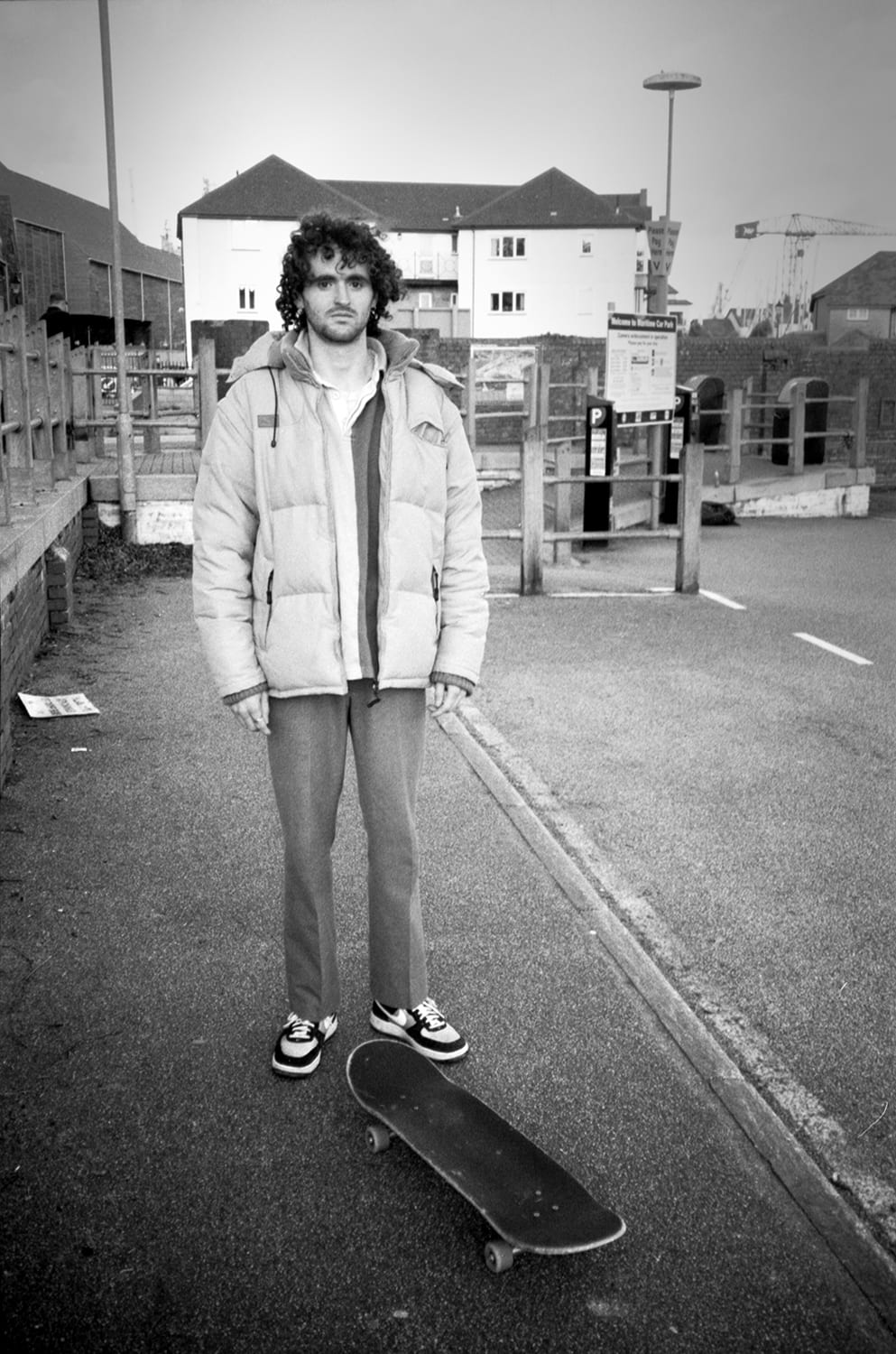
 

Showcase Portfolio: Louis Stopforth

Louis Stopforth

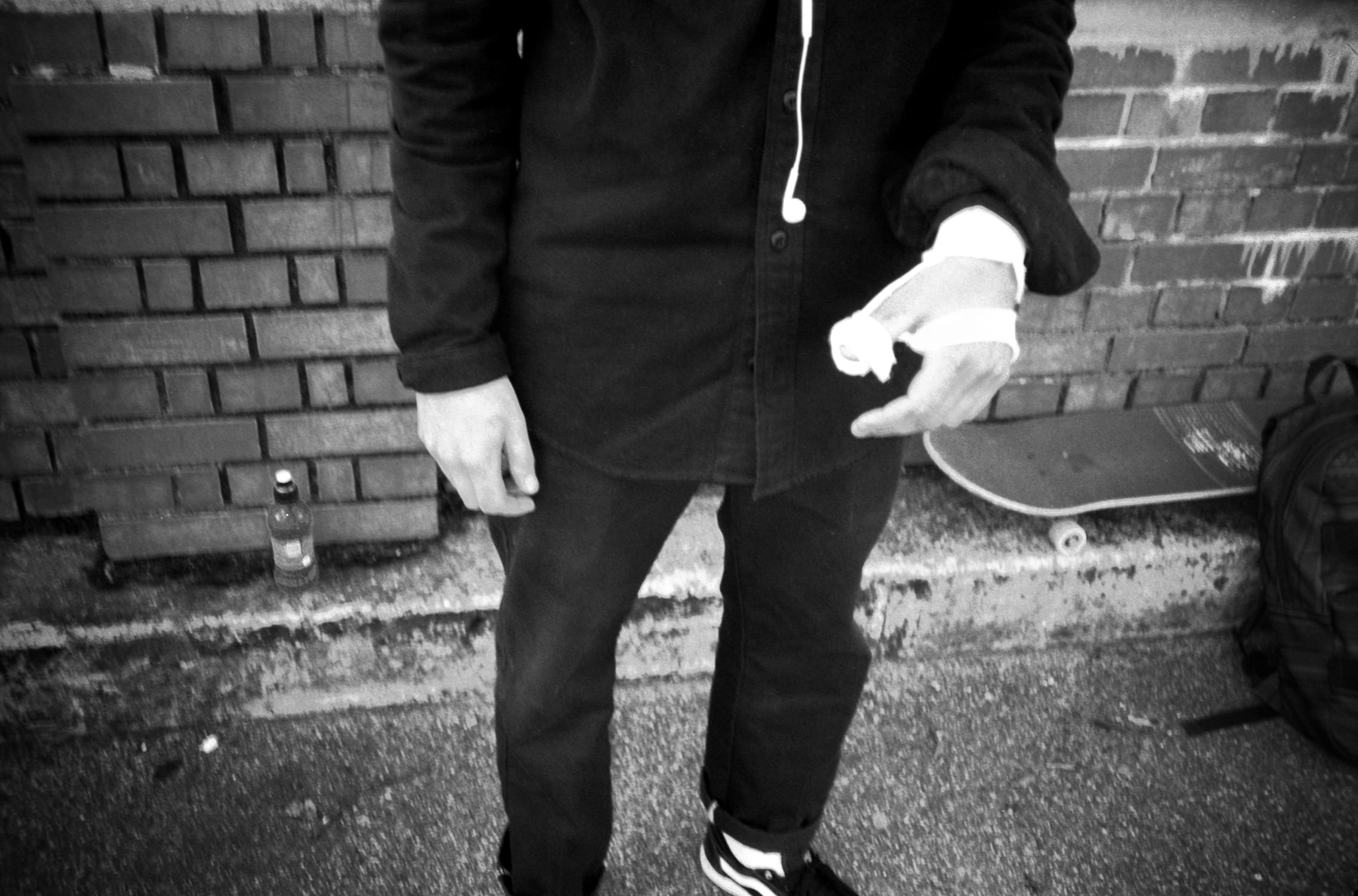
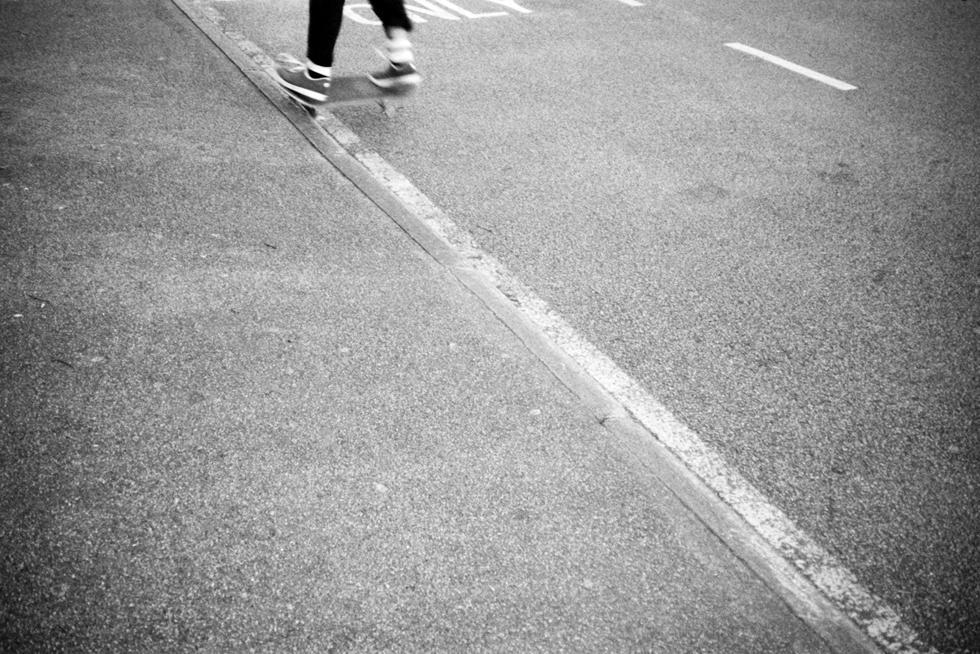
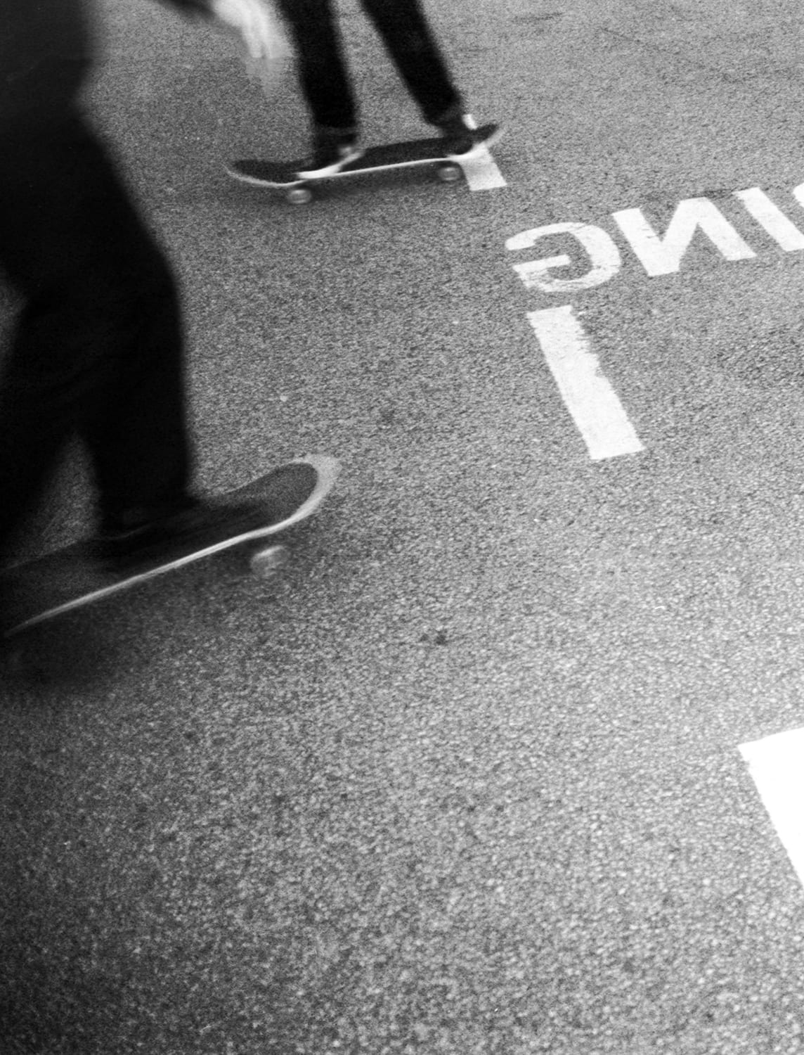
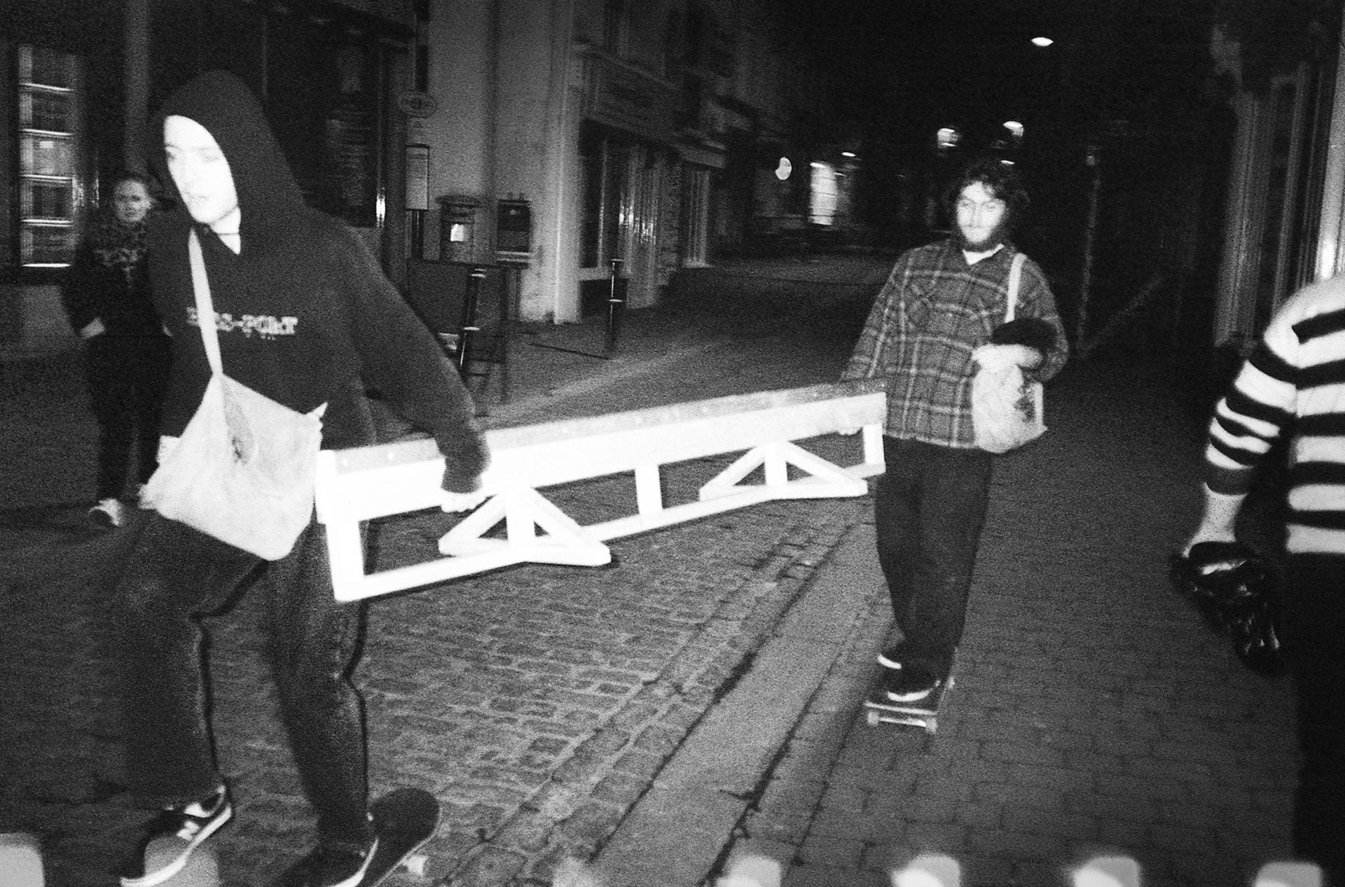
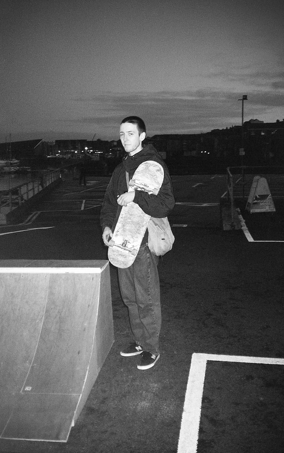
Strangers (2018) is a social documentary looking at street skateboarding sub-culture. The presentation of this work as a low quality newsprint zine formed a tactile and sensory viewing experience which reflected the rawness of the subject matter. Utilising the poor quality of a 35mm point and shoot camera, resulting in grainy images which highlight the rough terrain and movements of those recorded. This combination of imagery and material presentation created a visceral and dynamic series of images that ‘interact with one another and form an eye-catching, compelling picture story’ (Kobré, 1996, P.132). Alongside documenting the act of street skateboarding in an environment un-suited to it, the zine interspersed the zine with portraits of those that were part of the sub-culture during this period. Inspired by Larry Clark’s Tulsa (1971) I worked on this project as an insider, presenting the perspective not of an observer but a participant. ‘I wanted the audience to be eavesdropping on a world they had no chance to enter’ (Clark, 2015). It was this insiders perspective that allowed me to honestly and accurately depict a group otherwise not understood for its creativity and innovation in regards to their environment.


‘everything takes form, even infinity’ (Bachelard, 1964, P.212).

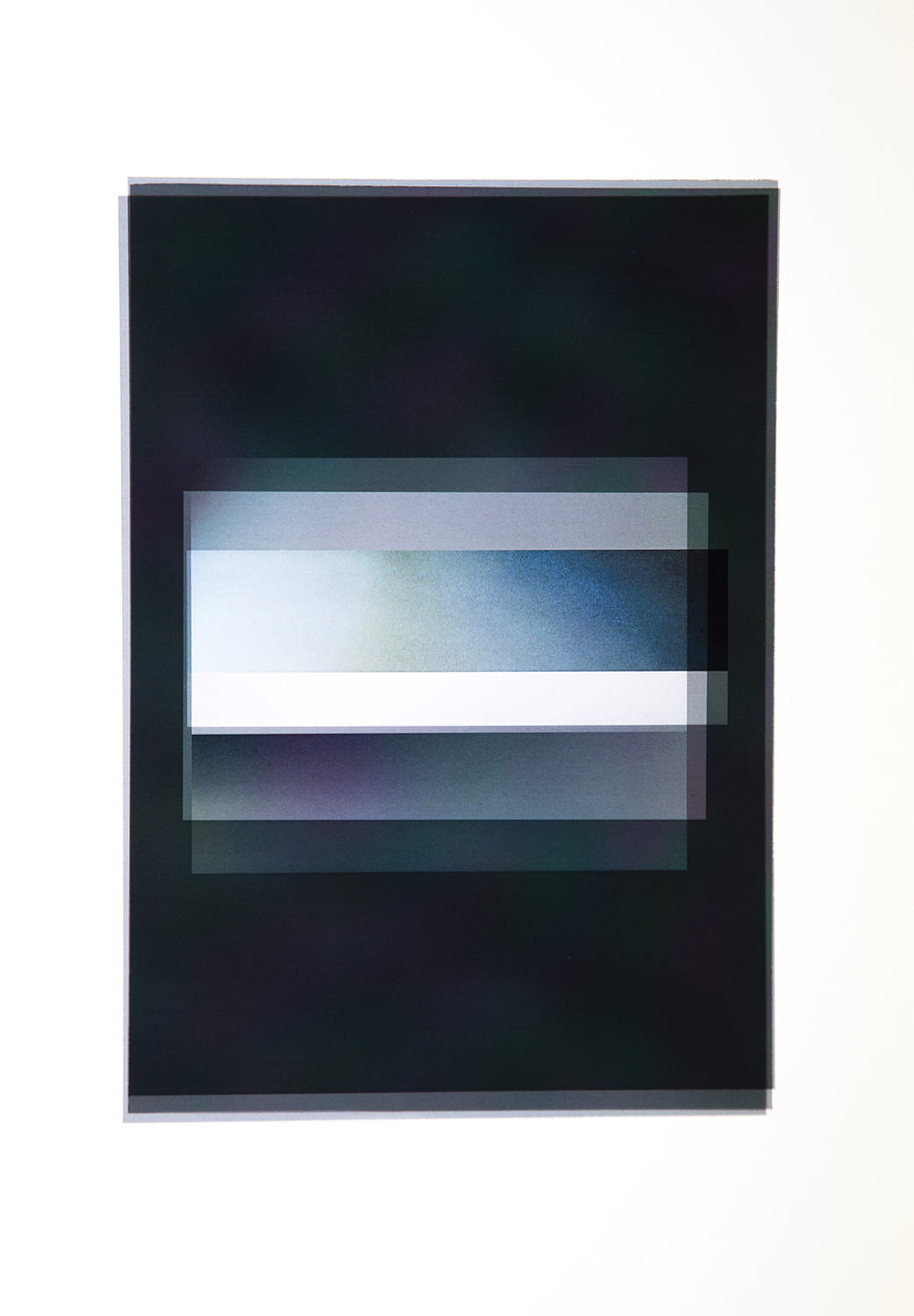
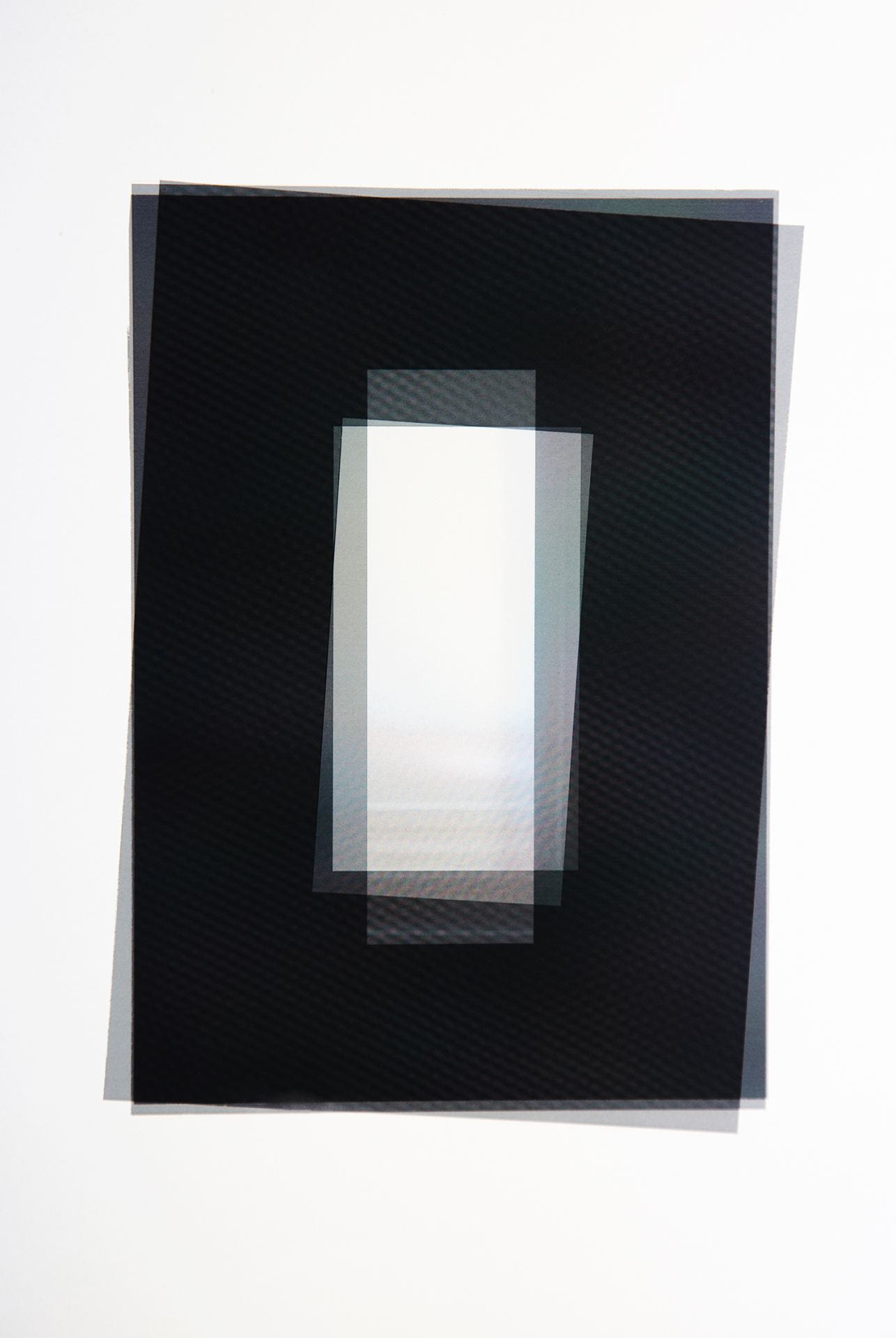
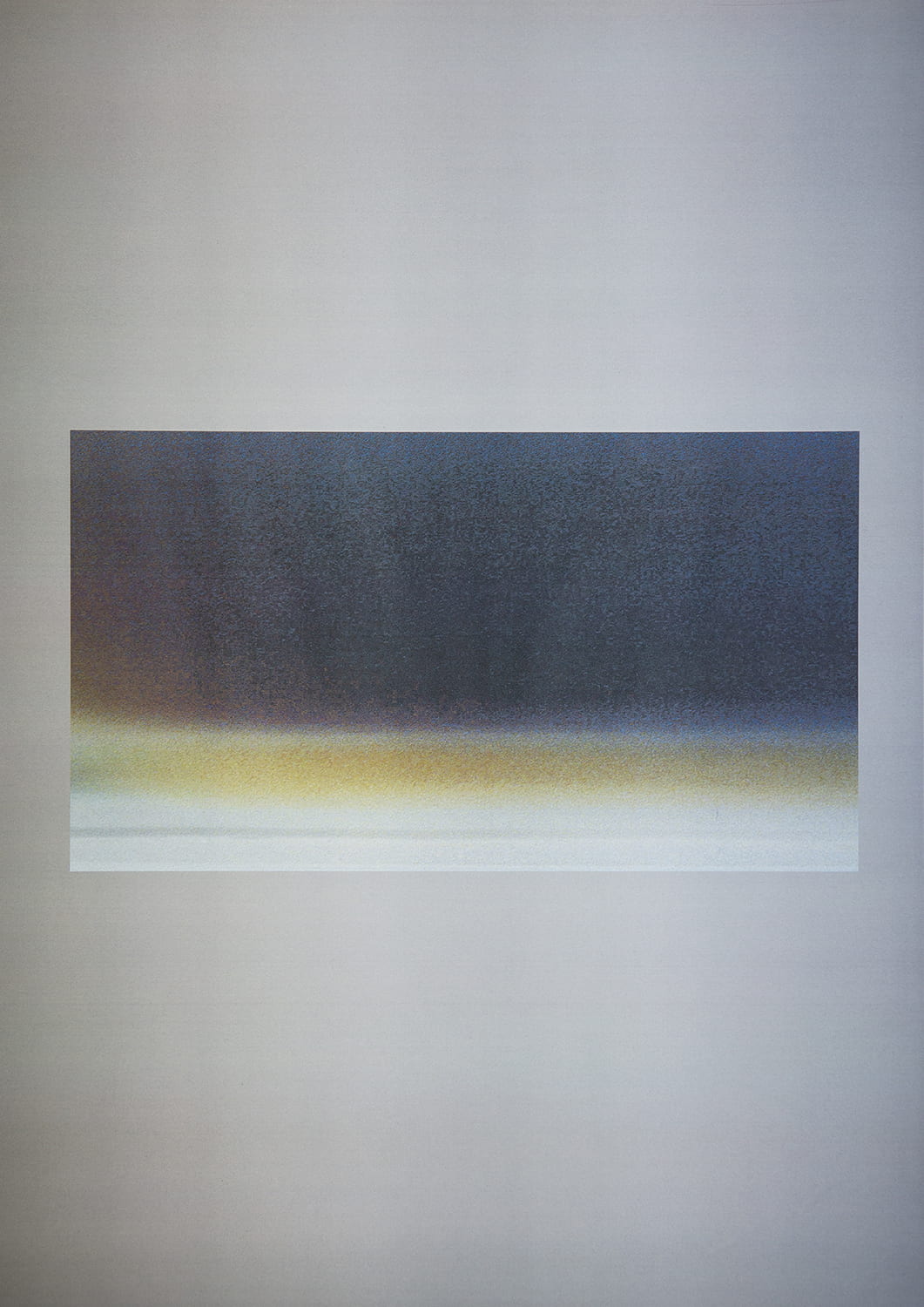
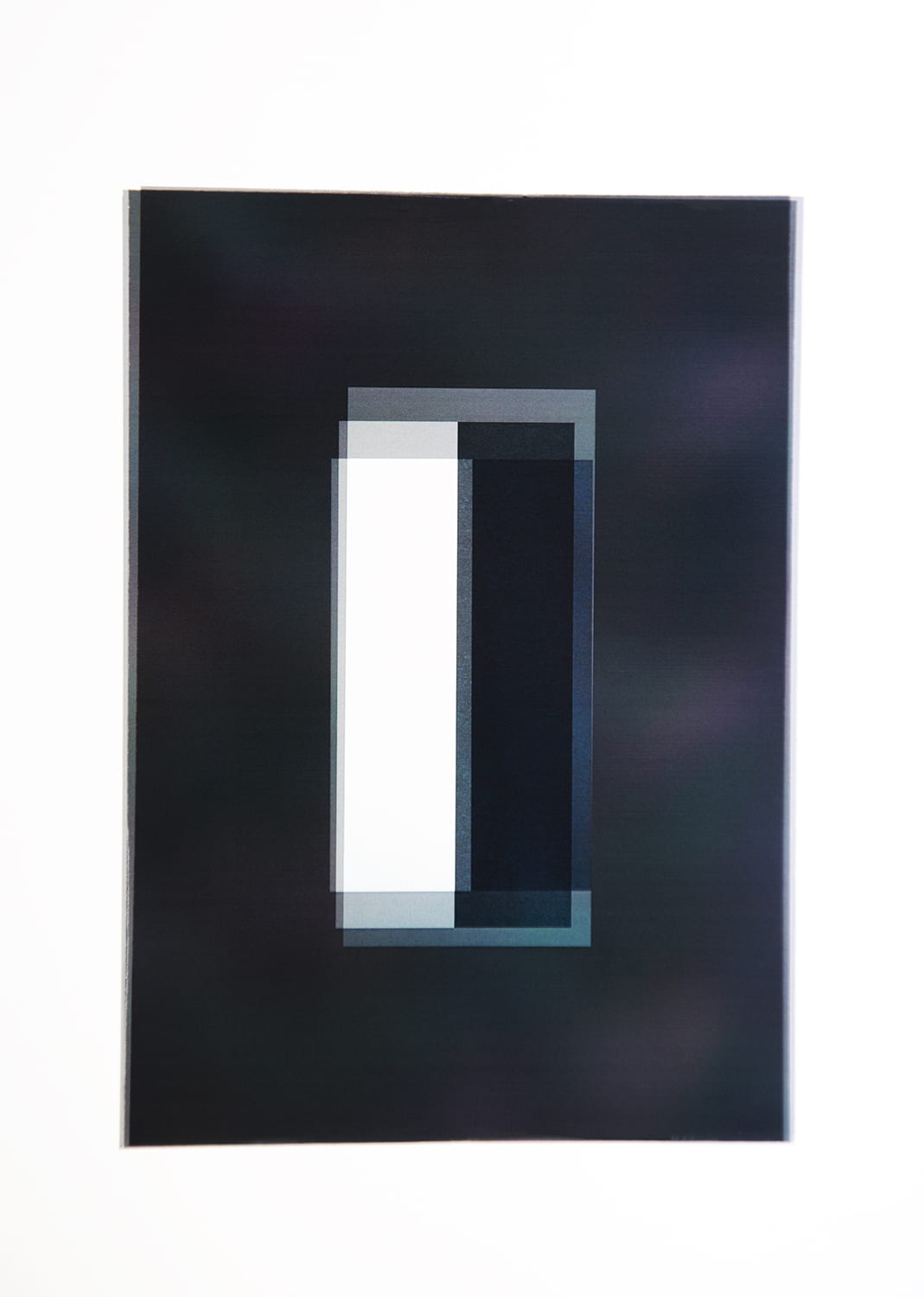
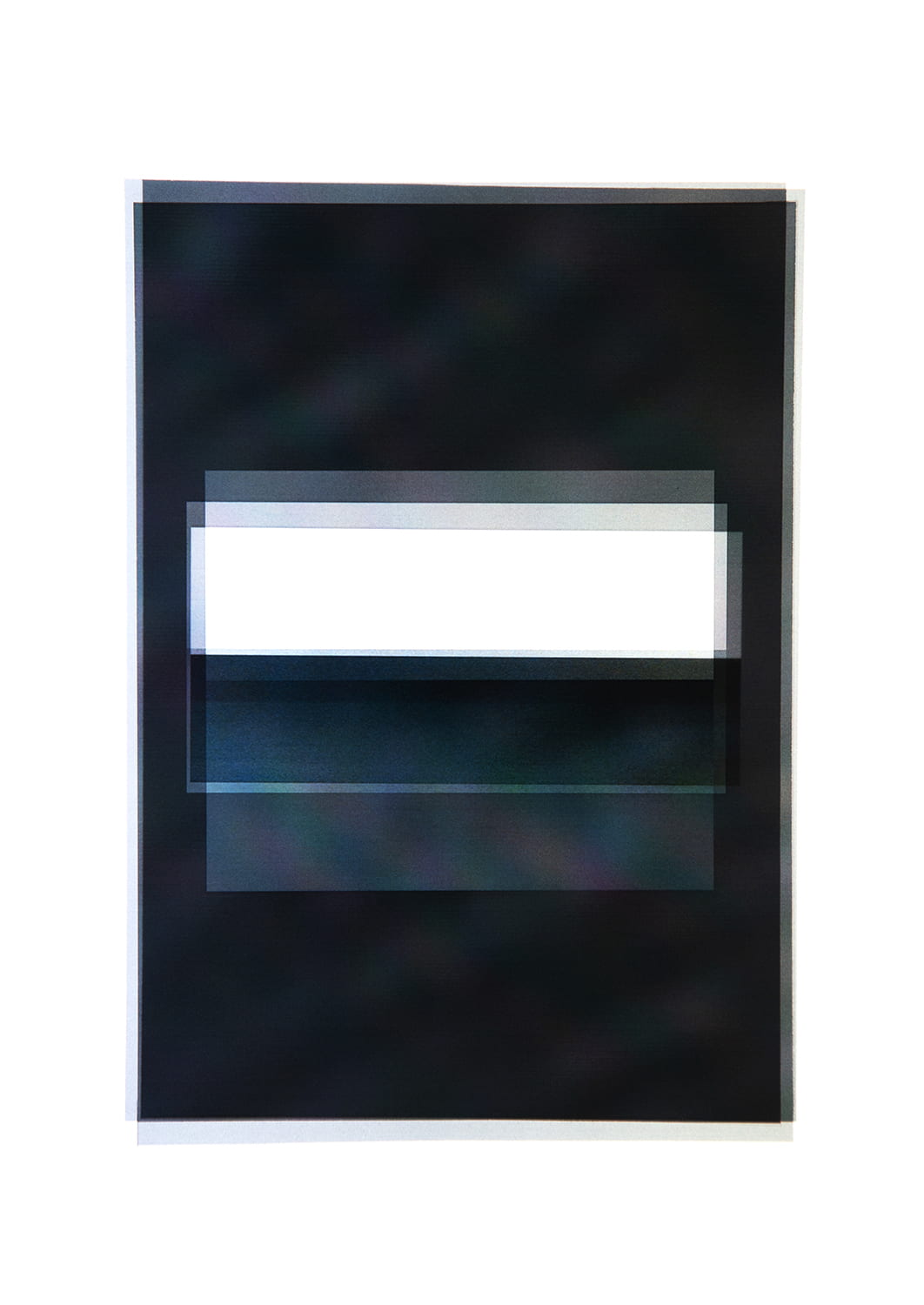
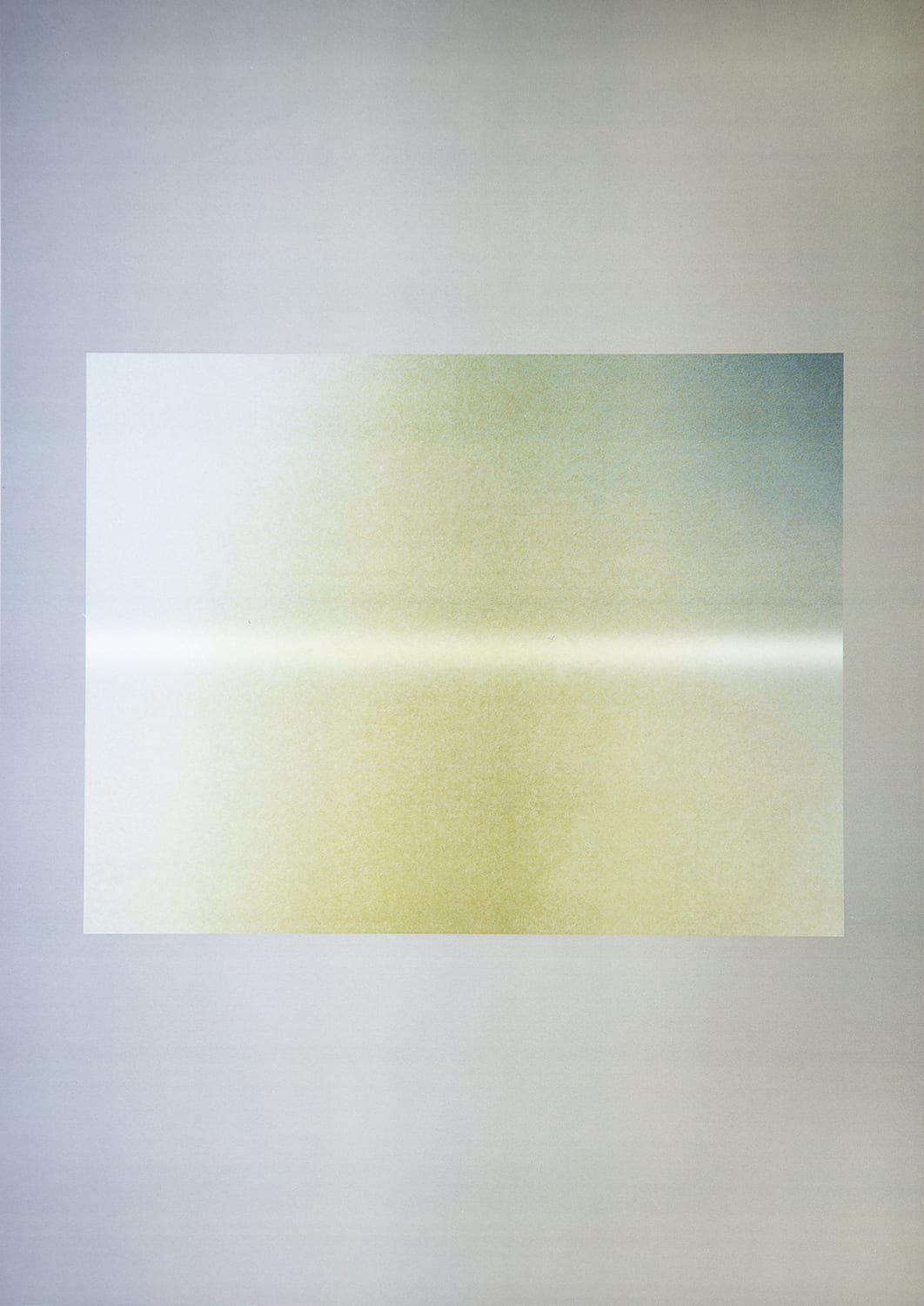
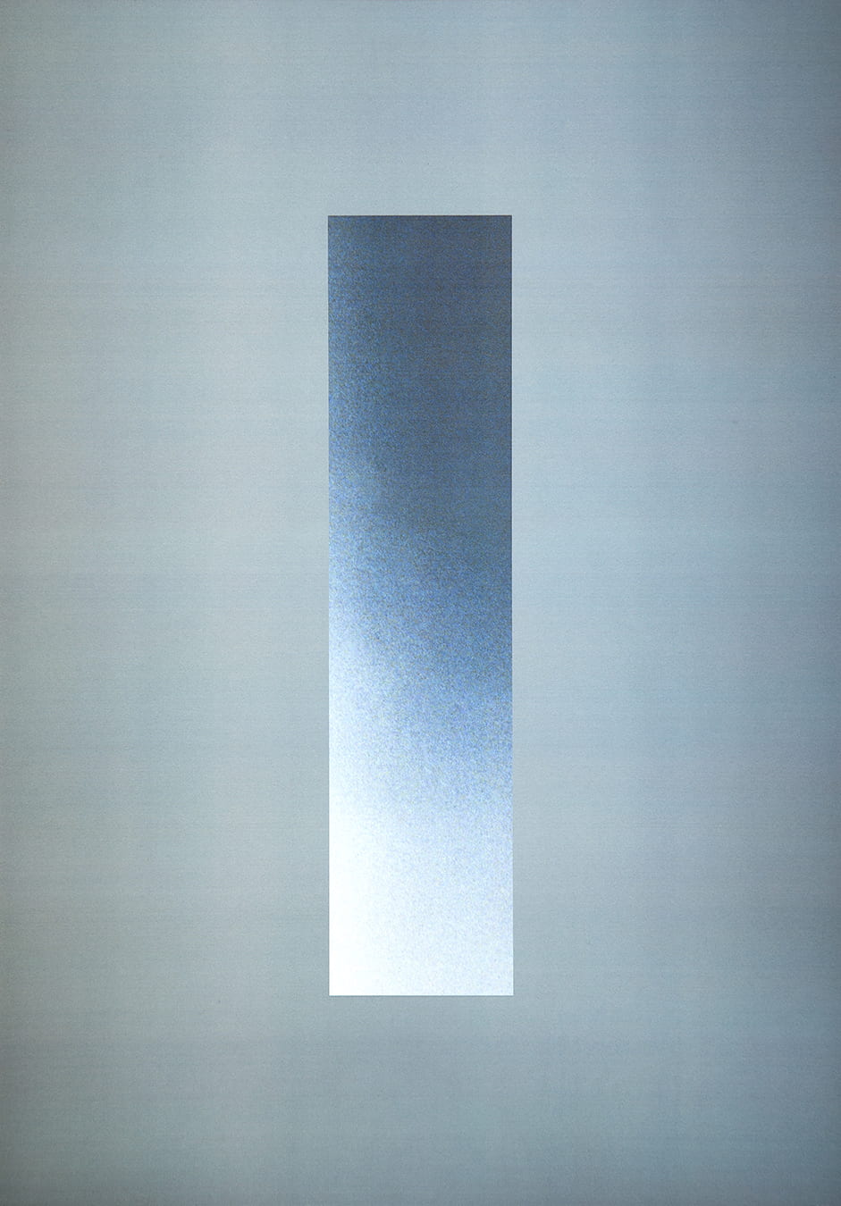
Concept of Space (2019) is a photographic investigation of space, in a metaphysical sense, and the relationship between this intangibility of subject and the representational nature of photography. The medium of photography is limited in the sense that something must physically exist before the camera in order to create a readable and representational photographic trace; photography deals ‘with the actual’ (Szarkowski, 2007, p.8). Exploring the abstraction of the photographic image itself I present minute extracts of photographs which exhibited variations in colour, shadow and form, and thus suggestive of depth and dimension. This is an abstract interpretation of a ‘non-subject’ yet derivative of imagery that showed clear and descript spaces such as rooms and corridors. As singular images one section of this project was titled monoliths, and the other, layers. The latter section is comprised of multiple singular abstractions overlaying one another and was developed as an ode to cubism and the belief in merging perspectives to better represent the three dimensional when challenged by the confines of a two dimensional medium. This issue is a discussion which goes beyond this project and speaks for all photography presented in its typical flat surfaced, depictional form.

Both sections of Concept of Space are printed onto transparent acetate, a material comparable to that of photographic film. However it was the tactility of this material and its transparent attributes that drew me to work with it. The transparency of the acetate means that the viewer can simultaneously experience their surroundings as well as the image, eliminating the simple act of looking at a print that discusses an idea but doesn’t physically interact with it. The works can be experienced both as an image and as an object in themselves; they are ‘both images and physical objects that exist in time and space’ (Edwards and Hart, 2004, P.1).

Follow Louis Stopforth on instagram


‘Real’ Beauty or Picture Perfect?

Human Bodies not Human Beings

By Abigail Emm (22nd December 2019)
‘A society where feminine beauty is defined not by the human self on genuine intellectual and sentimental grounds, but by a computer software on the grounds of economic interest, is more dead than alive. It is a society of human bodies, not human beings’ (Naskar, 2017)
Harper’s Bazaar (November, 2013)
Vogue (August, 2019)


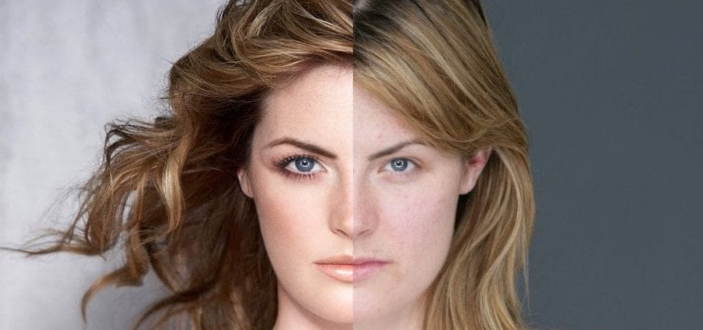
When we really consider the all too ubiquitous digital retouching / altering of models’ appearances, such as the removal of blemishes and changing of body shapes, we must also think about whether this is merely to aid the sale of an item, or promote a beauty ‘standard’. Or both? In our image world, these types of images are more easy to come across than ever, with a combination of social media, magazines, billboards and advertisements, the exposure to these types of representations of ‘woman’ are nearly inescapable.

Does this create unattainable expectations for bodies / create a market for products and services that could aid an individual to get closer to a so called feminine ‘ideal’. What is the morality of retouching models? How does it effect those who view these images? Is this ‘ideal’ a myth in itself?

A study by Kleemans et al (2016) on the impact of manipulated / perfected Instagram images on young women, concluded that indeed, manipulated images were more favourably viewed than their un-manipulated counterparts. Interestingly, the participants in the study also struggled to detect when the model’s body had been slimmed down. This causes concern, as this lack of awareness might suggest that there is a culture of doctored images as ‘reality’, and that young women may start comparing their body to these fictitious myths.

from Kleemans et al (2016)
‘Exposure to manipulated Instagram photos directly led to lower body image’ (Kleemans et al, 2016)

Bingham (2015) writing in The Telegraph reported that 90% of teenage girls ‘digitally enhance’ photographs of themselves before posting them online (Bingham, 2015). I believe this statistic wouldn’t be as high if this ubiquitous (but all to often hidden) use of retouching was lessened. In allowing young women to see other women with thier true blemishes and larger stomachs and thighs, a healthier body image will be developed, as the pull to change their bodies to resemble the (published) ‘myth’ of the model is made more realistic.

‘Retouching or otherwise altering pictures, to make them appear thinner, for example, has become the “new normal” for young people’
(Bingham, 2015)

This is clearly a dangerous game, particularly if young woman perceive these doctored images as ‘reality’, and as a result start comparing their body to fictitious ones, which can lead to the development of poor self-esteem and eating disorders. As Sarah Marsh (2019) proposes, ‘There has been a dramatic rise in hospital admissions for potentially life-threatening eating disorders in the last year, prompting concern from experts about a growing crisis of young people experiencing anorexia and bulimia’ (Marsh, 2019).

Is this directly related to a ‘myth’ of an ‘ideal’ woman / an ‘ideal’ body?
Dove (2006) Evolution

In 2006, Dove created an advert that depicted a woman preparing for a photoshoot, and subsequently being heavily photoshopped; with her neck lengthened and her eyes enlarged. Whilst this advertisement was praised for highlighting how drastically retouching can change appearances, it was also condemned, due to the company using it as a marketing tool. Dove were also selling ‘Intensive Firming Cream’ at the time (Traister, 2005) which aimed to improve the appearance of cellulite. This created a contradiction in what the company were saying vs thier simultaneous financiaal gain, which, when it came down to it, was still profiting from telling women that they needed to change their bodies.

Companies are slowly starting to alter their models less, which is shown through multiple fashion retailers such as H&M and Missguided halting their use of this practice. This encourages people who are concerned about the ethics of retouching to shop at these stores also. Whilst this is a step in the right direction, more companies need to join these retailers on their body-positive advertisements to make a larger impact

Missguided (2017) Make Your Mark
Follow Abigail Emm on instagram


Showcase Portfolio: Shona Waldron

Shona waldron

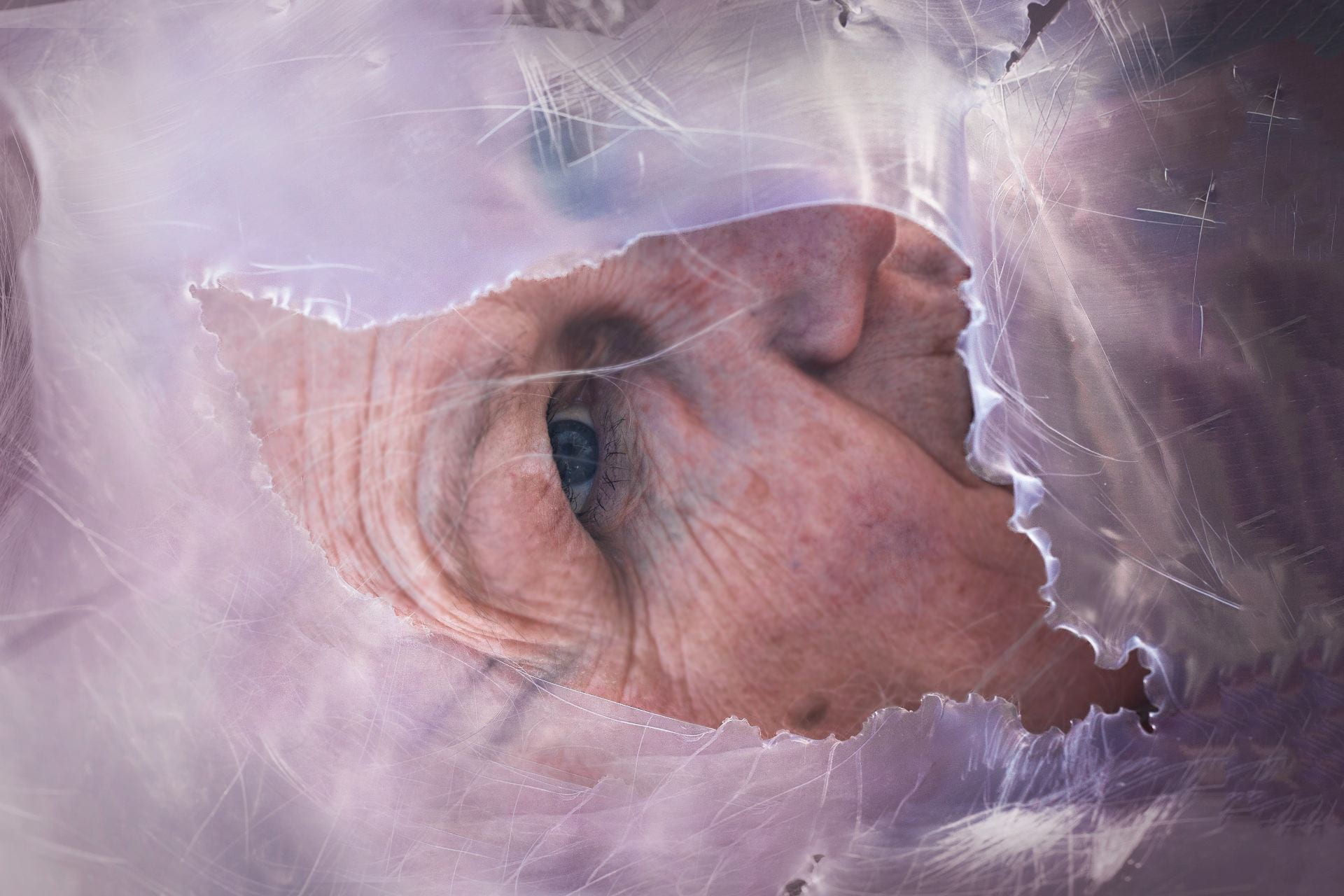
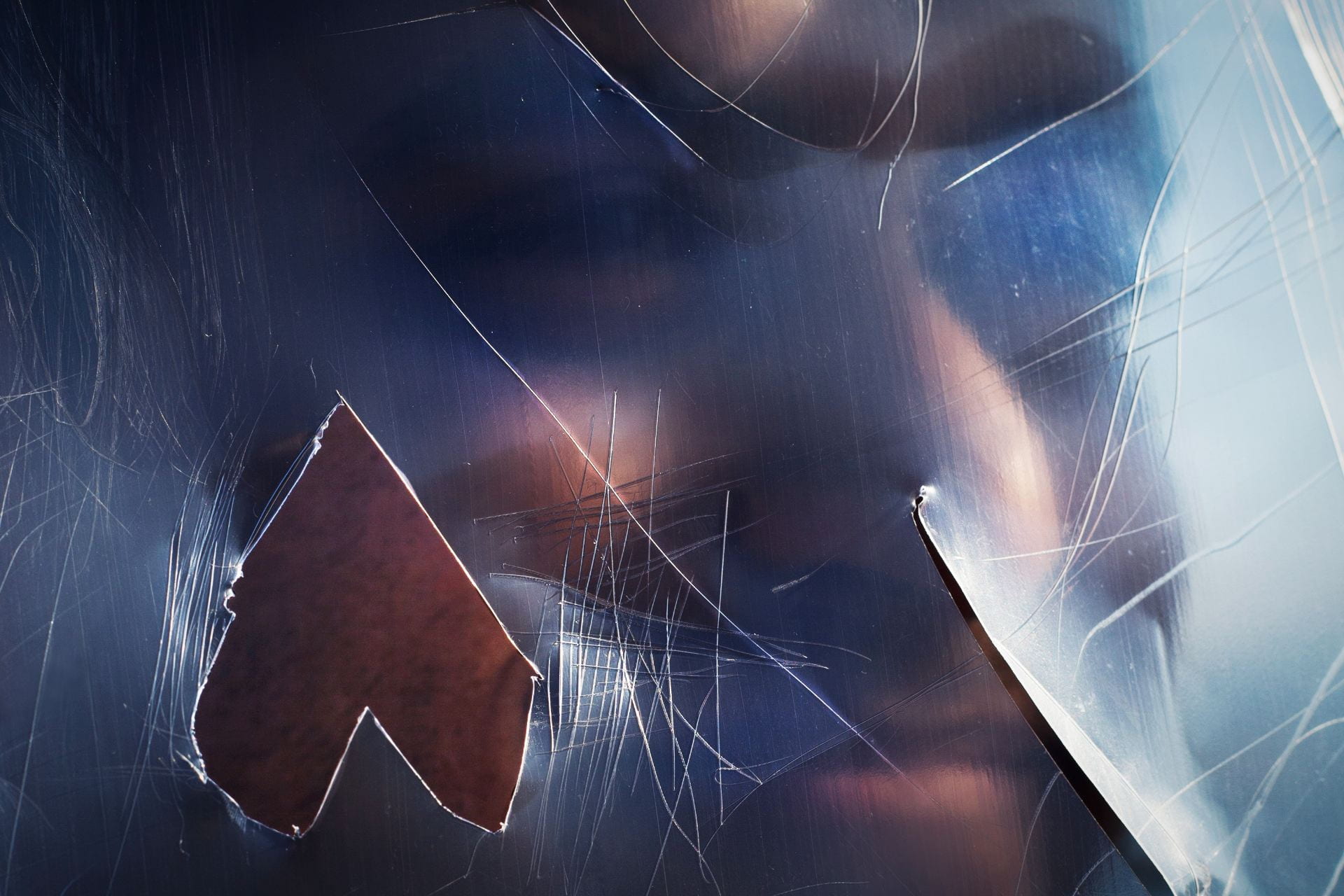
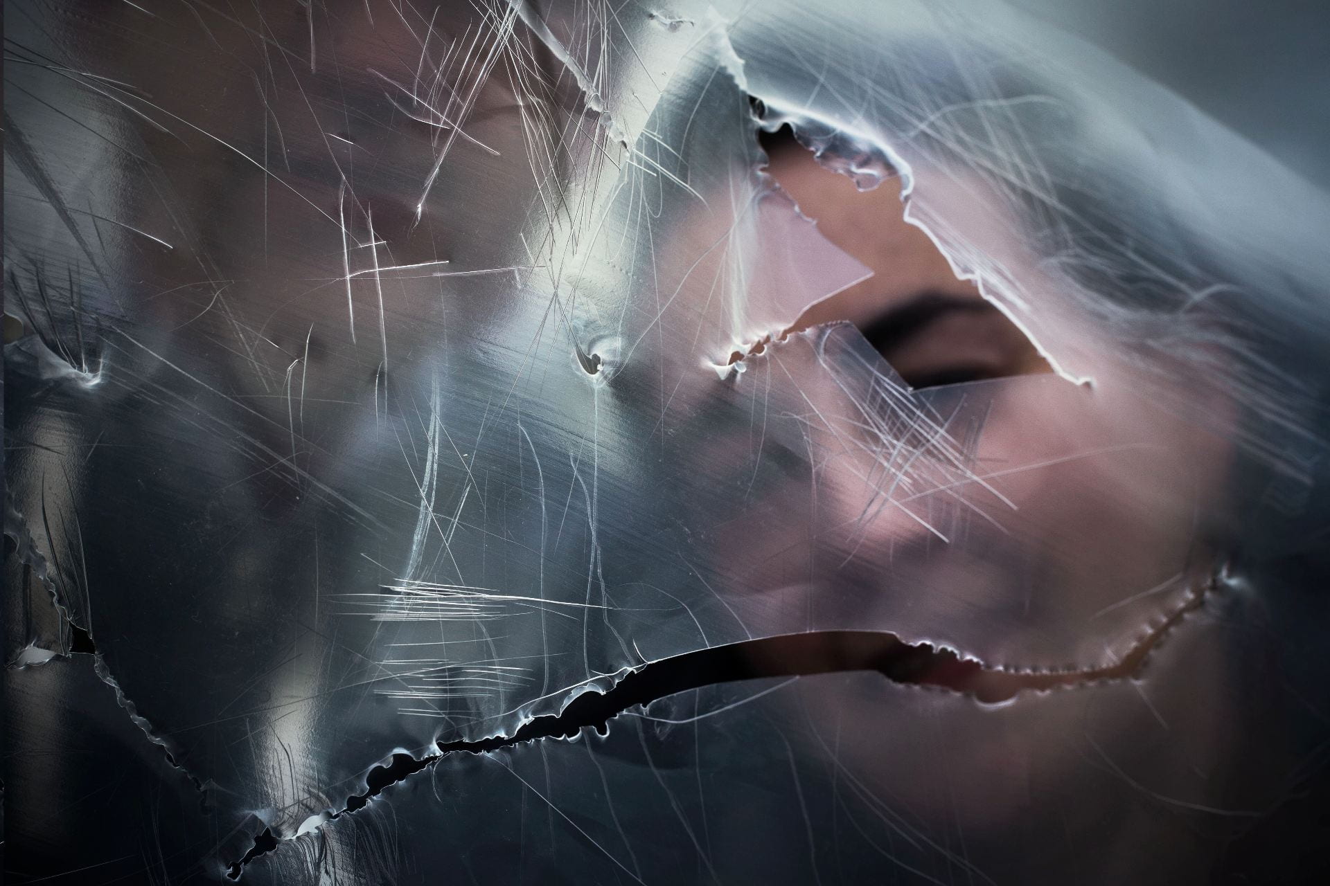
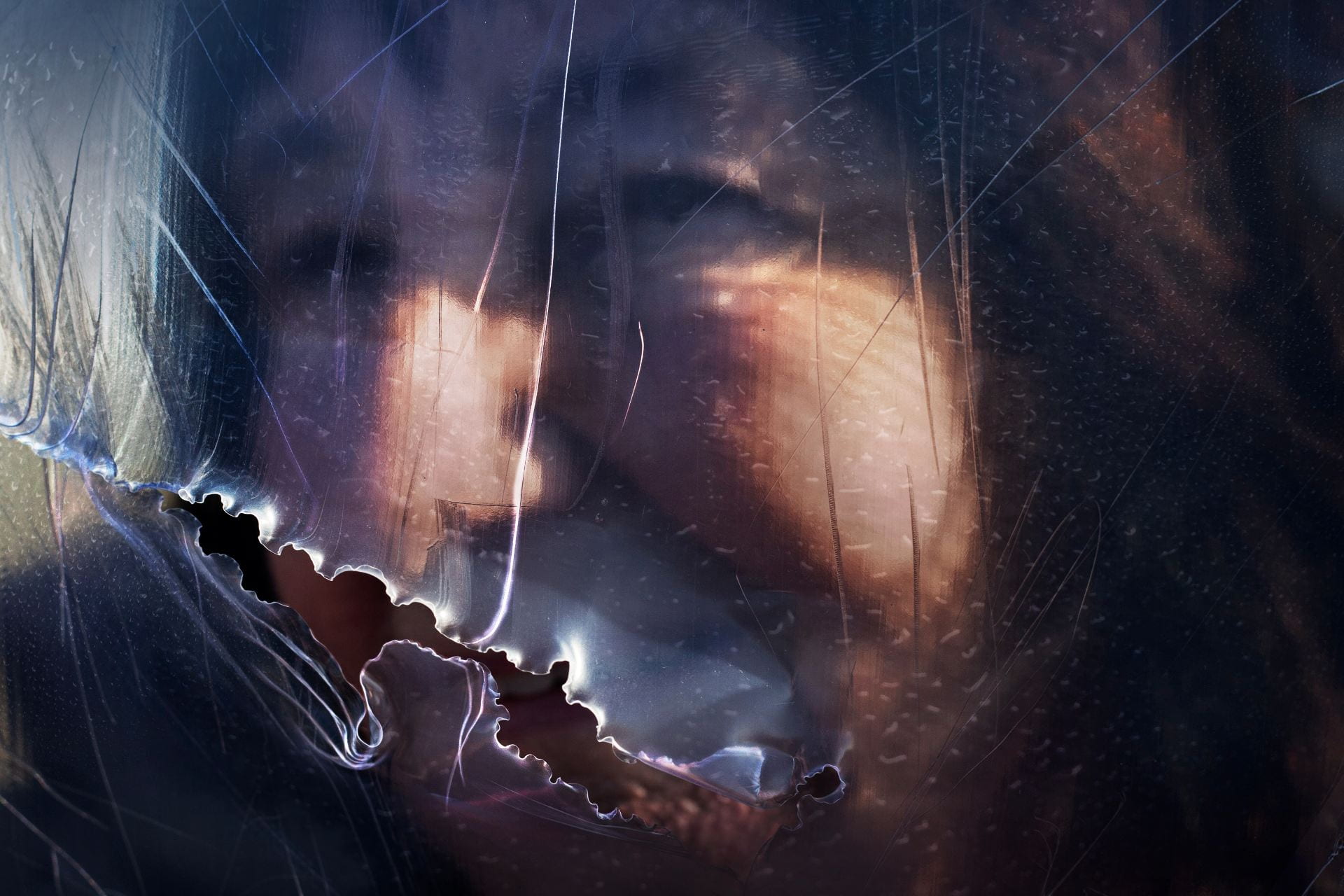
Strangers (2019) The term ‘stranger’ conveys a sense of distance, anonymity and perhaps even a slight uneasiness. These images explore the way we construct internal barriers to shield ourselves from others, a physical separation which is epitomised by the blurred areas of the work. The notion that ‘photography only depicts the surface of things’ (Ruff cited in Rehberg 2017) encapsulates the way we might perceive a conversation from an outsider’s perspective, blind to the personalities of the subjects as well as the original context of the exchange. Although concealment is the primary intention, some images paradoxically reveal pieces of faces as each stranger was asked to hold and position the rips and scratches in any way they felt inspired to do so. This idea of enabling the subject to be an active participant in their own depiction reflects the way we constantly adjust which facets of ourselves we reveal to others.


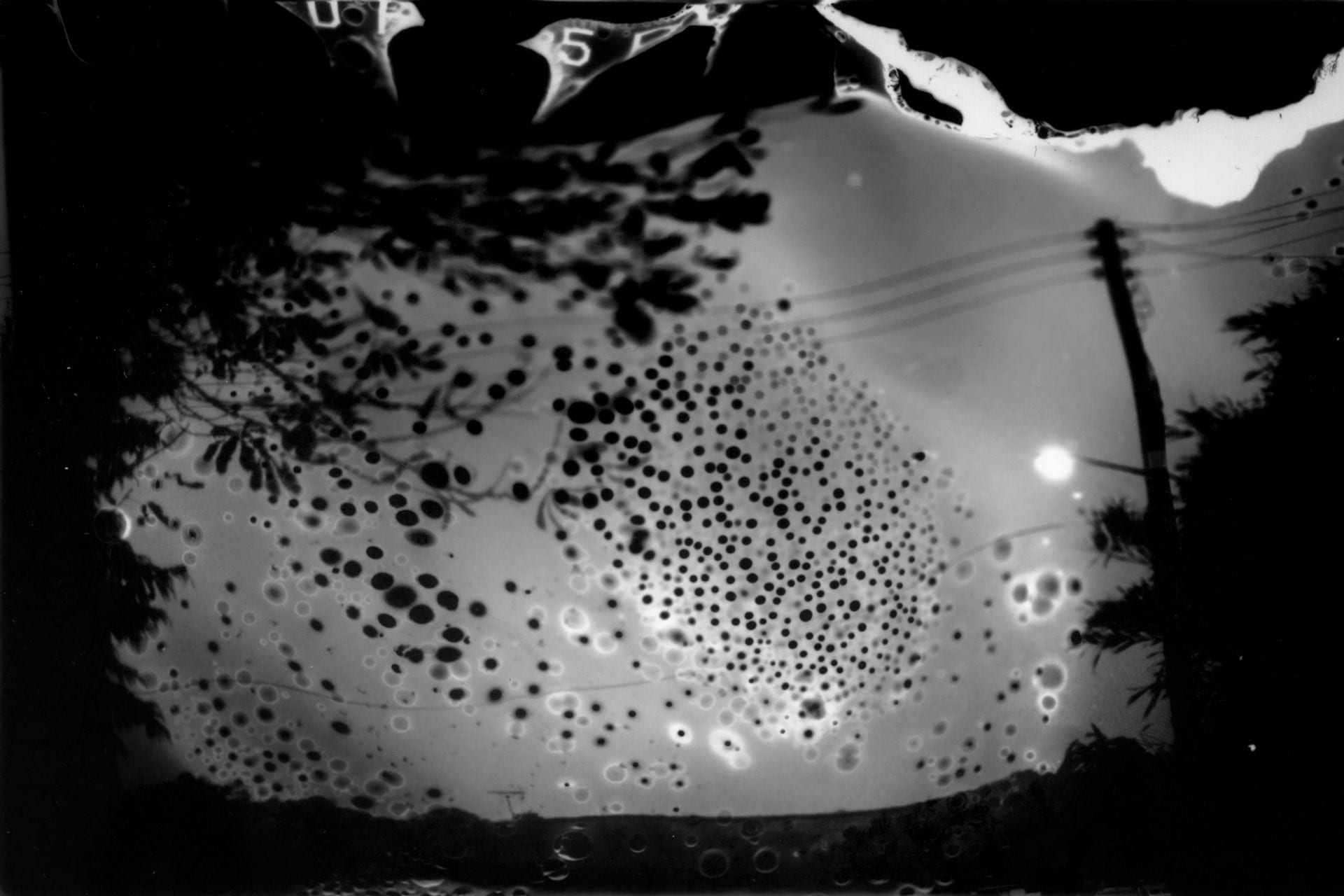
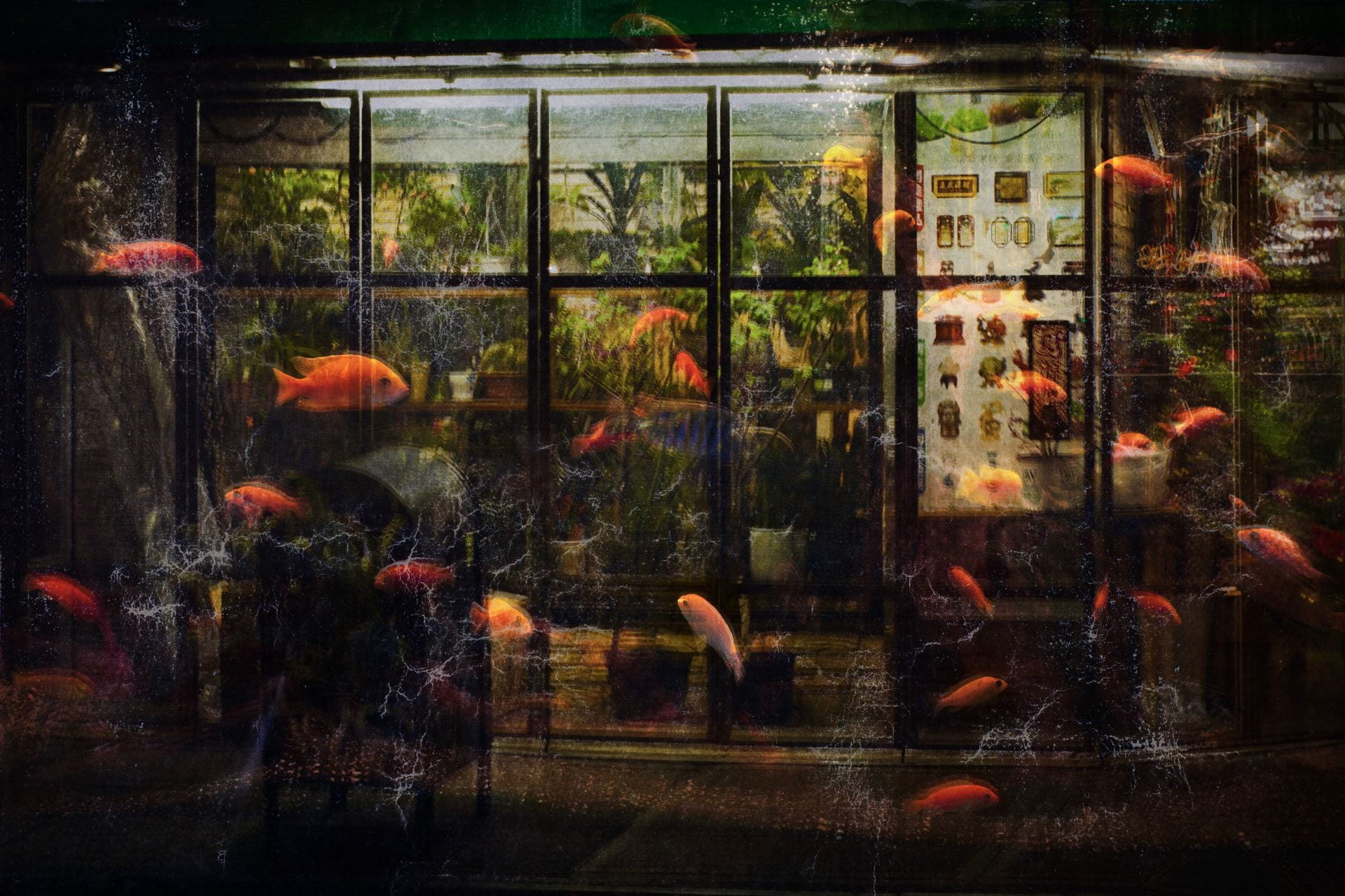
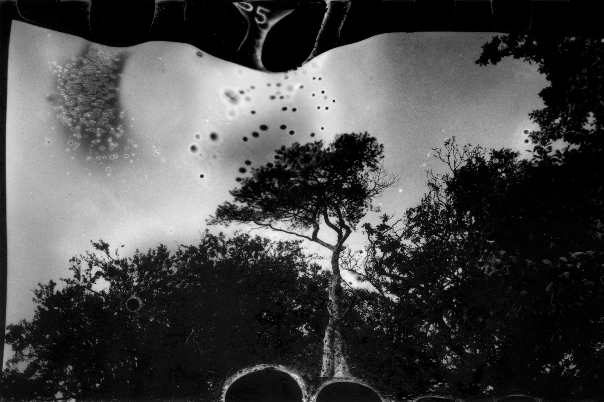
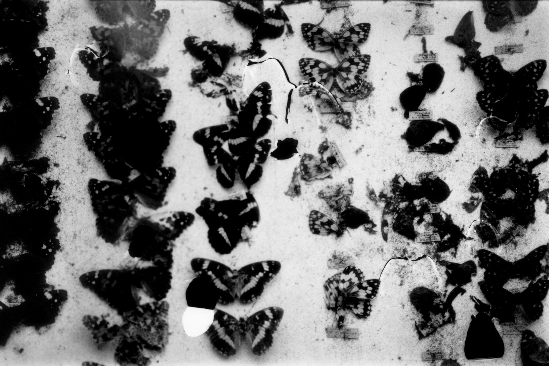
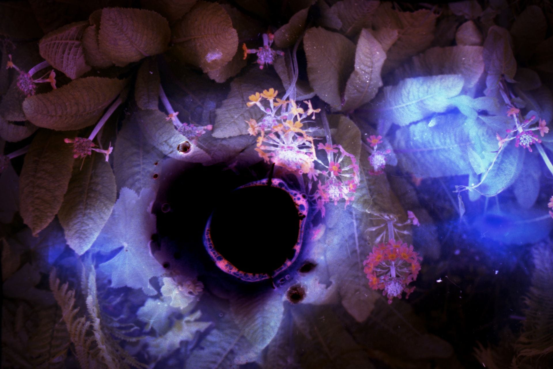
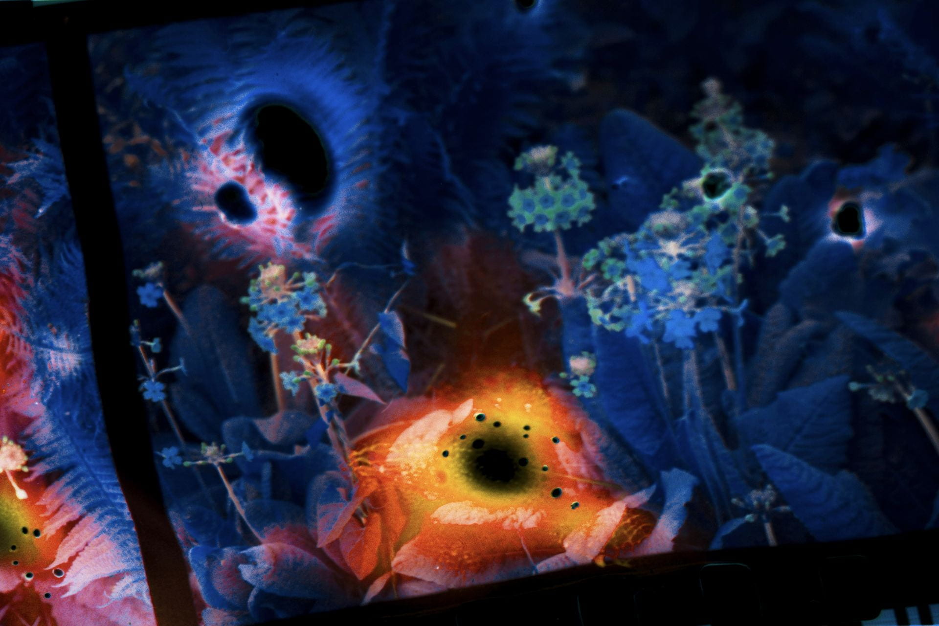
Light of the Mind (2018) turns to nature to externalise inner psychologies, creating a world where warped patterns and textures begin to emerge. This intends to replicate the landscape of an unsettled mind, capturing strange resonances which exist somewhere on the margin of our everyday reality. Through burning the negatives, the construction of each image is a two-fold process as, even though the original print is destroyed, it is reconfigured into something entirely new. This transformative effect relates to the power of the human subconscious to build a place home to both material and immaterial forms.

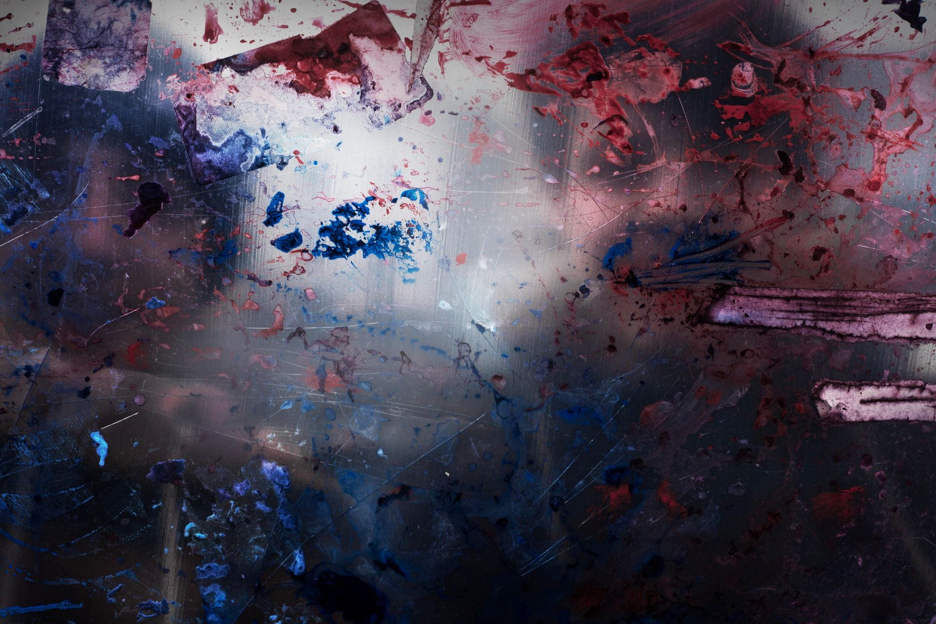
Organic Body (2019) Through the use of bold combinations of colour and shape,Organic Body conveys anthropomorphic presence within the natural world in an abstract, less defined way, blurring the definition of what we are able to identify as human. The physical manipulation and transformative quality of the work encapsulates the notion of life in an ‘alien everyday reality’ (Debord 1994: 153) as the subject matter becomes estranged from its original context. By creating something unfamiliar and alien-like, the images intend to evoke a futuristic vision – a contemporary renaissance in a sense – which questions what it means to live in a world on the constant brink of evolution.

Follow Shona Waldron on instagram

‘Strange & Familiar’ | The Barbican | 2016

‘Strange & Familiar’ at The Barbican (2016)

here’s looking at us: and what do we see?

‘You take a photo and the image is there on the back of the camera or phone and you immediately want to see how it looks. You know the moment; you were there, experiencing it. But the real thrill is seeing how the camera has turned the moment into an image that can last forever’ (Parr, in Pardo & Parr (ed.s), 2016, p.12)
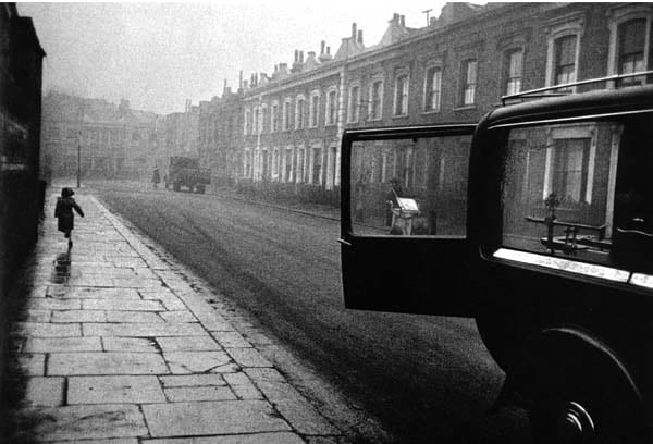
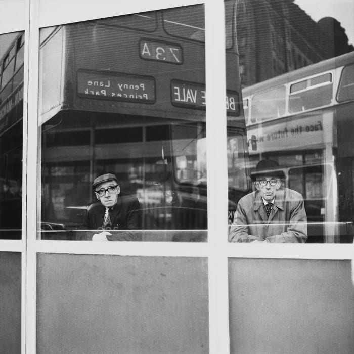
Sergio Larrain (1958) London. Baker Street

The Barbican (2016) show Strange and Familiar was a vision of ‘Britishness’ envisaged by 23 international photographers from the 1930’s to present day, each seeking to explore social, political and cultural aspects of British ‘identity’. Its curator, Martin Parr, is known for his affectionate yet satirical images of British life. He asks the question, ‘What is it about all these photographers that we find fascinating?’ I think it’s really interesting to understand and see that we are really a strange nation.’ (Parr in Klingelfuss, 2016). This session aims for participants to critically consider such representations of ‘Britishness’ as viewed through foreign eyes.

‘We cannot claim to have really seen anything before having photographed it’ (Zola in Sontag, 1977, p.87)
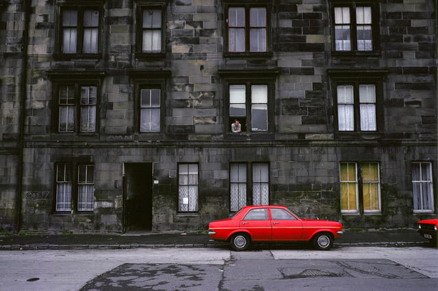
Raymond Depardon (1980) Glasgow

this session could be run in conjunction with:

Aims & Outcomes:

  • To investigate the representation of ‘culture’ and national identity? Are we merely a visual stereotype? Is Strange and Familiar really different? How might it show us something ‘new’? (or not?) Do we remain in a heterogeneous view of the (Western) world?
  • To reflect on positive / negative / stereotypical representations of ‘Britishness’ and consider the impact of these. How do we feel when the lens is trained on ‘Us’ not ‘Other’?
  • To consider the percieved ‘truth’ of such representations of icultural dentity
  • Participant Outcome: Research and identify / produce 2 truthful representations and 2 sterotypical representations of ‘Britishness’
‘The exhibition will reveal a very different take on British life than that produced by British photographers. It is both familiar and strange at the same time’ (Parr in bBC, 2016)
Gian Butturini (1969) A Calm Day

Martin Parr’s curatorial intent for Strange & Familiar is a simple one; and one that is inherent to the photographic enterprise (from a Western perspective anyway). Can these 23 foreign eyes provide us with new ways of looking at, understanding even, our own ‘British’ culture? In the age of Brexit – do we even have a unifom British identity anyway? Or, does the work shown fall back (at best) on visual tropes we have all seen before – despite thier combined focus on different areas and aspects of a so called ‘United’ Kingdom. Or (at worst) does it succumb to the voyeurism that is implicit in all imagery of ‘foreign’ lands. As John Taylor (1994) reminds us ‘By chance, the words ‘site’ and ‘sight’ in English sound the same, and thier meanings can overlap (a land is both a ‘site’ (as in a place) and a ‘sight’ (as in a view) (Taylor, 1994, p.15).

‘Be it on holiday or assignment, many of us relish the opportunity to take photos abroad – to document the architecture, the people and the rituals of the foreign lands we visit. That alien feeling of being somewhere unfamiliar breeds an excitement to get behind the camera and shoot. (Life Framer, 2016)
Robert Frank (1951) London

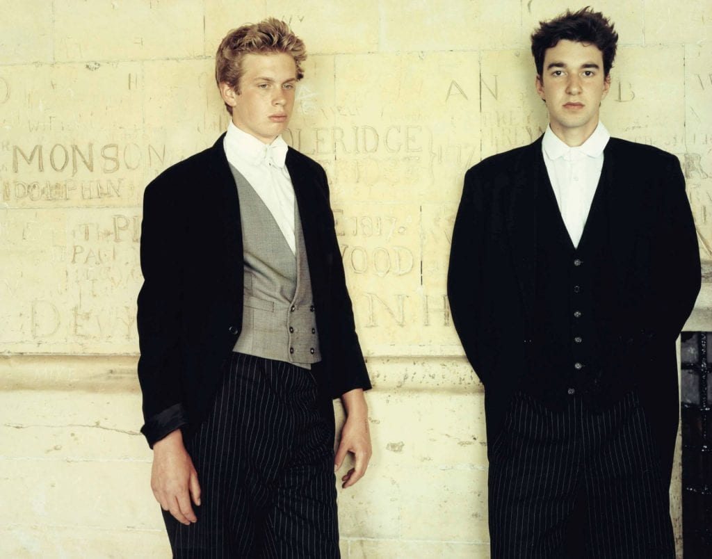
Consider the work from London / Wales included by Robert Frank for example, if we merely change the ‘site/sight’ from the USA to the UK – are we presented with a similaly (if not stylistically) darkened view of cultural identity? Might we say that Frank’s work in the UK is slightly more tame? Or, the work of Tina Barney, with her focus on the social elite, was notably introduced to her British subjects from contacts at Sotheby’s. Yet, in The Europeans her painterly tableau of these British upper classes continue to remain on the cusp of fact and myth, the staged and unstaged, and yes, certainly the familiar but strange with it. Is it really ‘British’? Or is it a subjective ressponse which is more irrespective of nationhood?

Tina Barney (2001) The Two Students

What is clear, is that the work contained in the exhibition is fluid in appropach but it is also cumulative in it intent. Like any ‘self’, it changes and evolves, and these 23 different subjective visions provide a plethora of ‘portraits’ of a British selfhood. Are they too politically motivated? Is there too much concentration on a percieved British class system? An external view, yes, but we must wonder what Google Earth /  and ‘photographers’ like Doug Rickard, Micheal Wolf and Jon Rafman might have to say?

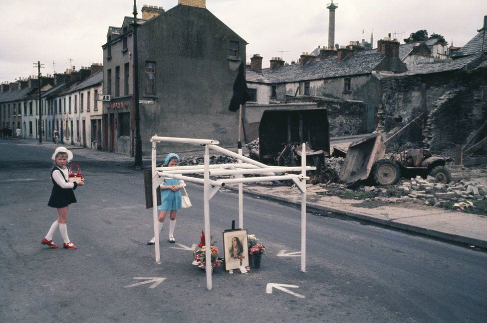
Akihiko Okamura (1969) Day after the Battle of Bogside, Northern Ireland

presentation: Strange & Familiar (Barbican, 2016)

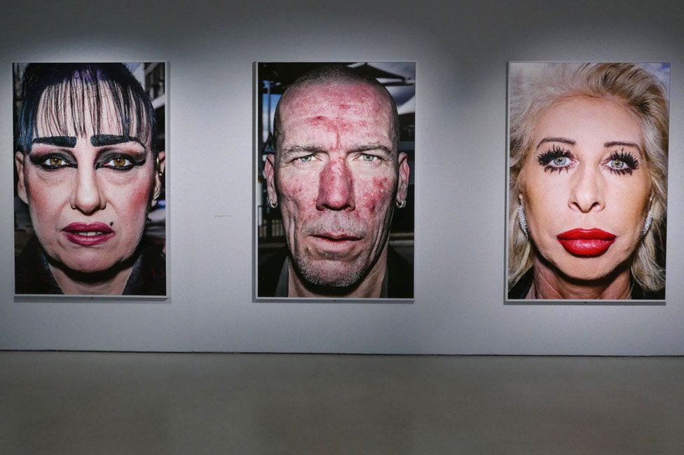
But not only is this exhibition a multifaceted history of Britain charted by very different sensibilities through the decades, it also charts the developing medium of photography itself, as various strands of social documentary give way to fine-art photography and colour floods in. In the show’s later rooms, places and people are increasingly given separate portrayals’ (Buck, 2016)
Bruce Gilden (2014) from Strange & Familiar exhibition

Suggested Session Outline:

‘So what do we learn about ourselves by studying the many different ways of looking at the United Kingdom? clichés have not become clichés without good reason…it makes us as a country more aware of our own diverse identity’ (Parr, in Pardo & Parr (ed.s), 2016, p.15)
  • Ask participants to conduct independent and in-depth research into the work of at least 2 of the practitoners included in the Strange and Familiar exhibition at The Barbican (2016).
  • Compare the works included in the Strange and Familiar exhibition with thier other projects / practices. Are they similar or is there anything ‘peculiarly’ British about thier approach?
  • Ask participants to read Lucy Buck (2016) ‘Martin Parr’s strange and familiar face of Britain at The Barbican (2016) in The Telegraph (1st April 2016) available here
  • Like any ‘portrait’, there is an interaction between photographer, sitter and audience Who’s view is it? Is it the photographers view? Is it an stereotypical identity? Is it a collaboration? How is it ‘read’ by its audience? What happens when we have a lens trained on us?
  • Brainstrom stereotypical representations of ‘Britishness’
  • Create 2 images of the same scene – one sterotypical, and one more subjective.
  • Critique and Review.
‘A way of certifying experience, taking photographs is also a way of refusing it – by limiting experience to a search for the photogenic, by converting experience into a souvenir (Sontag, 1977, p.9)
Candida Höfer (1968) Liverpool XVI

‘New Topographics’ | George Eastman House | 1975

New Topographics: Photographs of a Man-Altered Landscape at The George Eastman House (1975)

Visual Detachment & Political views?

By Amy Miles (16th Decemeber 2019)
‘Their stark, beautifully printed images of this mundane but oddly fascinating topography was both a reflection of the increasingly suburbanised world around them, and a reaction to the tyranny of idealised landscape photography that elevated the natural and the elemental’ (O’Hagan, 2010)
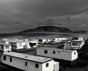
Robert Adams (1973) Mobile homes, Jefferson County, Colorado
The International Museum of Photography New Topographics (1975)  was pivotal in the development of American landscape photography. Gone were the romantic,  sublime visions of an unspoilt American frontier. Rather, the artists included in the show (Robert Adams, Lewis Baltz, Bernd & Hilla Becher, Joe Deal, Frank Gohlke, Nicholas Nixon, John Schott, Stephen Shore, and Henry Wessel) projected a version of America full of tract houses and industrial estates, a more anthropological, objective view of human imprint on the American land.

‘Looking at the work, what comes to the fore is the predominant spirit of the solitary road trip as a working model. The photographs evoke Evans’ American Photographs (1938) and Frank’s The Americans (1958) as much as Jack Kerouac’s On the Road (1957) and the Dennis Hopper-directed Easy Rider (1969)’ Many of the series were products of cross-country journeys, and all showed the conflict between the frontier spirit of traversing the majestic countryside and the stark reality of the pale, dank sprawl of motels, shops and houses that they encountered (Lange, 2010)

this session could be run in conjunction with:

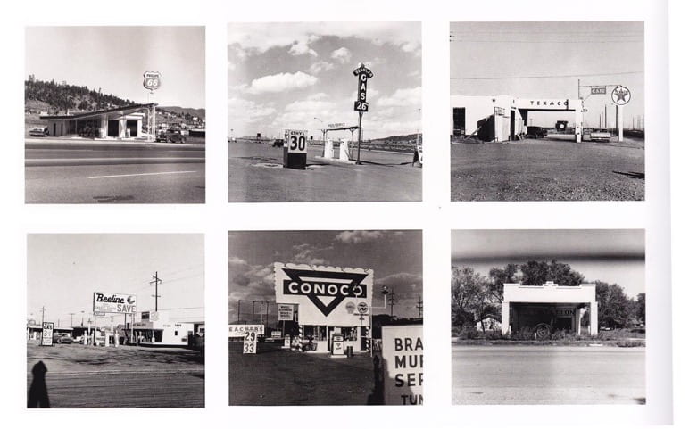
Traditionally, the first thing that comes to mind when thinking of landscape photography, might be something similar to the work of Ansel Adams – a romantized and idealic view of the American land. However these photographers didn’t follow in these footsteps at all, and started to capture what our landscapes really looked like. The curator of New Topographics, William Jenkins, aimed to show an America from a more neutral and non-biased stance, removing the photographers specific emotions or styles. Whether or not this accurately described the artists’ intentions, in retrospect we certainly have a more politically aware view of this ‘man-altered landscape’ (Rosa, 2010). Heavily influenced by the work of Ed Ruscha (strangely not included in the show) Jenkins muses;

‘the pictures were stripped of any artistic frills and reduced to an essentially topographic state, conveying substantial amounts of visual information but eschewing entirely aspects of beauty, emotion and opinion … [this was[ rigorous purity, deadpan humor and a casual disregard for the importance of the images’ (Jenkins in Hershberger, 2013, p.236)
Ed Ruscha (1963) from 26 Gasoline Stations
Aims & Outcomes:

  • For participants to consider a history of American landscape photography and a shift to a more political approach. How are photographers influenced? Is thiss political approach inherent today? Has there been a polarisation in the way we visualise the land between vernacular and gallery contexts?
  • For participants to take a critically informed personal stance to evaluate exhibitions / works and the curatorial rationale and intent.
  • To reflect on the nature of the gallery context and questions of taste, value and judgement. Is it ‘good’?
  • Participant Outcome: To critically evaluate an exhibition of thier choice, considering curatorial intent, selection of works, and reviews. Would thier own practice fit into this and why? *Participants could also be encouraged to ‘curate’ thier own exhibition / include thier own work in this and consider the curatorial rationale.
Walker Evans was also a clear influence for this new generation of photographers. His work refused to romanticise poverty, to create perhaps a more realistic (but certainly more objective) view of the American Depression.
Walker Evans (1941) from Let Us Now Priase Famous Men

However, Evans images have been debated (e.g. Whitman, 1975, Tagg, 2003, Tedford, 2017) upon whether they were taken from a detached point of view, or whether he was sgiving his subjects dignity (if not sympathy). Frank Gohike emphasises Evans influence on his practice, most importantly, the detached viewpoint, that ‘The attempt to make a photograph from which the photographer seems to be absent is a strategy whose value and power all of us I think primarily learned from [Evans]’ (Gohlke in Salvesen, 1975, p.17).

Frank Gohlke (1975) from Grain Elevators

presentation: New Topographics: Photographs of a Man-Altered Landscape (George Eastman House, 1975)

Robert Adams work is evidently based on this subjective relationship between man and the landscape. His work could be interpreted in a way that shows his emotional opinions towards how the landscape has changed and affected the environment.

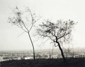
Robert Adams (1983) On Signal Hill overlooking Long Beach, California

For example, Dennis (2005) critiqued this image as: ‘The tree in the foreground is not only dwarfed by the enormous sprawl of the city behind it, but also acts as a lone and pathetic reminder of what has been displaced by urban development.’ That said, there is still evidence of an emotional / visual detachment in the outcome. It is not implausible to suggest that the image posits an subjective position towards the ongoing march of man.


One might argue that the work of Lewis Baltz were taken from a similarly detached and clinical viewpoint, but yet that that the ongoing march of human development around him made he, himself, feel detached – expressed also visually (and subjectively).

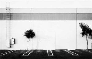
Lewis Baltz (1974) from New Industrial Parks

Gosney (2013) posits this view, that ‘Lewis Baltz’s stark images juxtaposed the contrary ugliness inherant in industrial tracts and national parks…symbolising what many saw as problems of the modern age’ (Gosney, 2013). However, it must also be noted that Baltz’s images are paradoxically akin to social research.

New Topograhics exhibition in 1975 was not just the moment when the apparently banal became accepted as a legitimate photographic subject, but when a certain strand of theoretically driven photography began to permeate the wider contemporary art world. Looking back, one can see how these images of the “man-altered landscape” carried a political message and reflected, unconsciously or otherwise, the growing unease about how the natural landscape was being eroded by industrial development and the spread of cities’ (O’Hagan, 2010)

Suggested Session Outline:

  • Ask participants to conduct in depth research into the work of at least 2 of the practitoners included in the New Topographics exhibition
  • Do they have any similar reference points / visual or conceptual infuences? What are the commonalities? What are the differences? Why do you think William Jenkins curated them in the same show?
  • If you were the curator: Of the practitoners included in the show, which work would remain? And which would be rejected?
  • If you were the curator: How you adapt the show today? Are there any new works you would include? By whom and why?
  • Would you include your own photographic practice? Could you make work in this detatched yet politically present way? Of what, and why?
‘We are, perhaps, never more frustrated than when the photograph fails to tell us what it means or is about something other than what it is as a picture.’ (Dennis, 2005).
Follow aMY MIles on Instagram

Showcase Portfolio: Amy Miles

Amy Miles

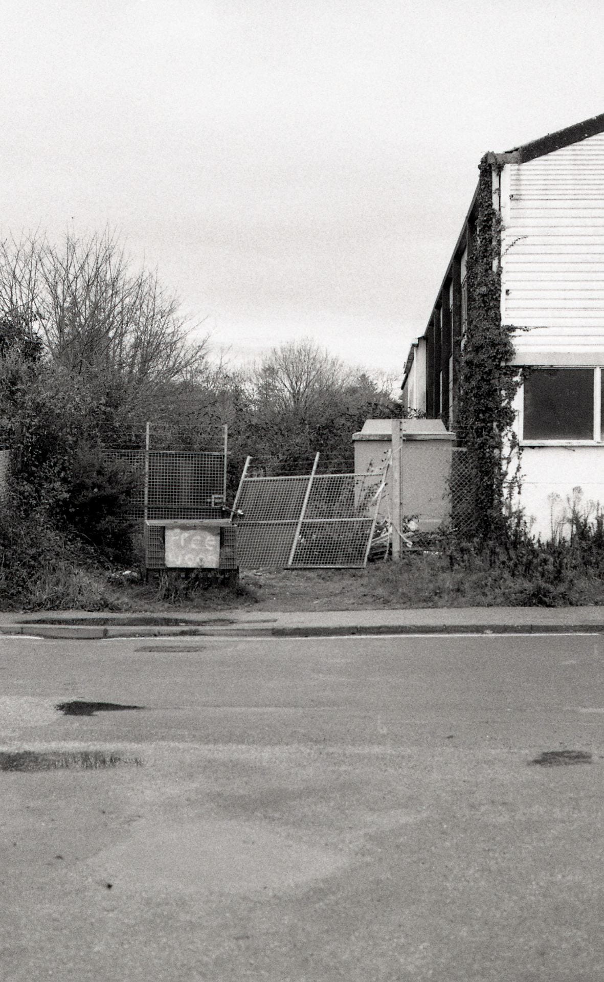
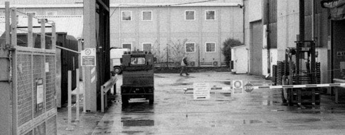
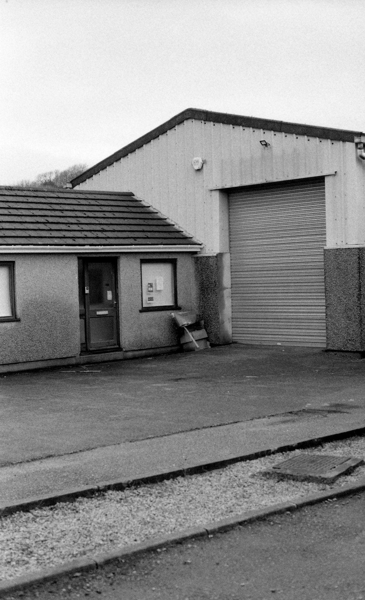
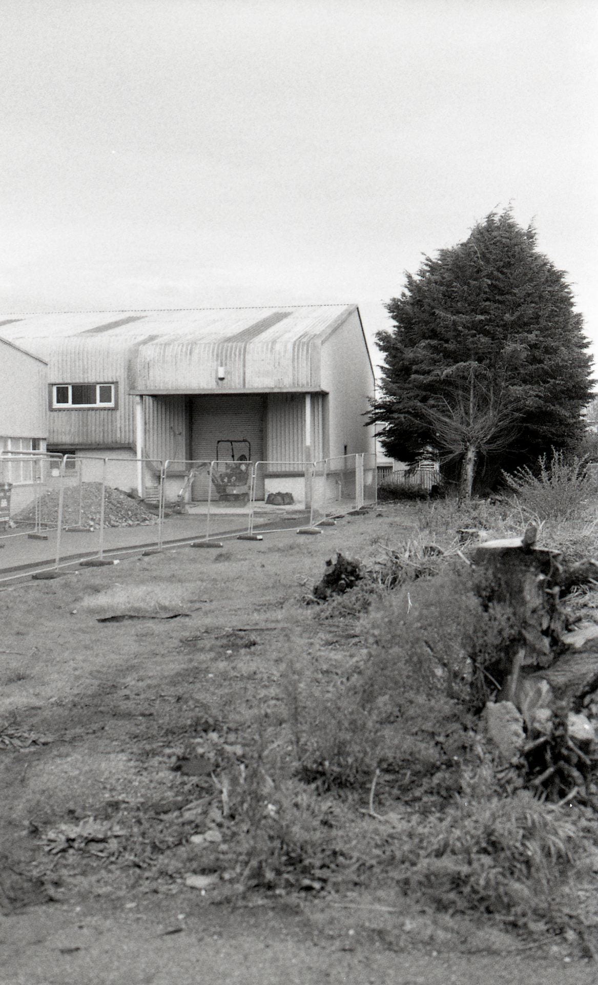
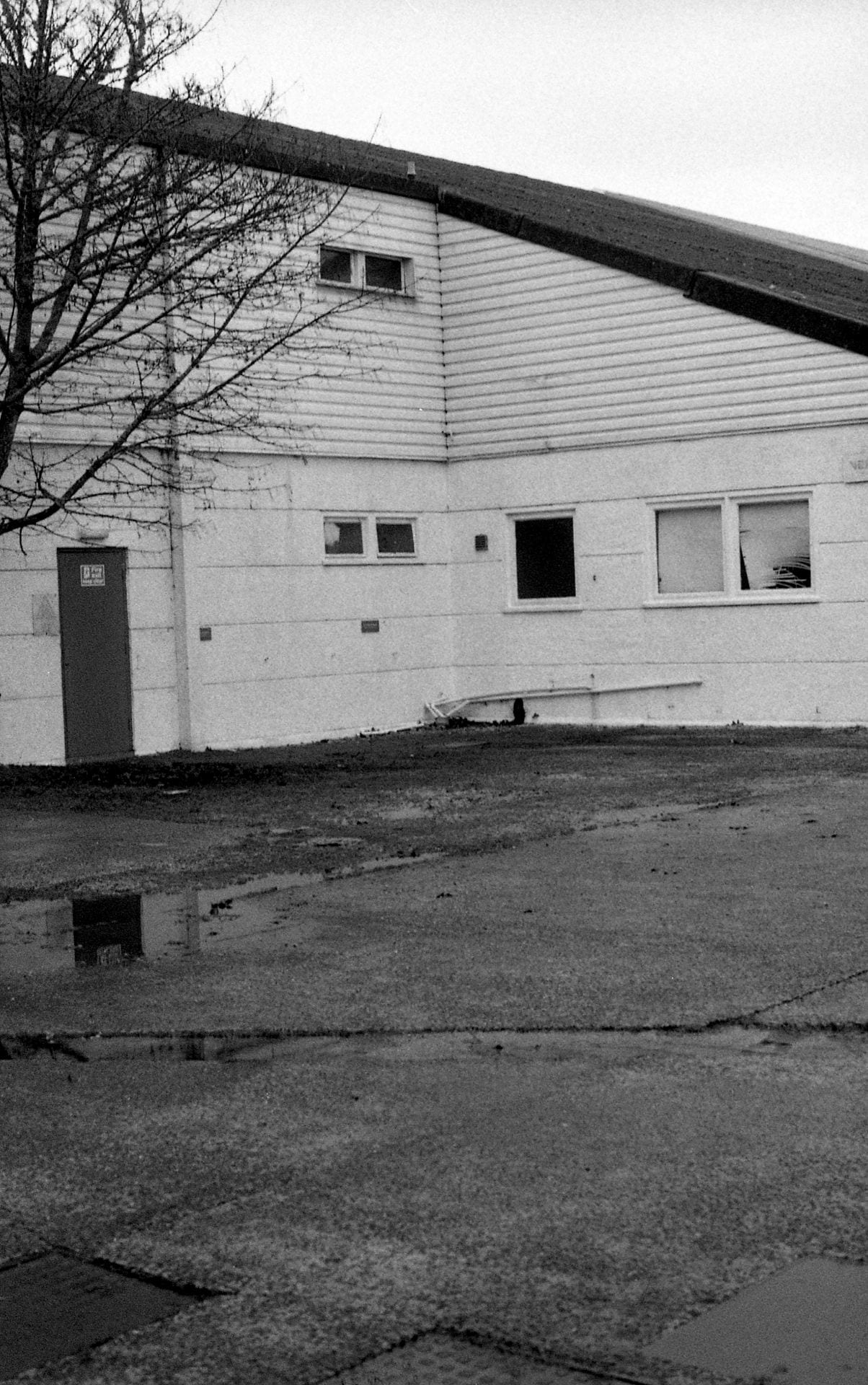
Goods Inwards is an observational study of how the purpose of Industrial Estates have changed and evolved over time. The work shows characteristics of the area which may be overlooked, making the viewer notice the un-noticeable. In the context of New Topographics, Baltz is significant when he posits: ‘What I was interested in was the phenomena of the place. Not the thing itself, but the effect of it: the effect of this kind of urbanization, the effect of this kind of living, the effect of this kind of building.’ (Baltz in Campany, 2015). Goods Inwards is a progression on from the intent of New Topographics – rather than looking at the immediate effects of the industrialization, it studies the effects of societal development in terms of how the area has once thrived, and now declined – maybe much like the circle of life.

Follow Amy Miles on instagram


Campany, D. (2015) ‘Fast World, Slow Photography’ in The Financial Times Magazine (16th May 2015) available here

Showcase Portfolio: Lydia Page-Wright

Lydia Page-Wright

Untitled Films aims to draw from – but not provide the answers to – known visual tropes from both cinema and photography and explore how an aesthetic / narrative / subject matter may (or may not) be recognisable to the viewer. Drawing from Kristeva (1966), Alfaro (1996) reminds us ‘There are always other words in a word, other texts in a text. We [should] understand texts not as self-contained systems, but as differential and historical, as they are shaped by the repetiton and structures of other textual systems’ (Alfaro, 1996, p,268). The work aims to sit on this oscillating boundary of a nagging recognition, between the literal and the obscure, the description the photograph (and accompanying text) might seem to promise, but yet the metaphor that ultimately, it always is.

Follow Lydia Page-Wright on instagram


Alfaro, María Jesús Martínez (1996) ‘Intertextuality: Origins and Development of the Concept’ in Atlantis (Vol. 18, No. 1/2) December 1996.

Conflicts and Contexts? A Brief Consideration

War as Entertainment. War as change?

By Louis Izard (14th Decemeber 2019)
‘Wars are now also living room sights and sounds’ (Sontag, 2004, p.16)
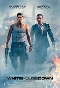
Roland Emmerich (2013) White House Down
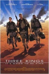
David O. Russell (2003) Three Kings
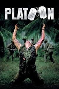
Oliver Stone (1987) Platoon
‘The shock of photographed atrocities wears off with repeated viewings’ (Sontag, 1977, p.20)

It is clear that certain representations of war and suffering have become all too commonplace, particlularly in the images we see (both now and then) of the difference between coverage of the the Vietnam war (1955- 1975) and Iraq war (2003 – 2011) and they way they have been appropriated for entertainment alone.

Does this make us less or more involved? Does the power of the cinema dilute this? or are we merely living in a simulacra? Where does the photograph fit in?

In Regarding the Pain of Others, Susan Sontag (2004) looks into the way we view war and suffering. She proposes two central ideas on how war photography / imagery can affect a population. The first is through the media, in which mass distribution of these images of suffering cause public outrage and demand for change. While the other idea looks at the gradual erosion of compassion after repeatedly viewing these images. Essentially, she argues that ‘Such images just make us a little less able to feel, to have our conscience pricked’ (Sontag, 2004, p.94).

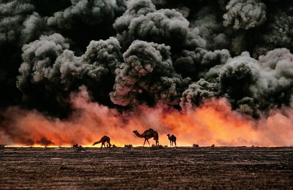
Steve McCurry (1991) Camels and Oil Fire, Kuwait
‘I really don’t think that a picture of an atrocity should be a good picture, a beautiful picture, a well-composed picture… It should be casually composed, hastily framed, only competently printed’ (Sischy in Lewis, 2003)

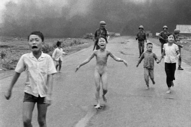
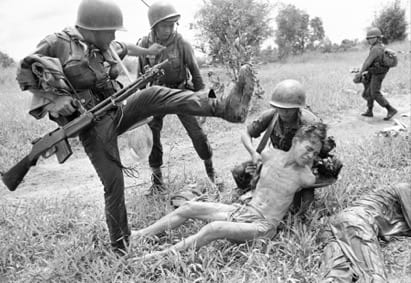
In contrast, the Vietnam war was widely photographed, and the images captured are certainly graphic to our modern eyes. This is due to the display of real and uncensored depictions of suffering from both sides, in so many different contexts.

Consider the photographs included in the music video for Buffalo Springfield (1966) For What It’s Worth below.

Iraq was considerably different. As Kenneth Jareke (2014) points out ‘It was one picture after another of a sunset with camels and a tank…If I don’t take pictures like these, people like my mom will think war is what they see in movies’ (Jarecke in Deghett, 2014).

Consider the film trailer for David O. Russell (2003) Three Kings below.

representations from Vietnam are more likely to depict the violence inflicted on others, whilst images of Iraq are mostly of tanks, guns and US soldiers – a particularly Western / American view of the world perhaps?
Nick Ut / AP (1972) The Terror of War / ‘Napalm Girl’
‘Baudrillard pointed out that the [Iraq] war was conducted as a media spectacle. Rehearsed as a wargame or simulation, it was then enacted for the viewing public as a simulation: as a news event, with its paraphernalia of embedded journalists and missile’s-eye-view video cameras, it was a videogame. The real violence was thoroughly overwritten by electronic narrative: by simulation’ (Poole, 2007)
Rick Merron / AP (1965) Vietnam War
Pablo Martinez Monsivais / Getty Images (2011) Iraq War

So today, in our image world, and the age of the (uncensored) internet – what is the role of Citizen Journalism? As Sontag (2004) notes, ‘The less polished pictures are… [more they are] welcomed as possessing a special kind of authenticity’ (2004, p,24). Here is New York (2004) was one of the largest collaborative projects undertaken to archive the events of 9/11 but also as a celebration of a vibrant city overcoming trauma.

Micheal Shulan (2004) (ed.) from Here is New York
‘What was captured by these photographs — captured with every conceivable kind of apparatus, from Leicas and digital Nikons to homemade pinhole cameras and little plastic gizmos that schoolchildren wear on their wrists — is truly astonishing: not only grief, and shock, and courage, but a beauty that is at once infernal and profoundly uplifting. The pictures speak both to the horror of what happened on 9.11 (and is still happening), and to the way it can and must be countered by us all. They speak not with one voice, but with one purpose, saying that to make sense of this terrifying new phase in our history we must break down the barriers that divide us’ (Shulan, 2004)


.Follow louis iZArD on Instagram

Doug Rickard’s ‘Pictures’?

America according to doug Rickard 

By Emily Jane Scott (13th December 2019)
‘(Photography) promises a view of the world, but it gives us a flattened object in which wrecked reminders of the world are logged’ (Elkins, 2011, p.17)
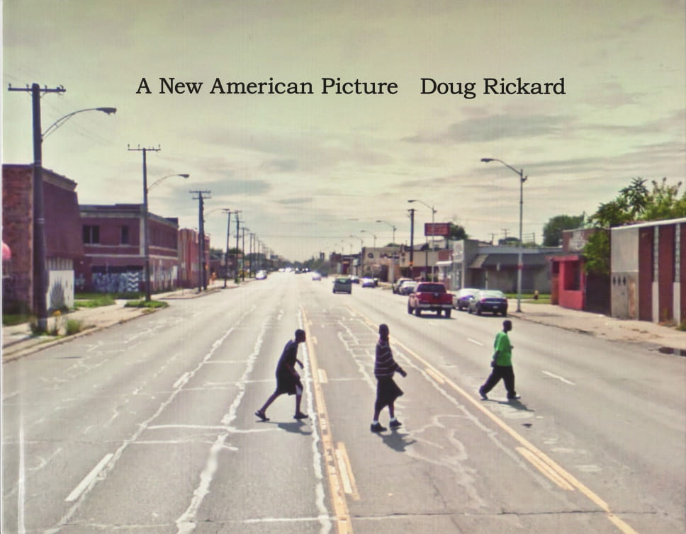
Doug Rickard (2011) from A New American Picture

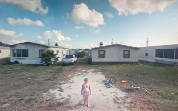
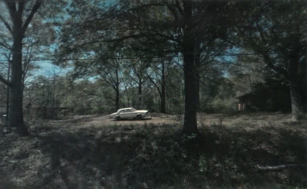
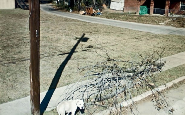
Doug Rickard produced his series A New American Picture, by utilising the vast visual archive of Google Street View. He iimportantly reminds us to challenge preconceptions about what photography, or ‘photographies’ can be, especially when it comes to digital imagery. Rickard spent an extensive amount of time (2009-2011) exploring stereotypically ‘subordinate’ urban neighbourhoods and rural areas across the USA, from the comfort of his own computer desk. He would then photograph the composition on his computer screen with a digital SLR. Whilst many photographers aim for the most transparent process possible, Rickard includes blurred faces, pixelated distortion and warped perspective which reveal the digital origin of his photographs.

Doug Rickard (2011) from A New American Picture
Perhaps Rickard’s process reflects the beginning of an age where human beings are reduced to data, constantly being observed, being monitored?

Yet, paradoxically, Rickard returns humanity to this data by picking out individual stories and adding them to the overarching and ongoing narrative of the American working class. The sense of distance provided by Rickard’s multi-layered technique adds weight to the images- reminding us of how distant we might be from these people and places; both on a geographical, cultural and socio-economic level. And so, Rickard is no more of a visual appropriator than any more ‘traditional’ photographer: he is simply photographing from within a digitally reconstructed environment, as opposed to the world outside. The images included in A New American Picture only became photographs (dare we say ‘art’?) once they were selected, framed, curated, contextualised and published by Rickard.

‘Doug Rickard… is interested in the American content and its haunting, visceral power. “I was interested in photographing America in the same context, with the same poetry and power, that has been done in the past” (in Appleyard, 2011)
Doug Rickard (2011) from A New American Picture
Rickard’s work blurs the lines between technology and reality, the image and the world around us. His practice challenges our view of what photography is, and could be in this new, digital age.

Although Rickard is drawing from a collection of images which have already been ‘taken’, His practice, to me, cannot be considered to be a ‘pure’ form of artistic appropriation (despite appropriation being a completely valid way of producing powerful work, which can eloquently distil a cultural mood). The original mages within Google Street View are not, in my opinion, photographs. They were objectively, methodically collected by a vehicle-mounted camera driven down every street; they have no nature of subjective selection.

Rickard is no more a visual hunter-gatherer than any photographer. he is simply photographing from within a digitally reconstructed environment, as opposed to the world outside which is, itself, layered with constructed imagery.

Szarkowski’s (1966) discussion of photography focuses on the idea of selection. A photographer chooses what to include within a frame, and what to leave out. It is impossible for the ‘photographer’ to be truly objective, as a truly objective image is not a photograph, it is only visual data. so where does that leave Rickard, or indeed, his source material? A New American Picture only became subjective photographs once they were selected, framed, curated, contextualised. One might even liken his work to that of a ‘readymade’ sculptor; he turns something completely banal and utilitarian into a different practice merely through recontextualization. But yet paradoxically, despite its source material, we should still frame this practice in the tradition of Walker Evans, Robert Frank, Stephen Shore, William Eggleston, Paul Graham – or even Edward Hopper, as an equally visual / critical and subjective commentary on the state of thier own America.

Doug Rickard (2011) from A New American Picture
‘Any doubts as to the artistic – rather than ethical or conceptual – merits of this new way of working were definitively settled by Rickard’s pictures. It was William Eggleston who coined the phrase “photographing democratically” but Rickard has used Google’s indiscriminate omniscience to radically extend this enterprise – technologically, politically and aesthetically’ (Dyer, 2012)

The idea of photography as an accurate representation of the real world is mythological. Whether it be an artist’s concept, a news story, a memory, an advertisement, an illustration or investigation, all photographs feed into a false narrative of some kind. Yet, Rickards photographs are aesthetically pleasing, insightful, emotive and harrowing. The sense of distance provided by his multi-layered technique adds weight to the images, reminding one of how distant we really might be from these people and places, on geographical, cultural and socio-economic levels.

Doug Rickard (2011) from A New American Picture
Follow Emily Jane Scott on Instagram