Ben Burbridge & Annebella Pollen (2019) Photography Reframed: New Visions in Contemporary Photographic Culture
Book Description
At a critical point in the development of photography, this book offers an engaging, detailed and far-reaching examination of the key issues that are defining contemporary photographic culture. Photography Reframed addresses the impact of radical technological, social and political change across a diverse set of photographic territories: the ontology of photography; the impact of mass photographic practice; the public display of intimate life; the current state of documentary, and the political possibilities of photographic culture. These lively, accessible essays by some of the best writers in photography together go deep into the most up-to-date frameworks for analysing and understanding photographic culture and shedding light on its histories. Photography Reframed is a vital road map for anyone interested in what photography has been, what it has become, and where it is going.
Table of Contents
Photography Reframed: Always, Already, Again: Ben Burbridge & Annebella Pollen
Section I. New Ontologies: Photography between the Archive and the Network
Technology and Interaction: Penelope Umbrico’s TVs from Craigslist: Duncan Wooldridge
Post-representational Photography, or the Grin of Schrödinger’s Cat: Daniel Rubinstein
Archival Measures: Photography Collections in a New Media Age: Tina Di Carlo
The Grain of Ephemera / Event: Thinking Digital Archive through Photography: Sen Uesaki & Jelena Stojkovic
Tomorrow’s Headlines Are Today’s Fish and Chip Papers: Some Thoughts on ‘Response-ability’: David Campany interviewed by Duncan Wooldridge
Section II. Mass Culture and the Politics of Distinction
Popular Photographic Cultures in Photography Studies: Gil Pasternak
The Photographer as Reader: The Aspirational Amateur in the Photo-Magazines: Peter Buse
Mrs Wagner’s Aspirations: The Album as Monument: Martha Langford
When is a Cliché not a Cliché?: Reconsidering Mass-produced Sunsets: Annebella Pollen
Section III. (Networked) Society and the Spectacle: Photography and Exhibitionism
The Shirt Off His Back: Male Torsos on Display in Contemporary Visual Culture: Marvin Heiferman
The Politics of Amateurism in Online Pornography: Feona Attwood
What a Body Can Do: From the Frenzy of the Communicative to the Visual Bond: Francis Summers
Hating Habermas: On Exhibitionism, Shame and Life on the Actually Existing Internet: Theresa M. Senft
Paradise Lost: Exhibitionism and the Work of Nan Goldin: Ben Burbridge
Section IV. Documentary Photography and Global Crisis
The Déjà Vu of September 11: An Essay on Inter-iconicity: Clément Chéroux
Facing War: Photography and Humanism: Iain Boal & Julian Stallabrass
War Primers: David Evans
Immigration Photography in Italy: Andrea Pogliano
Landscape Photography’s ‘New Humanism’: Chad Elias
Section V. Citizens? Photography, Resistance and Control
Dead End Streets: Photography, Protest and Social Control: David Hoffman
Escaping the Panopticon: Pauline Hadaway
You Don’t Even Represent Us’: Picturing the Moscow Protests: Aglaya Glebova
Occupy the Image: Liam Devlin
The Becoming-Photographer in Technoculture: Sarah Kember
Closing Reflections:Ronnie Close, Catherine Grant, Sarah E. James and Sandra Plummer
Afterword: Charlotte Cotton
About the Authors
Ben Burbridge is Senior Lecturer in Art History and Co-Director of the Centre for Photography and Visual Culture at the University of Sussex. He is widely published in the field of photography, art and politics. Curatorial projects include the 2012 Brighton Photo Biennial, Agents of Change: Photography and the Politics of Space and Revelations: Experiments in Photography (Science Museum, London and National Media Museum, Bradford, 2015).
Annebella Pollen is Principal Lecturer and Academic Programme Leader in the History of Art and Design at the University of Brighton. She is widely published in the field of visual and material culture. She is the author of The Kindred of the Kibbo Kift: Intellectual Barbarians (2015), Mass Photography: Collective Histories of Everyday Life (I.B.Tauris, 2016) and co-editor of Dress History: New Directions in Theory and Practice (2015).
“Without photography (or a video), it has been difficult to get people to respond; the urgency and relevance of an event, its importance, and sometimes even the fact of its occurrence might be called into question.” (Ritchin 2013: 8)
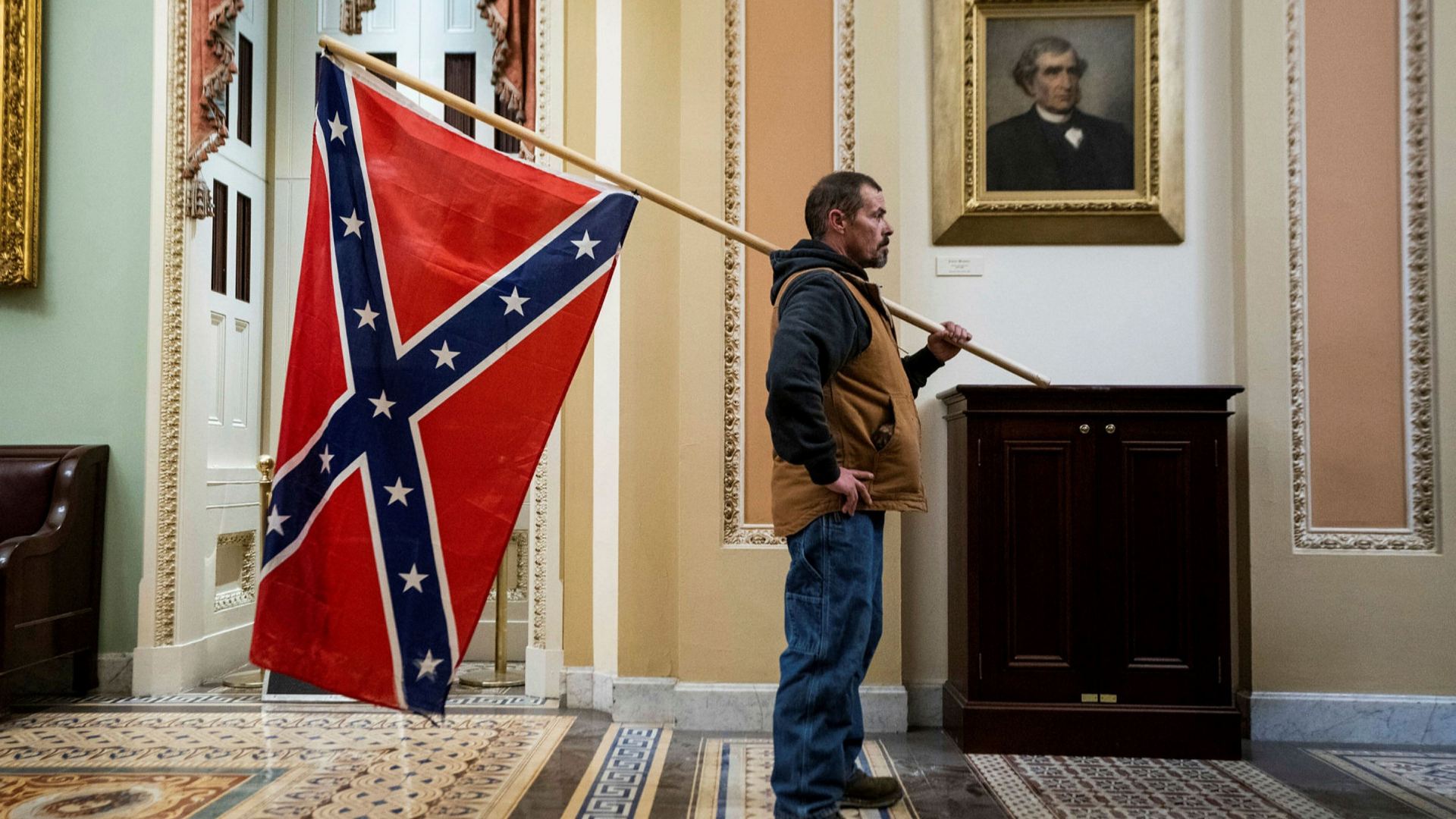
Jim Lo Scalzo (2021) A man carrying a Confederate flag stands outside the Senate chamber during the protest at the Capitol building on January 6 2021
Abstract
This paper explores the subject of superficial journalism and how the media use it as an excuse to shield citizens’ eyes from the visual horrors of war and conflict. It focuses on the arguments between the use of shock tactics and beautification in images, our decline in feeling compassion towards images of this nature and a case study on the way in which the Western media failed to report authentically on the Rwandan Genocide of 1994.
Drawing on the writing of Jean Baudrillard, Susan Sontag, Fred Ritchin and Susan Moeller; I shall also discuss a variety of conflicts such as Abu Ghraib, The Gulf War and the Algerian Massacre of 1997 and aim to conclude why the media censored such important images. Through the use of supportive material including critics such as Sean O’Hagan and Andy Worthington; artistic examples from photographers such as Alfredo Jaar and John Moore, I compare which of these were successful and those that were not successful in illustrating the terror of conflict in photographs.
By using a range of references, my paper argues the strategies we should be using to overcome the ever-expanding use of superficial journalism in the worldwide media. Additionally, how photojournalists such as Kenneth Jarecke and Gilles Peress are challenging the traditional media in the way in which current stories of conflict are presented.
Key Words: Shock Tactics, Compassion Fatigue, War, Photojournalism, Citizen Journalism
Contents
List of Figures
Introduction
Chapter 1: Shock Tactics, Beauty & Symbolism?
Chapter 2: Tackling Compassion Fatigue
Chapter 3: The Rwandan Genocide: Did the Western Media Fail?
Conclusion
References
Bibliography
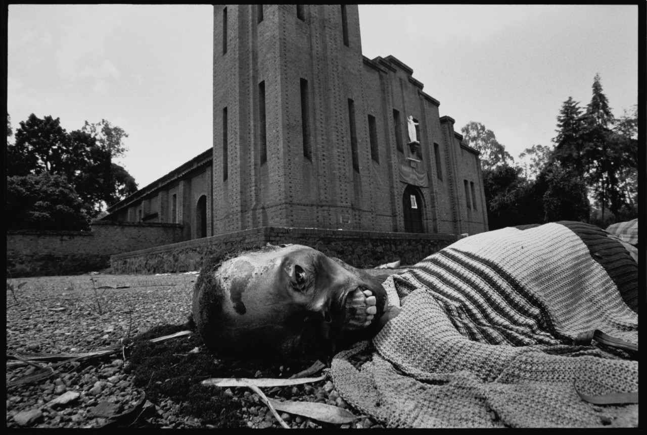
Alfredo Jaar (1994) A Victim of Tribal Violence, Nyarubuye, Rwanda
List of Figures
Cover Page: JAAR, Alfredo. 1994. A Victim of Tribal Violence, Nyarubuye, Rwanda
Figure 1: ASSOCIATED PRESS. 2003. An unidentified Abu Ghraib detainee
Figure 2: NILUFER DEMIR / GETTY IMAGES. 2015. A Turkish police officer discovered the body of Alan Kurdi on Sept. 2, 2015, after a boat carrying refugees sank en route to the Greek island of Kos
Figure 3: GOOGLE IMAGES. 2019. Google image search “sunset with a camel and a tank gulf war”
Figure 4: MCCURRY, Steve. 1991. Camels, Gulf War, Kuwait
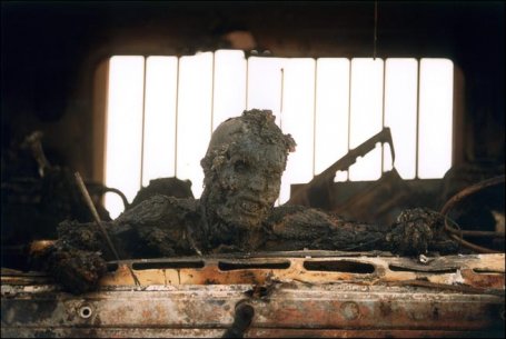
Figure 5: JARECKE, Kenneth. 1992. An Incinerated Soldier
Figure 6: MOSSE, Richard. 2013. from The Enclave
Figure 7: MOSSE, Richard. 2013. from The Enclave
Figure 8: MOSSE, Richard. 2013. from The Enclave
Figure 9: WILLIAMSON, Michael S. 1994. Untitled from Rwanda
Figure 10: ZAOURAR, Hocine. 1997. The Madonna of Bentalha
Figure 11: ARANDA, Samuel. 2011. Yemen, Fighting for Change
Figure 12: BUONARROTI, Michelangelo. 1498-1499. The Pieta (The Pity)
Figure 13: RHONEY, Ann. 1991. United Colours of Benetton, Pieta
Figure 14: FRARE, Therese. 1990. David Kirby’s Final Moments
“The increasingly malleable photograph – whether manipulated before or after the shutter’s release – is employed to fashion the world according to the intentions of the person making it, or of the institution for which it is being made.” (Ritchin 2013: 7) In my opinion, the problem with photojournalism today is that too many photographers are opting for the easy option of representing global conflicts; known as ‘superficial journalism’. Photographers are masquerading the real narrative behind their images and denying the public of the truth. Personally, I feel that if photographers are not going to reveal the blatant visuals to a wider audience when covering conflict, the use of images may as well be obsolete.
By using photographs or video when it comes to this nature of work, it can bear a beneficial effect upon society and in turn attempt to help stop the situation that is occurring. Speaking of the Abu Gharib photographs from 2004 (Figure 1) and the impact they had on society, Sontag comments: “It was the photographs that made all this ‘real’ to Bush and his associates. Up to then, there had been only words, which are easier to cover up in our age of infinite digital self-reproduction and self-dissemination, and so much easier to forget.” (Sontag 2004)
Furthermore, the silence of action from authoritative figures is still relevant today in recent global events. For example, during the European refugee crisis of 2015, officials were aware of what was happening but simply did nothing until an image of a young boy from Syria who was deceased surfaced in the media. (Figure 2) Without this image, a wider audience would have been completely oblivious to the refugee crisis.
Figure 1: Associated Press (2003) An unidentified Abu Ghraib detainee
Figure 2: Nilufer Demir / Getty Images (2015) A Turkish police officer discovered the body of Alan Kurdi on Sept. 2, 2015, after a boat carrying refugees sank en route to the Greek island of Kos
“Connotation drawn from knowledge is always a reassuring force – man likes signs and likes them clear.” (Barthes 1977: 29) If the incorrect settings are publicised that censor the true dialogue of the event, then the inevitable happens – citizens become ignorant to their surroundings and immune to feeling compassion towards the images. As Ritchin has said here, “Without photography (or a video), it has been difficult to get people to respond; the urgency and relevance of an event, its importance, and sometimes even the fact of its occurrence might be called into question.” (Ritchin 2013: 8)
For example, the media failed in my opinion, in truly representing the conflicts of Eastern Congo, The Gulf War, Yemen (2011), Algerian Massacre of 1997 to name a few. The question of whether the use of shock tactics frightens the mass media and that is the reason for its lack thereof in photojournalism, has caused much debate in photography over the years; I discuss this further in Chapter 1 and argue that it should be more present today, especially when photographing the degradation of human actions. Conor Friedersdorf of The Atlantic has stated on this subject that “sanitised images of warfare make it easier to accept bloodless language.” (Friedersdorf 2014)
These are not narratives that should be reimagined lightly, one must feel that they were present in that terror to understand its impact; I argue that the strategy that achieves this is citizen journalism. In Chapter 2, I propose that members of society have become more immune to feeling any emotion towards photographs of conflict, due to their poor representation in the media and have fallen into a category known as compassion fatigue. Additionally, the way to combat this problem is to allow citizen journalism to have a prominent stand in media today. In Chapter Three I shall specifically discuss the Rwandan Genocide of 1994; how I feel that the Western media failed to represent the Genocide through their use of imagery. (Cover Image) Also, how American security officials instructed photojournalists to only release culturally appropriate images to the public, censoring any other images taken – thus resulting in superficial journalism.
Chapter 1: Shock Tactics, Beauty & Symbolism?
“Do the media neutralise meaning and produce unformed or informed masses, or is it the masses who victoriously resist the media by directing or absorbing all the messages that the media produce without responding to them?” (Baudrillard 1994: 84) I completely agree with Baudrillard here, it is unclear when it comes to the mass media whether it is them who is at fault for delivering images that are useless to the focus of its subject; or if it is us as an audience who are looking at all the correct photographs and information needed to put a foot forward, but yet we choose to ignore what is not on our own terrain.
During the Gulf War in Kuwait of 1991, the true visuals of the conflict were lost due to poor media coverage. Many photojournalists attended the scenes to capture the unfolding events of horror that were occurring – but only one photographer in my opinion, managed to successfully produce authentic images and that was Kenneth Jarecke. “It was one picture after another of a sunset with camels and a tank.” (Jarecke 2014) As Jarecke has said above, the Gulf War was inconsistently covered by the media (Figure 3) and photojournalists were producing photographs that simply looked more like a theatrical film than a horrific conflict. This was due to the strict rules being enforced by the American government, that any shocking photographs captured must be censored from a wider audience; the government wanted the public to “rely on the ‘mind pictures’ suggested in correspondents reports.” (Burns 1991)
Figure 3: Google Images (2019) Google image search “sunset with a camel and a tank gulf war”
Photographer Steve McCurry also illustrated the Gulf War, but I feel that McCurry’s images were illustrated in a way that describes exactly what Jarecke meant from his comment about the array of sunset, camels and tank images that surfaced from the conflict. And unfortunately, these deceptive images were surfacing much quicker for members of the public to see; images that in my opinion offered no such visual importance of the aftereffects of war and were altogether superficial. As you can see in Figure 4, the image is exactly what the caption says it is – a roaring explosion of fire behind the silhouettes of camels. It is obvious that shock tactics were not considered when McCurry took this photograph, McCurry is only beautifying war and not showing the atrocities that coincide with devastating conflicts.
Figure 4: Steve McCurry (1991) Camels, Gulf War, Kuwait
In comparison to McCurry, Jarecke’s photographs were completely representative of the Gulf War and showed the inside eye of what the public were being denied of visually. (Figure 5). Jarecke’s images sparked controversy as being distasteful and dishonourable because he was specifically photographing the dead. However, Jarecke commented when being criticised that “if I don’t take pictures like these, people like my mum will think war is what they see in movies.” (Jarecke 2014) I completely agree with Jarecke here, if photojournalists do not adhere to photographing exactly what is in front of them, then their images will result in looking like McCurry’s cinematic images from the war – aesthetically newsworthy but with the wrong intentions.
Figure 5: Kenneth. Jarecke (1992) An Incinerated Soldier
The subject of war and conflict amongst photography has often been a difficult topic to approach for photographers. They can either take two paths I feel, either they decide to represent conflict with raw visualities; however this can then lead to their audience becoming desensitised to the images, especially when there is a constant outpour of these types of images. In my opinion, this would be the obvious choice though if I were to document terrorisation of a community, it bears no dishonesty. On the other hand, some photographers such as Richard Mosse, choose to opt for stunning aesthetics and this is where I feel artists who try to mirror photojournalism in their own work are failing.
Mosses’ project The Enclave displayed several images from the Democratic Republic of Congo, in what I can only describe as appearing like a fashion shoot. (Figures 6, 7 & 8) Mosse documented how 5.4 million people have died there since 1998 due to ongoing conflict; the conflicts are still happening presently as rebel groups operate to this day in Eastern Congo. He used discontinued infrared colour film that was originally used by the United States military during World War Two to highlight camouflage. Mosse’s reasoning for this was that he wanted to represent “the crisis of representation artists, photojournalists and filmmakers are confronted with when trying to depict brutality, suffering and destruction.” (Smaidment 2015)
Figure 6: Richard Mosse (2013) from The Enclave
Figure 7: Richard Mosse (2013) from The Enclave
Figure 8: Richard Mosse (2013) from The Enclave
Personally, it does not represent in my view the experience of victims who have died amongst the midst of the landscape shown. Using film that changes the colour of its surroundings in the image to bright pinks and reds, is not a valid depiction of the horror that citizens endured. The colour red may connotate the blood of the dead, but I feel the photographs do not emit anything other than visual beauty. “The first and greatest humanitarian trap is this need to simplify, if not actually lie about, the way things are in the crisis zones, in order to make the story more morally and psychologically palatable.” (Rieff 2013: 137) I agree with Rieff here, photographers such as Mosse and McCurry, continually produce work that allows the true narrative to hide behind a blanket of beauty in order for it to be deemed more acceptable for viewing.
Along with beautified images, I feel the media often uses biblical symbolism in their imagery or will refer to religion when broadcasting the news. (Figure 9) However, along with doing this, they have at times fabricated captions with images to make the story appear more dramatic – resulting in the truth of the news being pushed aside. An example of this can be found in Hocine Zaourar’s image, The Madonna of Bentalha. (Figure 10) Zaourar’s image depicted a woman crying out in despair just outside one of the hospitals within the town of Bentalha, Algeria. The Algerian Massacre of 1997 accumulated hundreds of deaths across the country, started by the Islamist guerrilla groups; they were opposing against the government and the cancellation of the elections that were due to start. The massacres had no organisation associated with them, the independent groups went from house to house, killing every man, woman, and child. Although the image had critical acclaim and benefited in the world knowing about the violence occurring in Algeria, the journalists changed the text accompanying the image and stated that the woman was a mother mourning the death of her eight children. The real story behind the photograph is that the woman was mourning over three of her relatives; changing the narrative behind the image inevitably gave it more power visually as McGonagle has said here: “positioning her as a mother mourning the loss of her eight children allowed commentators to draw parallels with notions of motherhood worldwide.” (McGonagle 2014: 80) Of course, any family member dying is devastating for a person, but society tend to feel more empathy towards a supposed mother and her incomparable grief over her own children in the centre of war.
Figure 9: Michael S Willaimson (1994) from Rwanda
Figure 10: Hocine Zaourar (1997) The Madonna of Bentalha
Religious iconography is another factor that the media include in images of conflict, this is something that I feel can be a positive attribute. Such as with Samuel Aranda’s image (Figure 11), the photograph depicts a mother cradling her adult son after she found him to be alive during the devastating chain of events; the picture has been linked to Michelangelo’s Pieta. (Figure 12) In comparison to Michelangelo’s Pieta, advertising company Benetton released a controversial campaign in 1991 of the same name, exposing the reality of AIDS. (Figure 13) The photo depicted AIDS activist David Kirby as he laid on his deathbed in hospital, surrounded by his family. The original photograph was taken by Therese Frare (Figure 14) and Benetton’s art director Oliviero Toscani enlisted artist Ann Rhoney to colourise the image with oil paint to give it more shock value.
Figure 13: Ann Rhoney (1991) for United Colours of Benetton
Figure 14: Therese Frare (1990) David Kirby’s Final Moments
Figure 12: Michelangelo Buonarroti (1498-1499) The Pieta (The Pity)
Figure 11: Samuel Aranda (2011) Yemen, Fighting for Change
Although the campaign was received both negatively and positively for its Christian comparisons to Pieta, I feel that it is an authentic representation of human suffering, much like Aranda’s Yemen work because we know it has happened and is still happening globally today. Benetton’s advert and Aranda’s image, I feel, are successful examples of when Christian iconography is used properly. In relation to my view, Toscani has commented that “The Michelangelo’s Pieta during the Renaissance might be fake, Jesus Christ may never have existed. But we know this death happened. This is the real thing.” (Toscani 1991) Relating images of conflict and suffering to a biblical narrative such as Mary and Jesus, is an exceptional way of attracting the viewer’s attention. Audience’s usually feel more empathy towards imagery of a family circle in my opinion, their compassion becomes heightened due to them thinking about their own families and how they would feel personally in the same situation. As Coomes says here of Aranda’s image and I believe that it can also be connected to Benetton’s advert, “the Renaissance style of lighting elevates it from an illustrative news picture to something that has a heritage.” (Coomes 2012)
Balog argues, “I’ve tended to look for an engaging way, not always a beautiful way, to pull people into the subject and make them care about it. And then, at the same time…(to) deliver a message behind that beautiful picture that says, ‘Things aren’t what you wish they were; things aren’t what they could be.” (Balog 2013: 132) This comment I feel, can be connected to how people reacted when the Abu Ghraib images were released; they again present religious tendencies, but in their case at a much darker level. In particular, the image that circulated at a faster rate than any other from Abu Ghraib was that of The Hooded Man. (Figure 1) The way in which the man’s arms are outstretched like Jesus’s were during his crucifixion (Figure 15), his hands being attached to electrical wires, much like Jesus’s hands were pinned in with nails to the cross – the image mimics the brutality that Jesus endured before his death.
Figure 15: Diego Velazquez (1632) Christ Crucified
Figure 16: The Economist (2004) Front Page
Figure 17: Various Newspapers (2004) Front Covers
The Hooded Man was also chosen for many international and global newspapers/magazines covers (Figure 16), most likely because I feel journalists knew it would attract immediate attention due to its raw and intense visuals; additionally that religious symmetry favours the eyes of most.“These forms of savagery are neither mere images nor mere actions, but are designed to be both: they are propaganda of the spectacle and of the deed.” (Linfield 2010: 152) As Linfield says here, these types of images are not there to beautify conflict but to create a reaction among people and educate them on how humans can become the overall enemy of humanity itself. The Abu Ghraib images were not released to be easy to view or to understand the actions of the American military. They were shown to expose the brutal truth of conflict behind closed doors; not everything we read about is proof of its subject and the issue certainly attracted the media’s attention (Figure 17). As Cartier-Bresson says here: “Life isn’t made of stories that you cut into slices like an apple pie. There’s no standard way of approaching a story. We have to evoke a situation, a truth.” (Cartier Bresson 2013: 36)
In addition, images such as the ones that came from Abu Ghraib should be the types of images we all collectively see when it concerns the topic of conflict; we need to see the chaos of a situation to understand its origin so that eventually, conflicts are reduced gradually. Without these types of photographs, the narrative cannot and in my opinion should not be released into the world. “As a journalist, I’m obliged to concede that the broadcasting of the images was a succinct demonstration of the visceral power of photos over the written word.” (Worthington 2009) Overall, I feel that shock tactics used in a conflict image are always the worthier choice; the subject of conflict should not be approached with caution, especially when vital visual information is at stake of being disregarded. Although talking about Abu Ghraib, I feel that this comment can be applied to photographs of a similar nature and represents how I feel about shocking images of conflict: “These photographs expose the essential blindness that constitutes the act of seeing as such.” (Phelan 2012: 55)
Chapter 2: Tackling Compassion Fatigue
Compassion fatigue and pleasing aesthetics create a vicious circle and, in some way, marry up to one another surprisingly. Without beautiful aesthetics, society becomes immune to the empathy they should be feeling when divulging conflict of war images; and when contradictive beauty takes its place within a photograph, people tend to only focus on that factor and not the narrative behind the colours. Whether or not this complication will ever be fixed is a question I cannot answer, but what I am certain of is that photographers should be focusing on what Ritchin says here – we must “incite discussion and attract attention.” (Ritchin 2013: 39)
Figure 18: John Moore (2007), The Moment the Bomb Exploded
Figure 19: John Moore (2007), A Survivor Grieves at the Attack Scene
Figure 20: Alexander Chadwick (2007), Mobile Phone Image of People Caught in the 7/7 Bombings
A strategy that I believe combats compassion fatigue is that of citizen journalism; this type of imagery is raw and attracts the attention of people that abstract journalism cannot.For example, the assassination of Pakistan’s former prime minister Benazir Bhutto that was captured by photojournalist John Moore at the very moment it occurred. The images (Figures 18 & 19) are visually catastrophic in keeping with the tone of the event; although they are not necessarily clear to understand, the physical facial expressions of surrounding people and the blurriness of the scene are enough to comprehend how disastrous it would have been to be there. Moore is not a citizen journalist per say, but his illustration of the attack was unplanned and is not the initial reason that he was there in the first place. He was at that time, a citizen voluntarily photographing the event – images that would later be a representation of the brutality endured by the involved people. The reason that I feel Moore’s pictures can be related to that of citizen journalism, is that they are closely similar to the images taken at the scene of the 7/7 bombings in London. (Figure 20)
These types of images may not be perfectly constructed to fit the editorial choices of magazines and newspapers, but they are an honest outline of how events of conflict can happen without warning – we must continue to deliver these photographs to inform people within the area. We can relate more efficiently to citizen journalists and I support my argument with this statement from Ritchin: “Many viewers may empathize with the motivations of these ordinary citizens, which are possibly similar to their own.” (Ritchin 2013: 11)
In comparison, artists Broomberg and Chanarin have said in an interview discussing photojournalism and conceptual photography, that Moore’s image from Pakistan was the catalyst for them to create their project The Day Nobody Died. Their intention for this project was to “create in the mind of the viewer, a question. Which was; what do you expect to see, what do you want to see and how much would be enough evidence for you.” (Chanarin 2012) Broomberg and Chanarin wanted to question whether images of conflict should be as brash and visually raw as the images that come mostly from citizen journalism. They took a roll of film out to Afghanistan and each time a conflicting event would happen; they would expose the film for 20 seconds into the light. (Figure 21)
Figure 21: Adam Broomberg & Oliver Chanarin (2008) The Day Nobody Died
This piece of work in my opinion, is not a valid alternative to citizen journalism and does not contain any valuable information at all regarding a scene of conflict. I agree with O’Hagan with his opinion on the project that, “they are in a warzone and their decking about with some conceptual joke, I think it’s patronising and arrogant.” (O’Hagan 2012) However, I do agree with Broomberg when he argues that, “why in 2012, are we seeing images that are less analytical and critical than they were in 1960. Something’s gone wrong, we are being controlled, there’s a clear act of censorship going on.” (Broomberg 2012) Consistently, we are bombarded with images of conflict that are not representative of the narrative that has occurred and this I feel, is the reason for society’s demise in feeling any form of compassion towards the subject of visual warzones.
Chapter 3: The Rwandan Genocide: Did Western Media Fail?
The overstuffed nations watched CNN and shook their heads in silence.” (Gannett News Service 1999: 283) In my view, the Rwandan Genocide of 1994 should have been an event that was publicised worldwide from start to finish; however, the Western media in their typical ‘late to the party’ fashion decided against releasing the images – that was until the death toll had soared to an unsustainable amount of 900,000 and help seemed to disappear into the abyss.“Only when the genocide turned into a refugee crisis, did either the public or government take any aggressive action.” (Moeller 1999: 284) As Moeller argues here, up until this point, nobody across the globe had an insight into what was happening in Rwanda. Yet the first images they were introduced to were of refugees fleeing the country (Figure 22) and not the cause of this action. It would not be for another four months that an international audience would be made privy to the true reason for the civilian escape. (Figure 23)
Figure 22: Gilles Peress (1994) from The Silence
Figure 23: Gilles Peress (1994) from The Silence
Only a select few of photographers such as Alfredo Jaar and Gilles Peress (Figure 24), succeeded in producing the right work that was representative of the horror during the Rwandan Genocide. Other photographers such as Sebastiao Salgado(Figure 25), simply masqueraded any importance from the genocide by providing the public with superficial journalism. Yet, these were the types of images that were chosen to be published first because the feelings of society were considered before the feelings of the victims. As Davies has argued here, “these are journalists who are no longer out gathering news but who are reduced instead to passive processors of whatever material comes their way, churning out stories, whether real event or PR artifice, important or trivial, true or false.” (Davies 2010: 46) It took a considerable amount of imagery to be released before any hierarchal figure decided to take action and offer their services of aid, as Polman explains here, “Africans especially have to kick up a considerable fuss to be heard and seen by donors, since modern history sets a high threshold for attention to ‘yet another African war drama.’” (Polman 2010: 161)
Figure 24: Giles Peress (1994) from The Silence
Figure 25: Sebastiao Salgado (1994) Rwandan refugees heading towards North Kivu and South Kivu. Zaire
In my opinion, the media had failed, as Moeller states here quoting from the 1996 report The International Response to Conflict and Genocide: Lessons from the Rwandan Experience, “The Western media’s failure to report adequately on the genocide in Rwanda possibly contributed to international indifference and inaction, and hence the crime itself.” (Moeller 1999: 298) Ritchin argues that “one of the most contested and restricted purviews of professional photographers has been the coverage of war.” (Ritchin 2013: 16) During thier time in Rwanda, photographers Giles Peress and Alfredo Jaar (Figure 26) managed to achieve what I believe to be almost impossible amongst photojournalism nowadays. I argue that they successfully produced images that represented what Western society should have been exposed to from the beginning; where beauty was not the favoured inclusion in the photographs and people could finally see the horrors that had occurred among Rwanda through their use of shock tactics. Although, it was not an easy task to follow through on because “imagery of a larger societal significance has a much harder time surfacing, let alone demanding attention.” (Ritchin 2013: 9) I agree with Ritchin here, as we know that with Jarecke’s Incinerated Soldier (Figure 6), that all American magazines/newspapers refused to publish the image due to its shocking graphics.
Figure 26: Alfredo Jaar (2010) from We Wish To Inform You That We Didn’t Know (Video Installation)
Jaar approached the genocide of Rwanda through the eyes of the survivors and it has been noted that “TheRwanda Project can be regarded as a form of epos, an epic poem dedicated to the Rwandan Genocide.” (Gervat 2014) TheRwanda Project is extremely intense in my view and includes repetition of certain images of his, but I feel that this appearance is vital in truly representing the tone of the subject; how powerful figures worldwide were repeatedly shown images from the genocide and simply did nothing. It is displayed in various forms and follows an aesthetic style to explain how the world failed to respond to the genocide.
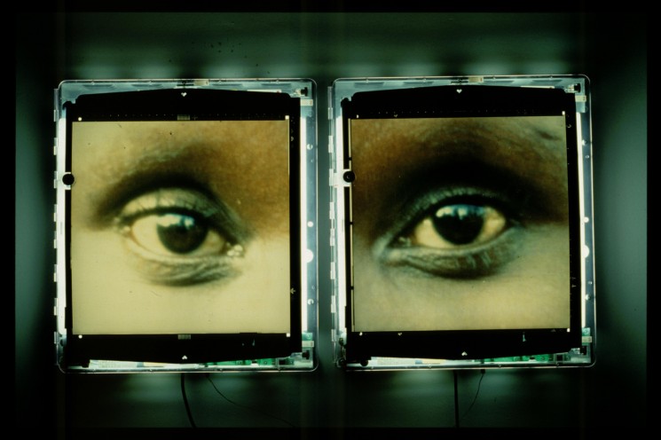
For example, a section entitled Eyes of Gutete Emerita (Figure 27) shows the eyes of a surviving mother; the text accompanying this image explains how Gutete was attending Sunday mass at her local church when the slaughters of 400 Tutsi men, women and children began right before her eyes; among those were also her husband and two sons. At times, the entirety of an image is not needed to fuel emotive narrative, and this is an example of how it can be achieved. Gutete’s eyes are harrowing to stare at, to imagine what she must have seen – the same images that Western society would have been shown during the massacre, yet they failed and still fail today to feel compassion towards distressing conflict images in the media. “What had happened during the coverage of the genocide was in hindsight less compassion fatigue, and more compassion avoidance.” (Moeller 1999: 306)
Figure 27: Alfredo Jaar (1996) The Eyes of Gutete Emerita
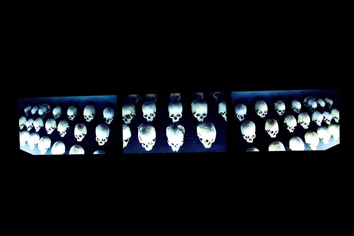
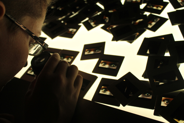
Personally, I cannot understand why aesthetically beautiful images are more successful in the public eye, especially if it is concerning terror among cultures. The people of Rwanda experienced an event that is incomprehensible to the human mind; it was a menacing attack of massacre – massacre is not picturesque, so why should the photographer’s images appear this way? Indeed, Jaar also exhibited the Rwanda Project in a way that exudes power upon any person that viewed it; Figure 28 shows a secondary way that the Eyes of Gutete Emerita were exhibited
Figure 28: Alfredo Jaar – (1996) The Eyes of Gutete Emerita (Installation View at Berlinsche Galerie)
Jaar exhibited Gutete’s eyes on a huge light box, consisting of one million slides along with magnifiers for visitors to use to investigate the images closer. In my opinion, this allowed the audience to inspect closely the haunting stare and focus of Gutete’s eyes onto theirs, reiterating that her eyes, are eyes of sorrow from a deadly massacre. The proportional amount of slides connects with the final count of corpses from the Rwandan Genocide; the way in which the slides pile above people walking around the table extenuates I feel, both the presentation of how the bodies were piled on top one another without care throughout the killings, and the amount of onlookers during the carnage. Western onlookers who watched and waited for it to end so that their services would not be needed, regardless of the amount of graphic imagery they were shown through the media. Gervat has argued about the various ways in which Jaar exhibited his work, that “they are all poetic exercises in representation that are at once a dirge and exaltation, an effigy and an elegy, a promulgation and a denunciation of the Rwandan Genocide and the world’s failure to respond to it.” (Gervat 2014) I agree with Gervat here, Jaar is demonstrating to the public through presentation, the amount of fatalities and the experiences of survivors whose voices were ignored among the rubble of superficial journalism, courtesy of the Western media.
However, Jaar was sceptical about how he had produced work from the Rwanda Project commenting, “I feel that it wouldn’t make any difference to show these images because I feel people here have lost the capacity to see, they have lost their capacity to be affected.” (Jaar 2004: 62) But I disagree with Jaar here, he is proving how powerful cropped images can be, not always having to be explicitly graphic, but nevertheless pinning the audience in the same way. I do agree with Jaar however, that people – meaning the Western world – have lost their compassion to feel something when looking at an image of conflict or post conflict.
Williamson (1994) however, took a different direction when it came to publishing photographs from the genocide. In my opinion, the style in which Williamson chose was that of how photojournalism should be executed for news information purposes. Williamson arrived six days after the Rwandan president was assassinated, instantly hearing the cries of victims who were being hacked to death when he stood upon the bridge at night. Williamson’s image (Figure 29) of bodies floating in the Kigali river is shocking due to its graphic nature and shows no attempt to hide the true subject matter of murder. Yet, even with images such as this one where you can see bloodied, decomposing bodies floating in the remnants of other corpses, both the public and officials across the Western front did not intervene to offer help. “Our failure is one of imagination, of empathy.” (Sontag 2004: 7) I argue that Sontag’s comment relates to how Western society is continually falling into the deep depths of compassion fatigue; fuelled by the ignorance that it is simply not their business to interfere in another ‘helpless conflict’, regardless of the floods of horrific images that come from it. In addition, I feel that this fatigue is not helped when we as a community are informed first with images (Figures 22 & 25) that can only be labelled as superficial.
Figure 29: Michael S. Williamson (1994) from Rwanda
In comparison, I would argue that the majority of Williamson’s images were lacking the accessories that are vital in an image to evoke a sense of ‘stand up and act’ in people. Such as, this image here of a child in Rwanda suffering from a cold. (Figure 30) This photograph has clearly been constructed for beauty purposes only; when a genocide is raging within the walls around this image, these are not the visuals we should be seeing instead. On the poor construction of images, Baudrillard argues that “rather than creating communication, it exhausts itself in the act of staging communication. Rather than producing meaning, it exhausts itself in the staging of meaning.” (Baudrillard 1994: 80) Although the media is aware that an audience responds well to the face of another African child in the midst of conflict, this image is not representative of the true context behind it. This photograph in particular, should not have been printed to be a representation of the Rwandan Genocide; caption or no caption, it still does not show the massacre that was happening, resulting in deaths that were accumulating “at nearly three times the rate of Jewish dead during the Holocaust.” (Gourevitch 1999: 280)
Figure 30: Michael S. Williamson (1994) from Rwanda
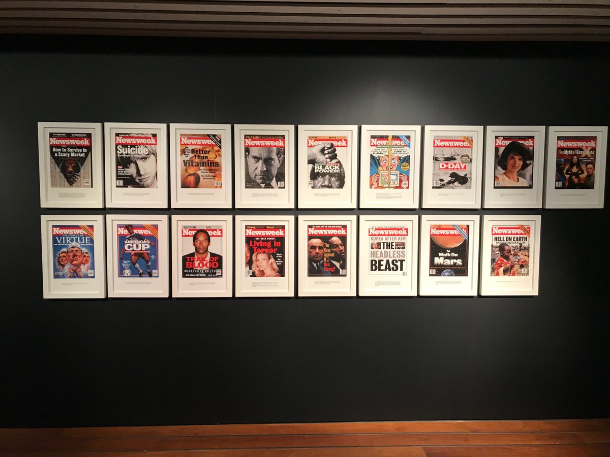
On the other hand, Jaar’s work from the Rwanda Project is more illustrative of the Rwandan Genocide and the controversies behind it especially. I feel that Jaar was extremely clever in showing just how neglected the genocide was when it came to being included in the worldwide press. He exhibited this piece (Figure 31) entitled Newsweek, in which he exposed how it took a renowned American magazine like Newsweek, sixteen weeks before their front page was covered with the horrors of Rwanda. Yet, that the journalists of Newsweek were most definitely aware of the genocide; yet they simply ignored the conflict because they were ordered to do so by American security officials. Instead, they were told to fill their front covers with more ‘culturally appropriate’ stories for the people of America. When Rwanda’s time finally came to be in the spotlight, it was August 1st 1994, four months after the genocide had begun and an estimated 900,000 Rwandans had been slaughtered alone, as well as another 2 million people who had fled, eventually dying from cholera.
Figure 31: Alfredo Jaar (1994) Untitled (Newsweek) (Exhibition View)
In my opinion, what Jaar has shown here, is that anything that is covering our newspapers or magazine front pages, could be completely irrelevant compared to more important events happening that we are unaware of; the mass media “are the vehicles for the simulation internal to the system and the simulation that destroys the system: (Baudrillard 1994: 84) Additionally to this point, “as a result of the risks and costs, ‘a lot of the coverage has been superficial.’” (Jennings 1999: 293) Or in this case, non-existent for sixteen weeks while women, men and children were killed on their own territory for simply not having the right identification card.
Conclusion
Conclusively, I argue that without the use of shock tactics within conflict photographs, we can never truly understand the storyline of the event. These types of events are not meant to be reconstructed for our viewing pleasure, they are available to us in order to show the realism of everyday conflicts and the inhuman actions that take place. As Taylor has commented here: “What would it mean for knowledge if the images ceased to circulate, or were never seen in the first place? What would it mean for civility if representations of war crimes were always polite? If prurience is ugly, what then is discretion in the face of barbarism?” (Taylor 2014: 85)
If photojournalists can use their valuable access to warzones for the benefit of illustrating the authentic story to citizens around the world, this could result in us seeing illustrations that we do not see often, due to the control of censorship from hierarchal officials. Journalists must push against these ridiculous expectations from powerful figures; figures who are not in the centre of the conflict and in turn have no authority to dictate what should or should not be shown in the media.
Superficial journalism is unfortunately becoming more apparent presently in the media; this downward spiral of dishonesty must be dealt with before we no longer have an urge to witness any form of media, due to continually questioning what is and is not a true representation of conflict.
References
BALOG, James. 2013. (As cited in RITCHIN, Fred. 2013. ‘Bending the Frame: Photojournalism, Documentary and the Citizen.’) Aperture Publishing
BAUDRILLARD, Jean. 1994. ‘Simulacra and Simulation’. Michigan, United States of American: University of Michigan Press
BROOMBERG, Adam. 2012. ‘What is Conceptual Photography?’. Youtube Available at: https://www.youtube.com/watch?v=9TvpxG9fLqo (Accessed 15/11/2019)
BURNS, Ken. 1991. ‘The Painful, Essential Images of War’. The New York Times Online. Available at: https://www.nytimes.com/1991/01/27/arts/the-painfulessential-images-of-war.html (Accessed 12/11/2019)
CARTIER-BRESSON, Henri. 2013. (As cited in RITCHIN, Fred. 2013. ‘Bending the Frame: Photojournalism, Documentary and the Citizen.’) Aperture Publishing
CHANARIN, Oliver. 2012. ‘What is Conceptual Photography?’. Youtube Available at: https://www.youtube.com/watch?v=9TvpxG9fLqo (Accessed 15/11/2019)
COOMES, Phil. 2012. ‘The story behind the World Press Photo’. BBC News Online. Available at: https://www.bbc.co.uk/news/17111673 (Accessed 11/10/2019)
DAVIES, Nick. 2010. (As cited in POLMAN, Linda. 2010. ‘The Crisis Caravan: What’s Wrong with Humanitarian Aid?’). New York, United States of America: Henry Holt and Company Publishing
FRIEDERSDORF, Conor. 2014. ‘The War Photo No One Would Publish’. The Atlantic Online. Available at: https://www.theatlantic.com/international/archive/2014/08/the-war-photo-noone-would-publish/375762/ (Accessed 6/11/2019)
GANNETT NEWS SERVICE. 1999. (As cited in MOELLER, Susan D. 1999. ‘Compassion Fatigue: How the Media Sell Disease, Famine, War and Death’). Oxfordshire, United Kingdom: Taylor & Francis Publishing
GERVAT, Briana. 2014. ‘The Penetrating Epic Poem: A Conversation with Alfredo Jaar’. Art Pulse Magazine Online. Available at: http://artpulsemagazine.com/thepenetrating-epic-poem-a-conversation-with-alfredo-jaar (Accessed 10/10/2019)
GOUREVITCH, Philip. 1999. (As cited in MOELLER, Susan D. 1999. ‘Compassion Fatigue: How the Media Sell Disease, Famine, War and Death’. Oxfordshire, United Kingdom: Taylor & Francis Publishing
JAAR, Alfredo. 2004. (As cited in RITCHIN, Fred. 2013. ‘Bending the Frame: Photojournalism, Documentary and the Citizen.’) Aperture Publishing
JARECKE, Kenneth. 2014. ‘The War Photo No One Would Publish’. The Atlantic Online. Available at:https://www.theatlantic.com/international/archive/2014/08/the-war-photo-noone-would-publish/375762/ (Accessed 6/11/2019)
JENNINGS, Peter. 1999. (As cited in MOELLER, Susan D. 1999. ‘Compassion Fatigue: How the Media Sell Disease, Famine, War and Death’. Oxfordshire, United Kingdom: Taylor & Francis Publishing
LINFIELD, Susie. 2010. ‘The Cruel Radiance’. Chicago, United States of America: University of Chicago Press
MCGONAGLE, Joseph. 2014. (As cited in KENNEDY, Liam and PATRICK, Caitlin. 2014. The Violence of the Image: Photography and International Conflict.’) London, United Kingdom: I.B. Tauris Bloomsbury Publishing
MOELLER, Susan D. 1999. ‘Compassion Fatigue: How the Media Sell Disease, Famine, War and Death’. Oxfordshire, United Kingdom: Taylor & Francis Publishing
O’HAGAN, Sean. 2012. ‘What is Conceptual Photography?’. Youtube Available at: https://www.youtube.com/watch?v=9TvpxG9fLqo (Accessed 15/11/2019)
PHELAN, Peggy. 2012. ‘Picturing Atrocity: Photography in Crisis’. London, United Kingdom: Reaktion Books Ltd
POLMAN, Linda. 2010. ‘The Crisis Caravan: What’s Wrong with Humanitarian Aid?’. New York, United States of America: Henry Holt and Company Publishing
RIEFF, David. 2013. (As cited in RITCHIN, Fred. 2013. ‘Bending the Frame: Photojournalism, Documentary and the Citizen.’) Aperture Publishing
RITCHIN, Fred. 2013. ‘Bending the Frame: Photojournalism, Documentary and the Citizen.’ Aperture Publishing
SMAIDMENT, Unknown. 2015. ‘Richard Mosse: The Enclave’. National Gallery of Victoria Online. Available at: https://www.ngv.vic.gov.au/essay/richard-mosse-theenclave/ (Accessed 13/11/2019)
SONTAG, Susan. 2004. ‘Regarding the Pain of Others’. London, United Kingdom: Penguin Books Publishing
SONTAG, Susan. 2004. ‘Regarding The Torture Of Others’. The New York Times Online. Available at: https://www.nytimes.com/2004/05/23/magazine/regardingthe-torture-of-others.html (Accessed 12/11/2019)
TAYLOR, John. 2014. (As cited in KENNEDY, Liam and PATRICK, Caitlin. 2014. ‘The Violence of the Image: Photography and International Conflict.’) London, United Kingdom: I.B. Tauris Bloomsbury Publishing
TOSCANI, Oliviero. 1991. (As cited in MACLEOD, Duncan. 2007. ‘Benetton Pieta in AIDS Campaign’.) The Inspiration Room. Available at: http://theinspirationroom.com/daily/2007/benetton-pieta-in-aids-campaign/ (Accessed 13/11/2019)
WORTHINGTON, Andy. 2009. ‘Images that exposed the truth on abuse’. The Guardian Online. Available at: https://www.theguardian.com/commentisfree/2009/apr/28/abu-ghraib-prisonerabuse-us (Accessed 11/10/2019)
Bibliography
BRENT PLATE, S. 2008. ‘Religion and Film: Cinema and the Re-creation of the World’. London, United Kingdom: Wallflower Press
ELKINS, James. 2001. ‘Pictures & Tears’. New York, United States of America: Routledge, Taylor & Francis Group
GEORGE, Terry. 2004. ‘Hotel Rwanda’. (video: DVD)
GOUREVITCH, Philip. 2019. ‘The Silence: 25 Years Since the Rwandan Genocide’. Magnum Photos Online. Available at: https://www.magnumphotos.com/newsroom/conflict/gilles-peress-silence-25years-since-rwandan-genocide/
KAPHLE, Anup. 2014. ’11 powerful photos from the aftermath of the Rwandan genocide’. The Washington Post Online. Available at: https://www.washingtonpost.com/news/worldviews/wp/2014/04/02/11-powerfulphotos-from-the-aftermath-of-the-rwandan-genocide/
KINGSLEY, Patrick. 2016. ‘The death of Alan Kurdi: one year on, compassion towards refugees fades’. The Guardian Online. Available at: https://www.theguardian.com/world/2016/sep/01/alan-kurdi-death-one-year-oncompassion-towards-refugees-fades (Accessed 16/11/2019)
LYONS, Robert & STRAUS, Scott. 2006. ‘Intimate Enemy: Images and Voices of the Rwandan Genocide’. Brooklyn, United States of America: Zone Books
MARSHALL BEIER, J. 2011. ‘The Militarization of Childhood: Thinking Beyond the Global South’. New York, United States of America: Palgrave Macmillan, St. Martin’s Press
NACHTWEY, James. 2011. ‘When the World Turned Its Back: James Nachtwey’s Reflections on the Rwandan Genocide’. Time Magazine Online. Available at: https://time.com/3449593/when-the-world-turned-its-back-james-nachtweysreflections-on-the-rwandan-genocide/ (Accessed 16/11/2019)
O’HAGAN, Sean. 2011. ‘Turning photojournalism upside down’. The Guardian Online. Available at: https://www.theguardian.com/artanddesign/2011/apr/19/broombergchanarin-photojournalism-war (Accessed 16/11/2019)
PERESS, Gilles. 1995. ‘The Silence’. New York, United States of America: Scalo Publishers
PHILLIPS, Sarah. 2012. ‘Samuel Aranda’s best photograph: a woman protects her son’. The Guardian Online. Available at: https://www.theguardian.com/artanddesign/2012/nov/07/samuel-aranda-bestphotograph
PROSSER, Jay. 2012. ‘Picturing Atrocity: Photography in Crisis’. London, United Kingdom: Reaktion Books Ltd
SAID, Edward W. 1991. ‘Orientalism’. London, United Kingdom: Penguin Books Publishing
TAFT, Sally. 2014. ‘How did you help us change the way we report the news?’. BBC News Online. Available at: https://www.bbc.co.uk/news/world-30421631 (Accessed 16/11/2019)
UNKNOWN. 2011. ‘Gulf war, 20 years on: memories of Desert Storm’. The Guardian Online. Available at: https://www.theguardian.com/world/2011/jan/16/gulf-war-20years-on (Accessed 16/11/2019)
VERGER, Rob. 2014. ‘Newsweek Rewind: The Genocide in Rwanda’. Newsweek Online. Available at: https://www.newsweek.com/newsweek-rewind-genociderwanda-245635 (Accessed 16/11/2019)
Shona Waldron is an interdisciplinary artist based between East Sussex and Cornwall, UK. Working across a diverse range of media including photography, painting, moving image and installation, she articulates a world of uncertainty, frequently using a combination of digital and analogue techniques to manipulate the periphery of fact and fiction. The blurring of these demarcations plays a crucial role in exploring ideas centred around time, space and the nature of existence, presenting life as a source of wonder and infinite possibility. Investigating states of change or metamorphosis is also a recurrent theme as she uses her work to illustrate the transition into a future which is impossible to predict or control.
BtL: Your upcoming exhibition Sensorium opens on the 24th June 2021. It brings together works from several of your recent projects. Can you sum up any overall themes in your practice?
SW: Sensorium is a collection of work that encompasses moving image, photography, painting and installation. The title draws inspiration from the sensory apparatus of the human body which is responsible for receiving and interpreting external stimuli. Intended to be viewed as part of an immersive experience, each exhibited piece explores themes surrounding the intersection of art, science and technology, evoking the idea of new realities that are activated by our perceptual encounters with the space.
Although my work often makes reference to scientific language and taxonomical systems, there is equally a free-flowing element that induces feelings of fluidity and life in a constant cycle of evolution. There are also parallels made between the organic and the technical, with a blending together of analogue and digital media to allow the subject matter to exist in a transformed state that surpasses the limits of its original definition.
BtL: You seem to be interested in visually exploring the relationship between the technological world and the natural world. Why is it important for you to incorporate a range of media into your practice?
SW: The incorporation of a variety of media and processes is definitely very important. I find that moving beyond the boundaries of a purely photographic practice allows the work to function in a universal context which is useful when dealing with these expansive and broad themes. This mixed media approach makes it easier for my work to emphasise connections on multiple levels, whether it be visual, auditory or as an entire sensorial experience. I think this way of working is helpful in creating a sense of dynamism, something that is of particular interest in light of my ideas surrounding the mutable relationship between technological and biological forms.
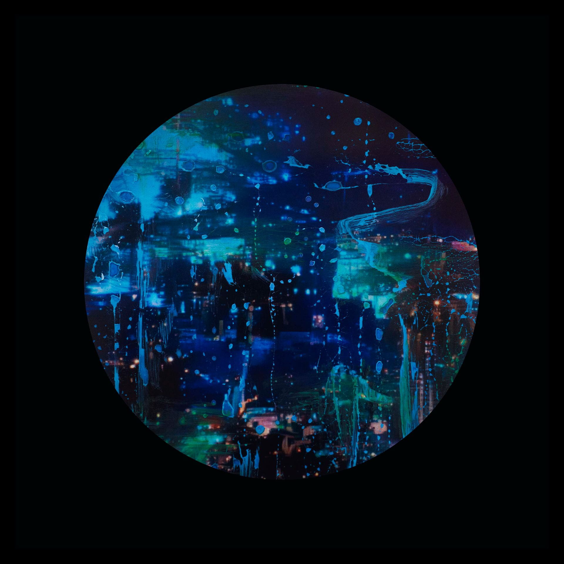
Shona Waldron (2021) from Merge / Melt
BtL: The title of your video work Primordial Loop seems to both juxtapose and connect the idea of new possibilities / the inter-connectedness of man and machine; the technical and the organic…
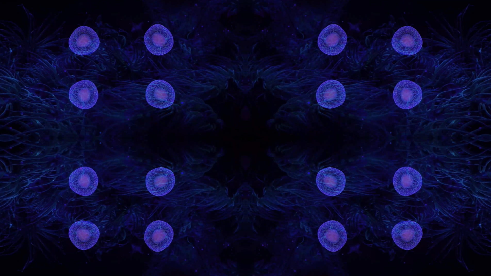
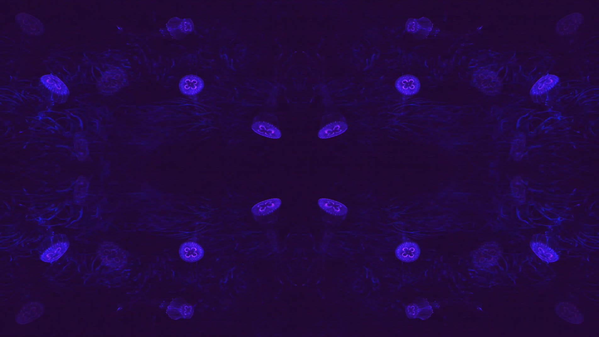
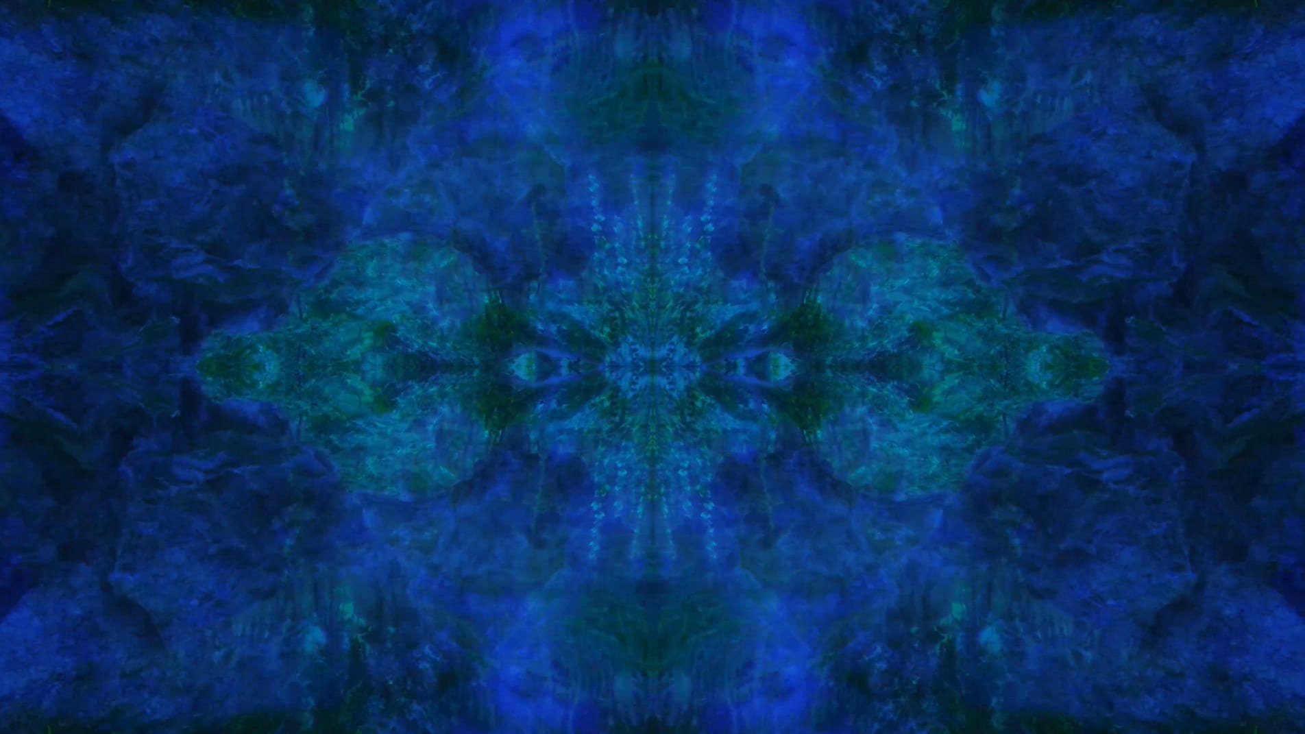
SW: Primordial Loop is an experimental video piece that incorporates 3D modelling and animation. Its title draws inspiration from ‘primordial soup’, a term often used to refer to the blend of biological conditions that first enabled life on our planet. In addition to looking back towards these early beginnings, the work explores our immersion in the digital world by reinterpreting natural environments through the screen-based society we inhabit. The study of evolutionary processes is also of great importance as this ultimately evokes a transcendental journey through the past, present and future as well as a fusion of the organic and the technical.
Shona Waldron (2021) from Primordial Loop
Emphasis is placed upon these themes from the very onset of the piece which opens with an animation of cells dividing, a sequence that delineates a point of origin and the genesis of new life. The cells then fade out of view to be replaced by jellyfish that float across the scene, gelatinous in form with iridescent hues of purple and blue. Although included due to their their correspondence with the cells, the jellyfish are notable in presence since they are one of the oldest species to exist on our planet, residing in our oceans for more than 500 million years. This remarkable timescale predates the dinosaurs and is fascinating in light of my ideas surrounding primal states.
Shona Waldron (2021) from Primordial Loop
Following this, the video transitions into a haze of violet light which dissipates to reveal the shapes and structures of tree branches, rocks and mountains as scenes of a digital jungle emerge. Moving deeper into the landscape and through the undergrowth, circular patterns begin to appear with organic matter converging into the centre point where the panels of the video meet, creating a hypnotic effect that is reminiscent of a kaleidoscope.
Shona Waldron (2021) from Primordial Loop
BtL: Do you think your process of digitally constructing the work is important as a way of situating these primitive visual landscapes within the conditions of the 21st Century?
SW: Absolutely. The digital process allows nature to exist in a computational form and suggests that it is not estranged from technology in the way that we might initially imagine. In the text Novacene – The Coming Age of Hyperintelligence, (2019) the scientist James Lovelock reiterates this view. He proposes that ‘computers work purely in zeros and ones; from that they can construct entire worlds … information may indeed be the basis of the cosmos’ (2019: 88). It is this description of the cosmos being made up of information, that is referenced in a literal sense within my work.
Shona Waldron (2021) from Primordial Loop
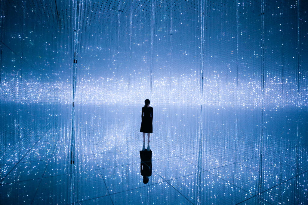
This environment visually resembles many of teamLab’s installations such as The Infinite Crystal Universe. Presented as immersive experiences, teamLab encourages us to reach infinity and oneness by seeking to ‘transcend boundaries in the relationship between the self and the world, and of the continuity of time’ (Pace Gallery 2014). Computer programmes and algorithms are widely used in the creation of these works, engendering the belief in a computational universe in the same way that my work intends to.
teamLab (2015-2018) The Infinite Crystal Universe
BtL: You seems to situate your visual practice across a variety of thresholds. Can you give us a few examples?
SW: Further influential research includes the concept of the technological singularity, a term first popularised in 1993 with Vernor Vinge’s essay The Coming Technological Singularity. In physics, a singularity is defined as a point of infinity, such as the centre of a black hole, where matter becomes endlessly dense and physical laws break down, resulting in the merging of space and time. In relation to this scientific definition, the theory of the technological singularity hypothesises that we will soon cross a threshold where machine intelligence will surpass biological intelligence, an advancement that will lead to irreversible changes to civilisation.
Ray Kurzweil, futurist and author of The Singularity is Near: When Humans Transcend Biology, suggests that ‘machine intelligence could become indistinguishable from that of its human progenitors within the first half of the twenty-first century’ (2005: 3). What this will look like for humanity is unclear as both a dystopian and utopian scenario would be possible. Either way, it is the notion of transcending current limitations that is most intriguing. It is also speculated that the universe began by such an event, meaning that there was a singularity in our past as well as one potentially in our future, demonstrating the way history repeats itself in a loop.
Shona Waldron (2021) from Primordial Loop
This notion of the singularity manifests in Primordial Loop when the screen becomes increasingly pixelated and the motion accelerates, referencing the exponential rate that we are approaching what is often referred to as the ‘event horizon’ (Kurzweil 2005: 7). Once this is reached, the centre of the screen unfolds to reveal a passage into a new space-time dimension.
Shona Waldron (2021) from Primordial Loop
The final scene reveals the culmination of this journey into a post-singularity state. The video fragments, breaking apart from its original structure and transforming into multiple screens floating within a dark void. The plurality of the work opens up new ways for it to exist, with the panels constantly moving across the X, Y and Z axes. The music also shifts from its electronic sound to something choral and celestial. At this point in the video, space is perceived in a more fluid way, it bends and stretches, becoming something that we develop a heightened awareness of.
Yayoi Kusama (2019) Infinity Mirrored Room: Dancing Lights that Flew Up to the Universe
This exploration of a boundless existence relates strongly to Yayoi Kusama’s Infinity Rooms, another key inspiration for my practice. The installation, Dancing Lights that Flew Up to the Universe, is described as a perceptual experience that functions as ‘a harmonious and quiet place for visitors to contemplate their existence, reflect on the passage of time, and think about their relationship to the outer world’ (Hirshhorn 2017). The title of Kusama’s piece acts as an expression of hope and resonates with my own feelings of reverence for the infinite. A sense of spirituality is embodied within the ending of my work, suggesting that it has indeed transcended in the same way that it is predicted that we, as humans, will one day transcend our own experience of reality.
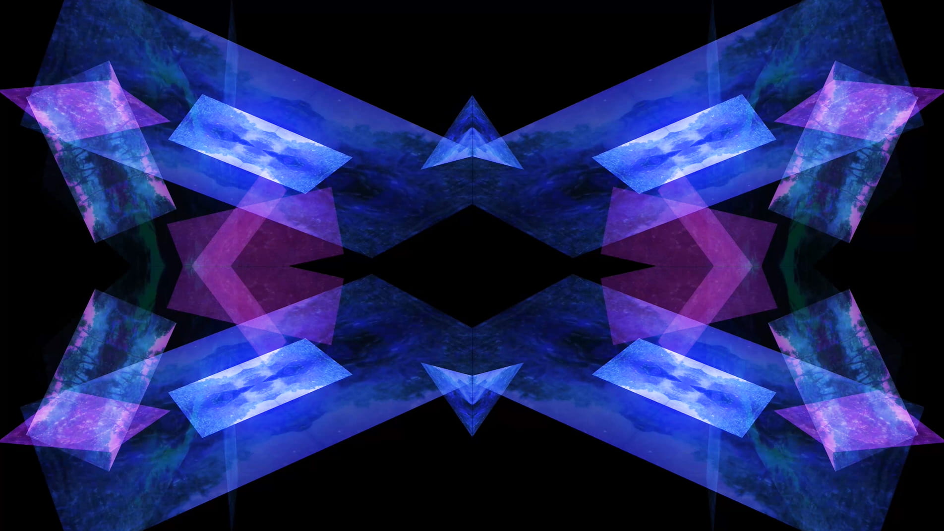
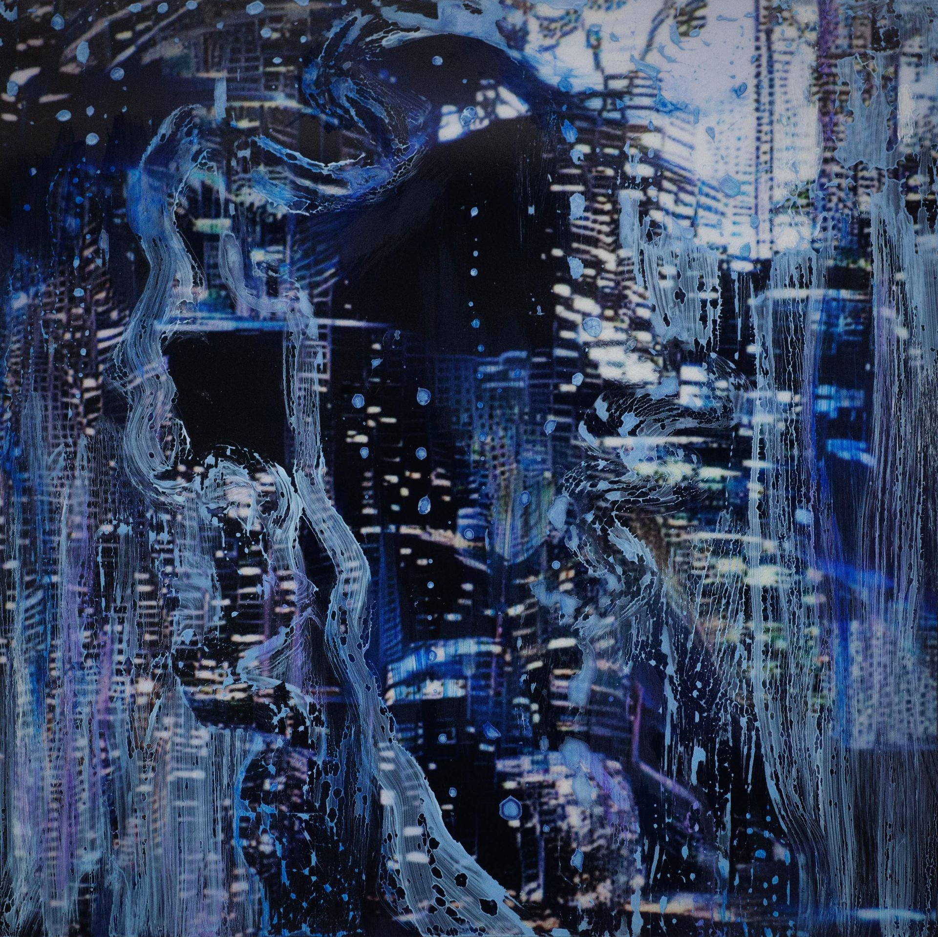
BtL: The photographic strand of your practice, titled Merge/Melt, seems to explore similar notions to Primordial Loop through amalgamating technological and natural elements to create something that exists in a transformed state.
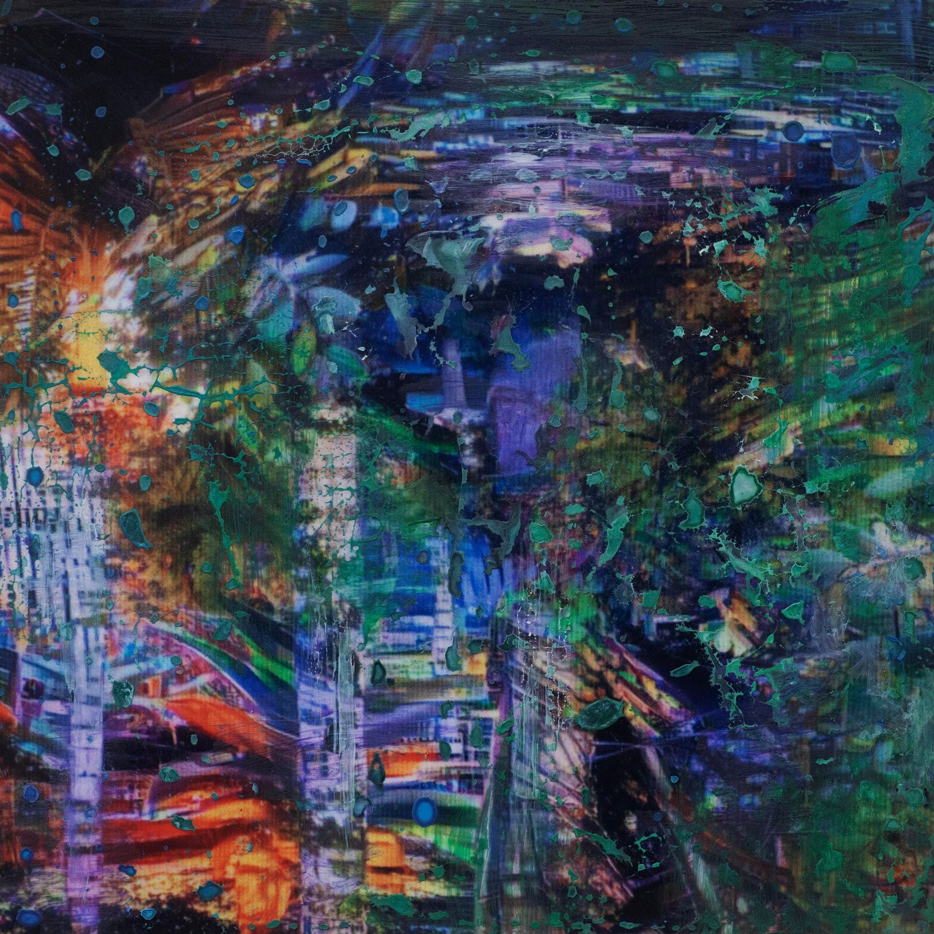
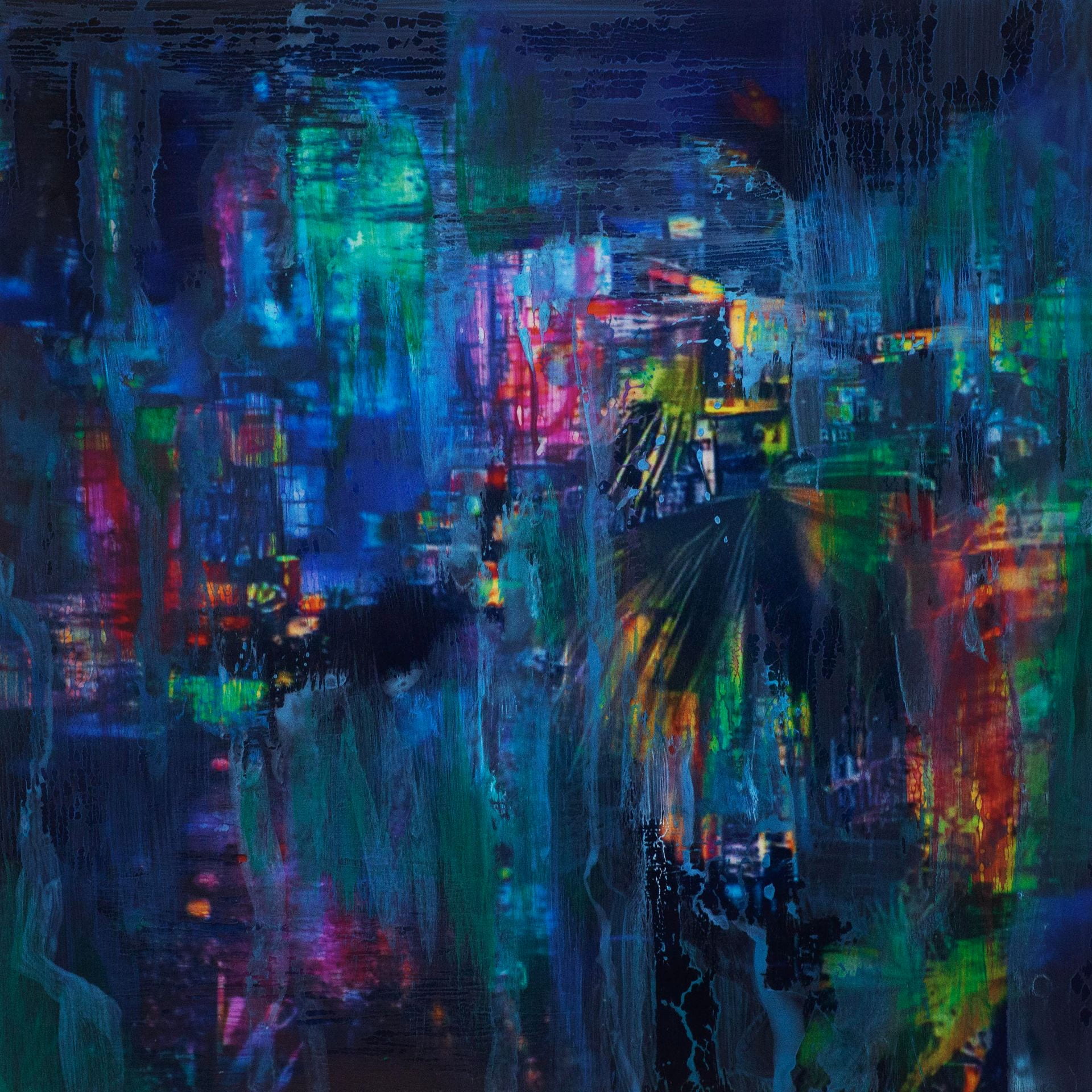
SW: Merge/Melt experiments with the use of digital tools to build new forms and structures, revealing warped patterns and textures that suggest the physical world is melting into an electronic one. During the production of the series, photographs of jungles and cityscapes were fed into an algorithm and then merged together to generate new entities.
Shona Waldron (2021) from Merge / Melt
The Deep Dream algorithm was used specifically for this purpose as it was able to draw out interesting shapes within the depths of the images. Deep Dream is described as a convolutional neural network and was originally developed in 2015 as a means of providing AI researchers with an insight into what an algorithm sees when it analyses an image. Since its inception, however, it has primarily been used as an artistic tool with results that are psychedelic in appearance. The artist Mario Klingemann is one of the pioneers of working with neural networks in this way. The works Archimedes Principle and Parting From You Now, draw attention to the pareidolic details that can emerge from an image, in the same way that humans are able to observe random shapes in passing clouds. The ability of Deep Dream to provide an algorithmic vision of our environments relates to the computational form of nature seen in Primordial Loop, epitomising the suggestion that ‘computation is existence’ (Lloyd and Ng cited in Kurzweil 2005: 342).
Mario Klingemann (2016) Archimedes’ PrincipleMario Klingemann (2016) Parting From You Now
BtL: There is appears both a visual and conceptual fluidity to your practice, yet also a sense of chaos and the unexpected.
Artist and theorist Joanna Zylinska’s text AI Art: Machine Visions and Warped Dreams also feels especially relevant. Zylinska refers to algorithmic art as ‘an ouroboros-like circle of random variations’ (2020: 72), a description that encapsulates the chaotic nature of my work but equally observes the connectivity that is so integral to its construction. The effect of this merging process is the predominant feature.
Shona Waldron (2021) from Merge / MeltShona Waldron (2021) from Merge / Melt
In some images, it becomes difficult to distinguish city lights from stars as the sky dissolves into the architecture and structures blend together like coloured inks, a liquid yet luminous appearance that could almost be the result of street lights reflected in a pool of water. Due to the alteration and enhancement of certain hues, some of the images look more industrial and synthetic whilst others, with jewel bright shades of green and blue, are more jungle-like, allowing each composition to exist on a continuum between metropolis and nature. It is this fluctuation that I find most inspiring as it underscores my interest in the creation of multiplicities.
Shona Waldron (2021) from Merge / Melt
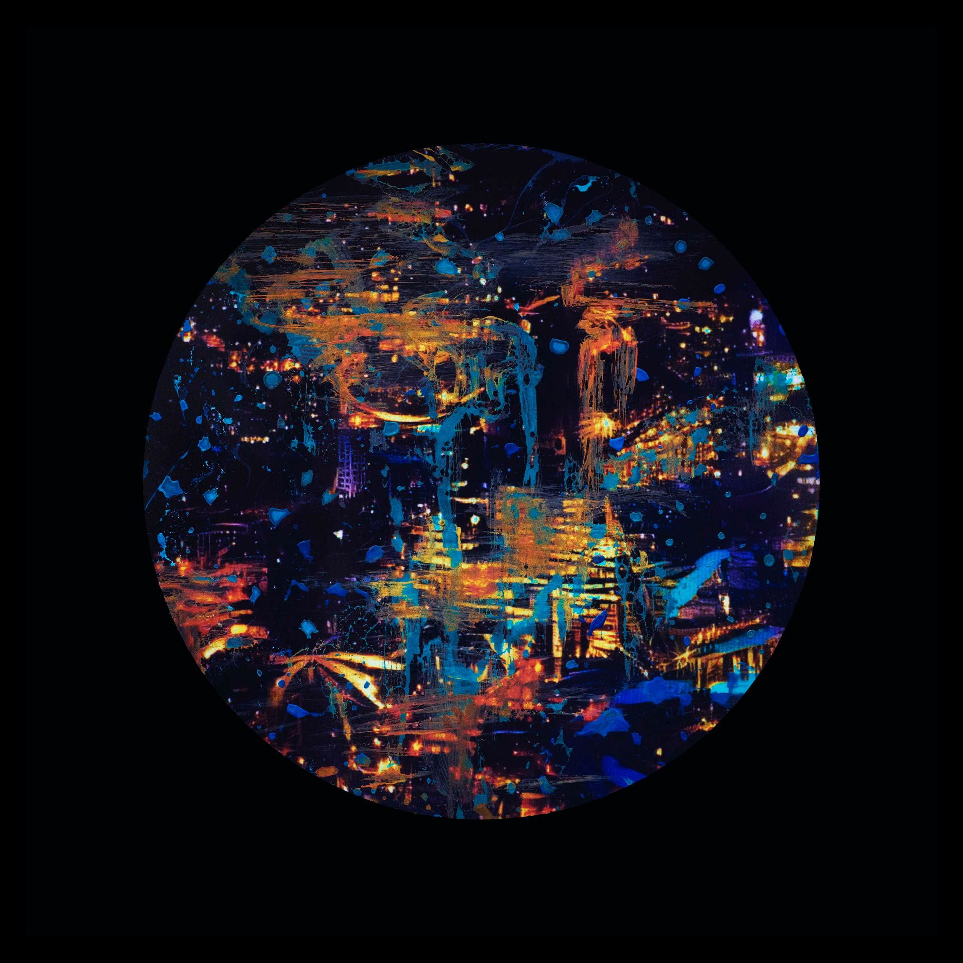
To clearly communicate a sense of things evolving, I present my images as animated video sequences on screens and opted for a circular format in order to create a stronger comparison to the concepts explored in Primordial Loop. These circular shaped pieces embody a more pronounced mutability and link back to Zylinska’s reference to the loop of the ‘ouroboros’, reflecting wholeness and infinity. They additionally have the look of portals, perhaps acting in a similar way to black holes. This creates a further parallel with my video piece which also leads us through into a new dimension.
SW: My advice would be to view university as a time to experiment with photography, to try out new ways of working and push the boundaries of the medium. Over the course of my three years at Falmouth, I feel fortunate to have been able to expand my practical image making skills, both with analogue and digital processes. Although it can be strange to do something unfamiliar, I would completely recommend it as it will enable you to develop new areas of interest and gain a broader experience of the arts. And, it goes without saying, to make the most of the university facilities and technical workshops in addition to opportunities for collaborative working whilst you are a student as this provides invaluable support.
BtL: What can we expect from you next?
SW: I am planning to develop more work that expands upon the themes seen Sensorium and incorporates a variety of techniques, I will be continuing to practice in other visual disciplines alongside my photography. In addition to lens-based media, i will be continuing to branch out into other areas such as painting, sculpture and installation – and continuing to experiment. Who knows?
‘Wars are now also living room sights and sounds’ (Sontag, 2004, p.16)
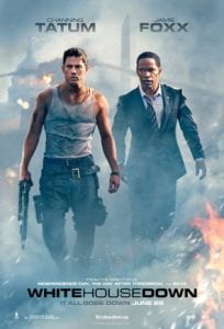
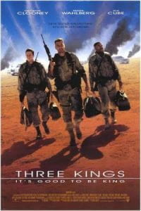
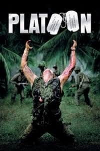
Roland Emmerich (2013) White House DownDavid O. Russell (2003) Three KingsOliver Stone (1987) Platoon
‘The shock of photographed atrocities wears off with repeated viewings’ (Sontag, 1977, p.20)
It is clear that certain representations of war and suffering have become all too commonplace, particlularly in the images we see (both now and then) of the difference between coverage of the the Vietnam war (1955- 1975) and Iraq war (2003 – 2011) and they way they have been appropriated for entertainment alone.
Does this make us less or more involved? Does the power of the cinema dilute this? or are we merely living in a simulacra? Where does the photograph fit in?
In Regarding the Pain of Others, Susan Sontag (2004) looks into the way we view war and suffering. She proposes two central ideas on how war photography / imagery can affect a population. The first is through the media, in which mass distribution of these images of suffering cause public outrage and demand for change. While the other idea looks at the gradual erosion of compassion after repeatedly viewing these images. Essentially, she argues that ‘Such images just make us a little less able to feel, to have our conscience pricked’ (Sontag, 2004, p.94).
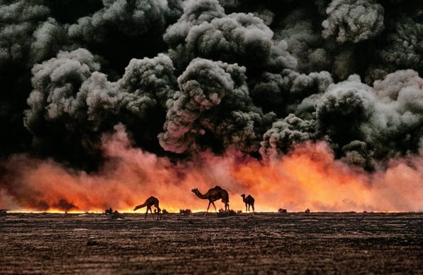
Steve McCurry (1991) Camels and Oil Fire, Kuwait
‘I really don’t think that a picture of an atrocity should be a good picture, a beautiful picture, a well-composed picture… It should be casually composed, hastily framed, only competently printed’ (Sischy in Lewis, 2003)
In contrast, the Vietnam war was widely photographed, and the images captured are certainly graphic to our modern eyes. This is due to the display of real and uncensored depictions of suffering from both sides, in so many different contexts.
Consider the photographs included in the music video for Buffalo Springfield (1966) For What It’s Worth below.
Iraq was considerably different. As Kenneth Jareke (2014) points out ‘It was one picture after another of a sunset with camels and a tank…If I don’t take pictures like these, people like my mom will think war is what they see in movies’ (Jarecke in Deghett, 2014).
Consider the film trailer for David O. Russell (2003) Three Kings below.
representations from Vietnam are more likely to depict the violence inflicted on others, whilst images of Iraq are mostly of tanks, guns and US soldiers – a particularly Western / American view of the world perhaps?
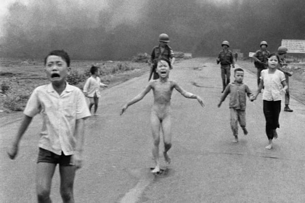
Nick Ut / AP (1972) The Terror of War / ‘Napalm Girl’
‘Baudrillard pointed out that the [Iraq] war was conducted as a media spectacle. Rehearsed as a wargame or simulation, it was then enacted for the viewing public as a simulation: as a news event, with its paraphernalia of embedded journalists and missile’s-eye-view video cameras, it was a videogame. The real violence was thoroughly overwritten by electronic narrative: by simulation’ (Poole, 2007)
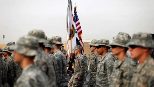
Rick Merron / AP (1965) Vietnam WarPablo Martinez Monsivais / Getty Images (2011) Iraq War
So today, in our image world, and the age of the (uncensored) internet – what is the role of Citizen Journalism? As Sontag (2004) notes, ‘The less polished pictures are… [more they are] welcomed as possessing a special kind of authenticity’ (2004, p,24). Here is New York (2004) was one of the largest collaborative projects undertaken to archive the events of 9/11 but also as a celebration of a vibrant city overcoming trauma.
Micheal Shulan (2004) (ed.) from Here is New York
‘What was captured by these photographs — captured with every conceivable kind of apparatus, from Leicas and digital Nikons to homemade pinhole cameras and little plastic gizmos that schoolchildren wear on their wrists — is truly astonishing: not only grief, and shock, and courage, but a beauty that is at once infernal and profoundly uplifting. The pictures speak both to the horror of what happened on 9.11 (and is still happening), and to the way it can and must be countered by us all. They speak not with one voice, but with one purpose, saying that to make sense of this terrifying new phase in our history we must break down the barriers that divide us’ (Shulan, 2004)
(T.S. Eliot, The Love Song of J. Alfred Prufrock, 1915)
‘A magazine can open peoples eyes at the same time it closes them’ (Mason in Goldberg, 2018, p.8)
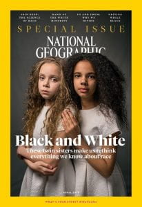
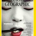
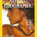
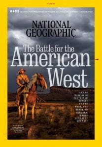
National Geographic (April 2018)
In April 2018, National Geographic reflected on thier representations of race and indigenous / non-Western people. This session aims for participants to interrogate racial / objectifying / mythological stereotypes that the magazine / visual culture might project, and to take a more critically reflective approach to such representations. It is appropriate to be used as a more theoretical / case study presentation based session or could have an associated visual response regarding the nature of visual stereotyping as it ‘becomes’ fact.
‘The photographer is super tourist, an extension of the anthropologist, visiting natives and bringing back news of their exotic doings and strange gear’ (Sontag, 1977, p.42)
To investigate the ethics of the representation of racial difference in visual culture
To reflect on positive / negative / stereotypical representations and consider the impact of these
To consider the percieved ‘truth’ of such representations
Participant Outcome: Research and identify 2 positive / truthful representations and 2 negative / sterotypical representations of people of colour
1: Presentation Ideas: 19th century / 21st century?
‘Every empire tells itself and the world that it is unlike all other empires, that its mission is not to plunder and control but to educate and liberate. These ideas are by no means shared by the people who inhabit that empire’ (Said, 2003)
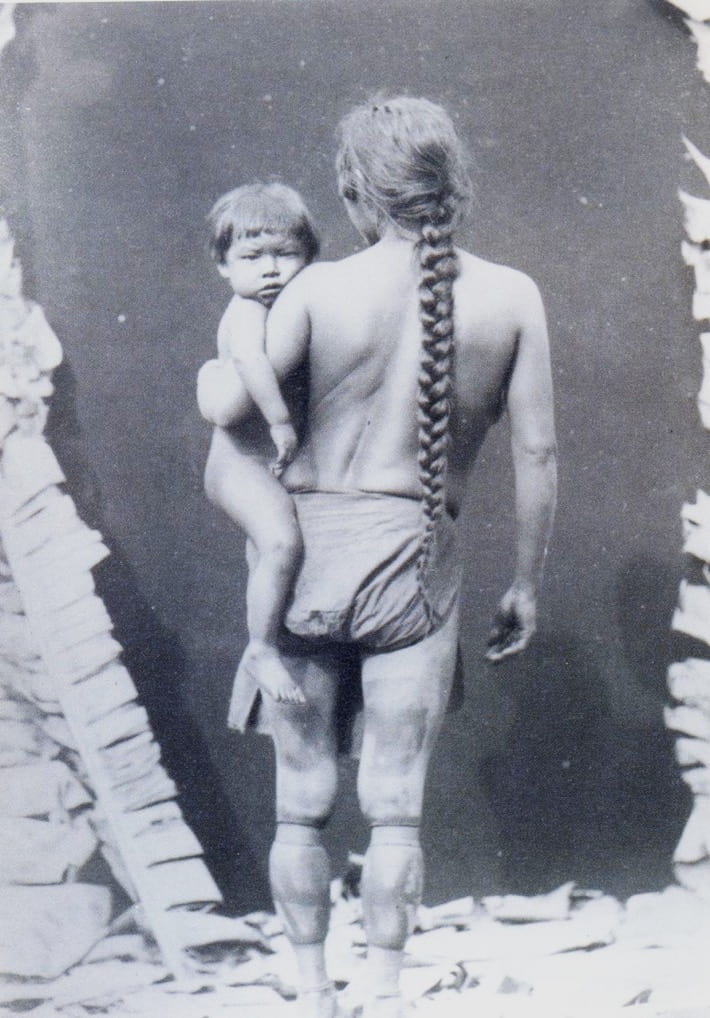
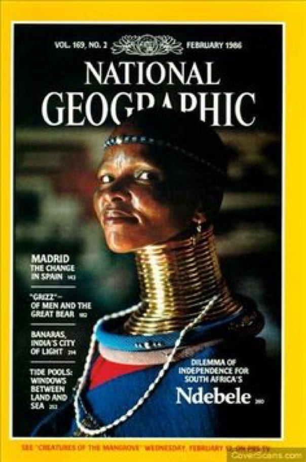
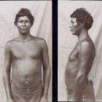
Pierre Petit (1882) A Kalina woman and her child photographed in ParisNational Geographic (February 1986)
The content of images may seem natural. But representational and interpretive processes are cultural in that they are anchored in aesthetic conventions. Photographs substitute for direct encounter; they act as surrogates, mediating that which was seen through the camera viewfinder’ (Wells, 2011, p.6)
Photographs are ubiquitous. We devour them daily and perhaps we do ignore the way they act as surrogates for our understanding and knowledge of the world. Since the first issue of National Geographic was published in 1888, it has provided a powerful yellow bordered window on a world beyond our reach. Yet, perhaps, it is more of a mirror, and at that, one which only reflects ourselves. The West. On the the 100th anniversary of the publication its editor positioned the magazine in an inherently (and uniquely) truthful context – ‘These covers mark a century of holding up to the world our uniquely objective publishing mirror’ (Garrett, 1988, p.270). is it really unique? is it really objective? indeed, can any photograph claim such veracity? Despite the popularity of National Geographic, and the respect it still seems to attract, Grundberg (1988) and Mason (2018) take less optimistic views, that it doesn’t show us anything new.
Does it merely recycle and reproduce a colonial gaze – merely reflecting already known stereotypes of The Other. Does our Western gaze still remain rooted in 19th Century tradiion?
National Geographic (September 1998)
National Geographic (April 2016)
National Geographic (April 2016)
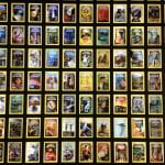
Andrew Evans (2013) Wall of National Geographic magazine covers (125th Anniversary)
Theodore Koch-Grünberg (c.1895) Frontal and side portraits of indigenous people of the Amazon
National Geographic (July 1987
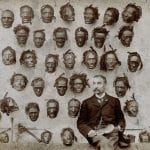
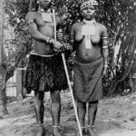
Major General Horatio Gordon Robley with his collection of tattooed Maori heads (c.1895)
National Geographic (June 1996)
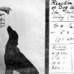
W.H.R. Rivers (c.1895) Reaction time of a dog to sight of falling body (biscuit)
National Geographic (February 2012)
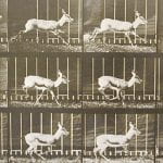
Eadweard Muybridge (c.1887) Antelope Trotting
National Geographic (June 2003)
Henry Fox Talbot (1844) Articles of China
National Geographic (September 2010)
Francis Frith (1858) Pyramids Of El-Geezeh
National Geographic (February 1982)
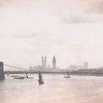
Roger Fenton (1858) Westminster from Waterloo Bridge from All the Mighty World
National Geographic (February 2016)
John Davis (c.1893) Samoan Woman holding a War Club
National Geographic (March 1978)
‘Besides presenting our culture’s attitudes and preconceptions as if they were universal, or even nonexistent, the photography of the National Geographic produces a pictorial iconography that tends to reduce experience to a simple, common denominator (Grundberg, 1988)
Preparation Work:
Ask partticipants to read Andy Grundberg (1988) ‘A Quintessentially American View of the World’ in The New York Times (18th September 1988) available here
Ask participants to read Susan Goldberg (2018) ‘For Decades Our Coverage Was Racist. To Rise above Our Past, We Must Acknowledge It ’ in National Geographic (April 2018) available here
Ask partticipants to read Kianaz Amaria (2018) ‘National Georgaphic’s November Cover Falls Back On Racist Cliches’ in Vox (18th November 2018) available here
2: Presentation Ideas: The survival of the stereotype?
‘If photography is perceived as reality, then modes of representations will themselves enhance that reality, in other words the photograph is perceived as ‘real’ and ‘true’ because that is what the viewer expects to see: this is how it should be, becomes this is how it is / was’ (Edwards, 1992, p.8)
National Geographic (July 1959)National Geographic Traveller (September 2016)
‘From the beginning of Western speculation about the Orient, the one thing the Orient could not do was to represent itself. Evidence of the Orient was credible only after it had passed through and been made firm by the refining fire of the Orientalist’s work’ (Said, 1978, p.283)
In 1915, National Geographic’s official policy statement was threefold; (in Lutz & Collins, 1993, p.26)
‘Absolute accuracy’
‘Beautiful, informative and artistic illustrations’
‘Nothing of a partisan or controversial character is printed’
There was no acknowledgement of a potential inconsistency between these aims – such as a tension between accuracy and aesthetics – an approach which is so easily recognised in contemporary photographic practice today – and often used very successfully to create contemplation / action in the viewer. Clearly not, in the case of National Geographic. In 2012, thier position had not changed: ‘Only what is of a kindly nature is printed about any country or people, everything unpleasant or unduly critical being avoided’ (Foster, 2012, p.2). In November 2018, only 6 months after thier public ‘apology’ in The Race Issue (April 2018) their cover / Instagram coverage maintained these colonial myths – in thier representation of The Cowboy / Native Americans – and this was even within thier own shores.
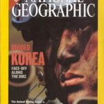
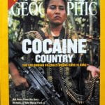
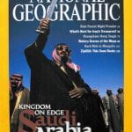
Is National Geographic still replicating a Western (or even white American) worldview? Think about Western ideas of Africa, North Korea, Columbia, Saudi Arabia. Does National Geographic merely reproduce what we already think we know?
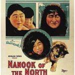
Robert J. Flaherty (1922) Nanook of the North
National Geographic (November 2015)
National Geographic (February 1971)
National Geographic (March 1974)
Chris Buck & Kevin Lima (1999) Tarzan: Buena Vista/Walt Disney Productions
Jodie Cobb (2000) Young Asaro mudmen from the Garoka tribe at the annual tribal sing-sing in Papua New Guinea in National Geographic Then and Now Exhibition (2013)
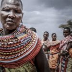
Seth Langbauer (2014) A Maasai women stands before her tribe in National Geographic Photography competition: Editors favorite submissions
National Geographic (July 2015)
National Geographic (June 1997)
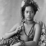
Thomas Andrew (c.1890) Young Samoan woman
Gordon Gahan (2018) Topless Tahitian dancer is annointed with coconut oil by firelight in National Geographic
National Geographic (July 1962)
A Zulu Bride and Groom, Witwatersrand, South Africa in National Geographic (1896)
National Geographic (July 2003)
National Geographic (July 2004)
National Geographic (October 2003)
‘The myth transforms history into nature’ (Barthes, 1972, p.154)
Preparation Work:
Ask partticipants to brainstorm some stereotypes of different countries and people
Find 2 visual examples which perpetuate these stereotypes (photographs, films, adverts, painting etc)
Find 2 examples which present a more truthful / positive view or less stereotypical viewpoint
3: Presentation Ideas: A (visually) superior simulation?
‘We are moving towards a culture of simulation in which people are increasingly comfortable with substituting representations of reality for the real’ (Turkle, 1996, p.23)
National Geographic (October 1978)National Geographic (November 2018)
‘Animals are anthropomorphized shamelessly…National Geographic seems less involved in conveying information about its subject, than in being perceived pictorially’ (Grundberg, 1988)
‘The simulacrum is never that which conceals the truth, it is the truth which conceals that there is none. The simulacrum is true’ (Baudrillard, 1994, p.1)
National Geographic (May 1985)National Geographic (August 1999)
‘The colonized is elevated above his jungle status in proportion to his adoption of the mother country’s cultural standards. He becomes whiter as he renounces his blackness, his jungle. (Fanon, 1986, p.18)
It is clear that 19th Century images might reflect the stereotype that readers in the industrial world expected to see. It was separate from the personal experience of its viewers and could only be read within the context of other images of its time – in relation to images taken by soldiers, anthropologists, missionaries and diplomats – who all had an imperialist agenda of thier own. However, when non-Western lands and people are represented as developed by National Geographic, it is all to often, an iconic ‘semi-developed’ stereotype that is created, a clash between traditional and new, Western and non-Western that can be almost comic. Again, the visual clash is of exotic tradition, timelessness, lack of development and change, which reminds us of an idea of a lack of development without Western intervention. In essence, in the National Geograpic view of the world, non -Western lands are more frequently pictured as unchanging and timeless, whereas images of the West seem to celebrate scientific and industrial achievement.
Today, does this position non-Western lands (and thier people) as backward / in need of Western / American intervention? Are non Western people simple aggregated into a similar category of Other – without any visual acknowledgement of individual customs and practices? Does a timeless mythical identity of Other, create an equally fabricated identity of a (so called) perfect and developed West?
National Geographic (November 1991)
National Geographic (April 1968)
National Geographic (April 1968)
National Geographic (November 2013)
National Geographic (March 1964)
National Geographic (July 2015)
National Geographic (November 1973)
National Geographic (January 2001)
‘A way of viewing the world as something fundamentally separated from the observer. Knowability in advance and sustainability were proofs of the power of one’s system of viewing, but they also include a destructive power over what is observed’ (Pinney, 2011, p.28)
‘Humankind lingers unregenerately in Plato’s cave, still reveling, it’s age old habit, in mere images of the truth’ (Sontag, 1977, p.3)
National Geographic (April 2002)
suggested Session Outline:
Ask participants to critically evaluate any racial stereotypes they percieve in the IKEA (2018) Wonderful Everyday advert below.
‘All photographs, be they of people with disabilities or of other subjects, contain visual rhetoric, patterns of conventions with a distinct style that cast the subject in a particular way’(Bogden, 2012, p.1)
Wirestone Advert (2010)
This session encourages a comparative and ethical approach to advertising campaigns / visual approaches which aim to promote disability awareness. Participants are encouraged to consider the potential for the objectification (or not) of disability, as well as the importance / function of text to potentially anchor our interpretation.
‘The body becomes the signifier of difference for disabled people’ (Hevey, 1992, p.30)
The Hunchback of Notre Dame (1996) for Walt Disney Pictures
‘Movies have tended to show disabled people as objects of pity or even comedy, a different breed whose condition subjects them to isolation’. (Cox, 2012)
Aims & Outcomes:
To investigate the ethics of the representation of disability in advertising / visual culture
To reflect on positive / negative / stereotypical representations
To visually consider the impact of these at provoking our ‘concern’ and action
To explore the role of text within the adverts to convey / support the message
Participant Outcome: 1 x A3 print advert
‘The impairment is what limits and thus defines the person. The focus here is on the failure of the individual to adapt to society as it is, and thus the impairment is regarded as the cause of disability’ (Evans, 1999, p.274)
The Spastic Society Advert (1982)
‘
The text constitutes a parasitic message designed to connote the image, to ‘quicken it’ with second order signifieds’ (Barthes, 1977, p.25)
You will need:
A selection of visual adverts and representations of disability
Digital cameras for all participants (and appropriate memory cards) *This session can also be run using Camera phones or Lumix cameras
Card readers
Access to computers (or laptops) and imaging software
An Introductory Brief & Presentation (below) for participants to outline the ideas and provide examples
A booked room to critique participants work (either via a projector or via print)
Blue tack to pin the work
Costings and Risk Assessments
‘By defining that person wholly by their impairment, the charities speak for disabled people implying they cannot speak for themselves’ (Hevey, 1992, p.26)
Muscular Dystrophy Association Advert (1995)
‘Only disabled persons, constructed as a particular kind of people, are subject to a process of image specialisation advertising, as such their image can be constitutied as a transaction in the public sphere. Charities are advertising a product who happen to be people’ (Evans, 1999, p.279
preparation work:
Ask participants to read Jessica Evans (1999) ‘Feeble Monsters: Making Up Disabled People? in The Visual Culture Reader (Hall & Evans eds. 1999) available here
Ask participants to read BBC (2016) Disabled models and athletes outraged by Brazilian Vogue Paralympic campaign photo (26th August 2016) available here
Ask participants to read Tara Campbell (2019) ‘Exploring Mental Health Through Photography’ in Creative Review available here
Ask participants to investigate the artists interviews available though fragmentary.org available here
Ask participants to watch and discuss Pro Infirmis (2013) ‘Becasue Who is Perfect?’ available here
Ask participants if they have thier own digital cameras and cards
Make sure you have access to computers / image editing software
Make sure there are enough team members to support participants (never assume thier prior knowledge)
Decide whether you will project the work or print it.
If you are printing it make sure Reprographics are aware and be aware of timekeeping so they have space to print the work – or use A3 colour photocopiers.
*If you are running this session off campus, make sure there is access to printers or projectors
‘The focus [on] the ability not the disability’ (Barnes & Mercer 2003, p.98)
Mencap (1990) Kevin’s Going Nowhere Advert
‘The implications of this is that for charity advertising to be successful in its aim of raising funds, it may be undermining another objective: to ensure people are afforded civil rights and seen as of equal value to others’. (Bender, 2003, p. 124)
‘Imagining disability as ordinary, as the typical rather than the atypical human experience, can promote practices of equality and inclusion that begin to fulfil the promise of a democratic order’ (Thompson, 2001, p.360)
Hugh Welch Diamond (c.1855) from The Surrey County Asylum
Hugh Welch Diamond (c.1855) from The Surrey County Asylum
Hugh Welch Diamond (c.1855) from The Surrey County Asylum
Hugh Welch Diamond (c.1855) from The Surrey County Asylum
Diane Arbus (1970-1971) from Untitled
Diane Arbus (1970-1971) from Untitled
Diane Arbus (1970-1971) from Untitled
Diane Arbus (1970-1971) from Untitled
Mencap Advert (1987)
Mencap Advert (1987)
The Spastic Society Advert (1980)
Leeds Visa Card Advert (1985)
Mencap Advert (1985)
The Spastic Society Advert (1982)
Muscular Dystrophy Association Advert (1977)
Muscular Dystrophy Association Advert (2010)
Target Advert (2015)
Pro Infirmis (2014) Because Who is Perfect? Get Closer
The Wizard of Oz (1939) (Victor Fleming)
Unbreakable (2000) (M. Night. Shyamalan)
Kevin McHale (Artie Abrams) in Glee (2014)
Lisa Hammond (Donna Yates) in Eastenders (2014)
Maltesers Advert (2016)
The Arc Advert (2014)
Enable Scotland Advert (2007)
Muscular Dystrophy Association Campaign (2011)
Muscular Dystrophy Association Campaign (2011)
Muscular Dystrophy Association Campaign (2011)
Edward Honaker (c.2015)
Edward Honaker (c.2015)
Edward Honaker (c.2015)
Edward Honaker (c.2015)
Linda Dajana Krüger (2014) from Real Pretttiness
Linda Dajana Krüger (2014) from Real Pretttiness
Lucy Jones (2013) How did you get on this canvas?
Lucy Jones (1996) Lucy Jones with Her Walking Stick
Linda Dajana Krüger (2014) from Real Pretttiness
‘Why can’t Down Syndrome people be exaggerated or wear too much makeup if they like it? You see all kinds of people expressing themselves with fashion or makeup that is more or less a costume. It’s a common habit’ (Krüger in Griffin, 2014)
Diane Arbus (1970-1971) from Untitled
‘We can stare at these portraits in a way that we couldn’t stare at these women and girls if we met them on the street. We can be fearful and curious and safe all at once. They areOther’ (Dorfman, 2009)
suggested Session Outline:
Ask participants what knowledge.they have about disability (both physical and non physical) Remind participants that not all disabilities are visually discernable.
Give the Presentation above. Invite participants to compare the adverts? What are the similarities and differences? Pay attention to the time they were made / positive or negative messages and use of text as message. Is is successful? Which adverts / images are more positive? Why?
Brainstorm ideas and (stress) ethical concerns about the images. *Participants might make a more ‘positive’ versison of a pre-existing advert / image / character etc.
individually / in groups make an advert (include text) which aims to inspire change and makes a positive representation of the individuals / issue.
Print / Project and critique the images with these intents / ethics / aesthetics / use of text in mind and considering how we might overcome compassion fatigue and the visual objectification of the differently abled.
Muscular Dystrophy Association Advert (1985)
‘They had me stand in leg braces and they told me the caption was going to be: ‘If I grow up, I want to be a fireman.’ I was 6 years old. I was told I had a normal life expectancy at that point and I did not want to be a fireman. So I was quite upset… I knew I couldn’t be a fireman. That was absurd… It felt untrue. It felt exploited’ (Mattlin, 2012)
The aesthetics of Apathy: advertising the Environment
‘An image is drained of its force by the way it is used, where and how often it is seen’ (Sontag, 2003, p.105)
Greenpeace Advert (2014)
This session encourages a comparative approach to advertising campaigns which promote environmental awareness and concern. Specifically, participants are encouraged to consider the potential for compassion fatigue in our image saturated world, the use of aesthetics / shock tactics in these adverts, as well as the importance / function of text within the adverts to spur us to take action (or not).
‘Those who design these actively campaign to awaken public consciousness over misuse of the environment and shape their communications to create and reinforce that message’ (Gold & Revill, 2004, p.3)
Aims & Outcomes:
To investigate the aesthetics of environmental issues in advertising
To consider the impact of these at provoking our ‘concern’ and action
To reflect on the success / weakness of each of these practices considering the intent / visual approach of the adverts
To consider the role of text within the adverts to convey / support the message
Participant Outcome: 1 x A3 print advert
‘Environmentalists picture the environment as ‘suffering’ too. These are all compositions that invoke a kind of visual ‘pain’ in the viewer’ (Bate, 2009, p.119)
Greenpeace Advert (2011)
You will need:
Digital cameras for all participants (and appropriate memory cards) *This session can also be run using Camera phones or Lumix cameras
Card readers
Access to computers (or laptops) and imaging software
An Introductory Brief & Presentation (below) for participants to outline the ideas and provide examples
A booked room to critique participants work (either via a projector or via print)
Blue tack to pin the work
Costings and Risk Assessments
‘A photograph that brings news of some unexpected zone of misery cannot make a dent in public opinion unless there is an appropriate context of feeling and attitude’ (Sontag, 1977, p.17)
Greenpeace Advert (2012)
Presentation: The Aesthetics of Apathy
Greenpeace Advert (2012)
Ecoeduca Advert (2013)
Greenpeace Advert (2012)
Friends of the Earth Advert (2009)
Worldwide Fund for Nature (WWF) Evolution Advert (2007)
World Wildlife Fund Advert (2016)
World Wildlife Fund Advert (2012)
Peta / Harvey Nichols Advert (2015)
World Wildlife Fund (2013) Extinction Can’t Be Fixed Campaign
World Wildlife Fund (2013) Extinction Can’t Be Fixed Campaign
World Wildlife Fund (2013) Extinction Can’t Be Fixed Campaign
Friends of the Earth / BUND (2011) The Clock is Ticking Campaign
Friends of the Earth / BUND (2011) The Clock is Ticking Campaign
Friends of the Earth / BUND (2011) The Clock is Ticking Campaign
World Wildlife Fund (2007) Save Trees. Save Wildlife Campaign
World Wildlife Fund (2007) Save Trees. Save Wildlife Campaign
‘Shocking ads traditionally worked because the message became so deeply lodged in a person’s consciousness that they were eventually forced to act upon it. However, if the same message and same tactics are being used all the time, then it just becomes wallpaper to a person and makes it far easier to ignore’ (Gardner in Williams 2009)
Society for the Protection of Animals Advert (2015)
Preparation Work:
Ask participants to read Aimee Meade (2014) ‘Emotive Charity Advertising: Has the public had enough? in The Guardian (24th September 2014) availablehere
Ask participants to read Fiona Shields (2019) ‘Why We’re Rethinking the Images we Use for our Climate Journalism in The Guardian (18th October 2019) available here
Ask participants to read Matt Williams (2009) ‘Close Up: Does Shock Advertising Still Work?’ in Campaign (24th April 2009) available here
Ask participants to watch and evaluate ‘Rang Tan’ Iceland Advert (2018) available here
Ask participants if they have thier own digital cameras and cards
Make sure you have access to computers / image editing software
Make sure there are enough team members to support participants (never assume thier prior knowledge)
Decide whether you will project the work or print it.
If you are printing it make sure Reprographics are aware and be aware of timekeeping so they have space to print the work – or use A3 colour photocopiers.
*If you are running this session off campus, make sure there is access to printers or projectors
‘If an ad is too shocking, for example, you run the risk of people deliberately avoiding what you say – they look away, change channel, turn the page. Also, if you start adding unnecessary layers of drama, people see through it, they feel they’re being manipulated (Brazier in Williams, 2009)
Animal Advert (2010)
suggested Session Outline:
Ask participants what environmental they have concerns about globally / locally
Give the Presentations above. Invite participants to compare the adverts? What are the similarities and differences? Pay attention to aesthetics and use of text as message. Is is successful? Which adverts enourage you to ‘care’ more? Why?
Brainstorm environmental issues and select issues that participants care about. How has this been represented visually? which aesthetic approach works best?
individually / in groups make an advert (include text) which aims to inspire change and encourage people to ‘care’ about the chosen environmental issue.
Print / Project and critique the images with these aesthetics / use of text in mind and considering how we might overcome compassion fatigue.
‘To aestheticize tragedy is the fastest way to anaesthetize the feelings of those who are witnessing it. Beauty is a call to admiration, not to action’ (Sischy, 1991, p.92)
This beautiful world?: The work of Sebastião Salgado and Nick Brandt
‘In these last decades ‘concerned’ photography has done at least as much to deaden our conscience as to arouse it’ (Sontag, 1977, p.21)
Sebastião Salgado (2009) from Genesis
This session takes a comparative approach to Sebastião Salgado’s Genesis and Nick Brandt’ s Inherit the Dust. Participants are encouraged to considet the intent of both of these practices, and evaluate thier success (or not) in encouraging us to care about our planet, as well as the use of aesthetics / shock tactics etc in their respective photographic approach.
‘Making suffering loom larger, by globalising it, may spur people to feel they ought to ‘care’ more. It also invites them to feel that the sufferings and misfortunes are too vast, too irrevocable, too epic to be much changed by any local political intervention’ (Sontag, 1977, p.3)
International Fund for Animal Welfare (WWF) (2012)
‘Why can’t beauty be a call to action? Being politically correct does not signify much unless the work is both visually and conceptually compelling. To be compelling there must be tension in the work’ (Strauss, 2003, p.9-10)
Aims & Outcomes:
To investigate the aesthetics of representations of the environmental issues
To consider the impact of these at provoking our ‘concern’ and action
To reflect on the success / weakness of each of these practices considering the intent / visual approach of the work
Participant Outcome: 2 10×8 digital prints
Environmental Investigation Agency (2014)
‘The key to good ‘shocking’ advertising is to make sure that the public think the issue is important enough to validate the use of shock, and make sure the execution doesn’t go too far’ (Bath in Meade, 2014)
You will need:
Digital cameras for all participants (and appropriate memory cards) *This session can also be run using Camera phones or Lumix cameras
Card readers
Access to computers (or laptops)
An Introductory Brief & Presentation (below) for participants to outline the ideas and provide examples
A booked room to critique participants work (either via a projector or via print)
Blue tack to pin the work
Costings and Risk Assessments
Research:Sebastião Salgado (2009) Genesis
Sebastião Salgado (2009) from Genesis
I thought the only way to give us an incentive, to bring hope, is to show the pictures of the pristine planet, to see the innocence. And then we can understand what we must preserve’ (Salgado in Hattenstone, 2004)
‘It is a pictorial depiction of the lands and lives of a still pristine planet. I feel Genesis also speaks urgently to our own age by portraying the breathtaking beauty of a lost world that somehow survives. It proclaims: this is what is in peril, this is what we must save’ (Salgado in Lebus, 2013)
‘Salgado is far too busy with the compositional aspects of his pictures, with finding the ‘grace’ and ‘beauty’ in the twisted forms of his anguished subjects. And this beautification of tragedy results in pictures that ultimately reinforce our passivity toward the experience they reveal’ (Sischy, 1991, p.92)
Sebastião Salgado (2009) from Genesis
Sebastião Salgado (2009) from Genesis
Sebastião Salgado (2009) from Genesis
Sebastião Salgado (2009) from Genesis
Sebastião Salgado (2009) from Genesis
Sebastião Salgado (2009) from Genesis
Sebastião Salgado (2009) from Genesis
Sebastião Salgado (2009) from Genesis
Research:nick brandt (2015) inherit the dust
Nick Brandt (2015) from Inherit the Dust
‘If we fail to act, future generations will be inheriting the sad remnants of a once-vibrant living planet. They will be inheriting dust’ (Brandt, 2016)
‘It’s not about their beauty. Yes, I might see the Christy Turlington version of a lion, but I will also shoot a blind old buffalo’ (Brandt in Kurcfeld, 2016)
‘An image is drained of its force by the way it is used, where and how often it is seen’ (Sontag, 2003, p.105)
Nick Brandt (2015) from Inherit the Dust
Nick Brandt (2015) from Inherit the Dust
Nick Brandt (2015) from Inherit the Dust
Nick Brandt (2015) from Inherit the Dust
Nick Brandt (2015) from Inherit the Dust
Nick Brandt (2015) from Inherit the Dust
Nick Brandt (2015) from Inherit the Dust
Nick Brandt (2015) from Inherit the Dust
Preparation Work:
Ask participants to read Ingrid Sischy (1991) ‘Good Intentions’ in The New Yorker (9th September, 1991) available here
Ask participants if they have thier own digital cameras and cards
Make sure you have access to computers / image editing software
Make sure there are enough team members to support participants (never assume thier prior knowledge)
Decide whether you will project the work or print it.
If you are printing it make sure the Photo Lab are aware and be aware of timekeeping so they have space to print the work.
*If you are running this session off campus, make sure there is access to printers or projectors
Worldwide Fund for Nature (WWF) (2007)
suggested Session Outline:
Ask participants what environmental they have concerns about globally / locally
Give the Presentations above. Invite participants to compare the Salgado’s and Brant’s work? What are the similarities and differences? Pay attention to aesthetics and the way that the practitoners discuss thier intention in the work. Is is successful? Which body of work enourages you to ‘care’ more?
Brainstorm environmental issues and select issues that participants care about. How has this been represented visually? which aesthetic approach works best?
individually / in groups make one beautiful image and one shocking image to inspire change and encourage people to ‘care’ about the issue.
Print / Project and critique the images with these aesthetics in mind and considering aesthetic choices in the constuction of the images.
‘My practice is quite hard to pinpoint. However, recently I have been making work where I explore new technologies and image-making techniques’Lucas Gabellini-Fava
by Louis Stopforth (9th July 2019)
Lucas Gabellini-Fava (2019) from Programmed by my Father
LS: Firstly, could you tell the readers a little bit about your own practice as well as how you came work alongside Adam Broomberg and Oliver Chanarin? What projects have you worked on with them?
LG-F: My practice is quite hard to pinpoint. However, recently I have been making work where I explore new technologies and image-making techniques. I am currently really interested in photogrammetry and the amazing potential of 3D scanning and printing. My latest work Programmed by my Father involved a deep learning artificial intelligence that learned to create new conversations between my father and I from every conversation that we have had in person in the last year.
My friend was working for [Adam Broomberg and Oliver Chanarin] at the time and had to go and shoot a project in South Korea for a while so he asked me to take over his duties in the studio for a while. He came back and we ended up both sticking around and working alongside each other. This worked really well because we were both also studying full-time. He has now left but I have stayed on, especially to help with Chopped Liver Press. I have worked on a few, but my biggest input was with their new book The Future of Images. It was a huge job and I think that we were all super happy and proud when it was over and printed.
LS: For the last three years, you have worked for Adam Broomberg and Oliver Chanarin (Oliver in particular) in their London Studio, whilst also running and managing Chopped Liver Press. I am interested to know how these two work environments operate and how they differ.
LG-F: Chopped Liver Press is an interesting one in terms of the way it works alongside Adam and Oliver’s practice. The Chopped Liver Press studio is housed in the same studio as Oliver’s in London and so we sort of share the space in half. I think that Oliver and I have got into a really good rhythm of working on these two things at once. It is also really important for Chopped Liver Press to live in that environment as the whole project lives and thrives off of what Oliver and Adam are working on at that time or what they are interested in. The prints almost become pages of a diary that mark a certain time in the studio.
LS: The work undertaken at Chopped Liver Press seems to me more therapeutic and instinctive in comparison to the work undertaken at the London space. Is this the case?
LG-F: Definitely. A lot of the time I am working on Chopped Liver Press independently (under the artistic direction of Oliver and Adam) to allow them to work on their collaborative practice, however from time to time we will brew some coffee in the morning and play around. We’ll make frames, discuss ideas and pin stuff up on the walls. Our best conversations always start over coffee and a Chopped Liver Press poster.
LS: In a recent video, Oliver remarks that creating the monthly posters from Chopped Liver Press is a ‘meditative’ process. I feel that all the projects that the duo have produced so far have this quality. The conceptualisation of their work is highly considered. How much of the physicality of the work comes from consideration and how much comes from creative instinct and experimentation?
Chopped Liver Press (2018) Death Always Happens To Other People
LG-F: This is a difficult question because in terms of a duo I think that both Oliver and Adam have very different personalities and they bring very different things to the table. Ideas seem to stem from books, the news and encounters with people and then it will grow from there. There is no set formula for how the work is made honestly. The conceptualisation is most definitely always highly considered but it always stems from a lot of experimentation and honestly a huge amount of interest in a wide range of different fields. They are both constantly keeping up to date with new technologies, the news and what other artists are doing.
LS: The Joseph Beuys quote ‘Bandage The Knife And Not The Wound’ appears both within the context of posters produced by Chopped Liver Press as well as a project of the same name. How often do the two separate outlets inform the other?
Chopped Liver Press (2018) Bandage the Knife Not The Wound
LG-F: They almost always inform each other in one way or another. Chopped Liver Press is a direct response to everything that happens in the studio and the work that they are making or conceptualising in the month that the poster is released. In a way it is an amalgam of all the most important ideas and quotes that have inspired work that has been made in the Broomberg and Chanarin studios.
LS: Talking of Joseph Beuys, his work was both a spiritual experience as well as a reflection of humanity and modern history. Oliver and Adam’s work share these qualities and additionally operates as an artistic experience. Has this connection to art always been a part of their practice? Even back when work was made in a more typical photojournalistic way, or has this developed when producing work for a gallery context?
LG-F: Oliver and Adam were really at the forefront of what they do, even when they were working together at Colors Magazine. We have a poster up on the door of the studio that states “you don’t take a photography, you make it” – and this is what they have always done. Their work has never been just about the ‘photograph’. I think their work begins with the acceptance that photography is a flawed medium at its core and through this they have found beautiful ways to tame and utilise the photographic to comment on and scrutinise any issues surrounding it.
Adam Broomberg & Oliver Chanarin (2008) The Day Nobody Died
LS: Also coming from their photojournalistic background, was The Day Nobody Died work as much a deliberation on physical presence in areas of conflict as well as that of photography, censorship and the accuracy of depicting conflict?
LG-F: The Day Nobody Died is one of my absolute favourite works by them. They simply unrolled a six-meter section of photographic paper in response to events that were happening around them during their visit to Afghanistan in the midst of the war in 2008. These were all events a ‘war’ or ‘documentary’ photographer would have recorded photographically, but instead Adam and Oliver created something that was simply a record of the day-to-day during the war but in a completely non-figurative way that removed any visual insight into what was happening. This completely subverted and turned the idea of ‘conflict’ or ‘war’ photography on its head.
LS: Typically, how do Adam and Oliver start their investigations? For example, does work start from a point driven by their own inspirations or do they feel an obligation to disclose certain issues to the public?
LG-F: FaceTime calls early in the morning, followed by emails with some of us Ccd into and then lots of research. I think people always tend to valorise important artists by trying to understand the ‘formula’ to their work, but I think that any artist that works by the books will quickly fade out of the limelight. Every project starts differently and ends differently, it can be by leaving a certain book on the table before locking up one evening or by watching a YouTube video. The work starts with the relationship that Oliver and Adam share and the way in which they communicate and their beautifully inspiring interest in the world around and its complicated systems and structures.
LS: When it comes to publishing and exhibiting work that utilises found imagery, such as War Primer, are there ever any legal difficulties encountered during this process?
LG-F: Yes, but I know that they always try and be careful. They have run into many issues over the years, especially because a lot of their practice is based on ‘appropriation’ – however they always manage deal with anything that pops up quite valiantly. They try and talk to people and explain themselves and their work, whilst also standing their ground and defending the work that they are making.
LS: Their work consistently questions the photographic medium, its history and its place within society.Is it because of this debate that the work produced – whether this be using found imagery or their own photographic images – can be regarded equally?
LG-F: Yes absolutely, Adam and Oliver work within the ‘photographic’, but I personally wouldn’t necessarily regard them as ‘photographers’. They use the medium as a way of turning a mirror on itself and this functions whether they are the authors of the work or not.
LS: The nature of photography tells both truth and fiction simultaneously; disclosure to a subject is given a moment at a time, but the actions of both the photographer and the context of its presentation can greatly alter its meaning. Adam and Oliver are greatly aware of this and produce work that is both a personal take on a subject as well as an informative one, reflecting the paradoxical nature of photography. How important is the conclusion of truth in engaging the viewer?
LG-F: (I understand your question here but I’m not too sure how to answer it. We can chat about it a bit if you want, if you send me an example of what you mean. Adam and Olly try and tell the truth through the photographic — which has a long history of skewing the truth. I’m not too sure how truthfulness might further engage a viewer?)
LS: The variation in aesthetic between projects is at times quite extreme and yet each project carries such importance. Is the change in project presentation always what works best for the context or is there a desired evolution of the artists practice? What can we expect to see from projects in the future?
LG-F: You can expect some amazing stuff. We all seem to be fascinated by new technologies at the moment and we are always sending each other PDFs on artificial intelligence and we are talking a lot about space! Their practice evolves with the times and it always has. I think that is one of the reasons that their work has always and will always feel so fresh and interesting and with this the aesthetics of their work changes, but it will always keep the same foundations.