Redesigning Rapture Week Six – Vendors and Location Select

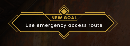
This week saw me delve into the world of vendor UI design, a task which proved to have its own unique challenges. I also created a simple ‘level select’ screen to be accessed in the bathyspheres.

Shop menu

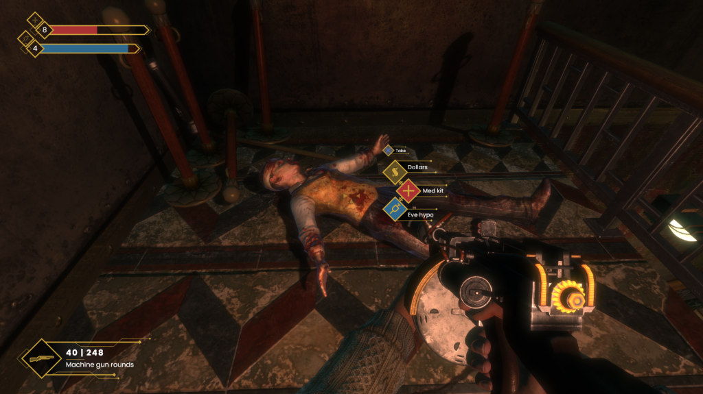
Within BioShock, vendors are an important interaction for the player as they allow them to purchase useful healing items, ammo, and weapon upgrades. As the player is often purchasing with a very limited currency, the design needs to be efficient and intuitive so that they have a good understanding of what they are spending their money on.

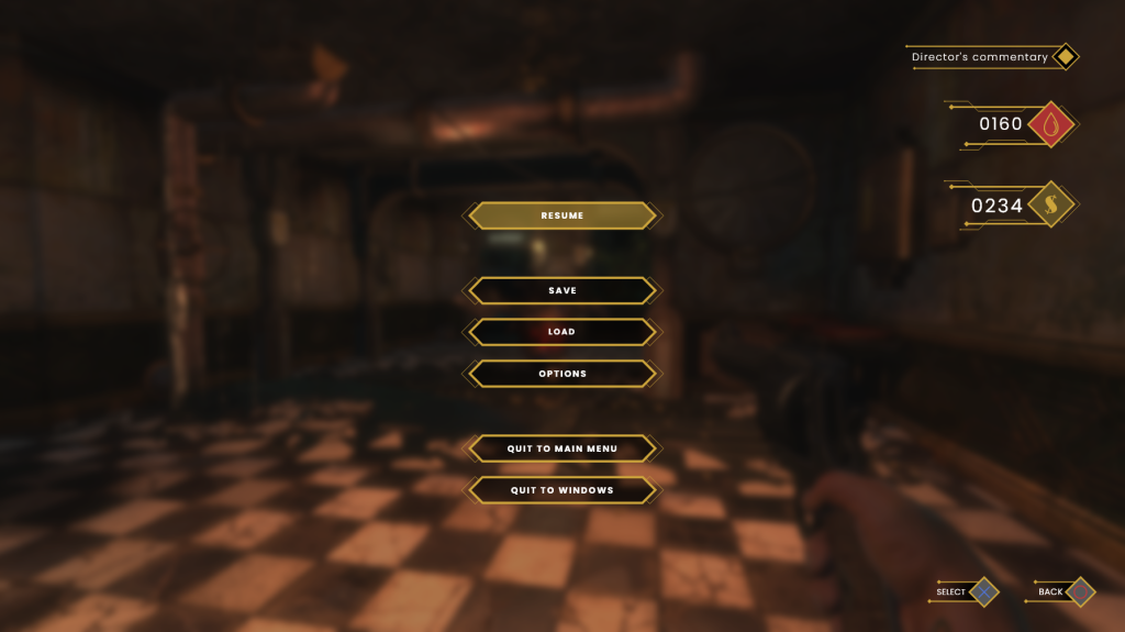
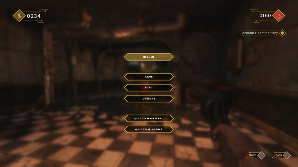
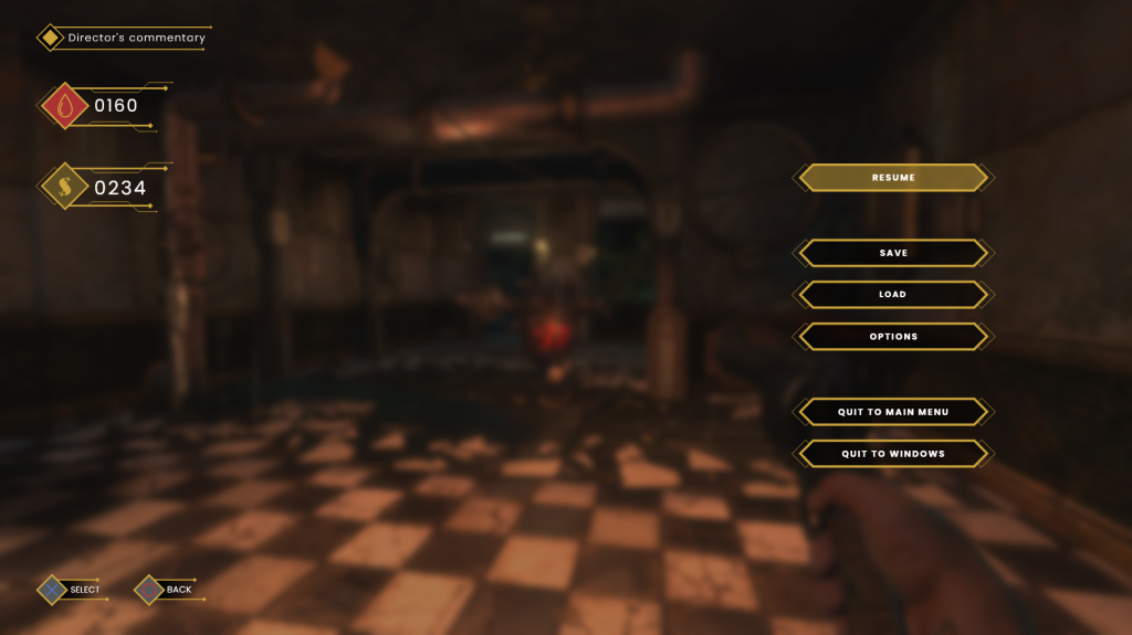
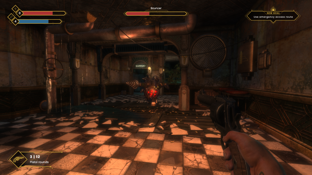
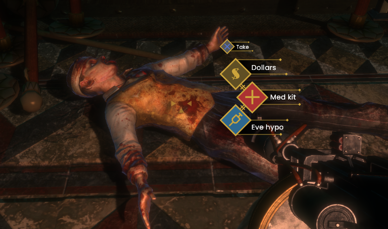
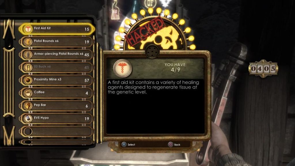
Looking at the design of the original’s vendor screens (fig. 1), I can see multiple areas for iteration. Item titles are not centred properly to their respective buttons. There is also a great deal of blank space to the right side of the screen, which could be better utilised. This is also where the currency count is located, the most pertinent information within this UI. As players read left-to-right and top-to-bottom, I feel a better location for this would be the top-left, where there is no risk of players missing it.

Figure 1: Screenshot. Original vendor UI from BioShock.

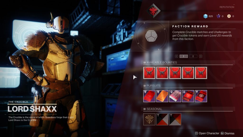
I took some time to research shop UI’s within more modern games to see if I could find current trends, or gleam any inspirations. The first I looked at was for Destiny 2 (2017), a game which has received a lot of deserved praise for its intuitive UI (fig. 2). The vendor UI uses grouping to organise elements pertaining to different systems, such as ‘faction rewards’, ‘miscellaneous’, and ‘daily bounty’. I like the horizontal arrangement of items in this context; it is much more instantly scannable and does not require the player to scroll to see all the elements they have access to.

Figure 2: 2017. Destiny 2 vendor UI screenshot. Interface in Game [online]. Available at: https://interfaceingame.com/screenshots/destiny-2-faction-reward/.

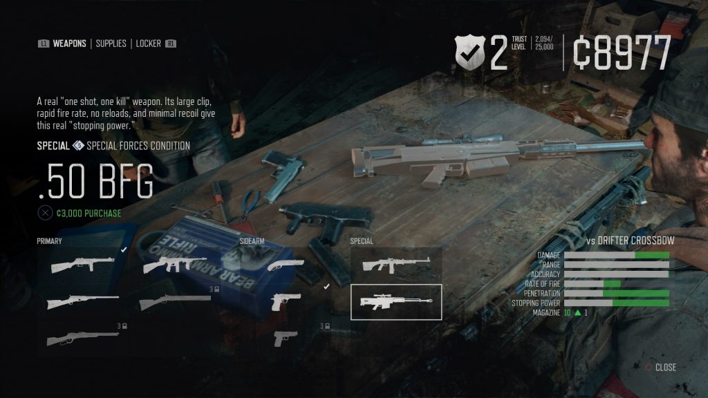
Days Gone (2019) shares some similarities in its vendor UI presentation (fig. 3). Horizontal grouping is used, with clean icons and large text denoting what each item is. Player currency is located at the top of the screen in a large font size that is very hard to miss. I like that the cost of each item is shown in a different colour, highlighting the important information.

Figure 3: Jake Green. 2019. Days Gone vendor UI screenshot. USgamer [online]. Available at: https://www.usgamer.net/articles/29-04-2019-days-gone-weapons-best-weapons-weapons-list-can-you-store-weapons

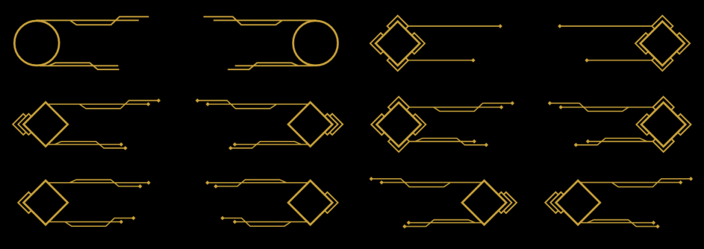
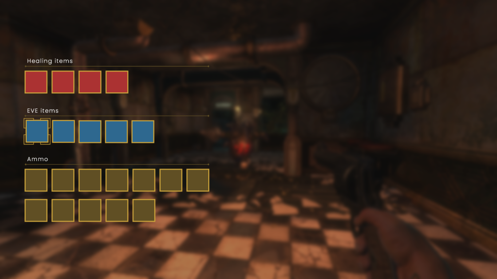
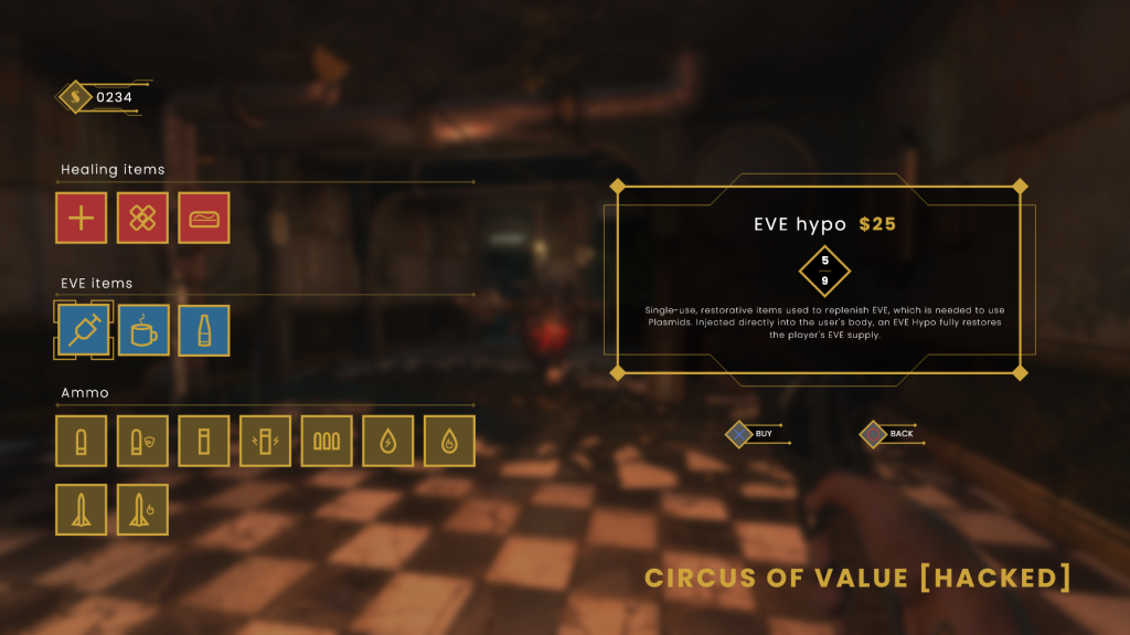
Taking both of these designs into account, I created my own vendor screen. I started by looking at the items generally available to players through in-game vendors and breaking them down into groups. I would argue that there are three groups of items – healing items, EVE replenishing items, and ammo. I intended to arrange my vendor UI around these groups for clarity. I then created three horizontal sections for these groups, with headers above. I experimented with a variety of shapes for the item slots, including diamond shapes and more elaborate line work. In the end, these all proved to get in the way of accessibility and simple squares proved to be the best fit (fig. 4). I created some simple corner borders around one slot to indicate which one the player had selected.

Figure 4: Screenshot. Vendor UI redesign process (first step) made by author.

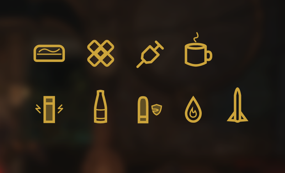
I enjoyed making simple icons for each item type, including bandages, cakes, coffee, soda and different ammunition types (fig. 5). My goal was to flatten and minimalise the original’s item icons to make for a more modern appearance which retains high readability. I am happy with the aesthetic I arrived at.

Figure 5: Screenshot. Consumable and ammo icons made by author.

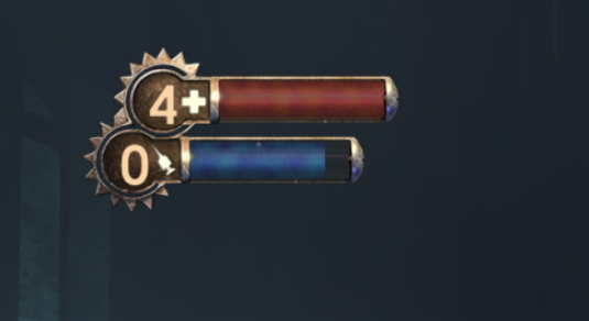
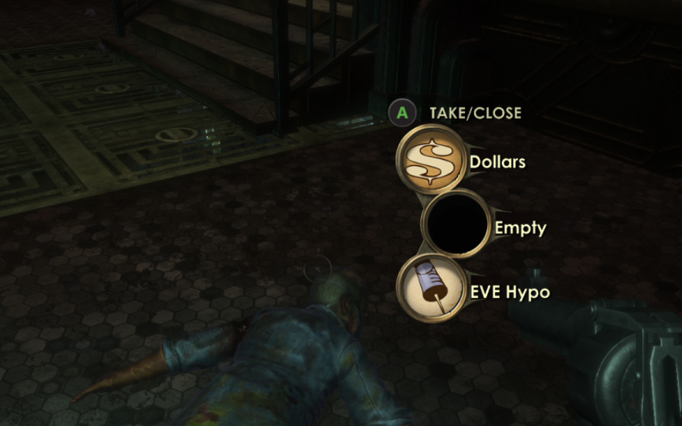
I then created a dialog box on the right hand side to display more information about the selected item. This box displays the item’s name and price, a brief description of it’s utility, and how many the player currently holds (if applicable). A currency count was added to the top-left (the first place user’s tend to scan from), and button prompts were placed below the dialog box. The name of the current vendor is located in the bottom left of the screen in a large, heavily-weighted font.

Figure 6: Screenshot. Finished vendor UI redesign made by author.

Location select

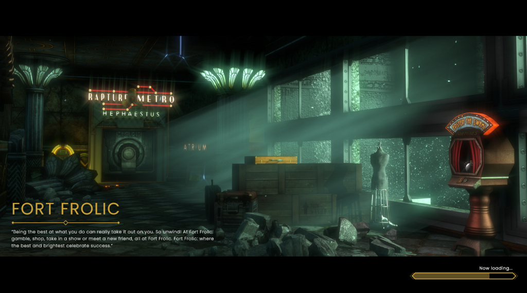
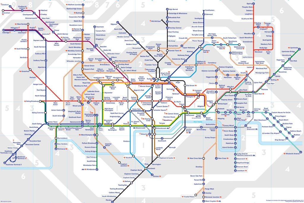
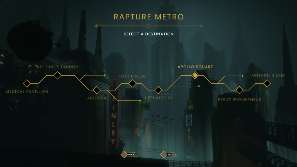
The next area of UI I tackled was the level/location select available to players when using a bathysphere. While an infrequently used screen, the original design is nicely themed to be aesthetically linked to the in-world Rapture Metro system. I wanted my design to be similarly themed in line with a metro system, this time taking the appearance of a rail map (fig. 8), to visually indicate the distance that the player is travelling between locations.

Figure 7: Screenshot. The Rapture Metro location select from the original BioShock.
Figure 8: BBC. London Underground Map. Available at: https://www.bbc.co.uk/london/travel/downloads/tube_map.html [accessed 29 October 2022].

Using the pen tool, I drew an angular path across the screen, moving up and down in 45 degree increments, to represent the main line of the metro system. At regular intervals, I placed a diamond on the path, each one representing one of the eight accessible locations. These were then labelled accordingly, with the currently selected level having a filled-in diamond and fully opaque title. To add some more believability to the rail map, I added some small paths diverging from the main line, to indicate other locations accessible via the metro. Final touches were then added, including a ‘Rapture Metro’ title, a subtitle directing the player to select a destination, and button prompts seen at the bottom (fig. 9).

Figure 9: Screenshot. Finished location select redesign made by author.

Research

In an attempt to increase my proficiency with my current toolset, I have started taking an online course on using Adobe XD (Scott 2022). Taught by a professional UI/UX designer, the course goes through the application in great detail, with practical tasks helping to cement the knowledge. The lecturer also takes time to describe how the design process works within a professional context, which has helped me to gain a better understanding of how this form of design works within industry. I am a quarter of the way through the 9.5 hour course and have already learnt some great keyboard shortcuts and less obvious features that have helped improve my workflow. I look forward to delving further into the course, where future lessons promise to cover animation, prototyping, and working in conjunction with other Adobe products.

References

BioShock. 2007. Irrational Games, 2K Games.

Days Gone. 2019. Bend Studio, Sony Interactive Entertainment.

Destiny 2. 2017. Bungie Inc, Activision.

SCOTT, Daniel Walter. 2022. ‘User Experience Design Essentials – Adobe XD UI UX Design’. Udemy [online] Available at: https://www.udemy.com/course/ui-ux-web-design-using-adobe-xd/ [accessed 26 October 2022].

List of figures

Figure 2: 2017. Destiny 2 vendor UI screenshot. Interface in Game [online]. Available at: https://interfaceingame.com/screenshots/destiny-2-faction-reward/.

Figure 3: Jake Green. 2019. Days Gone vendor UI screenshot. USgamer [online]. Available at: https://www.usgamer.net/articles/29-04-2019-days-gone-weapons-best-weapons-weapons-list-can-you-store-weapons

Figure 8: BBC. London Underground Map. Available at: https://www.bbc.co.uk/london/travel/downloads/tube_map.html [accessed 29 October 2022].

Redesigning Rapture Week Five – Quit Game and Audio Logs

Alongside my team project work, this week I have been steadily creating more UI screens and conducting personal research to better my understanding of UI/UX design.

Quit game screen

As I made a pause menu last week, I decided to create the quit game screen as a continuation. The original has a pleasant aesthetic, with simple, intuitive design (fig.1). This meant that not much needed to be iterated on, however I did of course need to adjust the design to be in keeping with my style. As the original’s ‘quit game’ button appears overlaid on the pause menu itself, I feel it creates unnecessary visual noise and clutter. For my design I would take the player to a separate screen with less distractions. I also felt that the text is not properly aligned with the center of the element, making for some noticeable empty space.

Figure 1: Screenshot. Original quit game dialog box from BioShock.

With these intentions in mind I began designing my rendition. The original shape I created resembled the ‘new objective’ element created in week three. While I feel this shape worked in its prior implementation, it is too asymmetrical for the purposes of a dialog box (fig. 2). What I created needed to better cater to player’s expectations, likely taking a rectangular shape.

Figure 2: Screenshot. First quit game iteration made by author.

The next version I made was very simple – simply a rectangular dialog box, with button prompts in the bottom center (fig. 3). As a wireframe, it is much more readable, and I used it as a basis to begin building on. I added more geometric lines and details, allowing myself to experiment with different shapes, while adhering to horizontal symmetry. Below are some of the iterations created (figs 4 & 5).

Figure 3: Screenshot. Second quit game iteration made by author.
Figure 4: Screenshot. Third quit game iteration made by author.
Figure 5: Screenshot. Fourth quit game iteration made by author.

Eventually I landed on a design I am happy with (fig. 6). It feels lavish enough to be considered Art Deco, while not detracting from readability and efficiency. It will also likely serve as a template for further dialog boxes that I design for this project.

Figure 6: Screenshot. Final quit game iteration made by author.

Audio logs

I have also begun creating the mock-up for the radio message collectible screen within the game. Audio logs are a central part of the BioShock experience, and the primary method by which narrative is delivered. Because of this, I want to make sure that this screen is fully intuitive so that players can find and listen to desired audio logs with little effort. The original menu feels slightly messy, with the centered text making for a lot of empty space to either side (fig. 7). Once clicked on, an entry takes you straight to another panel where it plays the audio alongside a written transcript. For my version, I would like to keep entries and transcripts on a single page, to minimise navigation.

Figure 8: Screenshot. Original audio log collectible screen from BioShock.

I began with the general outline of the panel, creating a centred rectangle and splitting it into three subsections; one for the page title, one for button selection, and one where the transcript and play/pause button will be located (fig. 9).

Figure 9: Screenshot. Radio message process (first step) made by author.

For the title section, I added some angular lines, allowing some to overflow from the base shape. I also added four diamonds to the top left in order to represent which page the player is on in relation to others (fig. 10). Buttons were stacked closely on top of each other within the left-hand portion of the screen. Alongside the title and character name that the original’s UI displays, I also ensured to include the level it was obtained in. A filled in diamond represents which entry is currently selected (fig. 11). The rest of the panel is taken up with a transcript of the audio log, a progress bar, and a play/pause button (fig. 12). I really like the overall profile of this area and I feel that the button and progress bar are optimal sizes. The text feels slightly too large and could likely be decreased.

Figure 10: Screenshot. Radio message process (second step) made by author.
Figure 11: Screenshot. Radio message process (third step) made by author.
Figure 12: Screenshot. Final rendition of the current radio message screen made by author.

Overall, while there is a fair amount that I like about this screen, I feel there is room for improvement. The overall navigation could be made more intuitive, and the buttons could be clearer, especially when highlighting a change in state. This will likely be a design that I come back to for further iteration.

Research

Next week I intend to begin designing some of the vendor screens for the game. This requires presenting multiple purchasable items on one screen, without overwhelming the player with choice. To help prepare myself for this I watched an interesting video essay on inventory UX design (Design Doc 2019). It showed the history of inventories in games and highlighted how they have evolved over the years. It stressed the point of making inventories feel intuitive, stacking multiple items, and allowing players to perform common actions with great ease. Ocarina of Time (1998) was brought up as an example of bad inventory design as within the Water Temple you have to frequently cycle between inventory pages to equip and unequip steel boots that allow for traversal. This could have been easily remedied by making the boots more easily accessible to save on time spent in the menu.

I have also been reading Lost in a Good Game (Etchells 2019), a memoir and exploration of the psychological effects (good, bad, and unknown) of video games. Author Pete Etchells is a professor of psychology and science communication and provides fascinating insights and anecdotes about the powerful healing abilities of engaging with video games. Game design is largely about understanding the psychology of players, and the more I can engage with this subject field the better placed I will be to understand and utilise psychology within my design. I look forward to delving deeper into this book.

References

BioShock. 2007. Irrational Games, 2K Games.

Design Doc. 2019. Inventory UX Design – How Zelda, Resident Evil, and Doom Make Great Game Menu UX [YouTube video]. Available at: https://www.youtube.com/watch?v=5_3BUU9ZmNo [accessed 21 October 2022].

ETCHELLS, Peter. 2019. Lost in a Good Game. London: Icon Press.

Ocarina of Time. 1998. Nintendo, Nintendo.

Redesigning Rapture Week Four – Loading Screens and Pause Menu

Having made a good start at redesigning the HUD, this week I have begun to tackle the menu systems of the game. Read on for my breakdown of each screen, and the research I have conducted to aid me.

Load save menu

For the load game screen, I wanted to create a sleek, readable menu, with each slot holding all information required at a glance. Looking at the original’s load game menu, I think it does a good job of displaying information, showing the exact time saved, the current level, and whether it is an autosave or not (fig. 1). The only piece of information I wanted to add to my version was the length of time played in hours, minutes and seconds. I always find it useful when a gameplay timer is included, and it is interesting to see exactly how long your playthrough has been thus far. I also feel that it makes it slightly easier to pinpoint which save you want to load into.

Figure 1: Screenshot. Load menu from BioShock.

For my rendition of the screen, I began with the basic skeleton of the original’s (with the top-centre title, vertically stacked buttons, and button prompts in the bottom-centre). I brought the title down slightly lower and added a simple divider below to separate it from the focus point of the screen (fig. 2).

Figure 2: Screenshot. Process for redesigned load menu.

I replaced the rounded semi-3D button design, with my own flat, angular bars that are stylistically consistent with the health bars on the HUD. I arranged the text information into three distinct groups, spacing them out evenly from left to right. To the far left is the time at point of save, both the date and the exact clock time. The former has been written in a heavier weighting than the latter, to create a visual hierarchy that draws attention to the date first as it is likely to be the most important piece of information. In the centre of the button is the name of the level the save was created within. To the far right is the playtime, and information on whether the save was manual or automatic, again employing a visual hierarchy with font weighting. While there is quite a lot of information held within each slot, I ensured to use a small font size and wide buttons to create a large amount of space between each group (fig. 3).

Figure 3: Screenshot. Process for redesigned load menu.

For the finishing elements, I created some simple button prompts that tell the player how to select an option, and back out. To the currently selected button I added a thicker outline, change in colour, and angular brackets to either side in order to clearly reflect the change in state. I added a subtle transparent gradient to the bottom of the buttons to better show that it is scrollable. Finally, I replaced the original’s dark background, with a dimmed screenshot of Rapture underwater, as I like the blue hue it gives the whole screen (fig. 4).

Figure 4: Screenshot. Finished redesign of the load save menu.

Loading screen

Having made a load save screen, it made logical sense to then move on to the actual loading screen – what the player will see while the game loads a level in the background. To help me better visualise my plan, I looked at examples from other games in an effort to gleam some techniques.

The loading screen for Dishonored 2 (2016) has a stylised feel, with the UI’s aesthetic heavily reflecting the world that the game takes place in (fig. 5). Messy, bleeding ink represents the grimy ‘whale-punk’ environment, and shattered glass belies it’s class divisions and political upheaval. The information presented to the players is neatly grouped; mission title and objective sit at the top left, and navigable hints are arranged in the bottom left, directly across from a simple load bar and location name. As evidenced here, in level-based games it is important that the loading screen shows you the area you are entering, and gives some information about the place.

Figure 5: Screenshot. Loading screen from Dishonored 2.

The next loading screen I looked at was for Final Fantasy XV (2016) (fig. 6). There is a great deal of restraint shown here, with the only information displayed being the location name, a brief description, and a loading wheel. Once again, an image of the locale is displayed, giving a visual description of the area, allowing for the description to be kept very brief. The use of black letterboxing is effective, as it creates a cinematic feel and creates anticipation for gameplay. I feel that the loading wheel is too far towards the center, creating a strange feel of empty space in the bottom right corner. This could be easily remedied by moving it to the bottom right of the screen.

Figure 6: Screenshot. Loading screen from Final Fantasy XV.

Taking what I learnt from these other effective load screens, I created my own for the Fort Frolic level (fig. 7). I used an atmospheric screenshot of the area that captures the look and feel of the space, and overlaid black letterboxing to create that cinematic feel. I then wrote out the location title, and the description below it. For the description, I chose an advertisement that plays on the PA announcement during the level, as I feel it helps retain verisimilitude while also effectively describing the location. Finally, I added a loading bar to the bottom right of the screen. I feel that this screen reads nicely from left to right, and leaves enough empty space to allow the player to get a full view of the image.

Figure 7: Screenshot. Finished redesign for the loading screen.
Figure 8: Screenshot. Original loading screen from BioShock.

Pause menu

The final screen I created this week was a reworked pause menu. The original one functions well, although I feel that there is an unnecessary number of UI groups on screen (fig. 9). When looking at it, I feel that the money, ADAM, and director’s commentary could easily be grouped together and make the whole screen easier to read. I also think that despite black ‘cut-out’ overlay of buildings being effective in raising the contrast for the lower UI elements, it also gives the overall interface a cheap feeling that I would like to remove.

Figure 9: Screenshot. Original pause menu from BioShock.

For my rendition, I began by taking a screenshot of gameplay and adding darker hue with background blur to soften hard edges and make sure the player’s eyes are focused on the UI. I then recreated the buttons, using the staple shapes that I have already used multiple times before. When arranging these buttons, I chose to separate out certain groups that pertain to different actions in an attempt to make the selection process a fraction easier. Resume is located at the top; generic actions such as saving, loading, and the options menu are the next group down; both quit actions take up the bottom two spaces. The ADAM, money, and director’s commentary checkmark are vertically arranged and placed on the left. The design of these elements is very similar to that of the weapon display found on the HUD, in order to keep visual consistency. I like this design as I feel that information is kept clear and visually consistent (fig. 10).

Figure 10: Screenshot. The finished redesign of the pause menu.

I struggled with the layout for this screen, going through about seven different arrangements before landing on one that worked well. The other layouts felt less intuitive for a variety of reasons, including the alignment of certain items being inconsistent, and the feeling that more importance was given to one UI group over the other (figs. 11, 12 & 13).

Figure 11: Screenshot. Variation one.
Figure 12: Screenshot. Variation two.
Figure 13: Screenshot. Variation three.

Research

Research this week largely took place on the ‘Interface in Games’ website (2022). This site hosts a large collection of UI interfaces, screenshots and videos from a wide array of AAA and indie titles. Games can be explored by genre, and specific filters can be applied such as ‘in-game’, ‘menu’, or ‘overlay’ allowing users to find the exact UI screens and elements they are looking for. I have found it to be a great tool to use when searching for inspiration and it has helped me to better identify UI patterns that players are accustomed to expecting. I have also been using ‘Game UI Database’ for the same purpose (2022).

References

BioShock. 2007. Irrational Games, 2K Games.

Dishonored 2. 2016. Arkane Studios, Bethesda Softworks.

Game UI Database. 2022. Available at: https://www.gameuidatabase.com/contribute.php [accessed 12 October 2022].

FINAL FANTASY XV. 2016. SQUARE ENIX CO., LTD., Square Enix.

Interface in Games. 2022. Available at: https://interfaceingame.com [accessed 12 October 2022].

Redesigning Rapture Week Three – HUD Reworks

Further HUD mock-ups

Following on from last week’s initial HUD mock-up, I have continued to create more in-game UI elements, including the health and EVE stats, loot prompts, enemy health, and objective notifications. See below for the finished mock-ups (figs. 1 and 2) and read on for my process in creating them.

Figure 1: Screenshot. HUD redesign with looting prompt made by author.
Figure 2: Screenshot. HUD redesign with enemy health and new goal made by author.

As with any successful interface, I want my UI rework to have a distinct, and consistent style that runs throughout. As already evidenced in the weapon display, I think that the use of diamond-shaped icons and angular lines will be core to this style and keep the visual profile close to that of the Art Deco movement.

I started by creating the health and EVE bars. Looking at the original UI, I like how the two are in a staggered layout, with the above bar coming further out than the bottom one. I decided to keep this structure but try to design for a more elegant appearance. I used diamonds as a basis for the icons and health kit/EVE hypo counts, with sleek rectangular bars proceeding outwards, capped out at a slanted 45-degree angle. These bars were each further detailed with thin, half-diamonds to add some more visual intrigue to the elements. I chose flat, muted colours for the fills, to prevent them from distracting the player during gameplay.

Figure 3: Screenshot. Original health and EVE bars from Bioshock.
Figure 4: Screenshot. Reworked health and EVE bars made by author.

Looking at the loot prompt for the original game, there is a lot that I like. I think that the placement is logical, and I like that the UI does not take the player to another screen, rather keeping them absorbed in the game world (something Bethesda would later adopt in Fallout 4 (2015).) I still felt that it could be slightly smaller, and made to look flatter, as the use of semi-3D UI only serves to break immersion and distract the player from the game world. Keeping this in mind, I designed a loot prompt that takes up less screen space, trims superfluous information, and adheres to the style that I am following. Along with readable icons, I have also opted for simple colour coding to telegraph to the player what each item does (red for healing, blue for EVE, brown for money.)

Figure 5: Screenshot. Original loot prompt from BioShock.
Figure 6: Screenshot. Loot prompt redesign made by author.

The next HUD element that I reworked was the enemy health bars that appear on screen when engaging in combat. In the original’s HUD, enemy health takes the form of a large crescent occupying the centre top-half of the screen. I feel that this UI element is by far one of the most distracting in the game and was in need of some revisions. To start with, I knew I wanted a smaller enemy bar, and I also wanted to include the name of the enemy it belonged to, as there are times when multiple enemies are on screen, and it would be useful to know exactly who you are shooting at. In order to achieve this minimal appearance, the crescent would have to be turned into a straight bar, and likely moved to the top-centre of the screen. The finished result is similar to that of Skyrim‘s (2011) enemy health bars, while in-keeping with the Art Deco theme. Just like the player health bar, I added half diamonds to either end in order to add more decorative flourish.

Figure 7: Screenshot. Enemy health bar from Bioshock.
Figure 8: Screenshot. Enemy health bar redesign made by author.

The final piece of HUD UI I created this week was the objective notification that alerts the player to their next goal. This UI piece is only on-screen for a limited time, so my goal was to create something that is visually distinct from the rest of the HUD and will draw the player’s eye to the important information. I went through multiple renditions of this, ranging from lavish designs to simplistic ones. I feel that what I ended up with was somewhere between those two extremes. I like the filled in diamond sat above the ‘new goal’ text, which serves as an anchor for the element and draws the player’s eye. I would like for this diamond to be animated, possibly flashing in and out of view, for greater visual draw.

Figure 9: Screenshot. Original ‘new goal’ prompt from BioShock.
Figure 10: Screenshot. ‘New goal’ prompt redesign made by author.

Spiritsweeper UI

I have also been undertaking UI work within my uni team’s game. We have recently had a large pivot in the game’s design, moving from an action-adventure game to a cosy exploration game. The gameplay is very different, and the UI and HUD will have to reflect that.

Our artist, Lou, created an initial illustration of an interior space that the player will be tasked with cleaning, which I was able to use as a base for my HUD mock-up. The progress bar is shaped like a large broom (the player’s primary tool in-game), serving as a piece of meta UI. I also created some contextual button prompts that will allow the player to understand the actions available to them at all times. While simple, this mock-up helped the team to better visualise the look of the game’s interface at this early stage of pre-production, and gave me some more experience within Adobe XD.

Figure 11: Screenshot. HUD mock-up made by author.

Research

My research for this week has largely been centered around an exceptionally useful GDC talk named ‘Art Direction for AAA UI’ (Younas 2018). Within the talk, Younas gives a broad look at the many principles of UI/UX design and their applications within games. The focus on AAA games was especially helpful as BioShock is a title that fits within that bracket.

Gestalt Theory was presented, which has a number of principles pertaining to the idea that “an organized whole, is perceived as greater than the sum of its parts” (Kurt Koffka). Using this, we can create UI that is understood holistically, with the player being able to pick up on patterns and symmetry and subconsciously grouping together elements that are in close proximity. In the case of BioShock, by placing both the health and EVE bars close together, the player is able to group the two together into one more manageable UI piece. In a more rudimentary sense, it also helps to limit the amount of time a player’s eyes are spent moving around the overlay to seek out information of similar pertinence.

Younas also provided some usability principles that apply to almost any game’s UI, which will prove so indispensable that I plan to print them out and stick them above my monitor. It is important to limit screens to seven or less unique UI groups, so as not to overwhelm the player. Menus should not be more than three levels deep, for ease of navigation and allowing the player to quickly return to the root. Buttons, sliders and checkboxes should largely look and function how players expect them to, and pages should flow in a hierarchy going from top-left to bottom-right (how the Western brain reads information.)

He also spoke in-depth about the importance of using a grid for layouts, considering multiple aspect ratios, utilising negative space, carefully selecting typography, understanding shape language and colour psychology. This was a fantastic talk, and one I will be revisiting in the future.

References

BioShock. 2007. Irrational Games, 2K Games.

Fallout 4. 2015. Bethesda Game Studios, Bethesda Softworks.

The Elder Scrolls V: Skyrim. 2011. Bethesda Game Studios, Bethesda Softworks. 

YOUNAS, Omer. 2018. Art Direction for AAA UI [GDC talk]. Available at: https://www.youtube.com/watch?v=kjbxxbmJCh [accessed 13 October 2022].

Redesigning Rapture Week Two – Adobe XD and Weapon Displays

Practicing Adobe XD

This week I have been continuing to learn and practice using Adobe XD, experimenting with the application’s tools and making some mock-ups. I am currently working on a group project, for which we are in the early stages of pre-production for a game. As part of this pre-production I created a mock-up for an inventory/stat screen (fig. 1).

I made an effort to ensure that the presentation of the UI was in keeping with the cosy aesthetic of the game we were making. Our concept centers around the collection of magic plants to empower your player in useful ways. To present this, I created three separate stacks, each representing a different type of plant, along with an icon for the stat they affect. Next to that is the current elemental effect applied to your weapon.

Figure 1: Screenshot. Inventory screen mock-up made by author.

Further to the right is the ‘stats’ panel that displays player health, stamina, and critical hit chance, as well as the description of the weapon’s effect. As a side note, I was able to use the prototype feature to set up a controller so that upon pressing the R1 button, the stat panel slides off screen (fig. 2). Pressing it again will bring the stat screen back into view. In both instances, I made it so that the rest of the UI scales and move in order to make space. While this is a small feature, its inclusion means that I can create some functional prototypes of working UI to further demonstrate how my designs would work.

Figure 2: Screenshot. Inventory screen mock-up made by author.

Along the top of the screen are UI pieces displaying carry capacity, current objective, and amount of currency. These pieces all had a drop shadow applied to them in order to add some more depth to the UI, and make the text more readable.

BioShock UI notes

Whilst BioShock (2007) is a game I know inside out, I wanted to dip back into it, this time with an eye towards the UI design. While playing I made some notes on it’s strengths, weaknesses, and possible improvements. Below are some examples of what was written.

  • The UI here is not poorly designed by any means, more so a product of its time.
  • The quest arrow at the top is iconic for how distracting it can be, there must be a subtler implementation of this idea.
  • Multiple fonts are used for different pieces of information, this detracts from overall readability and makes the UI feel less cohesive.
  • HUD elements look semi-3D, almost like they should be diegetic, makes for more visual noise and could be argued that it breaks immersion.
  • I like the general grouping of HUD elements, it reads clearly from top-left to bottom-right.
  • UI in general is a blend of Art Deco, and steampunk aesthetics, without fully committing to either. I would like to try and double down on the Art Deco half of this combination.
    • The sleek, clean lines of the style would afford a more minimal and immersive overlay.

In summary, BioShock‘s UI is far from horrible, but it certainly feels dated by today’s standards. For this reason, I feel that it is ripe for a redesign, with the challenge being to retain the distinct feel and usability, while streamlining and modernising the overall profile. To achieve this, a key decision I have made is to create UI that fully commits to the Art Deco aesthetic.

Early UI element concepts

Whilst I had been spending so much time in Adobe XD, I decided to create some mock-ups for a HUD piece that might fit with my concept of an entirely Art Deco inspired UI (fig. 3). I began by creating variations of a UI element that would display the currently selected weapon, alongside ammo-type and ammo count. These were made utilising Art Deco’s recognisable angular, perpendicular lines.

Figure 3: Screenshot. Weapon display mock-ups made by author.

I am pleased with a number of these designs, in particular, the middle left. I feel it adds enough flourish and ornaments, without detracting from overall readability. I initially created the piece using a circular base shape (seen in the top left) but quickly abandoned this idea as it feels incongruous to Art Deco’s sensibilities.

Taking the UI element, and overlaying it onto a screenshot of gameplay, I can already see its utility within the context of the game (fig. 4 ). In comparison to the corresponding HUD piece of the original (fig. 5 ), I feel that it makes for a more streamlined, unobtrusive piece of UI.

Figure 4: Screenshot. Gameplay screenshot overlaid with new weapon display made by author.
Figure 5: Screenshot. The original HUD seen during gameplay.

There are already some definite improvements to be made. I feel that the element could be made smaller, and I still need to include representation for the alternative ammo types. I look forward to filling out the rest of the HUD next week.

Research

To better ground myself in the era and style I am aiming for with this UI, I wanted to gain more understanding of the Art Deco movement. To help with this I watched a short YouTube documentary on the style (Curious Muse, 2021), taking notes of anything that could apply to my project. Key takeaways from this were the optimistic and hopeful feelings it aimed to instill, in response to the economic turmoil of a post-WW1 Europe. The movement had an eye to the future, intending to reflect aspects of modernity and prosper, representing this through the use of angular, perpendicular lines . Translating this style into UI design will entail carrying these core concepts over, something I have already begun to do in my concepts.

References

BioShock. 2007. Irrational Games, 2K Games.

BioShock 2. 2010. 2K Marin, 2K Games.

CURIOUS MUSE. 2021. Art Deco in 9 Minutes: Why Is It The Most Popular Architectural Style? [YouTube documentary]. Available at: https://www.youtube.com/watch?v=ZHF7vnbZD8Q [accessed 30 September 2022].