Having made a good start at redesigning the HUD, this week I have begun to tackle the menu systems of the game. Read on for my breakdown of each screen, and the research I have conducted to aid me.
Load save menu
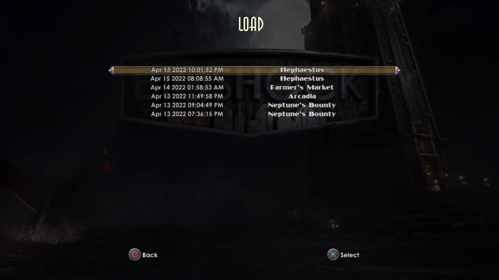
For the load game screen, I wanted to create a sleek, readable menu, with each slot holding all information required at a glance. Looking at the original’s load game menu, I think it does a good job of displaying information, showing the exact time saved, the current level, and whether it is an autosave or not (fig. 1). The only piece of information I wanted to add to my version was the length of time played in hours, minutes and seconds. I always find it useful when a gameplay timer is included, and it is interesting to see exactly how long your playthrough has been thus far. I also feel that it makes it slightly easier to pinpoint which save you want to load into.
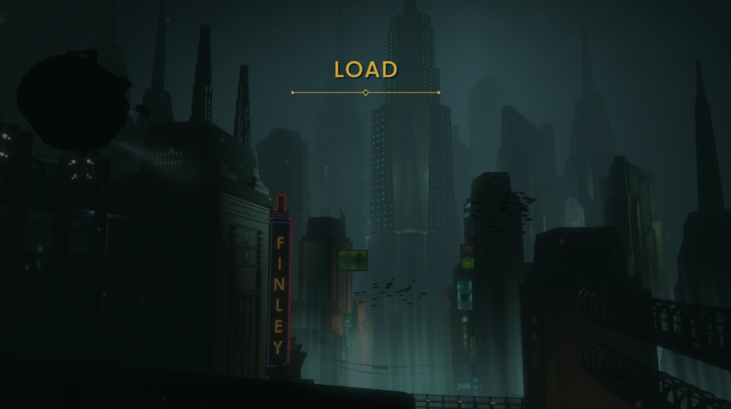
For my rendition of the screen, I began with the basic skeleton of the original’s (with the top-centre title, vertically stacked buttons, and button prompts in the bottom-centre). I brought the title down slightly lower and added a simple divider below to separate it from the focus point of the screen (fig. 2).
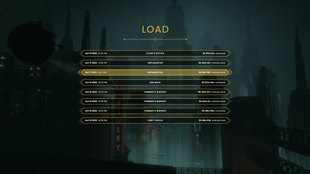
I replaced the rounded semi-3D button design, with my own flat, angular bars that are stylistically consistent with the health bars on the HUD. I arranged the text information into three distinct groups, spacing them out evenly from left to right. To the far left is the time at point of save, both the date and the exact clock time. The former has been written in a heavier weighting than the latter, to create a visual hierarchy that draws attention to the date first as it is likely to be the most important piece of information. In the centre of the button is the name of the level the save was created within. To the far right is the playtime, and information on whether the save was manual or automatic, again employing a visual hierarchy with font weighting. While there is quite a lot of information held within each slot, I ensured to use a small font size and wide buttons to create a large amount of space between each group (fig. 3).
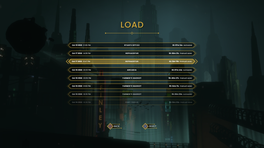
For the finishing elements, I created some simple button prompts that tell the player how to select an option, and back out. To the currently selected button I added a thicker outline, change in colour, and angular brackets to either side in order to clearly reflect the change in state. I added a subtle transparent gradient to the bottom of the buttons to better show that it is scrollable. Finally, I replaced the original’s dark background, with a dimmed screenshot of Rapture underwater, as I like the blue hue it gives the whole screen (fig. 4).
Loading screen
Having made a load save screen, it made logical sense to then move on to the actual loading screen – what the player will see while the game loads a level in the background. To help me better visualise my plan, I looked at examples from other games in an effort to gleam some techniques.
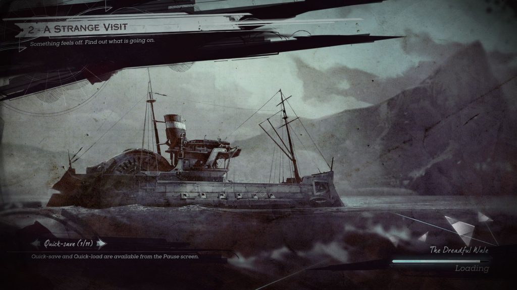
The loading screen for Dishonored 2 (2016) has a stylised feel, with the UI’s aesthetic heavily reflecting the world that the game takes place in (fig. 5). Messy, bleeding ink represents the grimy ‘whale-punk’ environment, and shattered glass belies it’s class divisions and political upheaval. The information presented to the players is neatly grouped; mission title and objective sit at the top left, and navigable hints are arranged in the bottom left, directly across from a simple load bar and location name. As evidenced here, in level-based games it is important that the loading screen shows you the area you are entering, and gives some information about the place.
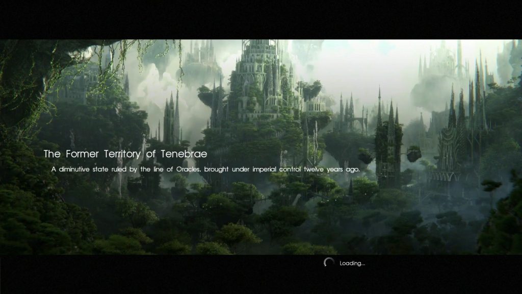
The next loading screen I looked at was for Final Fantasy XV (2016) (fig. 6). There is a great deal of restraint shown here, with the only information displayed being the location name, a brief description, and a loading wheel. Once again, an image of the locale is displayed, giving a visual description of the area, allowing for the description to be kept very brief. The use of black letterboxing is effective, as it creates a cinematic feel and creates anticipation for gameplay. I feel that the loading wheel is too far towards the center, creating a strange feel of empty space in the bottom right corner. This could be easily remedied by moving it to the bottom right of the screen.
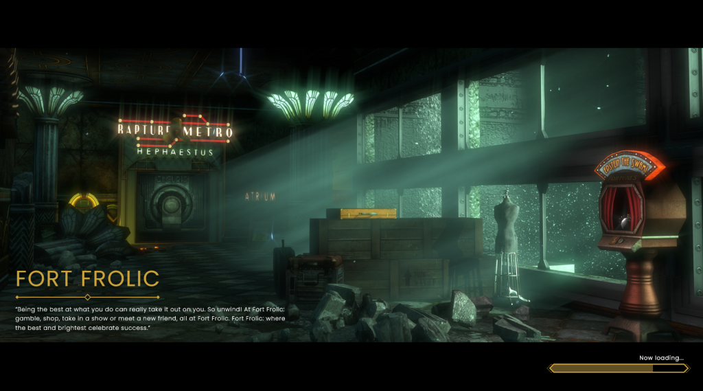
Taking what I learnt from these other effective load screens, I created my own for the Fort Frolic level (fig. 7). I used an atmospheric screenshot of the area that captures the look and feel of the space, and overlaid black letterboxing to create that cinematic feel. I then wrote out the location title, and the description below it. For the description, I chose an advertisement that plays on the PA announcement during the level, as I feel it helps retain verisimilitude while also effectively describing the location. Finally, I added a loading bar to the bottom right of the screen. I feel that this screen reads nicely from left to right, and leaves enough empty space to allow the player to get a full view of the image.
Pause menu
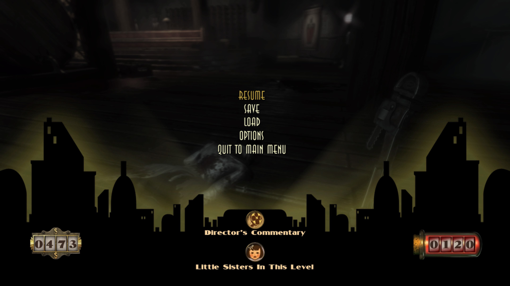
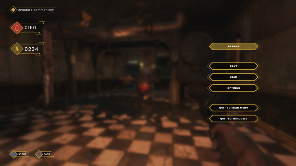
The final screen I created this week was a reworked pause menu. The original one functions well, although I feel that there is an unnecessary number of UI groups on screen (fig. 9). When looking at it, I feel that the money, ADAM, and director’s commentary could easily be grouped together and make the whole screen easier to read. I also think that despite black ‘cut-out’ overlay of buildings being effective in raising the contrast for the lower UI elements, it also gives the overall interface a cheap feeling that I would like to remove.
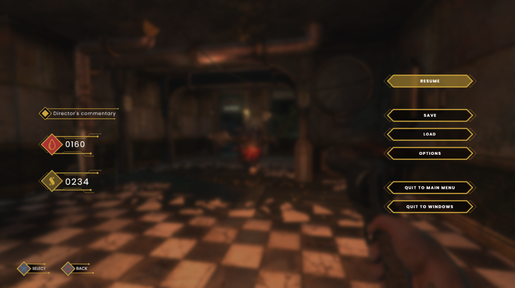
For my rendition, I began by taking a screenshot of gameplay and adding darker hue with background blur to soften hard edges and make sure the player’s eyes are focused on the UI. I then recreated the buttons, using the staple shapes that I have already used multiple times before. When arranging these buttons, I chose to separate out certain groups that pertain to different actions in an attempt to make the selection process a fraction easier. Resume is located at the top; generic actions such as saving, loading, and the options menu are the next group down; both quit actions take up the bottom two spaces. The ADAM, money, and director’s commentary checkmark are vertically arranged and placed on the left. The design of these elements is very similar to that of the weapon display found on the HUD, in order to keep visual consistency. I like this design as I feel that information is kept clear and visually consistent (fig. 10).
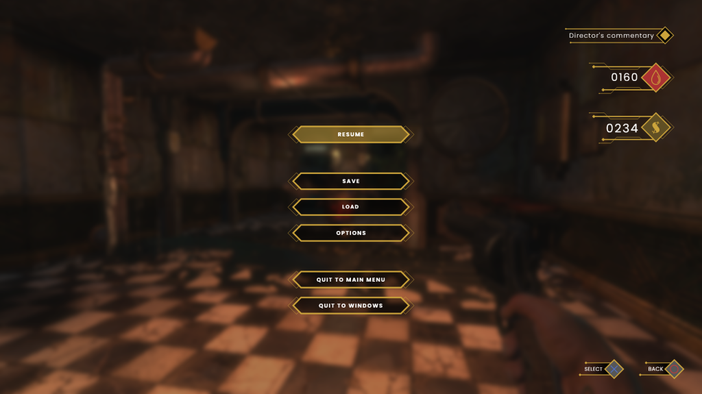
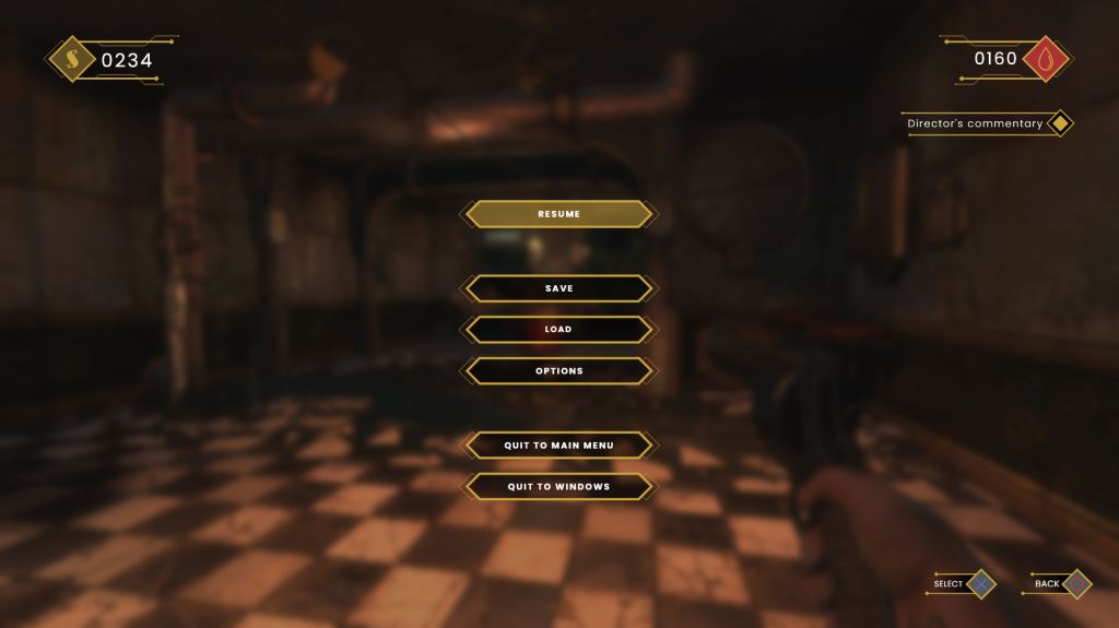
I struggled with the layout for this screen, going through about seven different arrangements before landing on one that worked well. The other layouts felt less intuitive for a variety of reasons, including the alignment of certain items being inconsistent, and the feeling that more importance was given to one UI group over the other (figs. 11, 12 & 13).
Research
Research this week largely took place on the ‘Interface in Games’ website (2022). This site hosts a large collection of UI interfaces, screenshots and videos from a wide array of AAA and indie titles. Games can be explored by genre, and specific filters can be applied such as ‘in-game’, ‘menu’, or ‘overlay’ allowing users to find the exact UI screens and elements they are looking for. I have found it to be a great tool to use when searching for inspiration and it has helped me to better identify UI patterns that players are accustomed to expecting. I have also been using ‘Game UI Database’ for the same purpose (2022).
References
BioShock. 2007. Irrational Games, 2K Games.
Dishonored 2. 2016. Arkane Studios, Bethesda Softworks.
Game UI Database. 2022. Available at: https://www.gameuidatabase.com/contribute.php [accessed 12 October 2022].
FINAL FANTASY XV. 2016. SQUARE ENIX CO., LTD., Square Enix.
Interface in Games. 2022. Available at: https://interfaceingame.com [accessed 12 October 2022].