Further HUD mock-ups
Following on from last week’s initial HUD mock-up, I have continued to create more in-game UI elements, including the health and EVE stats, loot prompts, enemy health, and objective notifications. See below for the finished mock-ups (figs. 1 and 2) and read on for my process in creating them.
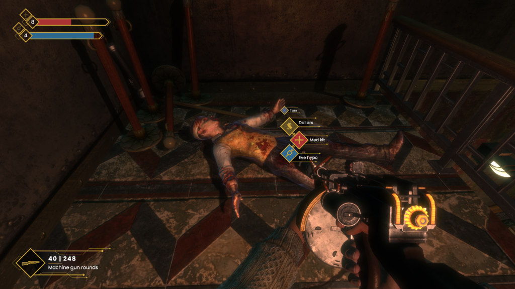
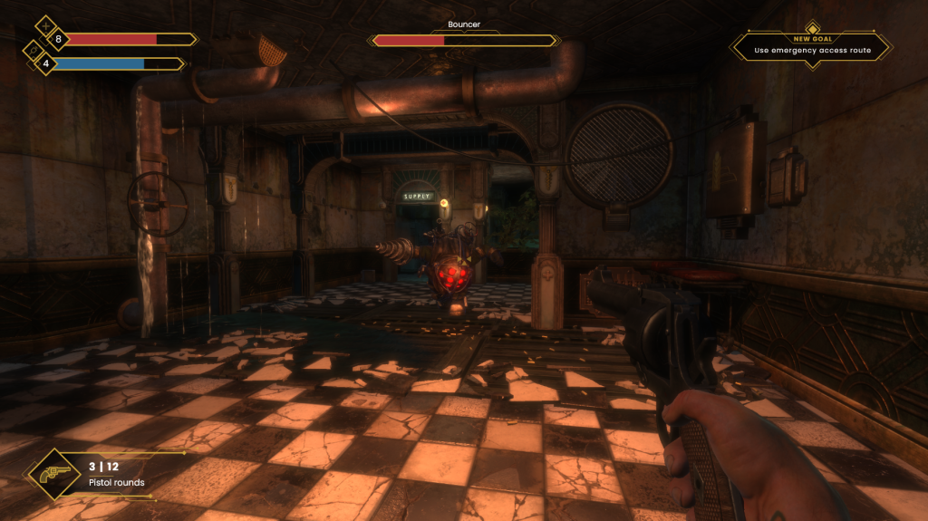
As with any successful interface, I want my UI rework to have a distinct, and consistent style that runs throughout. As already evidenced in the weapon display, I think that the use of diamond-shaped icons and angular lines will be core to this style and keep the visual profile close to that of the Art Deco movement.
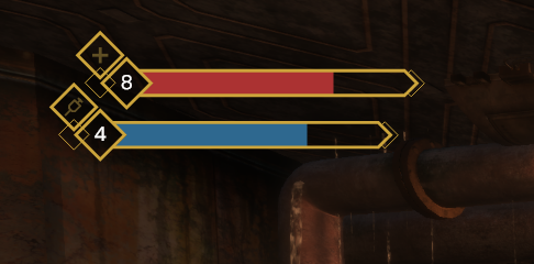
I started by creating the health and EVE bars. Looking at the original UI, I like how the two are in a staggered layout, with the above bar coming further out than the bottom one. I decided to keep this structure but try to design for a more elegant appearance. I used diamonds as a basis for the icons and health kit/EVE hypo counts, with sleek rectangular bars proceeding outwards, capped out at a slanted 45-degree angle. These bars were each further detailed with thin, half-diamonds to add some more visual intrigue to the elements. I chose flat, muted colours for the fills, to prevent them from distracting the player during gameplay.
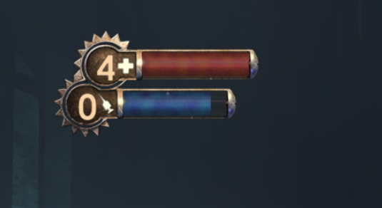
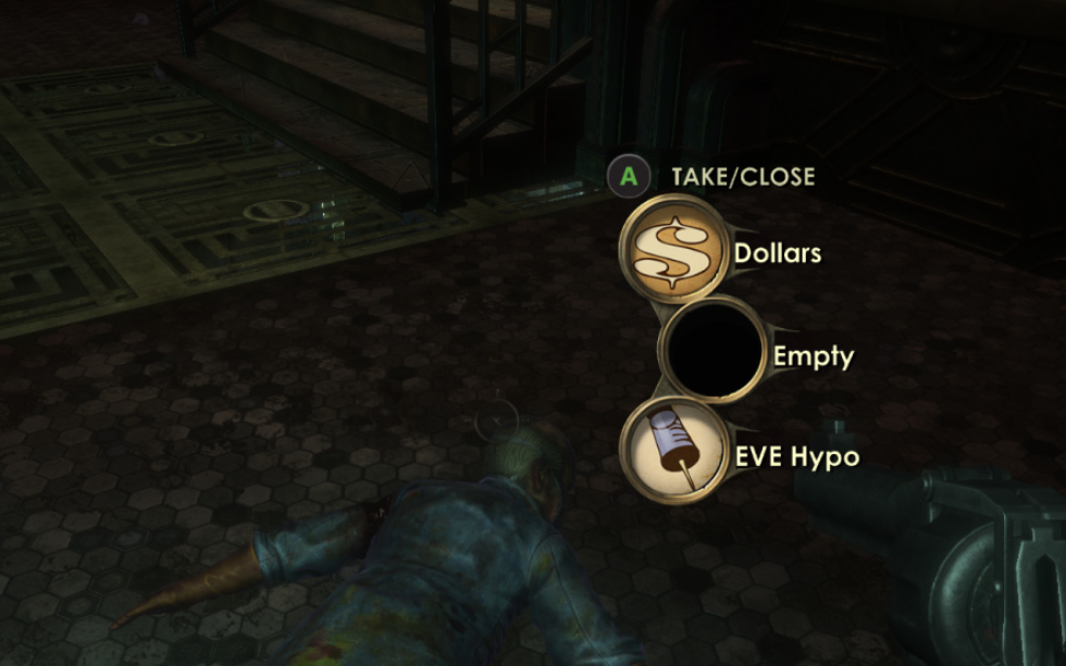
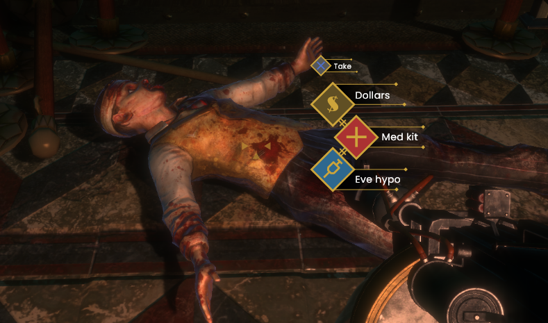
Looking at the loot prompt for the original game, there is a lot that I like. I think that the placement is logical, and I like that the UI does not take the player to another screen, rather keeping them absorbed in the game world (something Bethesda would later adopt in Fallout 4 (2015).) I still felt that it could be slightly smaller, and made to look flatter, as the use of semi-3D UI only serves to break immersion and distract the player from the game world. Keeping this in mind, I designed a loot prompt that takes up less screen space, trims superfluous information, and adheres to the style that I am following. Along with readable icons, I have also opted for simple colour coding to telegraph to the player what each item does (red for healing, blue for EVE, brown for money.)
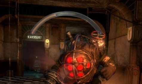
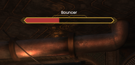
The next HUD element that I reworked was the enemy health bars that appear on screen when engaging in combat. In the original’s HUD, enemy health takes the form of a large crescent occupying the centre top-half of the screen. I feel that this UI element is by far one of the most distracting in the game and was in need of some revisions. To start with, I knew I wanted a smaller enemy bar, and I also wanted to include the name of the enemy it belonged to, as there are times when multiple enemies are on screen, and it would be useful to know exactly who you are shooting at. In order to achieve this minimal appearance, the crescent would have to be turned into a straight bar, and likely moved to the top-centre of the screen. The finished result is similar to that of Skyrim‘s (2011) enemy health bars, while in-keeping with the Art Deco theme. Just like the player health bar, I added half diamonds to either end in order to add more decorative flourish.
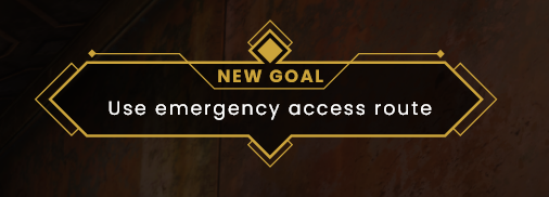
The final piece of HUD UI I created this week was the objective notification that alerts the player to their next goal. This UI piece is only on-screen for a limited time, so my goal was to create something that is visually distinct from the rest of the HUD and will draw the player’s eye to the important information. I went through multiple renditions of this, ranging from lavish designs to simplistic ones. I feel that what I ended up with was somewhere between those two extremes. I like the filled in diamond sat above the ‘new goal’ text, which serves as an anchor for the element and draws the player’s eye. I would like for this diamond to be animated, possibly flashing in and out of view, for greater visual draw.

Spiritsweeper UI
I have also been undertaking UI work within my uni team’s game. We have recently had a large pivot in the game’s design, moving from an action-adventure game to a cosy exploration game. The gameplay is very different, and the UI and HUD will have to reflect that.
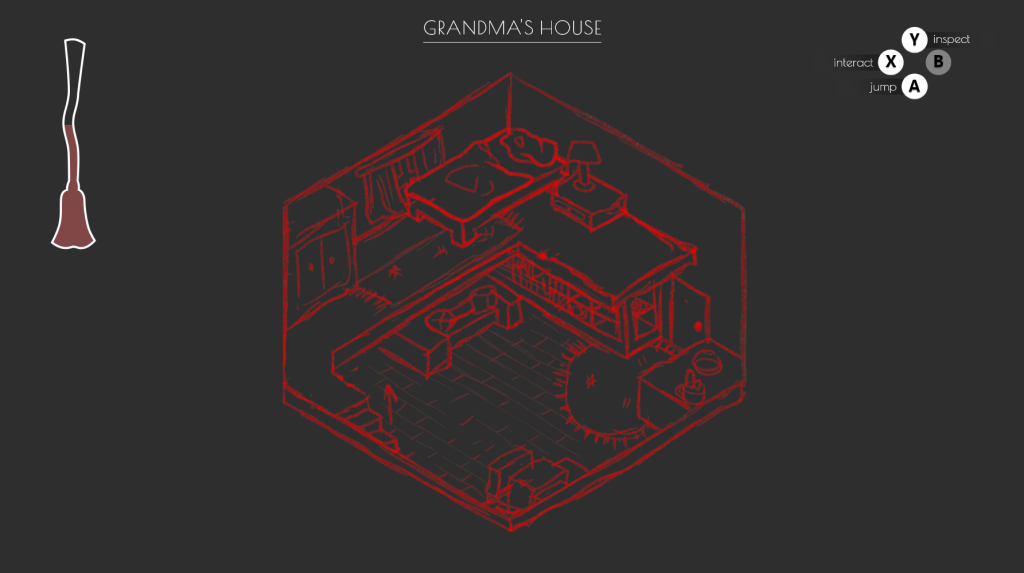
Our artist, Lou, created an initial illustration of an interior space that the player will be tasked with cleaning, which I was able to use as a base for my HUD mock-up. The progress bar is shaped like a large broom (the player’s primary tool in-game), serving as a piece of meta UI. I also created some contextual button prompts that will allow the player to understand the actions available to them at all times. While simple, this mock-up helped the team to better visualise the look of the game’s interface at this early stage of pre-production, and gave me some more experience within Adobe XD.
Research
My research for this week has largely been centered around an exceptionally useful GDC talk named ‘Art Direction for AAA UI’ (Younas 2018). Within the talk, Younas gives a broad look at the many principles of UI/UX design and their applications within games. The focus on AAA games was especially helpful as BioShock is a title that fits within that bracket.
Gestalt Theory was presented, which has a number of principles pertaining to the idea that “an organized whole, is perceived as greater than the sum of its parts” (Kurt Koffka). Using this, we can create UI that is understood holistically, with the player being able to pick up on patterns and symmetry and subconsciously grouping together elements that are in close proximity. In the case of BioShock, by placing both the health and EVE bars close together, the player is able to group the two together into one more manageable UI piece. In a more rudimentary sense, it also helps to limit the amount of time a player’s eyes are spent moving around the overlay to seek out information of similar pertinence.
Younas also provided some usability principles that apply to almost any game’s UI, which will prove so indispensable that I plan to print them out and stick them above my monitor. It is important to limit screens to seven or less unique UI groups, so as not to overwhelm the player. Menus should not be more than three levels deep, for ease of navigation and allowing the player to quickly return to the root. Buttons, sliders and checkboxes should largely look and function how players expect them to, and pages should flow in a hierarchy going from top-left to bottom-right (how the Western brain reads information.)
He also spoke in-depth about the importance of using a grid for layouts, considering multiple aspect ratios, utilising negative space, carefully selecting typography, understanding shape language and colour psychology. This was a fantastic talk, and one I will be revisiting in the future.
References
BioShock. 2007. Irrational Games, 2K Games.
Fallout 4. 2015. Bethesda Game Studios, Bethesda Softworks.
The Elder Scrolls V: Skyrim. 2011. Bethesda Game Studios, Bethesda Softworks.
YOUNAS, Omer. 2018. Art Direction for AAA UI [GDC talk]. Available at: https://www.youtube.com/watch?v=kjbxxbmJCh [accessed 13 October 2022].