Overhauling the typeface
After putting it off for much of the project, I finally decided to change the core font used within the redesign. This was something that I had been planning to do for a while, as while I like the clean look of the Poppins typeface, I feel that it clashes with the Art Deco styling of the rest of the UI elements. Following a talk with my lecturer, where he pointed out the same issue, I decided to overhaul the typeface.
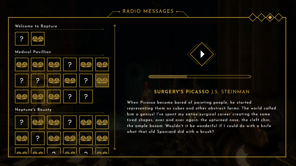
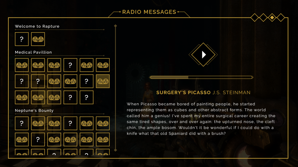
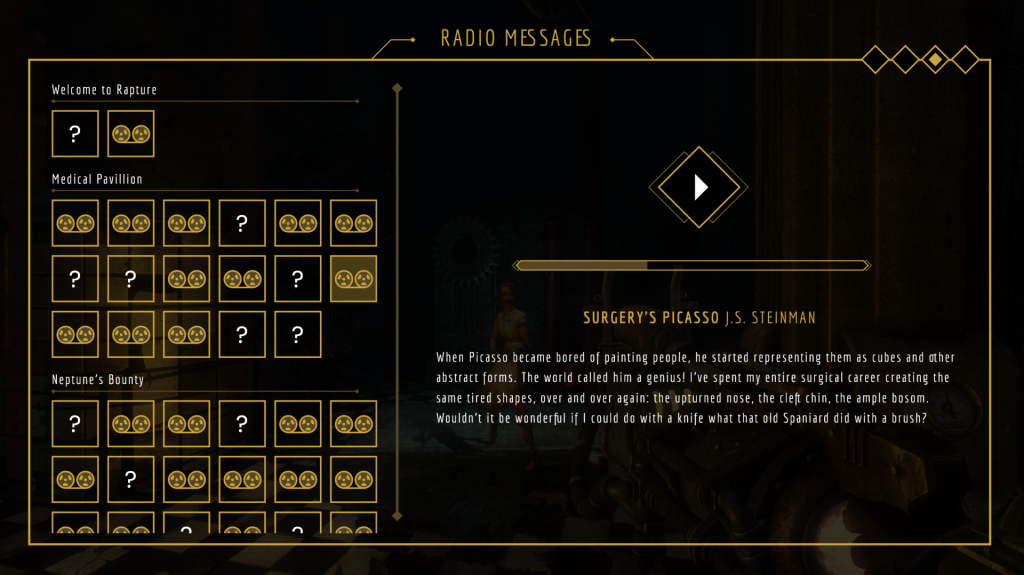
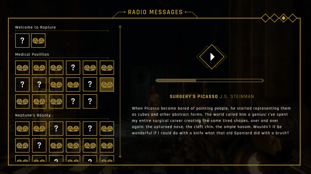
I started by going to Adobe Fonts and browsing via tags, including ‘sans serif’ and ‘geometric’. From this search, I selected a handful of potential fonts that I thought could work within the project. After activating them, I set about creating side by side screen comparisons (figs. 1, 2 and 3). I chose to use the ‘audio log’ UI for my comparison screens as it contains the most amount of text and uses various weightings. After changing each screen and observing them side by side, I chose to use the Rajdhani typeface (fig. 4) as I feel that it has a sleek, modern styling that fits an Art Deco theme, while retaining a great amount of readability.
Having settled on a new typeface, I set about altering each finished screen, replacing the Poppins font with Rajdhani. I am very happy with how these screens look now and I feel the user experience has been greatly improved by the new typeface which allows for a much easier reading experience. There were some instances where I had to shift font weightings, sizes, and text spacing in order to make allowances for Rajdhani’s thinner lettering. Due to this, I feel that it is important to secure a final typeface early on in the development of your UI as changing it can impact your designs in significant ways.
Photo feedback
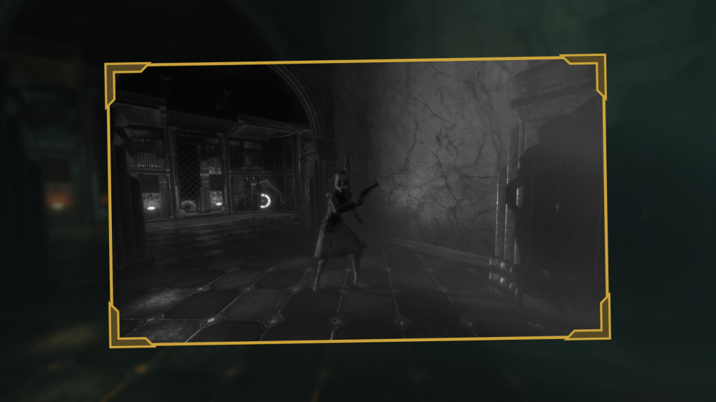
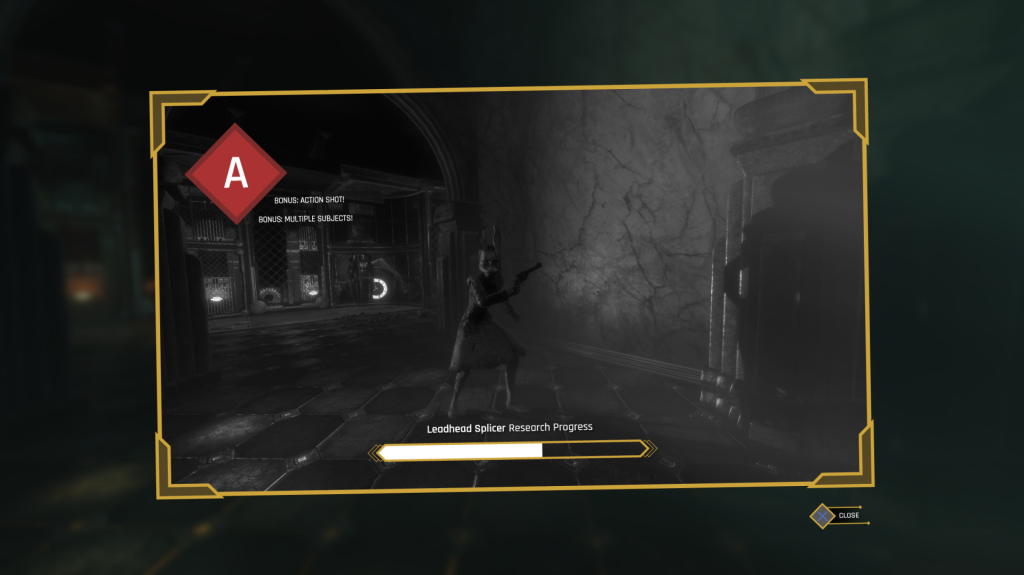
The next screen that I focused on was the research feedback for the camera mechanic. In-game, players are able to take photos of enemies in order to ‘research’ them and gain helpful perks. Each photo is graded based on quality, with contributing factors such as action shots and multiple subjects being in the image. I liked the skeuomorphism of the original screen which is made to look like a film photo, and wanted to retain that aesthetic (fig. 5).
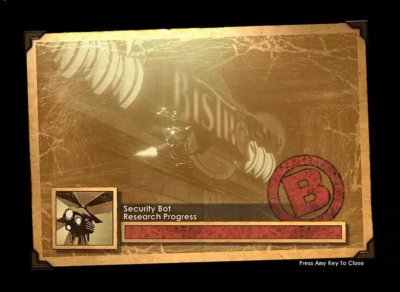
I created a similar shape to the original, with more minimal stylisation. I ensured to replicate the thick corner borders, and very slightly rotated the entire shape to make it look more like a physical object. I then placed the image inside of it, in this case, a screenshot of a ‘leadhead splicer’ in an action shot, and made it grayscale (fig. 6).
Next, I created a large red diamond icon for the grade to be displayed on. The location of this was moved to the top left of the UI element, as it is a salient piece of information for the player. Score bonuses were also re-positioned to be right next to the grade, in order to better group the information. I then created the research progress bar, which has a very similar profile to that of the previously created enemy health bar. I changed the colour of the fill to white in order to better distinguish it from health. Finally, I placed a ‘close’ prompt below the bottom right portion of the element (fig. 7).
Research
As I spent time tackling typefaces and text arrangement, I decided to take some time to deepen my understanding of the area. I found a GDC talk by Inkle’s Joseph Humfrey on ‘Designing Text UX for Effortless Reading’ (Humfrey 2018). This talk was surprisingly engaging, and led me to consider how small design considerations can greatly affect a user’s experience when consuming text. Humfrey highlighted focus and pacing as the two pillars of effective text UX, with various elements such as typeface, animation and sectioning contributing to them. Generous margins and paragraph spacing should be employed to allow the text space to ‘breath’, while you should aim to have no more than fifteen words per line in order to prevent the player losing their location within the writing. All of these considerations come together to make it so that “ideally the player should never have to think – the words just drop into their brain” (Humfrey 2018). These lessons are applicable to any form of text presentation within games, and I will refer to them to ensure that text consumption is enjoyable for the player, rather than feeling like a chore.
References
BioShock. 2007. Irrational Games, 2K Games.
HUMFREY, Joseph. 2018. Designing Text UX for Effortless Reading [GDC talk]. Available at: https://www.youtube.com/watch?v=x4G8UNiE560&t=623s [accessed 16 November 2022].