Redesigning Rapture Week Ten – Main Menu and Prototyping

Main menu

As I approach the end of this project, I decided to finally create an important front-end screen that no UI redesign would be complete without: the main menu. Main menus are a vital part of any game, as they have the opportunity to create a strong first impression with the player, and skilful design can help to effectively represent the atmosphere of the game as a whole.

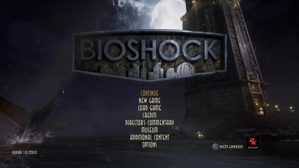
The original BioShock has a nicely presented main menu screen, with the game’s logo taking centre-stage, drawing the player’s eye and appropriately reflecting the nautical aesthetic of an underwater city (fig. 1). Buttons are arranged vertically below it, and the backdrop shows the game’s iconic lighthouse above water, creating a feeling of anticipation for the eventual descent. For my redesign, I wanted to present the logo in a manner that is minimal, while still reflective of the lavish Art Deco aesthetic. I also wanted to better convey the buttons as interactable objects and employ grouping in their arrangement

Figure 1: Screenshot. The original main menu from BioShock.

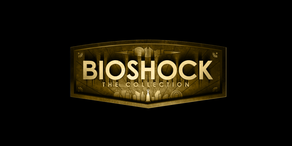
I started by tackling the game’s logo. To make mine look flatter, I started by drawing over the original’s, using the pen tool to draw simple linework that represents the various structures. I then wrote the title of the game in large, boldface lettering, occupying the centre of the logo (fig. 2). While there were elements that I like about this revised logo, I felt that the whole thing looked markedly worse than the existing one. It felt like a weak first impression for the player, while the original does such a good job at setting the tone. This led me to take a PNG of the logo and simply add a gold colour grading to it, to make it look appear more harmonious with the colours of the rest of my design (fig. 3). This instantly looked much better than my previous attempt and I am much happier with this direction.

Figure 2: Screenshot. The initial logo design, featuring simple, flat line work.
Figure 3: Screenshot. The final logo, featuring a colour graded version of the original’s.

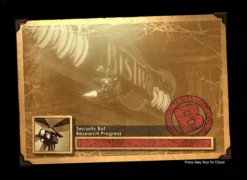
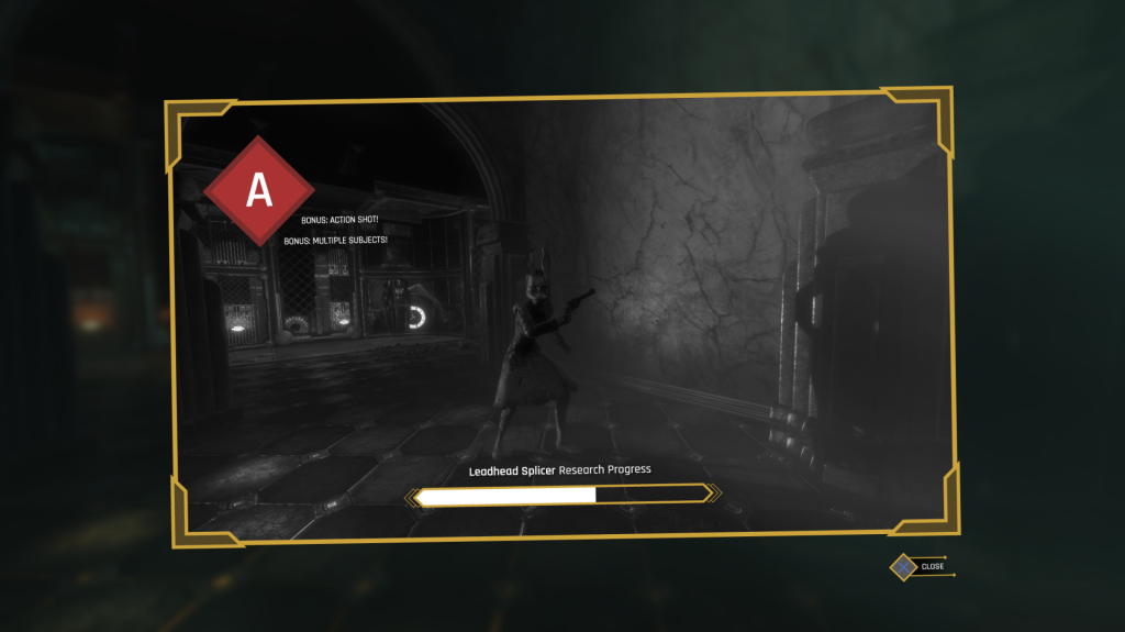
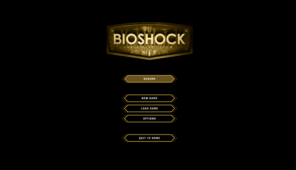
Next, I created the buttons. These did not take very long as they are essentially the same appearance as those seen in the previously created pause menu. I created buttons for ‘Resume’, ‘New Game’, ‘Load Game’, ‘Options’, and ‘Quit Game’, grouping them based on utility. These were placed under the logo, which I resized and positioned nearer the top of the screen (fig. 4).

Figure 4: Screenshot. Main menu redesign process (step one) made by author.

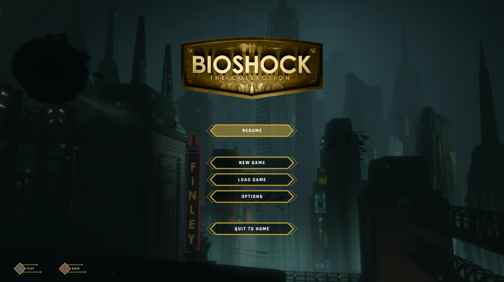
Finally, I added in button prompts in the bottom-left and placed a background (fig. 5). Much like the rest of my screens, the background was darkened for better readability.

Figure 5: Screenshot. Finished main menu redesign process made by author.

Prototyping

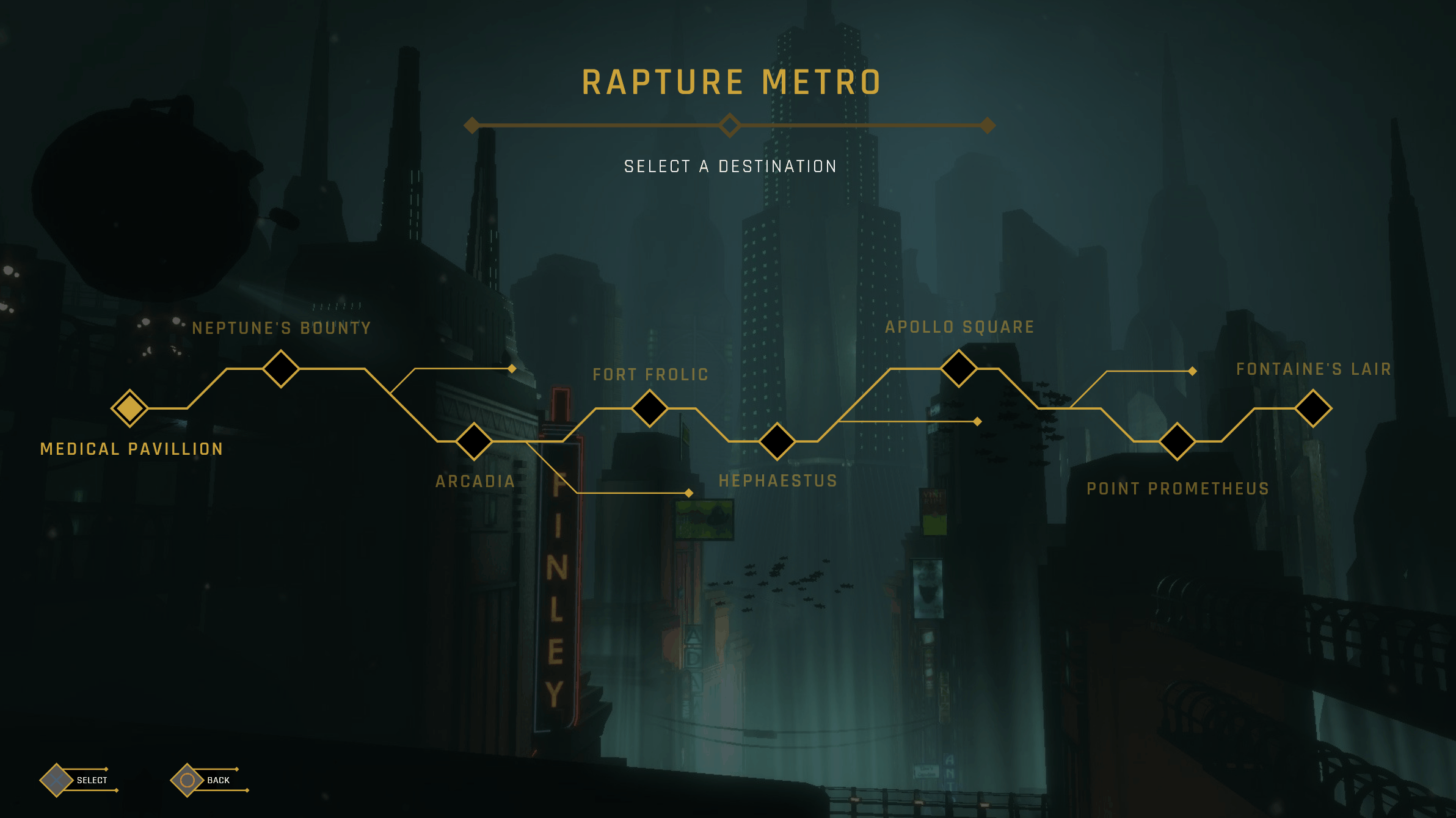
With the main menu finished, I now had fifteen completed UI screens. I am happy with this as a final number, as many of the projects I have researched seem to favour quality over quantity. While I could rush to attempt other designs, I feel that the screens I have currently make for a focused, coherent project when viewed together. This also gave me more time to embark on an important element of the project: prototyping.

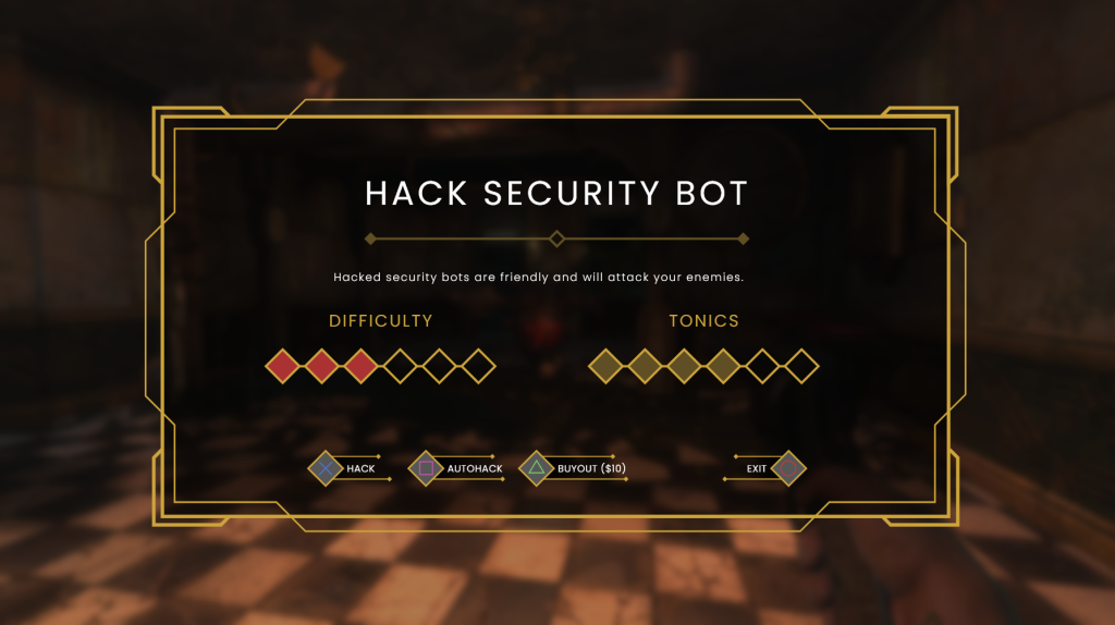
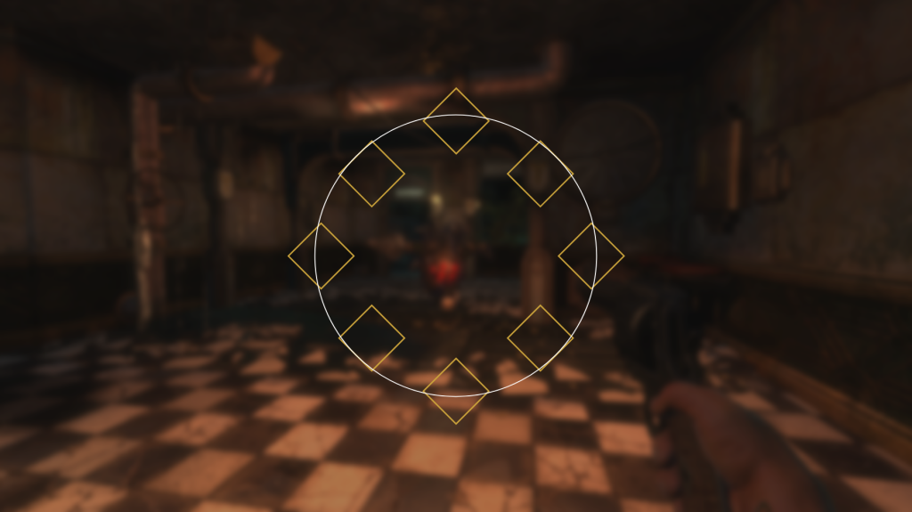
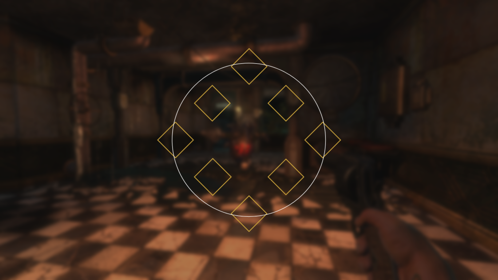
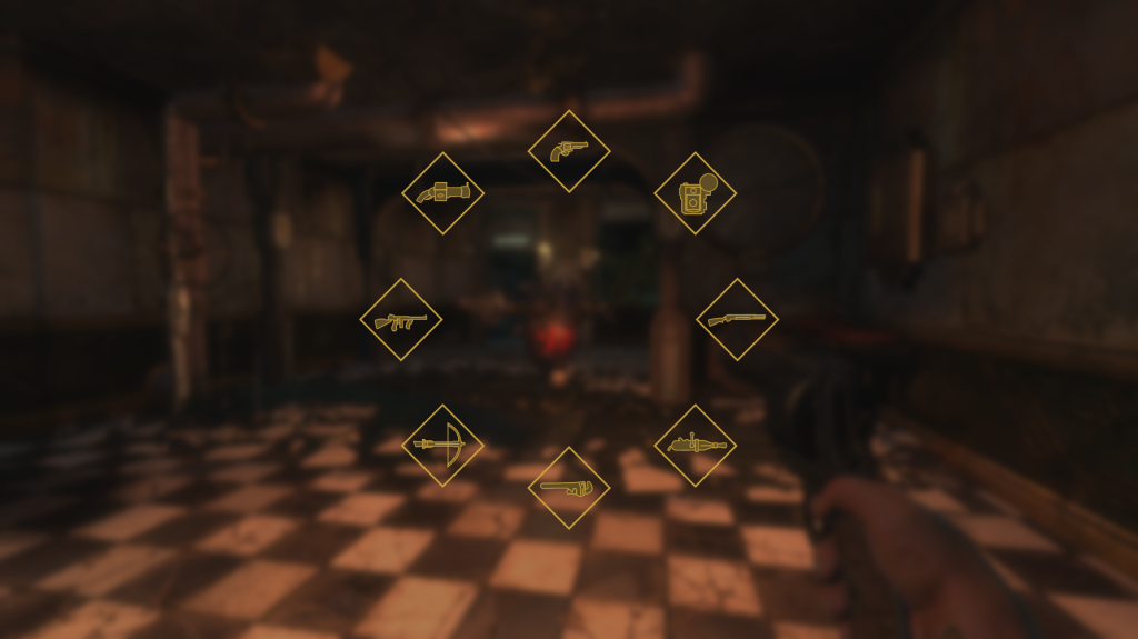
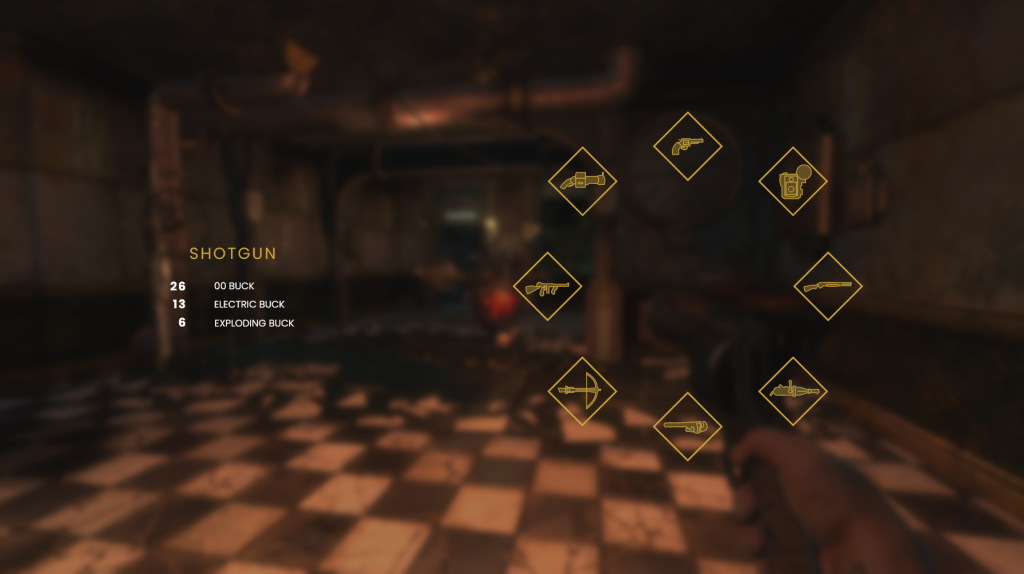
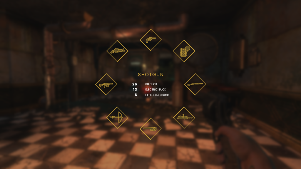
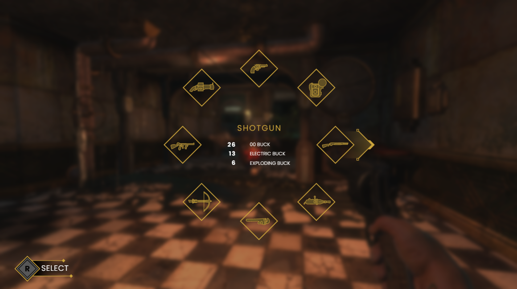
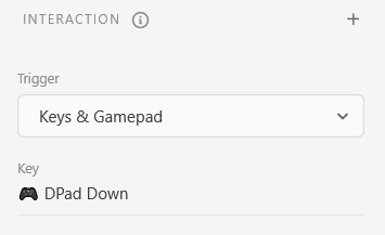
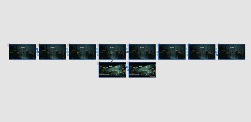
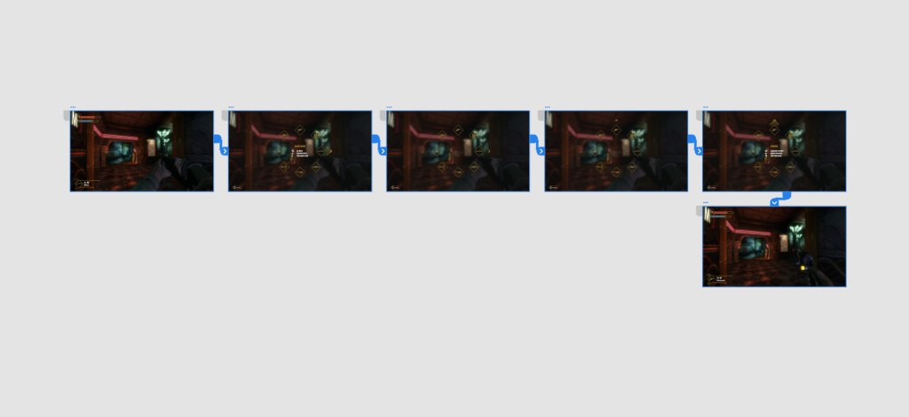
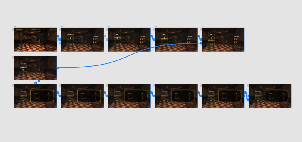
Adobe XD’s prototype tools allow for designers to create animated wireframes that can effectively represent the flow of UI navigation. In order to better illustrate how my UI designs would function in-game, I took advantage of this tool to create interactive, animated versions of my wireframes. I was even able to make it so that transitions were handled by controller inputs (fig. 6), which meant that users can essentially navigate through the UI using a console controller.

Figure 6: Screenshot. Interaction settings allowing for controller inputs

Creating these prototypes was a fun challenge, and I enjoyed experimenting with different animations speeds and easing’s to create the best user experience. Seeing my designs come to life through this level of interaction is a great joy, and makes them seem even more believable as in-game UI. See below for some of the finished animations, and the ‘flow’ (visual scripting) that makes them work.

Figure 7: GIF. UI interaction for location selection.
Figure 8: Screenshot. Prototype ‘flow’ for the above UI interaction/animation.
Figure 9: GIF. UI interaction for weapon selection.
Figure 10: Screenshot. Prototype ‘flow’ for the above UI interaction/animation.
Figure 11: GIF. UI interaction for the pause and options menu.
Figure 12: Screenshot. Prototype ‘flow’ for the above UI interaction/animation.

Research

This week, I watched an excellent talk on using UI to reflect the aesthetics, culture, and visual rules of the fictitious world a game is set in (Chow 2018). The lecturer makes the resonant statement that “UI is an opportunity to reflect your games world and strengthen your game’s visual branding through narrative, graphics and usability” (Chow 2018). This is certainly something that I have been aiming to do with this current redesign project; using UI as an opportunity to reinforce the once decadent, lavish world of Rapture.

Chow goes on to explain the three phases of creating immersive UI: research, exploration, and iteration. All three of these are shown to be crucial to the development process. UI designers must take the time to research the world that the game exhibits, seeking visual influences, patterns, and textures that can be adopted into the UI. They must then allow time for exploration of different UI screens, creating a variety of wireframes that utilise different approaches (skeuomorphic vs flat, diegetic vs non-diegetic etc.) in order to understand what works and what doesn’t. Once a certain style has been landed on, iteration is crucial as designers refine elements such as readability, personality, and layout in pursuit of accessible UI.

References

BioShock. 2007. Irrational Games, 2K Games.

CHOW, Steph. 2018. Immersing a Creative World into a Usable UI [GDC talk]. Available at: https://www.youtube.com/watch?v=ONYmBBZiBj8 [accessed 25 November 2022].

Redesigning Rapture Week Nine – Photo Feedback and Font Overhaul

Overhauling the typeface

After putting it off for much of the project, I finally decided to change the core font used within the redesign. This was something that I had been planning to do for a while, as while I like the clean look of the Poppins typeface, I feel that it clashes with the Art Deco styling of the rest of the UI elements. Following a talk with my lecturer, where he pointed out the same issue, I decided to overhaul the typeface.

I started by going to Adobe Fonts and browsing via tags, including ‘sans serif’ and ‘geometric’. From this search, I selected a handful of potential fonts that I thought could work within the project. After activating them, I set about creating side by side screen comparisons (figs. 1, 2 and 3). I chose to use the ‘audio log’ UI for my comparison screens as it contains the most amount of text and uses various weightings. After changing each screen and observing them side by side, I chose to use the Rajdhani typeface (fig. 4) as I feel that it has a sleek, modern styling that fits an Art Deco theme, while retaining a great amount of readability.

Figure 1: Screenshot. Font overhaul using Josefin Sans.
Figure 2: Screenshot. Font overhaul using Raleway.
Figure 3: Screenshot. Font overhaul using Economica.
Figure 4: Screenshot. Font overhaul using Rajdhani, the chosen typeface.

Having settled on a new typeface, I set about altering each finished screen, replacing the Poppins font with Rajdhani. I am very happy with how these screens look now and I feel the user experience has been greatly improved by the new typeface which allows for a much easier reading experience. There were some instances where I had to shift font weightings, sizes, and text spacing in order to make allowances for Rajdhani’s thinner lettering. Due to this, I feel that it is important to secure a final typeface early on in the development of your UI as changing it can impact your designs in significant ways.

Photo feedback

The next screen that I focused on was the research feedback for the camera mechanic. In-game, players are able to take photos of enemies in order to ‘research’ them and gain helpful perks. Each photo is graded based on quality, with contributing factors such as action shots and multiple subjects being in the image. I liked the skeuomorphism of the original screen which is made to look like a film photo, and wanted to retain that aesthetic (fig. 5).

Figure 5: Screenshot. Research progress UI from BioShock.

I created a similar shape to the original, with more minimal stylisation. I ensured to replicate the thick corner borders, and very slightly rotated the entire shape to make it look more like a physical object. I then placed the image inside of it, in this case, a screenshot of a ‘leadhead splicer’ in an action shot, and made it grayscale (fig. 6).

Figure 6: Screenshot. Research feedback redesign process (first step) made by author.

Next, I created a large red diamond icon for the grade to be displayed on. The location of this was moved to the top left of the UI element, as it is a salient piece of information for the player. Score bonuses were also re-positioned to be right next to the grade, in order to better group the information. I then created the research progress bar, which has a very similar profile to that of the previously created enemy health bar. I changed the colour of the fill to white in order to better distinguish it from health. Finally, I placed a ‘close’ prompt below the bottom right portion of the element (fig. 7).

Figure 7: Screenshot. Finished research feedback redesign process made by author.

Research

As I spent time tackling typefaces and text arrangement, I decided to take some time to deepen my understanding of the area. I found a GDC talk by Inkle’s Joseph Humfrey on ‘Designing Text UX for Effortless Reading’ (Humfrey 2018). This talk was surprisingly engaging, and led me to consider how small design considerations can greatly affect a user’s experience when consuming text. Humfrey highlighted focus and pacing as the two pillars of effective text UX, with various elements such as typeface, animation and sectioning contributing to them. Generous margins and paragraph spacing should be employed to allow the text space to ‘breath’, while you should aim to have no more than fifteen words per line in order to prevent the player losing their location within the writing. All of these considerations come together to make it so that “ideally the player should never have to think – the words just drop into their brain” (Humfrey 2018). These lessons are applicable to any form of text presentation within games, and I will refer to them to ensure that text consumption is enjoyable for the player, rather than feeling like a chore.

References

BioShock. 2007. Irrational Games, 2K Games.

HUMFREY, Joseph. 2018. Designing Text UX for Effortless Reading [GDC talk]. Available at: https://www.youtube.com/watch?v=x4G8UNiE560&t=623s [accessed 16 November 2022].

Redesigning Rapture Week Eight – Audio Logs and More HUD Elements

Revisiting the audio logs

This week I decided to revisit the collectable screen for the audio logs; UI that I had previously tackled to mixed results (fig. 1). The wireframe that I created in week five of this project has a lot of design elements that I like, in particular the general layout as well as the visual identity of the playback button and progress bar. However, the buttons on the left of the screen don’t feel like interactable components, and the change in state is not clear enough to effectively highlight the current selection. As I have had a few weeks of working on the project since then, I came back to the screen in the hope that I could bring more insight and improve upon its design.

Figure 1: Screenshot. The initial redesign of the audio logs made by author.

I began with the overall profile of the dialog box that takes up the majority of the screen. While I like the arrangement and general grouping of elements, I feel that the sections of my previous design were too closed off from each other, creating a feeling of disparity. To remedy this, I drew up a dialog box of the same size, and broke it up into the button selection area and the detail/transcript area. However this time, rather than using a definitive line to block them off, I created a subtler break which doesn’t quite extend to either end of the box. I already much prefer this as it implies the separation and creates a more cohesive UI (fig. 2).

Figure 2: Screenshot. Audio log redesign process (second step) made by author.

I then added in the playback button, progress bar, and transcript. As I was happy with the previous design, the location and arrangement of these elements has been largely untouched. I also added in a more subtle, centred page title, and kept the diamond navigation indicators, this time placed in the top-right (fig. 3).

Figure 3: Screenshot. Audio log redesign process (second step) made by author.

When adding in the selection buttons, I knew I would have to try a few variations before deciding on one which works. Below are some of the renditions created before eventually coming to a working design (figs. 4, 5 and 6). These were heading in the right direction, and I certainly felt more confident in their appearance as buttons. The small separation between each one denotes that they are individual elements in a list. I experimented with different state changes for the selected button, including colour shifts, borders, and highlights. I was still not happy with the layout and felt that I was constrained by being too similar to what the original had done.

Figure 4: Screenshot. Button design iteration one made by author.
Figure 5: Screenshot. Button design iteration two made by author.
Figure 6: Screenshot. Button design iteration three made by author.

It wasn’t until I looked back at the previous artboards created that I realised I had already figured out the look for these buttons in week six, within the vendor menu. Using that framework, I then created similar horizontal menus, separated by level name. Then, all I had to do was create a simple reel icon for the discovered audio logs. I used a question mark for the undiscovered ones (something the original BioShock doesn’t show.) Because the buttons were now visual, I moved the title text and character name over to the playback section of the screen, which I prefer as it makes that portion of the screen feel less empty than it did previously (fig. 7).

Figure 7: Screenshot. Final design of audio log screen made by author.

Research

My research for this week has primarily been a continuing of my engagement with previously accessed resources. I have read another chapter of UI is Communication (McKay 2013). Chapter two elaborates more on the the metaphor of UI being a ‘friendly conversation’. It details how to best present commands (the verbs of your conversation) in a manner that easily shows the user their available options without overwhelming them. As a rule of thumb, essential commands should be instantly discoverable within their given context, while more advanced actions can be located within less discoverable menus such as toolbars to allow for users to find them without being initially paralysed by choice. McKay also goes over the balance between conciseness and over-explanation within UI. Some commands are so obvious that to explain them would waste the users time and risk patronising them. On the other hand, if a command is highly contextual and could result in an irreversible action, a degree of explanation should be employed so that users know exactly what they are performing.

References

BioShock. 2007. Irrational Games, 2K Games.

MCKAY, Everett N. 2013. UI is Communication: How to Design Intuitive, User Centered Interfaces by Focusing on Effective Communication. London: Newnes.

Redesigning Rapture Week Seven – Hacking Prompt and Weapon Select

Hacking prompt

I began this week by focusing on an important system within BioShock‘s gameplay loop – hacking and lockpicking. Dependent on someone’s playstyle, it is likely that players will spend a lot of time engaging with this UI, as it is used to hack security bots, cameras, and turrets, as well as to pick your way into valuable safes. A common gripe with the original game is that hacking is not fun – for something that is heavily incentivised to the player, it takes them out of the overall experience and requires that they engage in a minigame. While I do not intend to redesign the puzzle system, I hope that by iterating on its UI, I will be able to at least improve the overall experience of hacking.

As always, I began by looking at the UI of the original prompt (fig. 1). As with much of the rest of the game, it has a heavily stylised interface, with realistic theming and semi-3D elements. At the top of the screen, the player’s hacking related tonics can be seen, followed by a short description of the process. Below that is a vague bar that indicates difficulty, and a cluster of buttons are occupying the bottom portion of the screen. To the right is the player’s current money (relevant for using the ‘buyout’ option.) The intention with my redesign is to translate the style semi-3D style to that of my own; to group the elements more logically; to make both the tonic slots and difficulty meter more clear to the player.

Figure 1: Screenshot. The original hacking prompt from BioShock.

Rather than have the UI take place on a separate screen, I wanted it to operate as an overlay to paused gameplay. This would go some lengths to retain player immersion. I created a decorative rectangular dialog box with a dark, translucent fill that would hold much of the information (fig. 2).

Figure 2: Screenshot. Hacking prompt redesign process (first step) made by author.

Next I created a header that displays exactly what the player is attempting to hack, in this case a Security Bot. Below, and separated by a divider, is a contextual description that explains the results of a successful hack. I then created two meters that represent the difficulty of hacking, and tonics held. By changing the difficulty bar to a defined meter, the player is able to see quantitative representation of difficulty, and better assess their options. Buttons have also been aligned to the same vertical positioning, and grouped depending on whether they will advance the player to the hacking minigame, or exit and return to gameplay (fig. 3).

Figure 3: Screenshot. hacking prompt redesign process (second step) made by author.

Finally, I created two indicators in the top-left corner of the screen that display the amount of dollars the player has, and the number of autohack tools available (both relevant to the ‘buyout’ and ‘autohack’ options respectively.) I feel that this screen is a marked improvement on the original, and with the removal of superfluous details makes for a more accessible and easily readable piece of UI (fig. 4).

Figure 4: Screenshot. Final hacking prompt redesign made by author.

Weapon select

As my UI redesign is for the console version of BioShock, I needed to create a controller-friendly method of selecting weapons. The original has a radial menu for weapon selection which works well, however some elements are slightly unintuitive by today’s standards (fig. 5). Icons are large which adds to readability but also makes for a small amount of empty space within the structure, and grouping could be better employed – perhaps by moving the ammo count closer to the weapon wheel so that salient information is nearby.

Figure 5: Jada Griffin. 2017. BioShock weapon select menu screenshot. NerdReactor [online]. Available at: https://nerdreactor.com/2017/05/15/prey-vs-bioshock-5-comparisons-make/bioshock-weapons/ [accessed November 2 2022].

Adhering to the Art Deco styling, all of my UI elements have featured strict angular lines, with no rounded edges or circles to be seen. This posed a unique challenge when creating a weapon wheel, as I needed to create a radial menu that fits the circular form of a thumbstick, without appearing inconsistent to my previous designs. Using the previously established diamond shapes, I created varying circular arrangements, with the shapes sat at different points on the circle (figs. 6, 7 & 8). The first arrangement was my favourite as I feel it has enough space in-between elements to make for better clarity.

Figure 6: Screenshot. First radial arrangement made by author.
Figure 7: Screenshot. Second radial arrangement made by author.
Figure 8: Screenshot. Third radial arrangement made by author.

From here, I began populating the radial menu with weapon icons (fig. 9). I created these by taking images of BioShock‘s weapons and drawing over them with the pen tool. It was important to use enough lines to convey the form of the weapon, without going overboard on unnecessary detail. I am happy with the results, as each weapon looks visually distinct.

Figure 9: Screenshot. Weapon select radial menu with weapon icons made by author.

Next came the placement of weapon information, including name, primary ammo counts, and secondary ammo counts. Once again, I experimented with different placements of this information before finally landing on the right location (figs. 10 & 11). With the central empty space that this radial menu affords, it was more logical to place it here than to the side. With this design, the player is able to see the weapon’s available to them, and their ammo pool for the current selection in one location without having to scan around the screen.

Figure 10: Screenshot. Weapon information position (first iteration) made by author.
Figure 11: Screenshot. Weapon information (second iteration) made by author.

Finally, I added an arrow indicator to represent the direction in which the player is pushing the thumbstick, as well as a control prompt in the bottom left (fig. 12). With that, the screen was finished in its current state. I intend to animate it later down the line, along with some of my previous designs.

Figure 12: Screenshot. Final radial weapon select menu made by author.

Research

Looking for further reading within the world of UI/UX design, I searched online for recommended resources. One book that came up on a lot of lists was the textbook UI is Communication (McKay 2013). Luckily the book was available online through the university’s library, and I have begun reading it. The first chapter goes over ‘communication design principles’, arguing that human-to-computer interaction should be no different from a human-to-human conversation. McKay argues that UI interfaces should be “polite, respectful, and intelligent” and “feel like a natural, professional, friendly conversation” (2013: 61). To this end, to design effective UI’s it is crucial to understand effective communication. By treating each design as a conversation, UI/UX designers can ensure that all user interactions are efficient and intuitive.

References

BioShock. 2007. Irrational Games, 2K Games.

MCKAY, Everett N. 2013. UI is Communication: How to Design Intuitive, User Centered Interfaces by Focusing on Effective Communication. London: Newnes.

List of figures

Figure 5: Jada Griffin. 2017. BioShock weapon select menu screenshot. NerdReactor [online]. Available at: https://nerdreactor.com/2017/05/15/prey-vs-bioshock-5-comparisons-make/bioshock-weapons/ [accessed November 2 2022].