Revisiting the audio logs
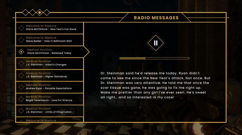
This week I decided to revisit the collectable screen for the audio logs; UI that I had previously tackled to mixed results (fig. 1). The wireframe that I created in week five of this project has a lot of design elements that I like, in particular the general layout as well as the visual identity of the playback button and progress bar. However, the buttons on the left of the screen don’t feel like interactable components, and the change in state is not clear enough to effectively highlight the current selection. As I have had a few weeks of working on the project since then, I came back to the screen in the hope that I could bring more insight and improve upon its design.
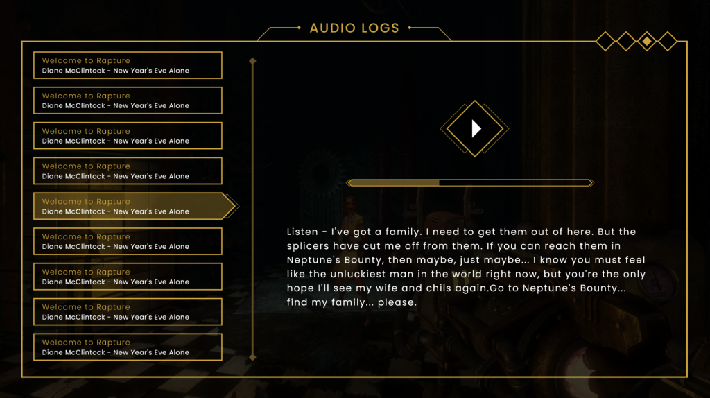
I began with the overall profile of the dialog box that takes up the majority of the screen. While I like the arrangement and general grouping of elements, I feel that the sections of my previous design were too closed off from each other, creating a feeling of disparity. To remedy this, I drew up a dialog box of the same size, and broke it up into the button selection area and the detail/transcript area. However this time, rather than using a definitive line to block them off, I created a subtler break which doesn’t quite extend to either end of the box. I already much prefer this as it implies the separation and creates a more cohesive UI (fig. 2).
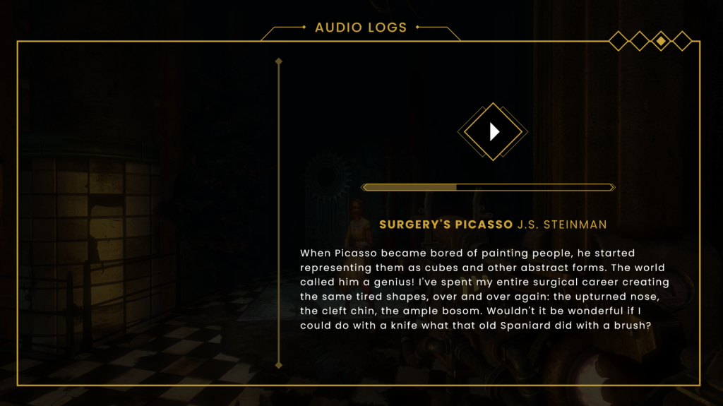
I then added in the playback button, progress bar, and transcript. As I was happy with the previous design, the location and arrangement of these elements has been largely untouched. I also added in a more subtle, centred page title, and kept the diamond navigation indicators, this time placed in the top-right (fig. 3).
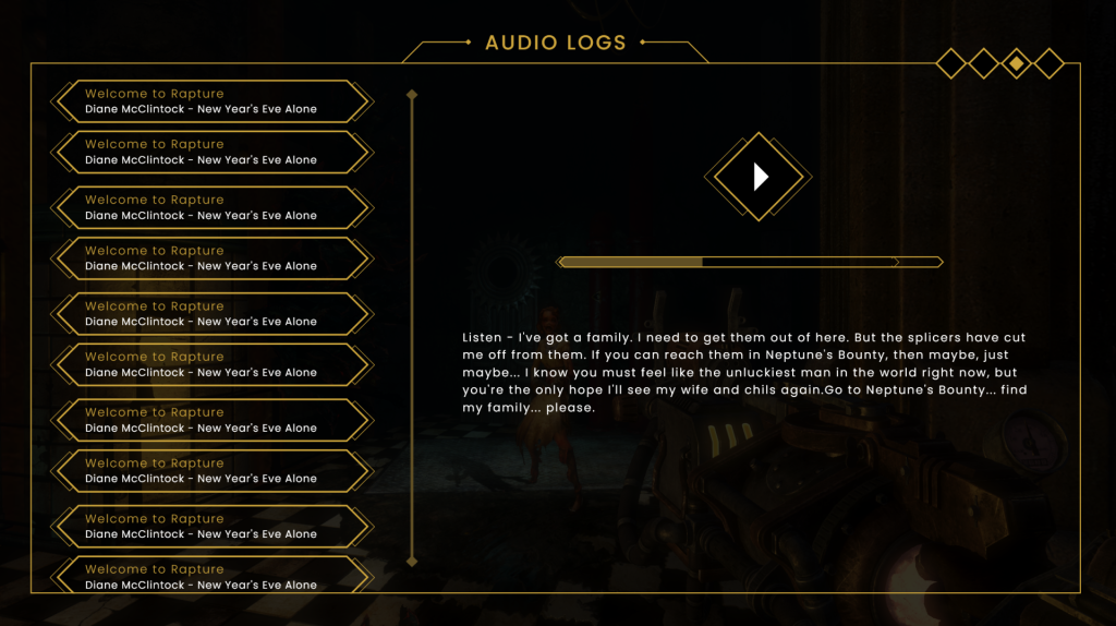
When adding in the selection buttons, I knew I would have to try a few variations before deciding on one which works. Below are some of the renditions created before eventually coming to a working design (figs. 4, 5 and 6). These were heading in the right direction, and I certainly felt more confident in their appearance as buttons. The small separation between each one denotes that they are individual elements in a list. I experimented with different state changes for the selected button, including colour shifts, borders, and highlights. I was still not happy with the layout and felt that I was constrained by being too similar to what the original had done.

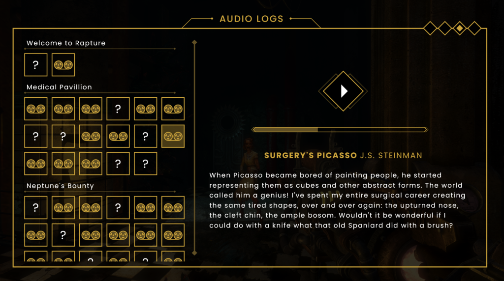
It wasn’t until I looked back at the previous artboards created that I realised I had already figured out the look for these buttons in week six, within the vendor menu. Using that framework, I then created similar horizontal menus, separated by level name. Then, all I had to do was create a simple reel icon for the discovered audio logs. I used a question mark for the undiscovered ones (something the original BioShock doesn’t show.) Because the buttons were now visual, I moved the title text and character name over to the playback section of the screen, which I prefer as it makes that portion of the screen feel less empty than it did previously (fig. 7).
Research
My research for this week has primarily been a continuing of my engagement with previously accessed resources. I have read another chapter of UI is Communication (McKay 2013). Chapter two elaborates more on the the metaphor of UI being a ‘friendly conversation’. It details how to best present commands (the verbs of your conversation) in a manner that easily shows the user their available options without overwhelming them. As a rule of thumb, essential commands should be instantly discoverable within their given context, while more advanced actions can be located within less discoverable menus such as toolbars to allow for users to find them without being initially paralysed by choice. McKay also goes over the balance between conciseness and over-explanation within UI. Some commands are so obvious that to explain them would waste the users time and risk patronising them. On the other hand, if a command is highly contextual and could result in an irreversible action, a degree of explanation should be employed so that users know exactly what they are performing.
References
BioShock. 2007. Irrational Games, 2K Games.
MCKAY, Everett N. 2013. UI is Communication: How to Design Intuitive, User Centered Interfaces by Focusing on Effective Communication. London: Newnes.