Hacking prompt
I began this week by focusing on an important system within BioShock‘s gameplay loop – hacking and lockpicking. Dependent on someone’s playstyle, it is likely that players will spend a lot of time engaging with this UI, as it is used to hack security bots, cameras, and turrets, as well as to pick your way into valuable safes. A common gripe with the original game is that hacking is not fun – for something that is heavily incentivised to the player, it takes them out of the overall experience and requires that they engage in a minigame. While I do not intend to redesign the puzzle system, I hope that by iterating on its UI, I will be able to at least improve the overall experience of hacking.
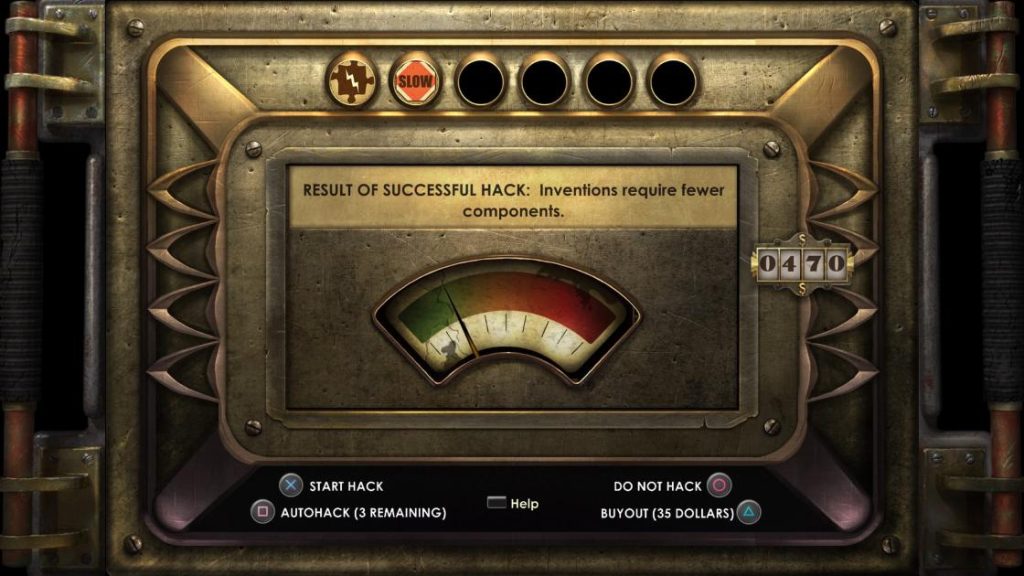
As always, I began by looking at the UI of the original prompt (fig. 1). As with much of the rest of the game, it has a heavily stylised interface, with realistic theming and semi-3D elements. At the top of the screen, the player’s hacking related tonics can be seen, followed by a short description of the process. Below that is a vague bar that indicates difficulty, and a cluster of buttons are occupying the bottom portion of the screen. To the right is the player’s current money (relevant for using the ‘buyout’ option.) The intention with my redesign is to translate the style semi-3D style to that of my own; to group the elements more logically; to make both the tonic slots and difficulty meter more clear to the player.
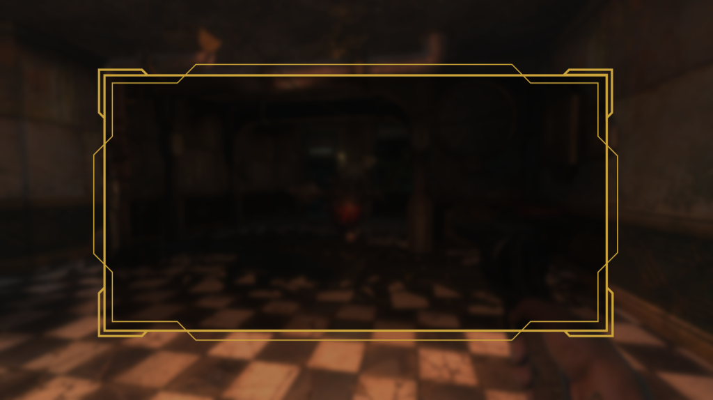
Rather than have the UI take place on a separate screen, I wanted it to operate as an overlay to paused gameplay. This would go some lengths to retain player immersion. I created a decorative rectangular dialog box with a dark, translucent fill that would hold much of the information (fig. 2).
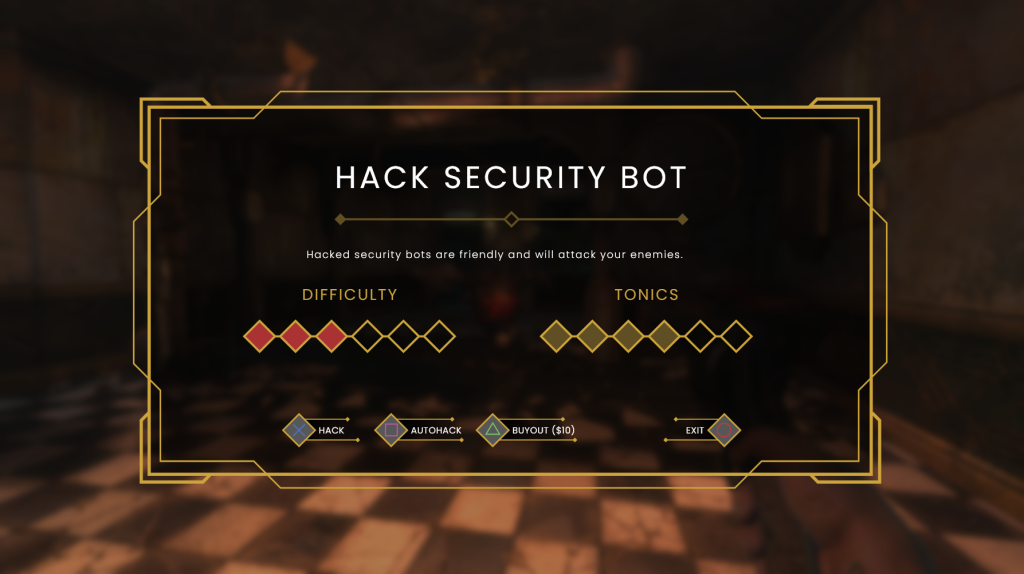
Next I created a header that displays exactly what the player is attempting to hack, in this case a Security Bot. Below, and separated by a divider, is a contextual description that explains the results of a successful hack. I then created two meters that represent the difficulty of hacking, and tonics held. By changing the difficulty bar to a defined meter, the player is able to see quantitative representation of difficulty, and better assess their options. Buttons have also been aligned to the same vertical positioning, and grouped depending on whether they will advance the player to the hacking minigame, or exit and return to gameplay (fig. 3).
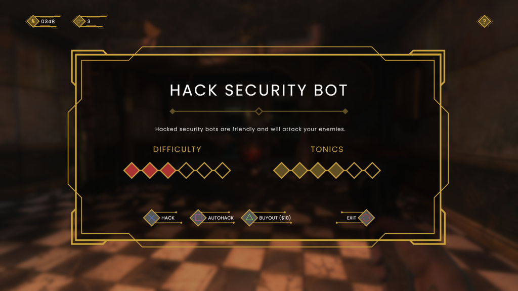
Finally, I created two indicators in the top-left corner of the screen that display the amount of dollars the player has, and the number of autohack tools available (both relevant to the ‘buyout’ and ‘autohack’ options respectively.) I feel that this screen is a marked improvement on the original, and with the removal of superfluous details makes for a more accessible and easily readable piece of UI (fig. 4).
Weapon select
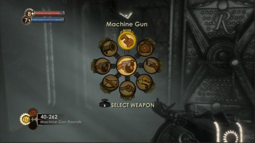
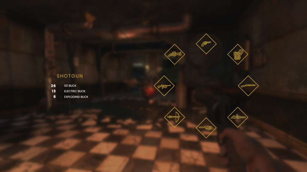
As my UI redesign is for the console version of BioShock, I needed to create a controller-friendly method of selecting weapons. The original has a radial menu for weapon selection which works well, however some elements are slightly unintuitive by today’s standards (fig. 5). Icons are large which adds to readability but also makes for a small amount of empty space within the structure, and grouping could be better employed – perhaps by moving the ammo count closer to the weapon wheel so that salient information is nearby.
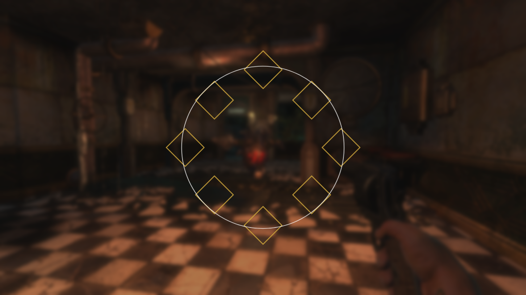
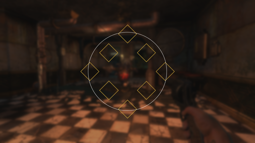
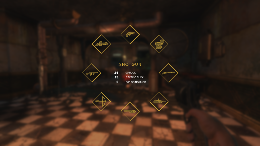
Adhering to the Art Deco styling, all of my UI elements have featured strict angular lines, with no rounded edges or circles to be seen. This posed a unique challenge when creating a weapon wheel, as I needed to create a radial menu that fits the circular form of a thumbstick, without appearing inconsistent to my previous designs. Using the previously established diamond shapes, I created varying circular arrangements, with the shapes sat at different points on the circle (figs. 6, 7 & 8). The first arrangement was my favourite as I feel it has enough space in-between elements to make for better clarity.

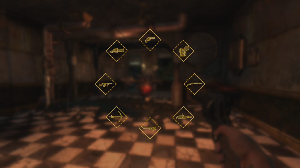
From here, I began populating the radial menu with weapon icons (fig. 9). I created these by taking images of BioShock‘s weapons and drawing over them with the pen tool. It was important to use enough lines to convey the form of the weapon, without going overboard on unnecessary detail. I am happy with the results, as each weapon looks visually distinct.
Next came the placement of weapon information, including name, primary ammo counts, and secondary ammo counts. Once again, I experimented with different placements of this information before finally landing on the right location (figs. 10 & 11). With the central empty space that this radial menu affords, it was more logical to place it here than to the side. With this design, the player is able to see the weapon’s available to them, and their ammo pool for the current selection in one location without having to scan around the screen.
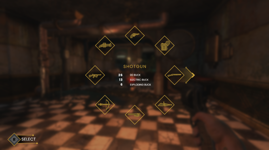
Finally, I added an arrow indicator to represent the direction in which the player is pushing the thumbstick, as well as a control prompt in the bottom left (fig. 12). With that, the screen was finished in its current state. I intend to animate it later down the line, along with some of my previous designs.
Research
Looking for further reading within the world of UI/UX design, I searched online for recommended resources. One book that came up on a lot of lists was the textbook UI is Communication (McKay 2013). Luckily the book was available online through the university’s library, and I have begun reading it. The first chapter goes over ‘communication design principles’, arguing that human-to-computer interaction should be no different from a human-to-human conversation. McKay argues that UI interfaces should be “polite, respectful, and intelligent” and “feel like a natural, professional, friendly conversation” (2013: 61). To this end, to design effective UI’s it is crucial to understand effective communication. By treating each design as a conversation, UI/UX designers can ensure that all user interactions are efficient and intuitive.
References
BioShock. 2007. Irrational Games, 2K Games.
MCKAY, Everett N. 2013. UI is Communication: How to Design Intuitive, User Centered Interfaces by Focusing on Effective Communication. London: Newnes.
List of figures
Figure 5: Jada Griffin. 2017. BioShock weapon select menu screenshot. NerdReactor [online]. Available at: https://nerdreactor.com/2017/05/15/prey-vs-bioshock-5-comparisons-make/bioshock-weapons/ [accessed November 2 2022].