Practicing Adobe XD
This week I have been continuing to learn and practice using Adobe XD, experimenting with the application’s tools and making some mock-ups. I am currently working on a group project, for which we are in the early stages of pre-production for a game. As part of this pre-production I created a mock-up for an inventory/stat screen (fig. 1).
I made an effort to ensure that the presentation of the UI was in keeping with the cosy aesthetic of the game we were making. Our concept centers around the collection of magic plants to empower your player in useful ways. To present this, I created three separate stacks, each representing a different type of plant, along with an icon for the stat they affect. Next to that is the current elemental effect applied to your weapon.
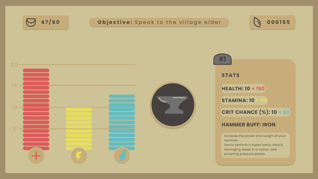
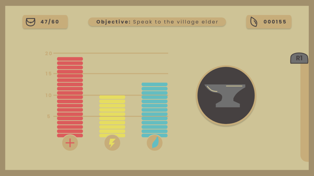
Further to the right is the ‘stats’ panel that displays player health, stamina, and critical hit chance, as well as the description of the weapon’s effect. As a side note, I was able to use the prototype feature to set up a controller so that upon pressing the R1 button, the stat panel slides off screen (fig. 2). Pressing it again will bring the stat screen back into view. In both instances, I made it so that the rest of the UI scales and move in order to make space. While this is a small feature, its inclusion means that I can create some functional prototypes of working UI to further demonstrate how my designs would work.
Along the top of the screen are UI pieces displaying carry capacity, current objective, and amount of currency. These pieces all had a drop shadow applied to them in order to add some more depth to the UI, and make the text more readable.
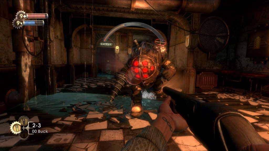
BioShock UI notes
Whilst BioShock (2007) is a game I know inside out, I wanted to dip back into it, this time with an eye towards the UI design. While playing I made some notes on it’s strengths, weaknesses, and possible improvements. Below are some examples of what was written.
- The UI here is not poorly designed by any means, more so a product of its time.
- The quest arrow at the top is iconic for how distracting it can be, there must be a subtler implementation of this idea.
- Multiple fonts are used for different pieces of information, this detracts from overall readability and makes the UI feel less cohesive.
- HUD elements look semi-3D, almost like they should be diegetic, makes for more visual noise and could be argued that it breaks immersion.
- I like the general grouping of HUD elements, it reads clearly from top-left to bottom-right.
- UI in general is a blend of Art Deco, and steampunk aesthetics, without fully committing to either. I would like to try and double down on the Art Deco half of this combination.
- The sleek, clean lines of the style would afford a more minimal and immersive overlay.
In summary, BioShock‘s UI is far from horrible, but it certainly feels dated by today’s standards. For this reason, I feel that it is ripe for a redesign, with the challenge being to retain the distinct feel and usability, while streamlining and modernising the overall profile. To achieve this, a key decision I have made is to create UI that fully commits to the Art Deco aesthetic.
Early UI element concepts
Whilst I had been spending so much time in Adobe XD, I decided to create some mock-ups for a HUD piece that might fit with my concept of an entirely Art Deco inspired UI (fig. 3). I began by creating variations of a UI element that would display the currently selected weapon, alongside ammo-type and ammo count. These were made utilising Art Deco’s recognisable angular, perpendicular lines.
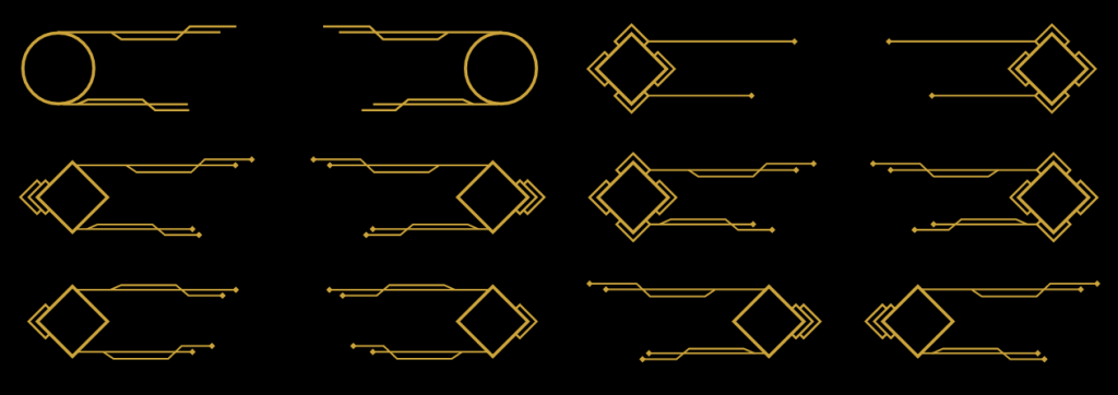
I am pleased with a number of these designs, in particular, the middle left. I feel it adds enough flourish and ornaments, without detracting from overall readability. I initially created the piece using a circular base shape (seen in the top left) but quickly abandoned this idea as it feels incongruous to Art Deco’s sensibilities.
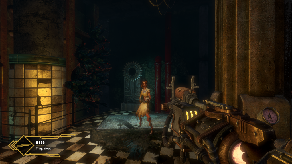
Taking the UI element, and overlaying it onto a screenshot of gameplay, I can already see its utility within the context of the game (fig. 4 ). In comparison to the corresponding HUD piece of the original (fig. 5 ), I feel that it makes for a more streamlined, unobtrusive piece of UI.
There are already some definite improvements to be made. I feel that the element could be made smaller, and I still need to include representation for the alternative ammo types. I look forward to filling out the rest of the HUD next week.
Research
To better ground myself in the era and style I am aiming for with this UI, I wanted to gain more understanding of the Art Deco movement. To help with this I watched a short YouTube documentary on the style (Curious Muse, 2021), taking notes of anything that could apply to my project. Key takeaways from this were the optimistic and hopeful feelings it aimed to instill, in response to the economic turmoil of a post-WW1 Europe. The movement had an eye to the future, intending to reflect aspects of modernity and prosper, representing this through the use of angular, perpendicular lines . Translating this style into UI design will entail carrying these core concepts over, something I have already begun to do in my concepts.
References
BioShock. 2007. Irrational Games, 2K Games.
BioShock 2. 2010. 2K Marin, 2K Games.
CURIOUS MUSE. 2021. Art Deco in 9 Minutes: Why Is It The Most Popular Architectural Style? [YouTube documentary]. Available at: https://www.youtube.com/watch?v=ZHF7vnbZD8Q [accessed 30 September 2022].