Alongside my team project work, this week I have been steadily creating more UI screens and conducting personal research to better my understanding of UI/UX design.
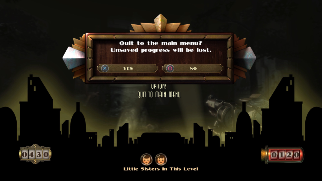
Quit game screen
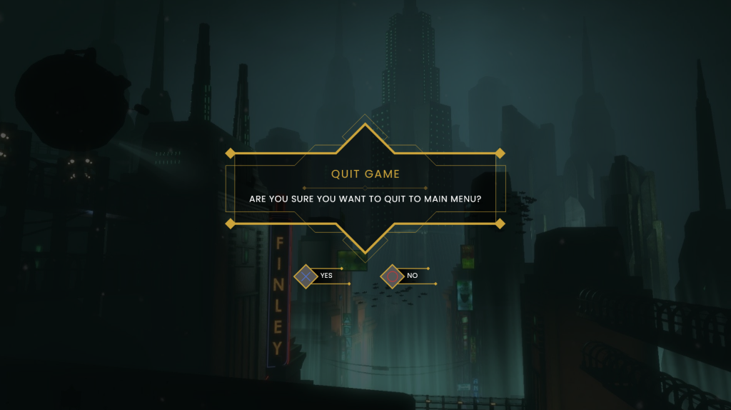
As I made a pause menu last week, I decided to create the quit game screen as a continuation. The original has a pleasant aesthetic, with simple, intuitive design (fig.1). This meant that not much needed to be iterated on, however I did of course need to adjust the design to be in keeping with my style. As the original’s ‘quit game’ button appears overlaid on the pause menu itself, I feel it creates unnecessary visual noise and clutter. For my design I would take the player to a separate screen with less distractions. I also felt that the text is not properly aligned with the center of the element, making for some noticeable empty space.
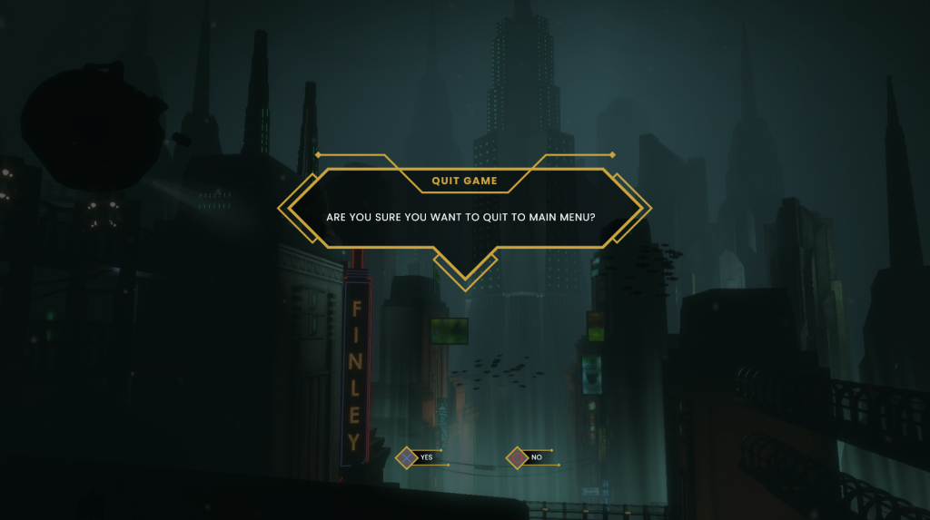
With these intentions in mind I began designing my rendition. The original shape I created resembled the ‘new objective’ element created in week three. While I feel this shape worked in its prior implementation, it is too asymmetrical for the purposes of a dialog box (fig. 2). What I created needed to better cater to player’s expectations, likely taking a rectangular shape.
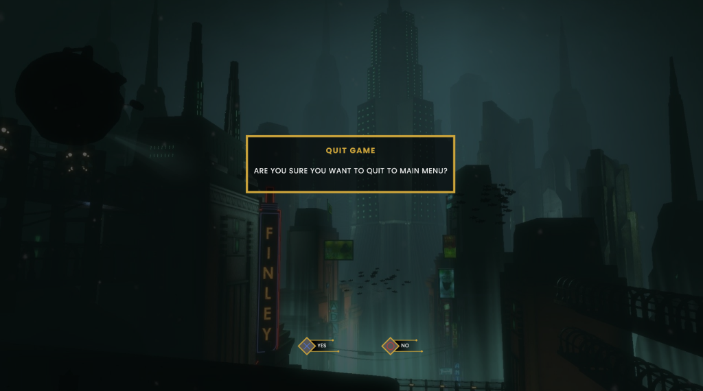
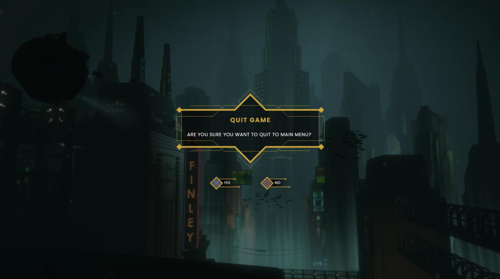
The next version I made was very simple – simply a rectangular dialog box, with button prompts in the bottom center (fig. 3). As a wireframe, it is much more readable, and I used it as a basis to begin building on. I added more geometric lines and details, allowing myself to experiment with different shapes, while adhering to horizontal symmetry. Below are some of the iterations created (figs 4 & 5).

Eventually I landed on a design I am happy with (fig. 6). It feels lavish enough to be considered Art Deco, while not detracting from readability and efficiency. It will also likely serve as a template for further dialog boxes that I design for this project.
Audio logs
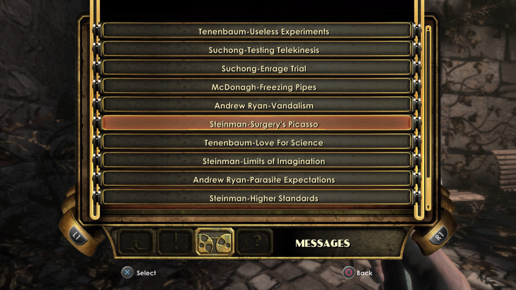
I have also begun creating the mock-up for the radio message collectible screen within the game. Audio logs are a central part of the BioShock experience, and the primary method by which narrative is delivered. Because of this, I want to make sure that this screen is fully intuitive so that players can find and listen to desired audio logs with little effort. The original menu feels slightly messy, with the centered text making for a lot of empty space to either side (fig. 7). Once clicked on, an entry takes you straight to another panel where it plays the audio alongside a written transcript. For my version, I would like to keep entries and transcripts on a single page, to minimise navigation.
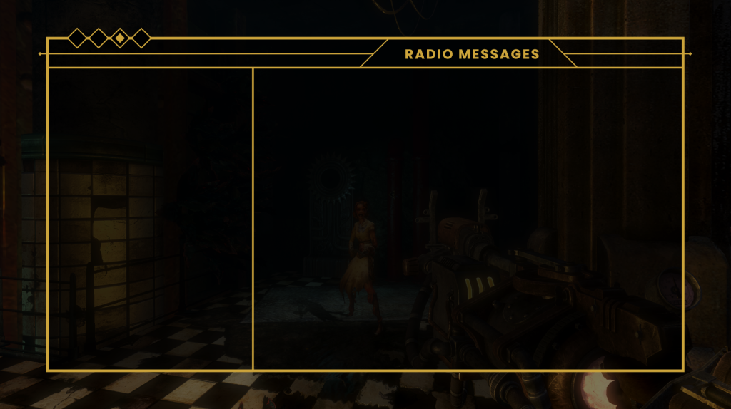
I began with the general outline of the panel, creating a centred rectangle and splitting it into three subsections; one for the page title, one for button selection, and one where the transcript and play/pause button will be located (fig. 9).
For the title section, I added some angular lines, allowing some to overflow from the base shape. I also added four diamonds to the top left in order to represent which page the player is on in relation to others (fig. 10). Buttons were stacked closely on top of each other within the left-hand portion of the screen. Alongside the title and character name that the original’s UI displays, I also ensured to include the level it was obtained in. A filled in diamond represents which entry is currently selected (fig. 11). The rest of the panel is taken up with a transcript of the audio log, a progress bar, and a play/pause button (fig. 12). I really like the overall profile of this area and I feel that the button and progress bar are optimal sizes. The text feels slightly too large and could likely be decreased.
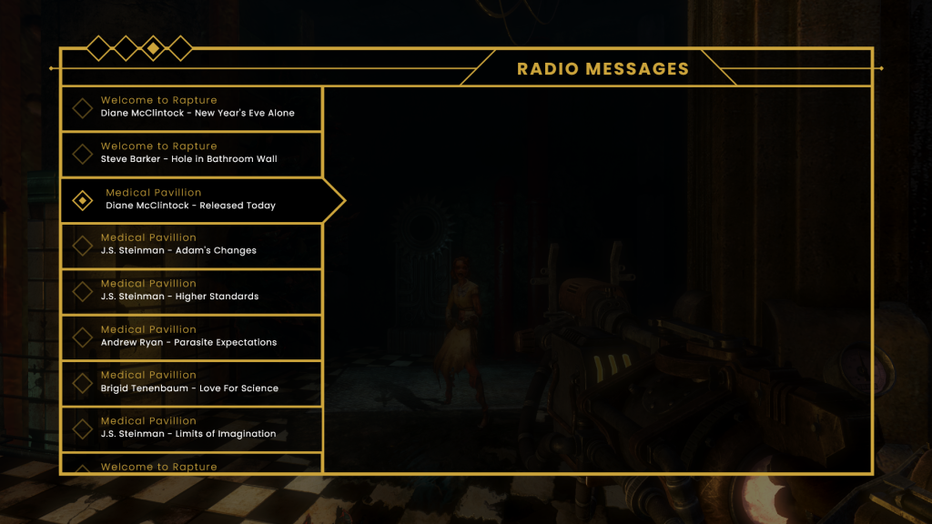

Overall, while there is a fair amount that I like about this screen, I feel there is room for improvement. The overall navigation could be made more intuitive, and the buttons could be clearer, especially when highlighting a change in state. This will likely be a design that I come back to for further iteration.
Research
Next week I intend to begin designing some of the vendor screens for the game. This requires presenting multiple purchasable items on one screen, without overwhelming the player with choice. To help prepare myself for this I watched an interesting video essay on inventory UX design (Design Doc 2019). It showed the history of inventories in games and highlighted how they have evolved over the years. It stressed the point of making inventories feel intuitive, stacking multiple items, and allowing players to perform common actions with great ease. Ocarina of Time (1998) was brought up as an example of bad inventory design as within the Water Temple you have to frequently cycle between inventory pages to equip and unequip steel boots that allow for traversal. This could have been easily remedied by making the boots more easily accessible to save on time spent in the menu.
I have also been reading Lost in a Good Game (Etchells 2019), a memoir and exploration of the psychological effects (good, bad, and unknown) of video games. Author Pete Etchells is a professor of psychology and science communication and provides fascinating insights and anecdotes about the powerful healing abilities of engaging with video games. Game design is largely about understanding the psychology of players, and the more I can engage with this subject field the better placed I will be to understand and utilise psychology within my design. I look forward to delving deeper into this book.
References
BioShock. 2007. Irrational Games, 2K Games.
Design Doc. 2019. Inventory UX Design – How Zelda, Resident Evil, and Doom Make Great Game Menu UX [YouTube video]. Available at: https://www.youtube.com/watch?v=5_3BUU9ZmNo [accessed 21 October 2022].
ETCHELLS, Peter. 2019. Lost in a Good Game. London: Icon Press.
Ocarina of Time. 1998. Nintendo, Nintendo.