ALUMNI: ADVERTISING/BRANDING
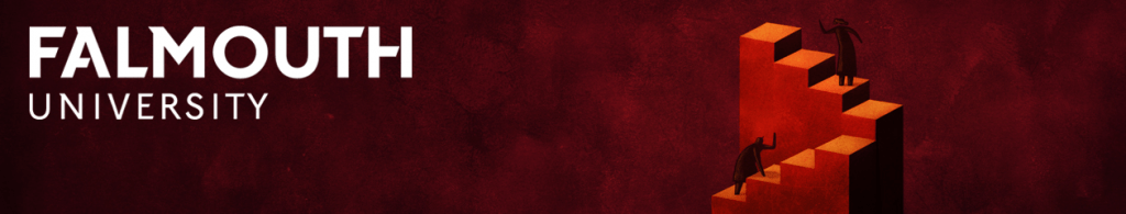
JOSH MCKENNA
We speak to Josh McKenna about the inspiring range of contexts his work spans, including illustrations for mobile phones, bottles, badges, clothing, transport, interiors and shop windows, as well as more traditional areas such as editorial and publishing.
Q: You have worked on vastly different scales, from very large murals and shop window displays to emoji’s for mobile phones. How do you adapt to such different creative challenges?
Each commission varies from the last and each comes with its own challenges. Adaptability is key and making sure that my style of work can translate well, no matter which format it is applied to. If it’s a hand painted mural then I try to keep the lines simple and smooth, much like my digital work, but I have more room to be creative with scale and colour. With smaller jobs, like emojis or icons, it’s all about simplifying my work but not losing the core elements of my style.
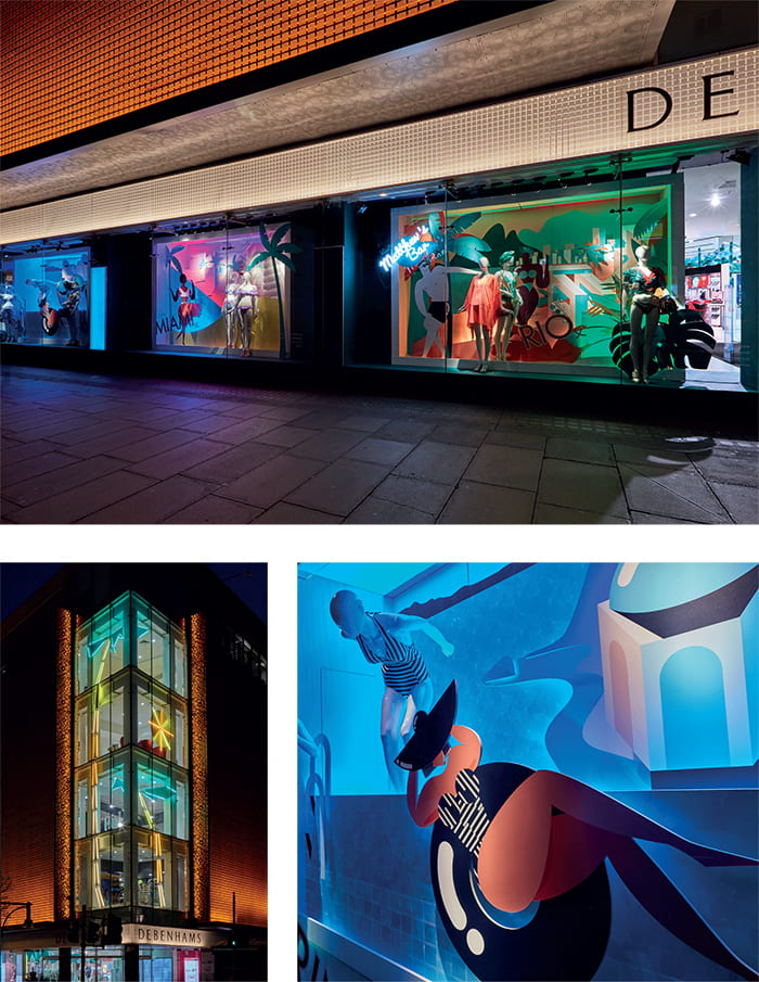
Q: You were commissioned to do a very large-scale promotional window display for the Debenhams flagship store in Oxford Street. Can you tell us about your working process and how working on such a large scale affected it? Did the job involve collaboration and if so, how did you find working in a team?
Working on the store windows was definitely a challenge as I’d never had my work built into 3D before and I had to create a design that would work as a display. The idea was to use layering and to create a three-dimensional box with separate elements which included a background, plant elements and characters in the foreground. It was certainly a collaborative project, which was both fun and challenging. It was fun working with a very small creative team, but working for such a large corporation did involve compromise, and many of my ideas and character designs had to be watered down or made ‘slimmer.’ The inclusion of the mannequins with clothes was not in my initial designs, but as the project was for a shop window this approach made sense for Debenhams.
Q: You designed a float for the Mardi Gras in Sydney this year. Many freelance illustration commissions are developed in a solitary studio, with all correspondence and submission of artwork taking place with an art director via email, and a design team managing the design, print and production. How did you manage the logistics of this job i.e. creating large-scale work for a live event on the opposite side of the world?
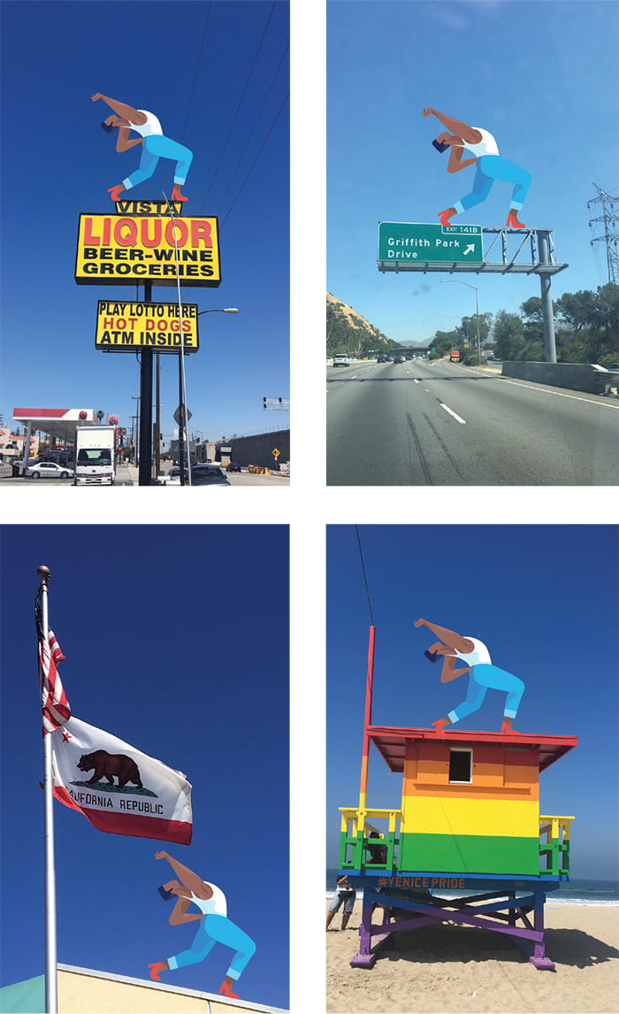
This commission is by far the craziest one yet. To have my Instagram Sticker illustration blown up to four metres high and covered in glitter for one of the world’s largest LGBTQ+ events still hasn’t sunk in. The design and build of the float was actually done in-house by Sydney Mardi Gras, an amazing team of creatives and craftspeople, who build all of the floats in a huge warehouse throughout the year. I handed over the design to Facebook/Instagram and they worked with the team to create the design. As the original illustration is a small 2D sticker, their challenge was to create a giant double-sided 3D version which could be viewed by spectators on either side, along the parade route. As part of the project I was flown out to attend Mardi Gras, to do lots of press and interviews and to attend the live revealing of my float on camera. I was also interviewed on Australian morning television, live from the warehouse itself!
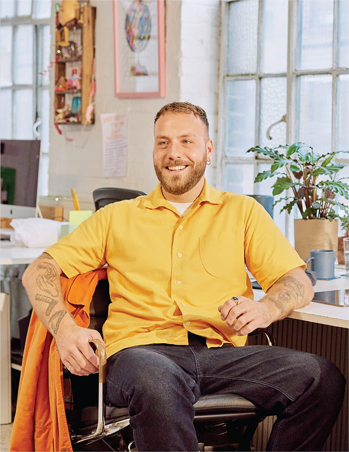
Q: You were commissioned by Vodafone/VOXI to develop designs in conjunction with Pride branding, to work across different contexts e.g. phones, badges, banners and umbrellas. How did you create visual consistency across the series while also embracing the different identity of each shape, size and context? Your illustration for the branding is solely character led and is about identity (LGBTQ+). Was it a challenge to represent the diversity in society?
I was allowed a lot of freedom with this commission, which was great for me to be able to represent the LGBTQ+ community in a way that I felt strongest. I knew the images were going to be placed across different media, including accessories for phones as well as banners and badges for the pride parade itself. I knew that I wanted to draw a large group of different people in a simple, pink setting which enabled me to select certain characters to apply to different contexts. So, if one character resonated with a person in the crowd then they could have a more personal connection to their chosen accessory.
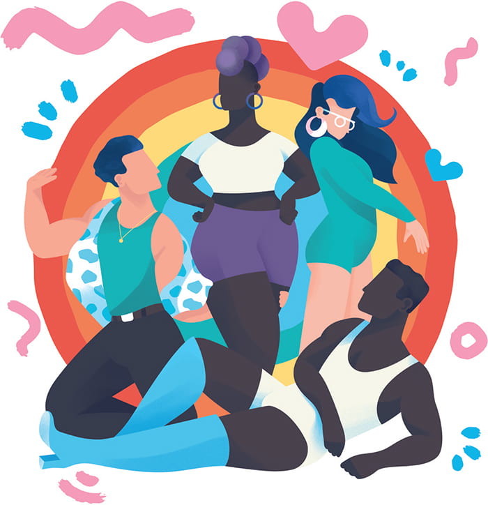
Q: You have developed a series of promotional Invitation Design, Mr Porter, ‘Miami by Day’ and ‘Miami by Night’ posters for the internationally recognised restaurant Beefbar (for Monte Carlo, Paris, Méribel and Malta). How art directed was this commission, in terms of promoting the identity of the restaurant and attracting a particular audience/clientele?
The theme of this ongoing series (there will be 14 in total) is loosely based on vintage travel posters but with my own modern twist. Given the clientele of the restaurants, I was briefed ‘to show a bit of class, but with a lot of sass’. Each round of feedback from the people at Beefbar is usually, “can you make it sassier,” which is always fun! Further requirements for each brief include depicting scenery of the restaurant or surrounding area, and each poster needs to feature their signature food and drink.
Q: You have done a series of illustrations for Bombay Sapphire, which are very different in media, scale and context/use, including limited edition bottles, embroidered jackets and a large interior mural. How did you translate your work into stitch and fabric? How did you develop a design with different functions, firstly to promote the brand identity of Bombay Sapphire but also to be a desirable fashion item?
As the jacket was a ‘Hypebeast’ collaboration I wanted to create an illustration on a garment, and it was my idea to have it hand-embroidered as a one-off piece rather than a static artwork. I worked with a local London embroiderer, Lisa Salama, to break the illustration down into sections of thread and to work out approaches for each section. She then hand stitched the design onto a jacket. I was given a particular cocktail recipe by Bombay Sapphire, which I had to incorporate into the design, so I used the ingredients as a base for a graphic image. Using a limited colour palette and the Bombay Sapphire blue helped tie the piece together.
Q: For the Bombay Sapphire project you worked with other high profile illustrators on the mural, such as Olaf Hajek. How did this collaboration work?
Although the mural was a collaboration, we each had a section of wall to paint and Olaf Hajek designed the walls around the bar, so the working process didn’t involve much collaboration.
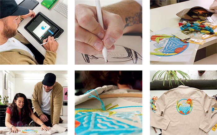
Q: As the design for the Bombay Sapphire bottles was a limited edition, how did you embrace the idea of creating something special as a one off? How did the 3D factor affect your design ideas?
This project was a difficult one as I’d not worked by hand in 3D before. I wanted each bottle to be unique, so I came up with a process of spray painting the whole thing and adding vinyl foliage and shapes individually to each bottle. The design was really strong and worked well over the 40 or so bottles, but they needed to be waterproof as they are in use at different bars across London, so this required a lot of aftercare hassle involving industrial varnish.
Q: Your commissions are diverse in terms of the platforms you’ve worked across, but there’s a common thread to a lot of your work in terms of the subject matter, which often involves themes connected to LGBTQ+. E.g. A Facebook mural connected to Pride London, promotional material for an LGBTQ+ community centre, and the float for Pride Sydney and Pride branding for Vodafone already discussed. Is this just down to the snowballing nature of the commissioning process or is this a personal interest, which you have consciously pushed in your work?
All the LGBTQ+ work that I have done has come directly from creating the Instagram Pride sticker. As a well-known icon within the community, it has opened doors to different commissions and has accelerated my work globally. Having the ability to use the platform of illustration and my voice as an illustrator to highlight LGBTQ+ is very important to me and I strive to represent a diverse roster of people within my character choices as I think it’s important for all types of people to be seen.
“Having the ability to use the platform of illustration and my voice as an illustrator to highlight LGBTQ+ is very important to me and I strive to represent a diverse roster of people within my character choices.”
Q: You have worked on promotional material for UAL, including the UAL prospectus and welcome booklets. As the imagery for these commissions is quite character driven, how do you generate figurative ideas which will embrace the diverse student population in London Universities? You tend to depict faces with no eyes – is this a strategy to avoid stereotyping?
As my style develops, I’m ever-evolving my characters to be more and more diverse and I think this is important in particular publications, like a university prospectus. It’s not always about colour of skin, I make sure to include everybody without stereotyping. Depicting the faces with no eyes is a conscious way of achieving this.
Q: The above commissions discussed are largely concerned with branding and promotion. Your broader commissions cover all key fields of illustration, including editorial, advertising and publishing, and involve working more with text and broader subject matter. Do you have different working processes and strategies for different kinds of illustration projects? What sort of commissions do you enjoy most and why?
I enjoy the fact that each commission is different from the last and that’s what keeps the job exciting for me. I enjoy branding/promotional work the most as it’s the area where I’m most likely to see my work printed in broader contexts, and the collaborative element allows me to meet great people. Publishing and advertising are my bread and butter and I still occasionally work on editorials, although at this stage I am becoming more particular with who I create editorials for, as notoriously low budgets don’t always seem worth the time.
Q: You’ve worked with a lot of high profile companies, such as Apple, Google, Vodafone, Facebook, Instagram, Converse, the V&A, Vogue and Wall Street Journal. Does their high profile affect your working process and the amount of art direction you have?
It varies with each project. I have been lucky with my larger clients who have come to me for my vision and have allowed me a lot of free reign. Of course, there are some restrictions when it comes to depicting characters and how they dress/interact with each other – with high profile companies the audience is larger and more global, so they often have their own restrictions to adhere to.

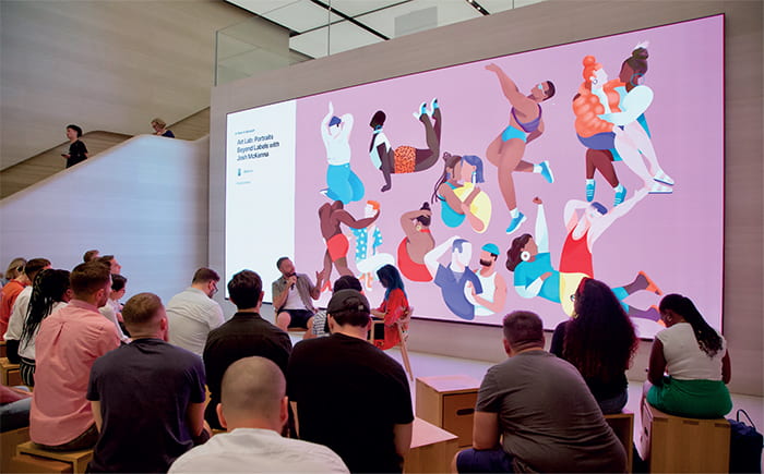
Q: You have done some talks and workshops in the Apple flagship store in Regent Street. How did you apply your creative skills to this very different challenge i.e. in taking on the role of a tutor? How did you find working with a broader demographic of people?
I have done two workshops and talks at Apple’s flagship Regent Street store which has been a fantastic experience as I get to share my skills and what I have learnt as an illustrator with people who have specifically signed up to the workshop and are wanting to learn from me. It’s a great feeling, once you get past the nerves of public speaking, to impart (some) wisdom to willing people. During the last talk I demonstrated how I personally use an iPad and Procreate and asked the audience to get involved in creating their own sticker or emoji to represent themselves, which yielded some really lovely results!
