
Group B: Critical Design, 5m pres: bring a Draft PDF of your Critical Design Publication, discussing how its chosen form extends or speaks to its content
For the design of my essay, I have laid out some preliminary plans which I think best reflect its nature via visual means.
Touching upon the theme of luminosity, I considered printing with glow in the dark ink. This touches upon the trickster nature of a Will-O’-The-Wisp. However, I decided against this due to 1) its artificialness not being reflective of the natural elements I discuss and 2) charging the essay in the light and then viewing it in the dark are not particularly relevant to the essay’s content.
LAYOUT CONSIDERATIONS
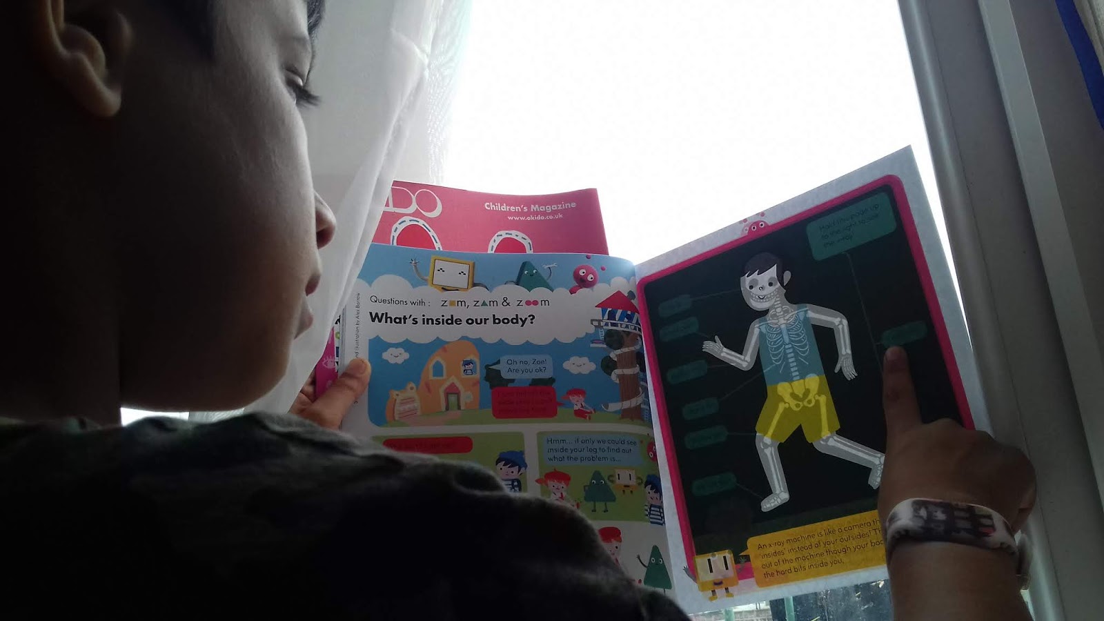
Instead I am thinking of designing the book using the technique shown above in the “What’s Inside?” children’s book. I like the simplicity of the reader holding the book up to the light and having to personally intervene in order to fully read the essay.
So far, I have created these example sheets:
the front of page = writing facing the correct way / back of page = writing is backwards.


If you read the essay held together, or on an opaque table, it would not make any sense. By holding it up to the light it will show the entirety of the text.
This technique could be used on pages with larger and less text, to take into account the difficulty of alignment when printing.
Other techniques may be the whole page is written on the other side, with all of the text backwards.
I intend on printing on A4 and cropping with a 5mm bleed all around.
PDF CONSIDERATIONS
For the PDF’s purposes I intend to photograph the essay either on a lightbox or the essay being held to the light – whichever technique combines legibility with the design principle the most effectively.
TYPOGRAPHIC CONSIDERATIONS
I have really like these local 1970s/80s Norfolk supernatural quarterlies. They both discuss similar folklores to that of my essay and have a regional aspect that evokes a sense of familiarity with me. Providing the text is very legible (and considering photography will be involved for the PDF) a similar typewritten font and perhaps some hand drawn titles / hand drawn notes or diagrams may help me to evoke this style. In particular this may work well for the front cover (MATERIAL?)


BINDING CONSIDERATIONS
My initial instinct is to spiral bind the pages. I am thinking about this option because I want each page to be easily separated from the rest of the essay – when holding up to a light source, a gutter would complicate the holding of it, as well potentially limiting the opacity of the page. A decent sized left hand margin needs to be considered to take into account the dimensions of a spiral, which I will look into. Another bindings that create this flexibility may also be suitable, which I will briefly look into.